Showing Electoral College Impact With Overlapped Bars


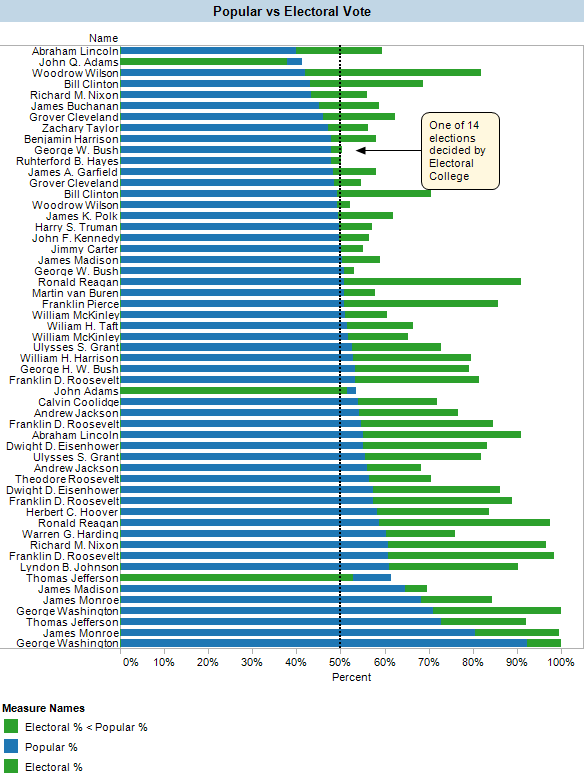
You can see that despite the attention that the 2000 election brought to the electoral college, George W. Bush’s win was the 14th time that the ultimate winner earned less than 50% of the popular vote but more than 50% of the electoral college. Among the other thirteen times, 3rd-party candidates may have been the "spoilers" (as in Bill Clinton’s 1992 win over George H.W. Bush and Ross Perot). Nonetheless, it’s an interesting observation to realize how often this phenomenon has occurred.
Three interesting notes: John Adams (1796), Thomas Jefferson (1800) and John Q. Adams (1824) all earned a greater percentage of the popular vote than they did of the electoral college vote, with John Q. Adams not even hitting 50% of either. That was quite an election since it was eventually decided by the House of Representatives; for more details, see http://en.wikipedia.org/wiki/United_States_presidential_election,_1824.
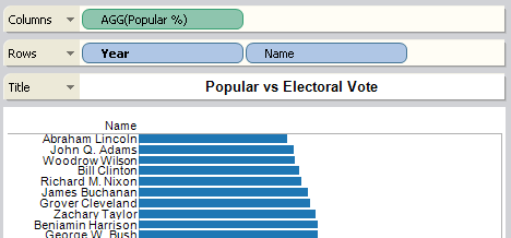
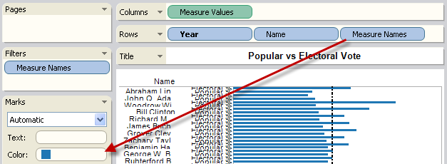
Here is how you build this overlapping bar view of two measures in Tableau:
- Build a bar view
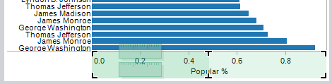
- Drag the second measure to the axis to combine it with the first measure
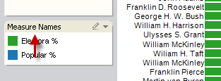
- Move the Measure Names field to the color shelf
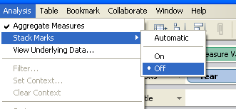
- Turn off stacking
- Adjust the overlap order by dragging items on the color shelf
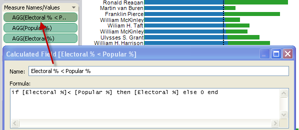
- Finally, write a calculated field to create an extra column to show when the electoral % was less than the popular %. Add it to the Measure Names/Values card.