In this day and age, understanding data is the key to making the best decisions for any business. However, the amount of information that’s available at any time can be overwhelming for the most data-savvy person.
So what’s the key to making data-driven decisions? Finding the most important data and formatting it in a way that’s easy to understand. This can change, depending on who will view the data. If you’re an industry expert, you may find complex data easier to understand. If you’re presenting data to less well-versed stakeholders at your company, you may need to simplify it before sharing it with others.
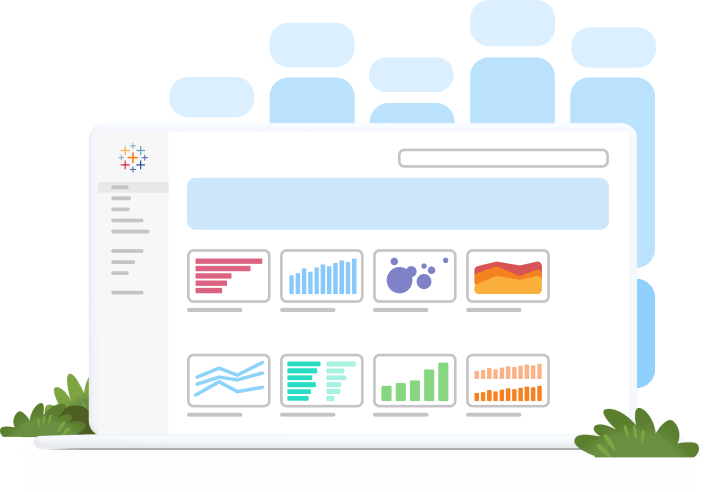
One of the easiest ways to make data easy to understand for technical and non-technical audiences is to create a dashboard that easily displays all of your data visualizations in one place.
In this article, we will run through:
- Dashboard definition
- How dashboards work
- Uses
- Importance
- How to create a dashboard
- Types of dashboards
- Best practices
- Benefits
Dashboard definition
A dashboard is a way of displaying various types of visual data in one place. Usually, a dashboard is intended to convey different, but related information in an easy-to-digest form. And oftentimes, this includes things like key performance indicators (KPI)s or other important business metrics that stakeholders need to see and understand at a glance.
Dashboards are useful across different industries and verticals because they’re highly customizable. They can include data of all sorts with varying date ranges to help you understand: what happened, why it happened, what may happen, and what action you should take. And since dashboards use visualizations like tables, graphs, and charts, others who aren’t as close to the data can quickly and easily understand the story it tells or the insights it reveals.
Data dashboards versus reports
Both dashboards and reports are commonly utilized to collect and analyze data. So what makes them different?
Broadly speaking, reports usually have a more narrow focus. They serve the purpose of providing a deep-dive view into a data set and tend to concentrate on a single item or event.
On the other hand, dashboards tend to have a high-level view of broad amounts of data and are created to answer a single question. That question can be broad, such as, “how was our site performance last month?” Or more specific, such as, “how many units did we sell?” Or perhaps something that’s a little harder to track without specialized expertise, such as, “is our overall efficiency improving?”
Data dashboards versus data visualizations
Two common terms when it comes to analytics and reporting are “data dashboard” and “data visualization.” What’s the difference?
Data visualization is a way of presenting data in a visual form to make it easier to understand and analyze.
Data dashboards are a summary of different, but related data sets, presented in a way that makes the related information easier to understand. Dashboards are a type of data visualization, and often use common visualization tools such as graphs, charts, and tables.
How do dashboards work?
Dashboards take data from different sources and aggregate it so non-technical people can more easily read and interpret it. With interactive elements, it helps anyone using the dashboard better understand certain points, explore areas of increased interest, and support more questioning to arrive at key insights or make key decisions.
Dashboard uses
The main use of a dashboard is to show a comprehensive overview of data from different sources. Dashboards are useful for monitoring, measuring, and analyzing relevant data in key areas. They take raw data from many sources and clearly present it in a way that’s highly tailored to the viewer’s needs—whether you’re a business leader, line of business analyst, sales representative, marketer, and more.
Use dashboards to measure things like:
- Customer metrics
- Financial information
- Sales information
- Web analytics
- Manufacturing information
- Human resources data
- Marketing performance
- Logistics information
Since dashboards are useful aggregation and visualization tools, they’re highly versatile—used by professionals to analyze complex data or subject matter experts to track or present data to non-subject matter experts. Use them in your presentations to executives or other key stakeholders to help them understand challenges, opportunities, where to grow and make changes.
The importance of dashboards
Dashboards are important because they provide a platform for people to make better, more informed, data-driven decisions. Since they’re dynamic, interactive, and show near real-time data, they help you get a more precise, in-the-moment understanding of what’s happening in the world around you and navigate rapid, sometimes difficult changes.
How to create a data dashboard
There are many different solutions to help you build dashboards: Tableau, Excel, or Google Sheets. But at a basic level, here are important steps to help you build a dashboard:
- Define your audience and goals: Ask who you are building this dashboard for and what do they need to understand? Once you know that, you can answer their questions more easily with selected visualizations and data.
- Choose your data: Most businesses have an abundance of data from different sources. Choose only what’s relevant to your audience and goal to avoid overwhelming your audience with information.
- Double-check your data: Always make sure your data is clean and correct before building a dashboard. The last thing you want is to realize in several months that your data was wrong the entire time.
- Choose your visualizations: There are many different types of visualizations to use, such as charts, graphs, maps, etc. Choose the best one to represent your data. For example, bar and pie charts can quickly become overwhelming when they include too much information.
- Use a template: When building a dashboard for the first time, use a template or intuitive software to save time and headaches. Carefully choose the best one for your project and don’t try to shoehorn data into a template that doesn’t work.
- Keep it simple: Use similar colors and styles so your dashboard doesn’t become cluttered and overwhelming.
- Iterate and improve: Once your dashboard is in a good place, ask for feedback from a specific person in your core audience. Find out if it makes sense to them and answers their questions. Take that feedback to heart and make improvements for better adoption and understanding.
Create beautiful visualizations with your data.
Types of dashboards
Because dashboards are customizable, it’s hard to categorize them into distinct types. However, there are seven major categories they fall into, including:
Business dashboards
Companies can’t make solid decisions without data, which is where business dashboards come into play. They can host all kinds of different data, from sales, finance, management, marketing, human resources, and more. They’re designed to give managers and directors the data needed to make strategic plans and refine ideas.
Executive dashboards
An executive dashboard is a specific type of business dashboard meant to visualize crucial metrics for the executive team. Usually, the data is high level, but gives leaders transparency into critical business activity and performance to help them make more informed decisions, better plan, and assess effectiveness.
KPI dashboards
Arguably one of the most important is the key performance indicator (KPI) dashboard—used by subject matter experts, executives, or laypeople. They visually display the performance of key data points at a glance, revealing progression toward key goals. The most important part of a KPI dashboard is to know what your KPIs are and the best way to measure them.
Project Dashboards
When running and/or managing a large project, this dashboard is a useful tool to track its progress and share that with your team and other key stakeholders. It offers a complete view of the project status, insights, and main data.
Performance dashboards
The versatile performance dashboard can track everything from overall business performance to the performance of individual campaigns. It’s useful for marketing, finance, advertising, human resources, and other business groups.
Website dashboards
When tracking site performance, creating a website dashboard is useful. It tracks data like overall traffic, total users, active users, e-commerce activity, sales, and revenue. Whether your organization maintains a simple or more complex site, this dashboard offers an integrated, clear view of your metrics.
Operations dashboards
This is a common type of business dashboard. Unlike the high-level dashboards previously mentioned, these are hyper-focused on helping you run the business day-to-day and give users an end-to-end view of daily operations.
Industry dashboards
Since dashboards are versatile and customizable to the needs of the user and business, they’re a common tool across different industries. Industries that rely heavily on data analysis to make decisions (e.g., healthcare, sales, and marketing) use these to help with their decision-making and problem-solving.
Here are some common industry dashboards:
Healthcare Dashboards
The healthcare industry deals with large amounts of critical data: hospital admission and discharge rates, costs, staff allocations, insurance claims, appointment attendance, no-show rates, and more. Healthcare dashboards keep that information accessible, understandable, and secure so clinicians, office administrators, and other healthcare staff can focus on improving patient outcomes.
Marketing Dashboards
Marketers of all levels deal with an overabundance of data due to the complex nature of online tracking and analytics. That’s why they rely on dashboards to streamline analysis and discover key insights that help enhance campaigns or performance. These dashboards include data such as return on investment (ROI), churn rate, retention, lead numbers, cost per lead, revenue, goal completions, and more.
Retail Dashboards
E-commerce and brick-and-mortar stores deal with complex data about inventory and profit, which is why many managers and owners utilize retail dashboards. They commonly house data such as the number of sales, net profit, inventory, foot traffic, or employee turnover and performance to help retailers understand areas such as performance, customer engagement, and how to improve service.
Sales Dashboards
The sales process is complex with many steps and people involved. A sales dashboard can vary depending on this process and the main KPIs, but oftentimes includes data like the number of leads, open cases, opportunities, contact, closed deals, lost opportunities, and revenue, which reveals to sales staff if they’re fulfilling, exceeding, or underperforming against different goals.
Dashboard best practices
Best practices for building and using dashboards vary across companies (and person to person). Keep in mind the goal you hope to achieve with the dashboard and who will look at it, as well as these considerations for creating a good dashboard:
- KPIs: Don’t overwhelm your audience with data. Choose only the most relevant data for and present it in a way that makes sense.
- Elements: Ensure you choose the correct charts, graphs, and tables for each piece of data. The best visual enhances understanding.
- Design: Make sure your dashboard is easy to understand at a glance by organizing the data and using a consistent color scheme.
- Labels: Be concise and clearly label every piece of information.
- Interactivity: Use interactive elements as needed. This allows people to drill further into data or shows variability.
Benefits of dashboards
There are many benefits to using dashboards as you visualize and understand data. For a start, it gives you a clear view of key data metrics that are important to your organization. Other major benefits include:
- Data clarity
- Real-time analytics
- More accurate forecasting
- More intuitive presentations
- Increased accessibility and transparency
- Better decision-making and problem solving
Dashboards: An ideal data tool to analyze, share, and understand data
Dashboards are a popular tool for a reason. As discussed, they’re highly versatile and customizable, which makes them incredibly useful no matter who you are, what kind of business you run, or what business group or job role you’re part of. Learn more about dashboards and how Tableau helps you visualize data quickly, easily, and effectively.