Scatter Plots
Understanding and Using Scatter Plots
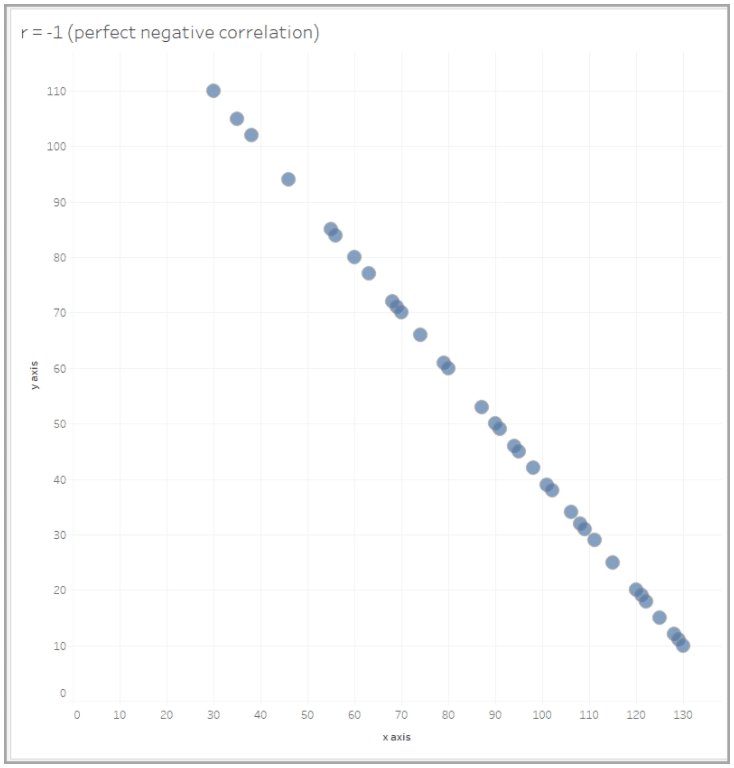
How To Read Scatter Plots
A scatter plot uses two fields to show the relationship between pairs of variables in a single chart. In general, the x-axis is the chart’s independent variable, and the y-axis is the chart’s dependent variable. An independent variable is not changed by the other variables in your measurement. Alternately, independent variables affect dependent variables. A scatter plot’s purpose is to show how changes in the independent variable change the dependent variable.
First, to read a scatter plot, make sure you understand what the independent (x-axis) and dependent variables (y-axis) are measuring.
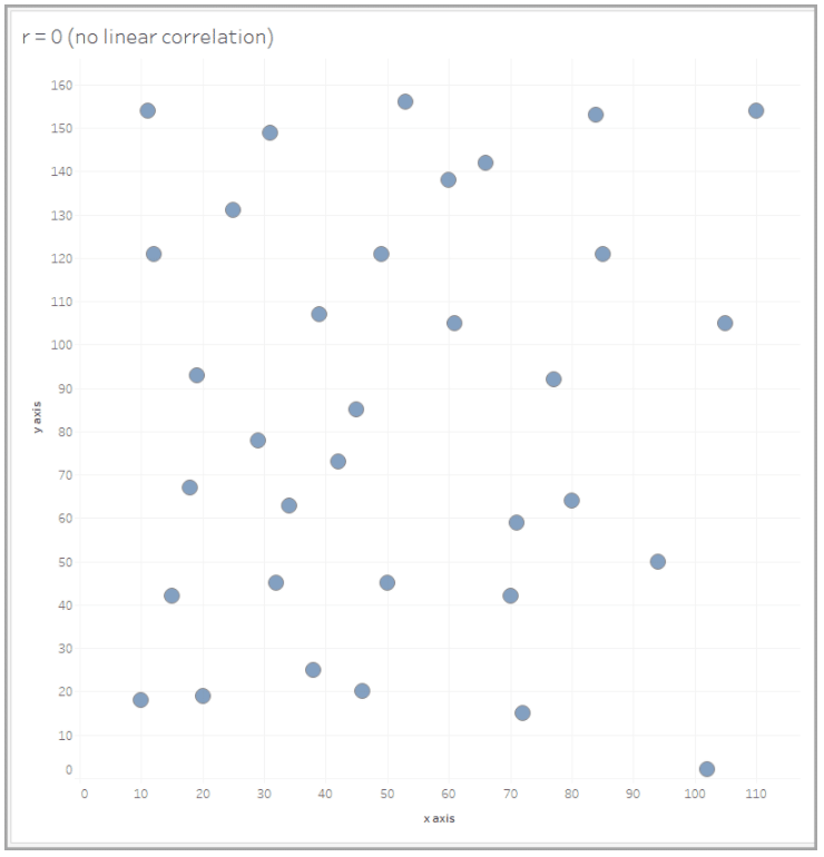
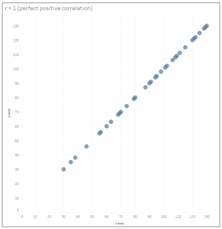
Next, we examine the view to see if we can identify a correlation between fields in the view. If the variables correlate they will fall along a line or curve. The stronger the correlation the tighter the data points will follow the line or curve. Some common correlations you can find using scatter plots include positive, negative, and null.
Scatter plots help identify correlations between variables. But it’s important to remember that correlation does not equal causation. Scatter plots don’t necessarily answer why a variable changes.
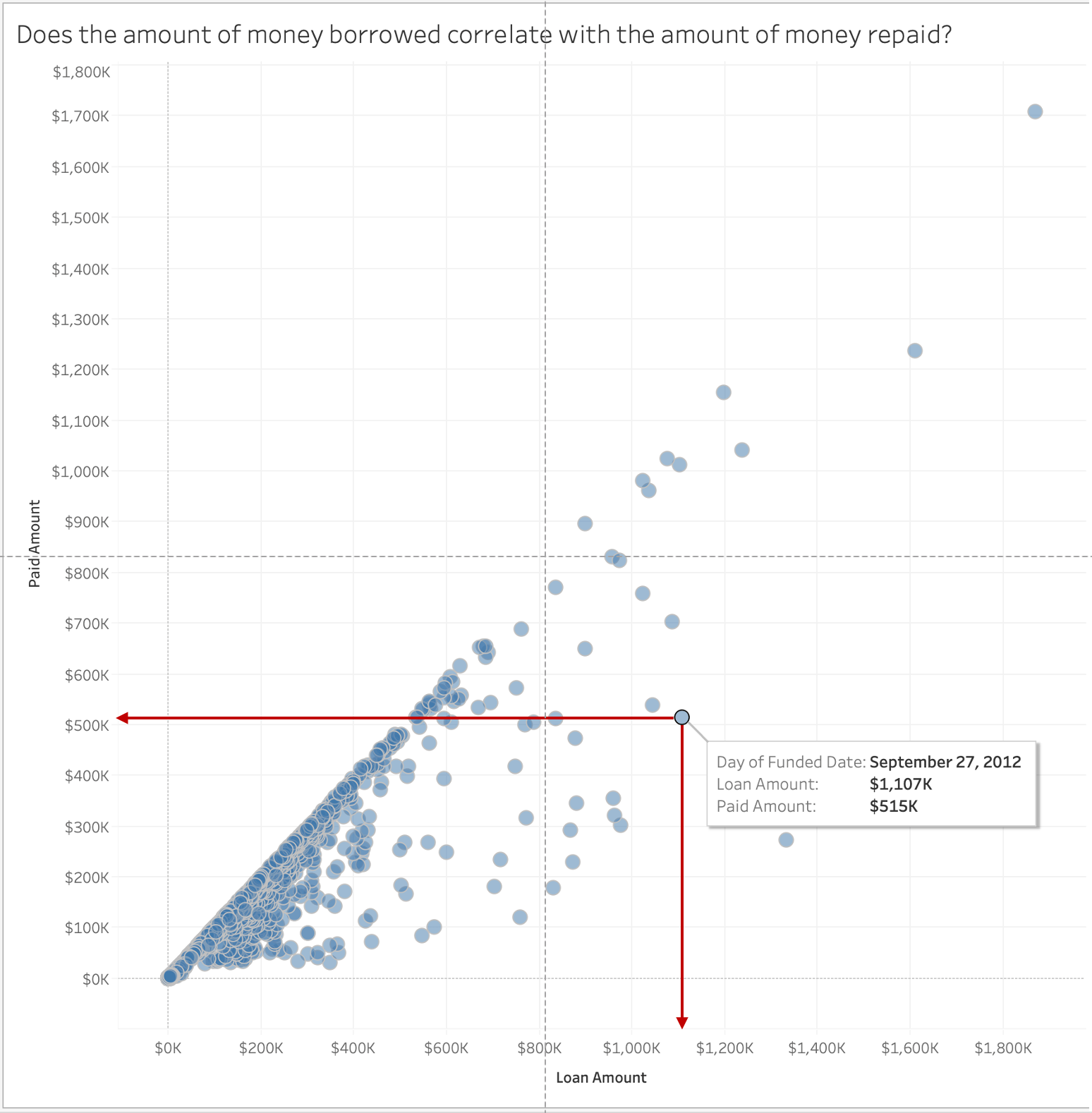
Finally, locate data points on the chart and see where they fall on the axes. Look at the other points to see how the independent variable affects the dependent variable.
Looking at individual data points after looking at how they affect each other can help you better understand the relationship.
What Type of Analysis Do Scatter Plots Support?
Scatter plots support finding correlations between two variables. A simple form of a scatter plot might help reveal if the level of precipitation affected the number of umbrellas sold on a given day.
When and How to Use Scatter Plots for Visual Analysis
You can use scatter plots to investigate whether there is a relationship between two variables. Doing so can show if one variable is a good predictor of another.
For example, a scatter plot can help you see if there’s a connection between an ice cream shop's sales and the average daily temperature. In this scenario, the average daily temperature will constitute your independent variable (x-axis). And the dependent variable (y-axis) is a scale of your ice cream sales, starting from zero. Each data point on this chart would represent one day.
Plot the points by the average daily temperature and daily ice cream sales. After placing all the data points, you can look to see if there’s a correlation between your ice cream sales and the temperature. As mentioned before, correlation doesn't show causation on a scatter plot. But, if you see more ice cream sales when the temperature is hotter than you could infer a relationship between these two variables.
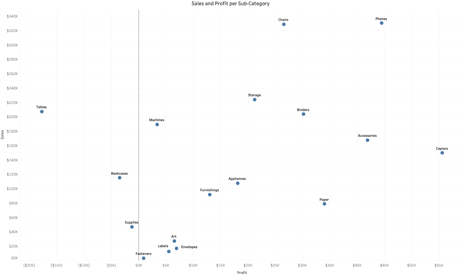
Great Examples of Scatter Plots
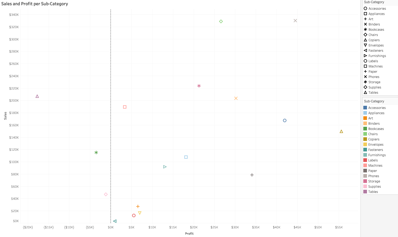
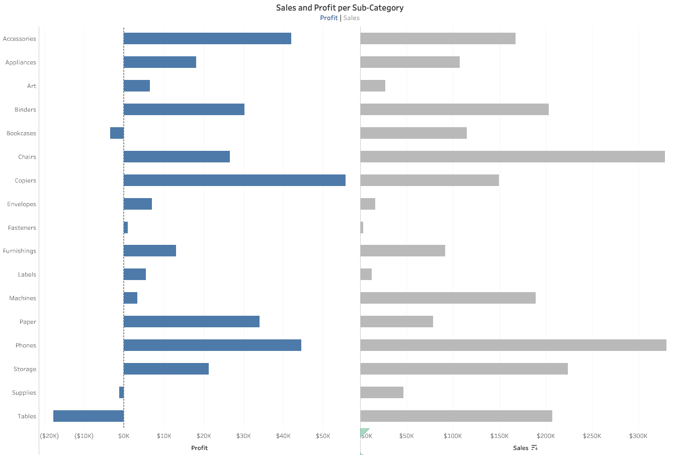
Bad Examples of Scatter Plots and Alternatives
Sources
https://www.tableau.com/learn/whitepapers/which-chart-or-graph-is-right-for-you
https://datavizcatalogue.com/methods/scatterplot.html
https://www.carbondesignsystem.com/data-visualization/basic-charts#scatter
https://chartio.com/learn/charts/what-is-a-scatter-plot/
https://corporatefinanceinstitute.com/resources/knowledge/other/scatter-plot/
https://mste.illinois.edu/courses/ci330ms/youtsey/scatterinfo.html
https://www.itl.nist.gov/div898/handbook/eda/section3/eda33q.htm
https://www.statisticssolutions.com/directory-of-statistical-analyses-cluster-analysis/
https://help.tableau.com/current/pro/desktop/en-us/clustering.htm