Best of Tableau Web: August 2021


I imagine you’re familiar with this line of questioning: ”How satisfied are you with XYZ?” and “How likely are you to recommend XYZ to others?” or “How much do you agree or disagree with the following statements?”
Here these questions are rhetorical, but you’ve likely all seen and responded to similar survey questions as you’ve traversed the web. Maybe you’ve even worked with the resulting datasets from those surveys. If so, you may have also ended up scratching your head because although it feels like survey data should be easy to use, it’s harder to work with than first meets the eye.
With that unexpected difficulty in mind, it’s been a pleasure to see a flurry of survey-data posts this month to help you on the way. The Workout Wednesday team surveyed the user community, and created a particularly meta Workout Wednesday challenge based on the data. Rosario Gauna and Donna Coles both wrote tutorials on the heels of the challenge, detailing how they approached the main requirements: donut charts, bar charts, divergent bar charts, and heatmaps. I always enjoy posts from these two authors, and these were no different. Rosario and Donna provided detailed tutorials on the real-world data storytelling challenges we face as analysts.
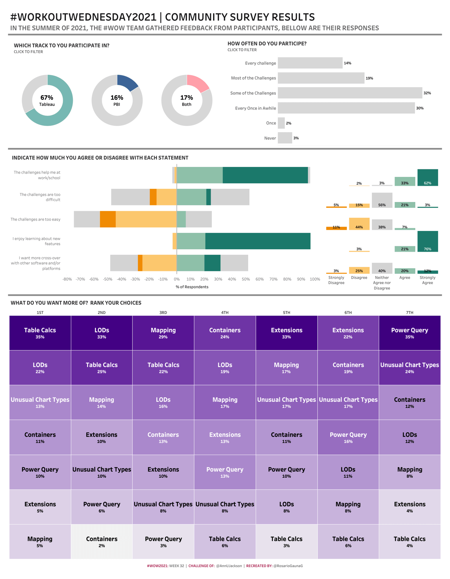
Rosario Gauna’s take on the week 32 #WOW21 challenge.
They’re not the only ones digging into the survey data. Zen Master Steve Wexler has been blogging about survey data longer than most people have been using Tableau. (The first post I could find on his blog about the topic is from 2013!). He’s still creating new content as the field evolves along with his own perspective. Steve’s latest post details new techniques for using Likert-scales to effectively visualize survey data—and why he no longer recommends the “classic” divergent stacked bar approach.
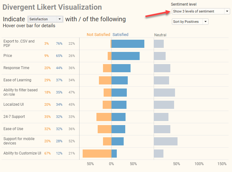
Tableau Zen Master Steve Wexler once used a “classic” divergent stacked bar approach. Now, he recommends concentrated values diverging from the center (shown here)—and shares a dashboard you can copy into your own workbook to customize.
Aside from survey data, I also wanted to highlight Adam Mico’s excellent post describing his process behind a visualization he built exploring his own mortality, from research and data collection to fine tuning the chart and dashboard. Process descriptions like this are extremely informative as we develop our own skills. I always learn something new when seeing “inside the mind” of expert practitioners like Adam.
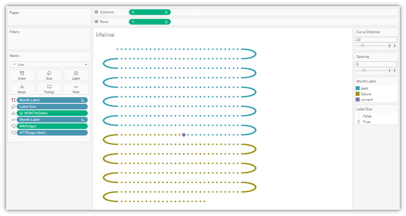
Inspired by a post showing how to visualize the rest of your life, Adam Mico vizzed his own mortality with a path chart, working from Toan Hoang’s guidance on creating path charts in Tableau.
Finally, there have been some great posts on the nitty gritty of analytics, such as how joining multiple datasets together can do so much more than simply combine different tables. Spencer Bauke explains how you can use joins to aid forecasting models framed in the common industry use case of forecasting product inventory. Ken Flerlage lists three more creative uses of joins. TL;DR: Try using joins for getting data from a prior row or partition, running totals, and cross joins.
Calculations
- Visualise Our Survey Data
Donna Coles, Donna + DataViz
- How to Calculate Dynamic Point-In-Time Metrics in Tableau
James Zirbes, Tessellation
- Working with Dates in Tableau: To-Date vs. Rolling Periods
Ben Calder, InterWorks
Tips and Tricks
- Min(0), Avg(0)? Where would I use this?
Priyanka Dobhal
- Obscure PowerPoint Tips & Tricks for Dashboards
Kevin Flerlage, The Flerlage Twins
- What’s the difference between Parameters and Filters ?
Kavita Nand, The Data School Australia
- One Button Sheet Swap in Tableau
Alexander Mou, Vizible Difference
- Tips and Tricks from my Twitter Viz
Ant Pulley
Formatting, Design, Storytelling
- Visualize Survey Data
Rosario Gauna, RosarioViz
- How to visualize Likert scale data in Tableau
Steve Wexler, Data Revelations
Inspiration
- The Ultimate Motivation of a Lifeline .|: A Tableau Visualization Tutorial
Adam Mico
- 3 Creative Uses for Relationships/Joins in Tableau
Ken Flerlage, The Flerlage Twins
- Iron Quest – Travel & Vacations
Sarah Bartlett, Sarah Loves Data
- Can you find the needle in the haystack?
Donna Coles, Donna + DataViz
- Assign Color to Non-Existing Values in Tableau
Anthony Smoak, Smoak Signals
- A Tableau Accessibility Journey - Part IV - Keyboard Accessibility
Chris DeMartini, DataBlick
- Get Certified!
Annabelle Rincon, Rativiz
- Project Starter: Part 2 – 3 Tips to Learn the Data’s Story
Kier Bituin, The Data School Australia
- Your Tableau Web-Edit Playbook
Simon Beaumont, vizionary
- 8 Data Sets for Your Tableau / Data / Analytics Projects
Donabel Santos, sqlbelle
Prep
- How to… create a Running Total
Carl Allchin, Preppin’ Data
- 2021: Week 33 Excelling at adding one more row
Carl Allchin, Preppin’ Data
Server
- Tableau Row Level Security
Mark Wu, Scaling Tableau to Enterprise
- PROJECT (4/10) : Sub-project or nested project
Mark Wu, Scaling Tableau to Enterprise
Set and Parameter Actions
- How to Flag Rows of Interest in Tableau
Maddie Dierkes, Playfair Data
With that, enjoy Best of the Tableau Web with tips, tricks, inspiration and more produced by the Tableau community. For updates throughout the month, follow me on Twitter and LinkedIn, and check out the list of blogs I follow for Best of the Tableau Web. If you don’t see yours on the list, I invite you to add it here.
相關文章

Meet Iron Viz 2024 Finalist Jessica Moon
 2024/04/15
DataFam Roundup: April 8–12, 2024
 2024/04/12

Meet Iron Viz 2024 Finalist Pata Gogová
2024/04/08
Subscribe to our blog
在收件匣中收到最新的 Tableau 消息。