Why is sport such a good topic for visualisations?


Sport visualisations aren’t for everyone, but I do think that the debate on this question is quite simple. Sports by their nature are full of numbers and data—times, goals, scores, dates, rankings, statistics, averages, records, tables, and the like. Most of these are not too difficult to get hold of, either via Wikipedia or more specialist websites, and the datasets are often therefore complete and in good shape. Often, little or no pesky data cleaning is needed.
So many of us enjoy following sport. When learning, practicing or just visualising for fun, there’s nothing better than playing with data which you enjoy, can recognise, and relate to. While this second factor may rule out sport visualisations for many (those for whom sport don’t hold the same interest), one of my first bits of advice for those new to data visualisation is this: When choosing data, sometimes you might be put off by company data (sales, profits and the like), but you can understand better if you are working with data you enjoy. And if that’s sport data, then dive in!
So, I’m going to lay myself bare here with the first visualisations I ever published on Tableau Public:

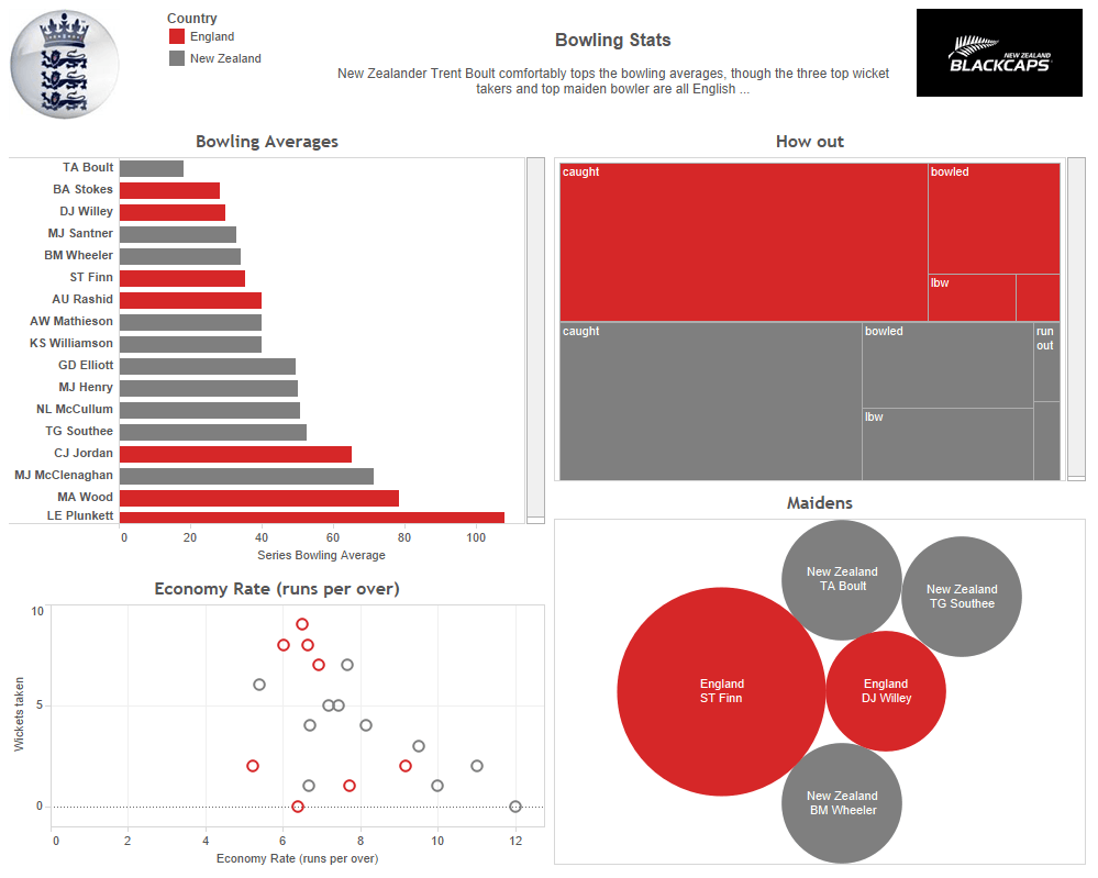

I won’t go into too much detail here, as I think my experience and skill level has improved since then—I shudder at my use of a bubble chart, for example. This was very much an exercise in understanding what viz types were available, how to use them, some of the available formatting options, etc. But, after looking at cricket data, I understood it so much more. I created the dataset (albeit by copy/paste from websites), I knew what results to expect (having followed the cricket series) and I was able to find some insight around batting and bowling averages, which made sense to me.
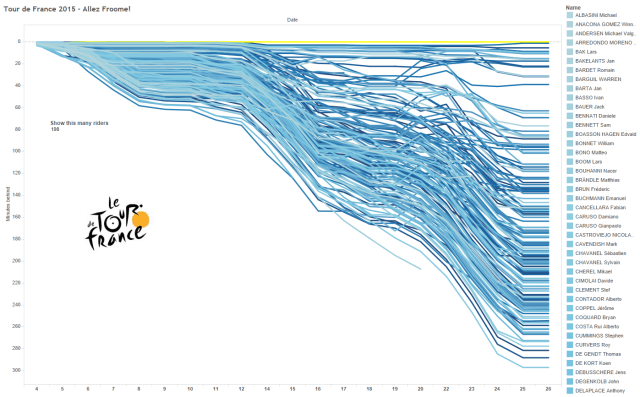
My second visualisation was how I managed to understand using line charts and cumulative totals, using times relative to the minimum (i.e. the leader). This was the Tour de France in 2015. I’d been following the Tour and knew what results to expect, and so was delighted with the results.
By this point, I knew that I would often turn to sport data for personal projects or to learn more skills.
Fast forward almost three years and I still love to create sport visualisations. From a month or so ago, here’s my US Masters Golf viz:
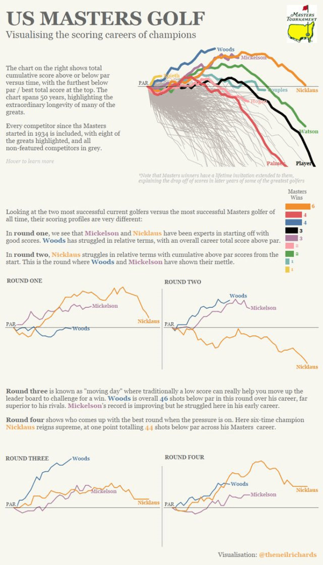
I enjoyed creating this for lots of reasons, but three stood out:
- It’s a data visualisation; it’s another look at timelines and comparisons of careers. I love this kind of stuff.
- It was part of a group effort. As I was doing this, so were other visualisation and sport enthusiasts. I was really looking forward to seeing what else would be created.
- I like my golf, and as I’m not a young man, I saw and recognised a lot of trends, information and data that I was familiar with. But I found some interesting results—some actual analysis. The difference in round performances between two of the greats: Nicklaus and Woods, is really emphasised in a way that you might not have known (I certainly didn’t) without visualising.
This brings me to Sports Viz Sunday—an initiative conceived and run by Simon Beaumont, James Smith, and Spencer Baucke. The site is active throughout the year, but once a month there’s a dataset posted around a different major sporting event and a challenge to visualise the dataset alongside your co-participants.
There have been monthly datasets on Formula One, Masters Golf, Winter Olympics and more. This is also a great chance for me to showcase some of the great vizzes already created. There are far too many for me to include, but I’ve included three of the many that caught my eye for great design and insight below:
1. From Justin Davis – Charting the debut season of the Vegas Golden Knights

2. From Rodrigo Calloni – A great viz of World Cup wins and losses

3. From Simon Beaumont – Golf balls showing US PGA Tour player performance

I could cite many more examples, not least my own—I couldn’t resist another Lexis chart, this time on Tennis World Number Ones:

But it’s time to stop blogging and start visualising!
Join Tableau in visualising sports this summer!
Share your sport vizzes with #AnalyzeTheGame, learn what kind of sport analysis Tableau customers are doing, and attend one of the live webinars to see more sporting data in action. To learn more and get involved, visit the Summer of Sport page!
相關文章

Visualizing Women's Impact to History Through Data Visualization
 2024/03/18

Behind the Viz: Adrian Zinovei Helps You Design Your Next Dashboard
2024/03/01

Charting the Heart: Data Visualizations on Love
 2024/02/14
Subscribe to our blog
在收件匣中收到最新的 Tableau 消息。