Viz Variety Show: When to use heatmap calendars


Editor’s note: Viz Variety Show is an occasional series that aims to help you go beyond bar and line charts. In it, we will showcase various types of visualizations and outline how to build them, when they should be used, and when they should be avoided altogether. Tableau Zen Master Andy Kriebel also has a great post on this chart type. Check out the post on his blog, VizWiz.
Let’s explore a chart type that’s likely familiar to most people: the heatmap calendar.
Now, this one is not new by any means. I personally learned these techniques from Andy Kriebel’s VizWiz blog way back when I still had a few hairs on my head and fewer inches on my waist. I’ll walk you through my build which will be near identical to Andy’s. However, I want to take this one step further.
I’m going to show you how to view an entire calendar year in a single view (single workbook) in a similar fashion to a 12-month wall calendar. When I presented the heatmap calendar build at TC16, I challenged all three audiences to come up with such a solution. And guess who figured it out: None other than my co-speaker, Ben Neville. Dude is good! How good? I’m pretty certain he sent me the response within an hour of our last session with the email subject line “Merry Christmas…not sure what to do with my afternoon now.”
Now, if my memory would have served me well, I had been holding onto the answer for several months, courtesy of Tableau extraordinaire and close friend Sean Trout. Sean had sent me an almost identical solution over the summer and I must have been too focused on sipping drinks with umbrellas to recall his great work. So kudos to both Sean and Ben. I will share both calculations (as there are likely several other ways to reach the same answer, but beware of performance).
Let’s start with the end in mind. Here’s what we’re after:

Common use cases:
- When used as a selector on a dashboard
- When “Daily” value AND “Day of Week” value are important
- When viewing daily values for an entire year is important
Not ideal when:
- Data needs to aggregated to the week, month, quarter, or year levels
- When precision is important
- When you want to see the speed or shape at which your data is trending, shifting
With this in mind, we might typically something like the daily change in the Dow Jones Index in the following way: (Data sourced from FRED Economic Data, Federal Reserved of St. Louis)

And this is good. It confirms that the market goes up and the market goes down, changing more often than the weather in North Carolina (last week we had a low of 0 and a high of 71 within a couple days. We have all four seasons some months).
But were there any months that were better than others? Were there any days of the week that were particularly stronger or weaker than others? This chart doesn’t help answer these questions. A calendar can—not to say a series of bar charts wouldn’t do the trick and do it well, but calendar can and a calendar may be more engaging than a series of bar charts.
So with that, here’s a simple build of a calendar with a couple clever calculations to help arrange the months in a format familiar to most. (and at the end, I will offer up more challenges).
Warm up your right mouse button. If you haven’t yet found the power of right-clicking and dragging objects onto your viz, you will today with your date fields. Try right-dragging in other data types as well—more magic.
For today’s build, let’s dive into the Dow Jones Index data visualized in the bar chart above. Since we’re dealing with Stock Market data, the weeks will only consist of five days since trading doesn’t occur over Saturday or Sunday.
Step 1: Build out a calendar
Once connected to the DIJA data set, let’s first build out a monthly calendar:
- Right-click and drag “Date” to the Columns shelf
- Select “WEEKDAY(Date)” from the discrete date parts
- Right-click and drag “Date” to the Rows shelf
- Select “WEEK(Date)” from the discrete date parts
- Right-click “WEEK(Date)” and uncheck “Show Header”
- Right-click and drag “Date” to the Filters shelf
- Select Month/Year from the discrete data parts and click “Next”
- Select any month, year (I’ll select June, 2016, a month most Brits will not soon forget)

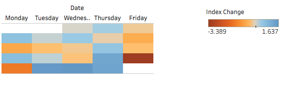
Step 2: Add color
It’s starting to take shape but let’s add in some color for Daily Index Change
- Change the Marks type to “Square”
- Drag “Index Change” to the Color shelf
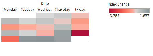
Step 3: Change color
While I love Tableau’s new default color palette, it likely alienates less folks with any form of red-green color blindness. When I’m analyzing financials data, I prefer to visualize in red and black. This just makes more sense to my brain so it resonates much quicker. Think “Back in Black” by AC/DC if you prefer.
- Click “Color” and select “Edit Colors”
- Change the Palette to “Red-Black Diverging” and click “OK”
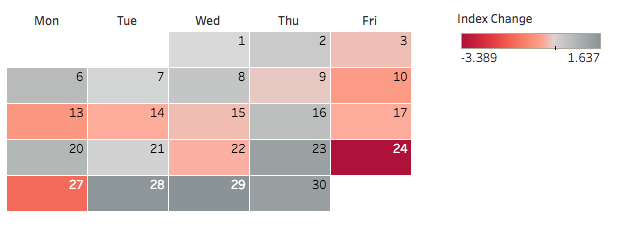
Step 4: Format your viz
So now we’ve got some color but a little bit of formatting with go a long way to really make this look sharp.
- Right-click and drag “Date” to the Label shelf
- Select “DAY(Date)” from the discrete date parts
- Make the calendar a little larger by dragging the horizontal and vertical edges
- Click the Label shelf and change alignment to “Upper Right”
- Right-click “WEEKDAY(Date)” in the Columns shelf and select “Format”
- Under Header > Default > Dates > Select “Abbreviation”
- Click the Color shelf > click border > choose “White”
- Right-click open space and click “Format”
- Go to “Format Borders”
- Under Row Divider, change Pane to “None”
- Right-click on “Date” label above the days and select “Hide Field Labels for Columns”
This is great, if you only want to look at one month at a time, but what happens if you select more than 1 month?
Select all 12 months from 2016, and set the view to to “Fit Height.”
We get something that looks like this:

Even if we add month labels, it’s still going to be a mess. So let’s get that to an at-a-glance layout that has become unconsciously engrained in our brains.

Step 5: Create a calculation
We need to get each month to align to its corresponding column. I personally like the three-months-per-row approach since it gives an additional quarterly look at the data. But four per row seems to be a popular approach. We’ll go with the former and here’s the calculation I will recommend.
Create a calculation called “Column Number” as shown below:
CASE MONTH([Date]) WHEN 1 THEN 1
WHEN 2 THEN 2
WHEN 3 THEN 3
WHEN 4 THEN 1
WHEN 5 THEN 2
WHEN 6 THEN 3
WHEN 7 THEN 1
WHEN 8 THEN 2
WHEN 9 THEN 3
WHEN 10 THEN 1
WHEN 11 THEN 2
WHEN 12 THEN 3
END
This was the ONLY difference between Ben and Sean’s solutions.
Here was Ben’s calculation:
IF DATEPART('month',[Date]) % 3 = 0 THEN 3
ELSEIF DATEPART('month',[Date]) = 2 OR DATEPART('month',[Date]) = 5 OR DATEPART('month',[Date]) = 8 OR DATEPART('month',[Date]) = 11 THEN 2
ELSE 1
END
There are likely several more ways to create the necessary logic, so at the end it may come down to performance. On this data set, it really doesn’t matter to me if it finishes in .02 seconds or .03; the difference isn’t noticeable. But if I’m working with larger data, I want to design my workbooks as efficiently as possible. Personally, I find CASE statements to perform slightly better than IF-THEN.
Secondly, I like simplicity and the CASE statement is simple if nothing else.
AND, I love the customer first and foremost! So in this example, I will use Sean’s CASE statement to arrange our columns. Getting back to our regularly-scheduled program:
- Drag “Column Number” from Measures to Dimensions
- Drag “Column Number” to the left of “WEEKDAY(Date)” in the Columns shelf
- Set view to "Fit to Height"

Step 6: Add a Level of Detail expression
Almost there. Just need to compress this accordion together if you will. Rather than using WEEK(Date), we need to create an index that will set the week number = 0-5 at the month level. Since we’re not aggregating our visualization at the month level, a Level of Detail expression works great here:
- Create a calculation called “Week Index” as follows:
- Drag “Week Index” from Measures to Dimensions
- Drag “ Week Index” on top of “WEEK(Day)” in the Rows shelf
DATEPART('week', [Date]) - {FIXED DATEPART('month',[Date]): MIN(DATEPART('week', [Date]))}
This calculation first looks at the week number at the level of the visualization and then subtracts the minimum week number at the Month Level.

Step 7: Break it down by quarters
Now we need to break the visualization four times to get each quarter. Easy enough.
- Right-click and drag “Date” to the left of “Week Index” in the Rows shelf and select “Quarter(Date)” from the discrete date parts

Step 8: Add your final polish
To polish this up…
- Right-click “Week Index” and uncheck “Show Header”
- Right-click “Column Number” and uncheck “Show Header”
- Right-click on “Quarter of Date” and select “Hide Field Labels for Rows”
- Hide the title
- Right-click on “Q1” and select “Format”
- Change the Default Header Alignment to “Middle Center”
- Right-click and drag Date to the left of “Column Number” in the Columns shelf and select “YEAR(Date)” from the discrete date parts (last right-click and drag, I promise!)
- Right-click in whitespace and select Format
- Go to Format Borders and change the pane setting for both the Row and Column Divider to the thickest width line and color set to white
- Click the Color shelf and change the borders color to the bottom gray in the second column from the left. That will help the individual months pop!

Step 9: Make it interactive
To add a little interaction:
- Right-click “YEAR(Date)” in the Columns shelf and select “Show Filter”
- Change filter type to “Single Value (List)” for a radio selector (remove any previous date filters)

I’m personally a big fan of these types of calendars. I’ve been lucky enough to come across several use cases in my endeavors and hope you will, too.
And as for my additional challenge! I’ve still yet to come across a really good, scalable solution for adding in the month names. If you have a way, please do share. Or if you have a better way to create a 12 month calendar, again, please share.
相關文章

Visualizing Women's Impact to History Through Data Visualization
 2024/03/18

Behind the Viz: Adrian Zinovei Helps You Design Your Next Dashboard
2024/03/01

Charting the Heart: Data Visualizations on Love
 2024/02/14
Subscribe to our blog
在收件匣中收到最新的 Tableau 消息。