Enhance your presentation with Tableau


This piece is part of the Back-to-School series on the Tableau blog. Students around the world are returning to school with the hopes of learning new skills that will help them find success in their future careers. Learn more about the skill that tops that list—Tableau.
I attended business school. Almost every class had a project that included a presentation. I quickly realized presentation design and storytelling is truly an art and something I wanted to refine. A presentation consists of taking information and compiling it in a concise, visual, and aesthetically pleasing way. The result should be an easily digestible compilation of information for any audience to understand.
After I started working at Tableau, I realized how much more powerful my presentations and stories could have been if I used Tableau, specifically the Story Points feature.
For example, pulling a direct statistic from an article or source is a common presentation tactic.
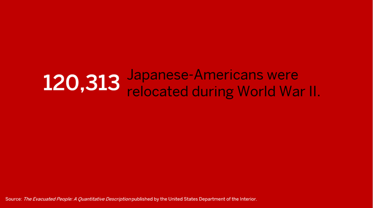
But how much more impactful could this method be when presented in Tableau?

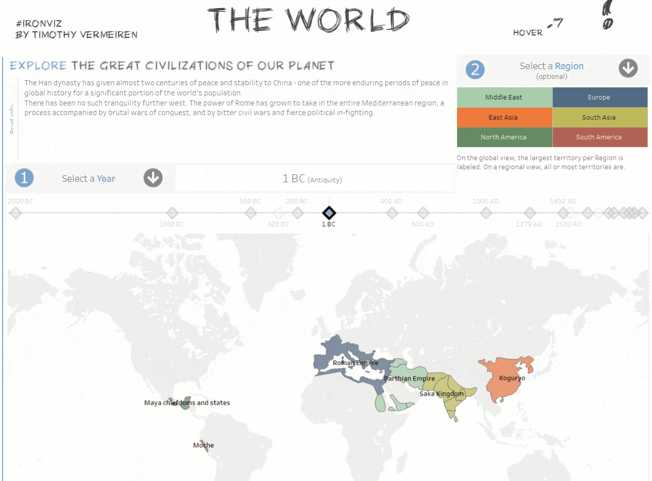
Viz by Deron Hayes-Hirschy
With Story Points, an audience sees the impact of the statistic and the direct data source. This gives the audience context and makes the story easier to understand. Since this context is also coming from a real data source and presented in a visual way, you get the impact of the statistic, while allowing the audience to see all the facts.
Another common presentation tactic is to create an appendix with “additional” information. Typically presentations are short and there isn’t enough time to cover all the information you and your team have researched.
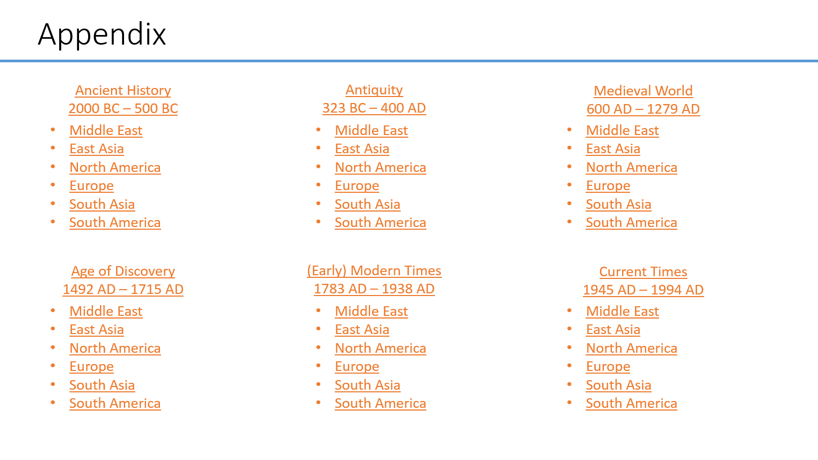
Instead of placing this additional information at the end of a presentation where it may never get covered, show the audience the whole picture first. Then drill down to the point you want to make.
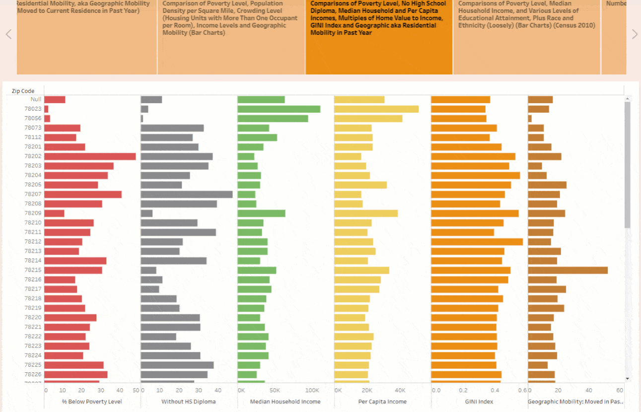
By adding filters and highlighter features into your viz, you can indirectly cover more material. Instead of skipping to the main points, you can show the audience the data you started with. Then, move into a viz with all the information and drill -down with features like filtering and highlighting.
Interactivity is one of the biggest benefits I’ve encountered from using dashboards as presentations and Tableau’s Story Points feature. We’ve all seen a presentation with a static line graph or bar chart.

Tableau gives life to your presentation and allows it to be interactive.
Viz by Lily Casura
If a member of the audience asks you a question about a certain date, you can drill down to the exact time they are interested in. You can also add callouts to specific data points you want the audience to see.
These are a few ways you can enhance your presentations in school (or even for work!). Do you use Tableau for presentations? If so, share some examples in the comments below.
相關文章
Data Literacy for All: Free data skills training for individuals and organizations
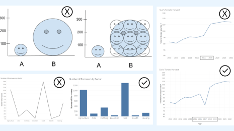
How to Spot Misleading Charts, a Checklist
 2023/11/15
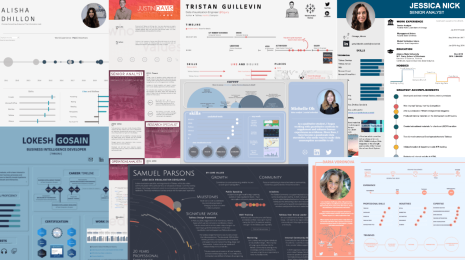
Stand Out in Your Job Search with an Interactive Tableau Resume
 2022/12/08
Recruiters spend just 6 seconds skimming through each resume. Show off your data visualization skills and stand out in the application process by visualizing and making it interactive in Tableau.
Subscribe to our blog
在收件匣中收到最新的 Tableau 消息。