How to use hex-tile maps to eliminate the Alaska effect


Editor’s note: Alt Viz is an occasional series that aims to help you go beyond bar charts and line charts. The series will showcase various types of visualizations and outline how to build them, when they should be used, and when they should be avoided altogether. This post builds on the tutorial by Tableau Zen Master Matt Chambers who first outlined the steps of building a hex-tile map in Tableau. Check out the post on his blog, Sir Viz-a-Lot.
Rather than creating my own soapbox, I will choose rather to jump off the one created by my speaking partner at TC16, Ben Neville, in his initial post for this blog series.
Ben and I presented “Advanced Mark Types: Going Beyond Bars & Lines” at TC16 in Austin. As a follow-up to that session (available on-demand here), Ben and I will be sharing a more in-depth blog post for each of the charts we built live during our presentation.
As Ben noted in his introduction, there are visualization best practices that neither of us suggest you ignore. However, from time to time, it’s okay to “look the other way” in the interest of telling the most meaningful and engaging story for your audience with your data.
Let’s take a look at a chart type that has been growing in popularity amongst the Tableau community, the hex-tile map.
Getting familiar with the Hex-tile map

Common use cases for hex-tile maps
- Eliminate the Alaska effect on US maps (more on this below)
- Eliminate discrepancies in US state sizes
- Provide a more modern web look
Not ideal when:
- Geographical precision is important
Here's where the "Alaska effect" comes in.
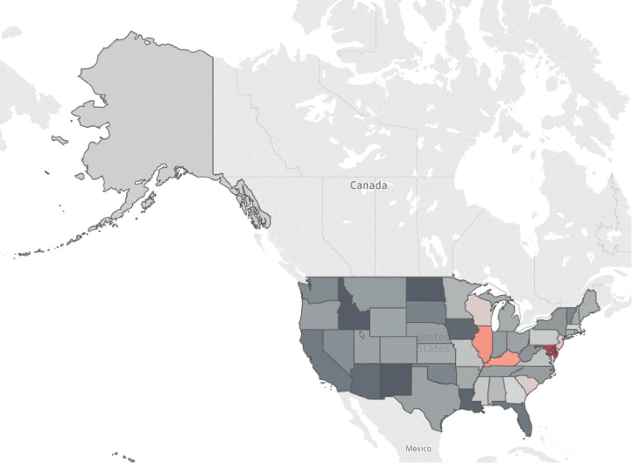
Take a look at the following map. The data here shows, by state, the percent increase in expected student debt for students graduating in 2004 compared to those graduating in 2014.
Does anything pop out at you? Not really, with maybe the exception that Alaska is really, really BIG. Not only is Alaska big—more than 2x larger than the next largest state, Texas—but the Earth is round. And when we try to present a round object on a 2D screen, the land masses near the poles, i.e. Alaska, will appear larger than they actually should. This is bullet point one above.
Due to the size of Alaska, in addition to its relative lack of proximity to the “lower 48” (or those states not know as Alaska or Hawaii), including geographical precision can be costly when it comes to delivering your message.
Adding more distortion to this message is the fact that the states in the eastern part of the US, especially those along the Northeast seaboard, are typically far smaller than those in the western portion of the country.
In the example below, there are two states that are performing significantly worse than the others, but that story is very hard to derive for the audience. It certainly isn’t popping off the page like it could.
Enter the hex-tile map: same data, different story:
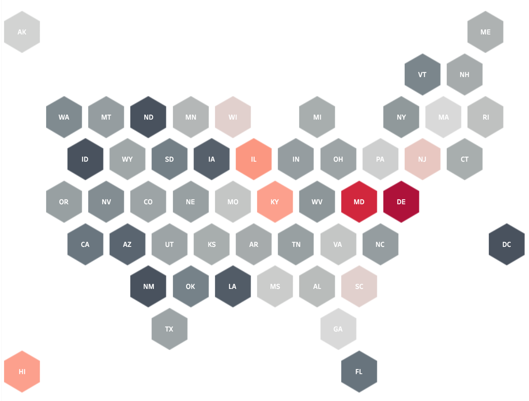
Here it should be pretty obvious, almost immediately, that both Maryland and Delaware have experienced increases significantly larger than those of most other states. By leveling the size of each state and by bringing Alaska and Hawaii closer to the action, the story is now popping right off the page.
Now, you might be eager to draw some additional conclusions. The West seems to have fared much better than the East; or there may be an issue just west of The Mississippi River. But this is where a hex-tile map can be the wrong choice of maps and may not win with best-practice hardliners. Look how far west Kentucky is pushed with this plotting. Kentucky is in actuality well east of the big river. And being from North Carolina, I know for a fact that Virginia is due north, not due west. So pick your poison and be sure to provide the right level of context so that your audience is alert and can avoid any common pitfalls.
So how do we build one of these bad boys in Tableau? Easy enough. You’ll need to a get a hex-tile map plotting for your states (or whatever geographic bodies you want to map). I have included the mapping used for the example. And you’ll need a custom shape (check out this Online Help guide for more on creating custom shapes). Once you have your two files ready to go, it’s a walk in the park:
1. Join your data
Join your data (in this case, StudentDebt.xlsx) to your hexmap plots (HexmapPlots.xlsx). For the two provided data sources, your join should like this:

2. Add your hex-tile mapping coordinates
Bring your mapping coordinates from your hex-tile map-plot data source as follows:
- Right-drag "Column" to the Column shelf. Choose AVG for the aggregation.
- Right-drag "Row" to the Rows shelf. Choose AVG for the aggregation.
- Drag “Abbreviation” to Label.

3. Reverse the axis for Row value
Notice that it appears our states are aligned yet upside down. This is due to the coordinates from our HexmapPlot.xlsx file where the states in the north had a lower value than those in the south. To correct this, we simply need to reverse the axis for the “Row” value:
- Edit Row axis
- Set scale to reversed

4. Add custom shape
Next we’ll want to change the default “circle” to our “inverted hexagon” custom shape. As noted previously, you will want either a .png or .gif for purposes of color fill. You will find a .png file attached (InvertedHex.png) thanks to Tableau Zen Master Matt Chambers. Tableau works with square tiles, so if you color other image types, it will color the entire tile.
- Change Marks type to “shape”
- Click shape > more shapes > go to wherever you have saved your hexagon .png or .gif

5. Adjust size
Adjust size manually until the form a honeycomb shape. You will want to minimize the amount of whitespace between objects.

6. Add color
Set the color mark for the measure you wish to analyze. In this example, we are looking at the average-debt percent change from 2004 to 2014. Rather sticking to the default color palette, I’d recommend something that will pop a little bit more, i.e. red-black.
- Add “Ten-Year Change, Average Debt % Change, 2004 to 2014” to Color
- Change color to “red-black diverging” color palette
- Check the “reversed” box

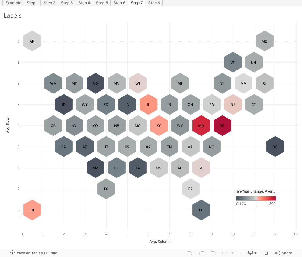
7. Format labels
We’ll want to have the labels right on the hexagons for quicker analysis.
- Change alignment to center for both height and width
- Set font to bold (and white, if you prefer)
- Check box to allow labels to overlap (they won’t)
8. Clean up your view
Remove as much of the “non-data ink” as possible. Think Edward Tufte here. Do you need gridlines or even axes at all?
- Remove all grid lines
- Remove zero line
- Unshow headers
- Resize accordingly

That’s all there is to building hex tile maps in Tableau. Join in some plotting data, add a hexagon file to your custom shapes, do some dragging and dropping, and voilá! You’ve got a beautiful hex-tile map visualization.
Explore more Viz Whiz posts
相關文章

Visualizing Women's Impact to History Through Data Visualization
 2024/03/18

Behind the Viz: Adrian Zinovei Helps You Design Your Next Dashboard
2024/03/01

Charting the Heart: Data Visualizations on Love
 2024/02/14
Subscribe to our blog
在收件匣中收到最新的 Tableau 消息。