And the winners of our User Group Viz Contest are…


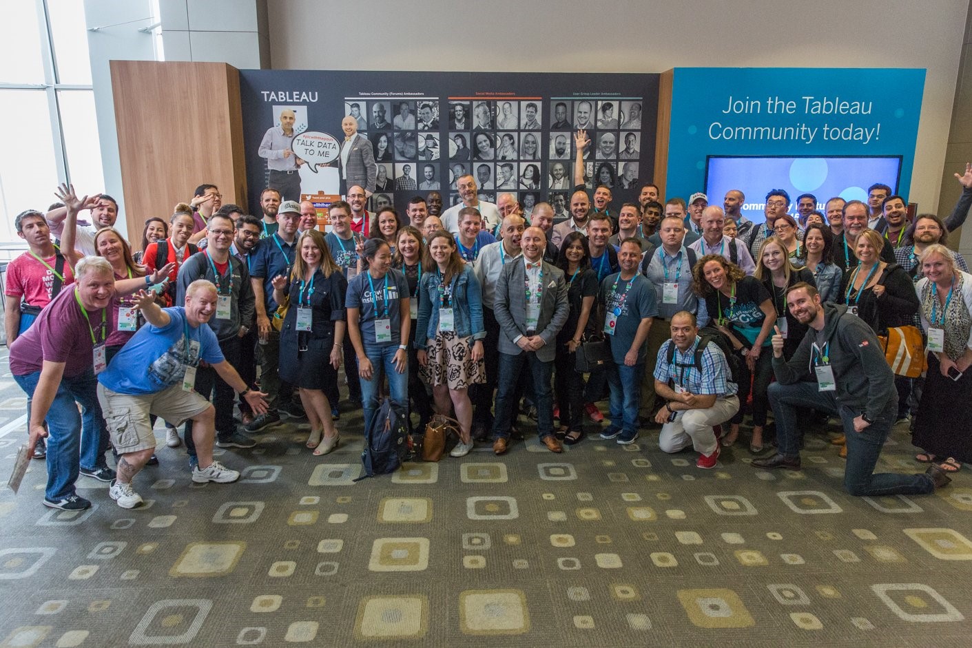
The folks who make up the 211 Tableau User Groups around the world know the value of communities working together to help each other. So when we teamed up with the Tableau Foundation on the latest User Group Viz Contest, we put that idea at the heart of the competition.
For the latest edition, we focused on a data set that sat at the heart of My Brother’s Keeper, an initiative launched by the White House in 2014 to “expand opportunities for boys and young men of color from cradle to career.”
“That’s what My Brother’s Keeper is all about. Helping more of our young people stay on track. Providing the support they need to think more broadly about their future. Building on what works—when it works—in those critical life-changing moments,” President Barack Obama said back in 2014.
From the outset, data has been part of the MBK plan. The art, however, is in working to identify the goals in which the entire community is invested. When the whole community buys into the outcomes, everyone has a shared language and understanding for working together.
The MBK Task Force recommended a focus on critical indicators of life outcomes for boys and young men of color and their peers. Following this, the Federal Interagency Forum on Child and Family Statistics created an initial snapshot of young people’s well-being across health, nutrition, poverty, education, economic opportunity, and other domains.
For the viz contest, the data focused on educational attainment and career earnings segmented by race and gender. From there, the User Groups were encouraged to incorporate other data sources from the library.
The User Groups spent the month of December working on their submissions. Winners would not only earn bragging rights but also a chance to make a difference: the Tableau Foundation would make donations to the top three winners’ charities of choices.
And the winners are…
When it came time for judging, we focused on both the clarity and quality of the viz, but also the applicability of the insights to MBK’s core mission. Without further ado, here are the winners.
Third Place: Atlanta User Group
We really liked how the left side of this viz tackled the intersection of race and gender. The side-by-side bar and line charts clearly connect the two dynamics.
The dashboard also does a terrific job of using annotations to call out specific insights, such as the volatility in earnings for high school dropouts relative to overall GDP growth. The User Group not only called out the individual statistics but also provided historical context to make it easier for the viewer to quickly understand.

The Atlanta TUG chose Children’s Literacy Initiative as the recipient of a $2,000 contribution from the Tableau Foundation.
Second Place: Phoenix User Group
This dashboard uses the mobile layout to great effect. Toggling back and forth between the “high school” and “some college” educational levels, the viewer can quickly take away how often, and by how much, young black men earn less on average that their educational peers.
The viz also shows the overall decline in earnings for all people at the high school and some college levels over the same 12-year period. This is reinforced by the line chart below.

The Phoenix TUG chose 10,000 Degrees as the recipient of a $3,000 contribution from the Tableau Foundation.
First Place: Kansas City
The Kansas City User Group clenched the win with a multi-dashboard look at the intersection of education, race, and gender.
This submission packs a lot of information into each dashboard. First, the group shows earnings by education level, a metric that many of the groups explored. However, what sets this one apart is that the dashboard includes both the time series and the median per level. This gives useful context to the individual line charts below while keeping the overall trend—declining incomes relative to their 200 levels—in the forefront of the viewer’s mind.

The second dashboard is a really smart use of tree charts to compare the results analyzed by both education level and race, with the added ability to drill down into any individual race for a more specific comparison of educational value.
With multi-variable considerations, this is a really effective way of showing this data.

The final dashboard in the workbook looks at differences in median income by gender and race. This analysis showed up in several of the submissions, but this viz was the clearest presentation of the findings.
Most interestingly, the data held an interesting surprise for those looking into the earnings of black men and women. While men tended to out earn women at most education levels, black women with a bachelor's degree or higher out earned black men by over $2,000.

The Kansas City TUG chose Child Care Aware of America as the recipient of a $5,000 contribution from the Tableau Foundation.
Add all of this analysis to the clean design choices and very effective use of the “Next” actions that move viewers along through the viz, and it was clear we had a winner. Congrats, KC!
The Tableau Foundation also shared these and the other submissions with city and national MBK programs. Several of the design choices and analyses are being considered for performance dashboards being developed for those efforts.
Congrats to all the User Groups who submitted vizzes for the competition!
If you haven't yet, find a Tableau User Group near you or start one yourself.
相關文章

Meet Iron Viz 2024 Finalist Jessica Moon
 2024/04/15
DataFam Roundup: April 8–12, 2024
 2024/04/12

Meet Iron Viz 2024 Finalist Pata Gogová
2024/04/08
Subscribe to our blog
在收件匣中收到最新的 Tableau 消息。