Design dashboards that shine on any device in Tableau 10


Update: Tableau 10 is here! Download now to try out the feature outlined below.
Ever wish you could make your dashboard look great on desktop and on mobile? Say hello to device designer in Tableau 10!
With this new feature, you can design, preview, and customize a dashboard’s appearance on phones, tablets, and desktop monitors. Then you can publish a single dashboard to Tableau Server with optimized viewing and interaction across a range of devices.
How it works
When you open a dashboard, you’ll notice a “device preview” button in the dashboard pane.
Clicking the button reveals two new authoring tools that preview the dashboard layout across a variety of device types and models.
The first is the preview toolbar. It lets you select from a variety preview device types (desktop, tablets, and phones) and models (iPhone 6S, iPad Pro, etc.). The second is a black outline of the device’s screen (in logical pixels) overlaid on your dashboard. We call this the preview frame.
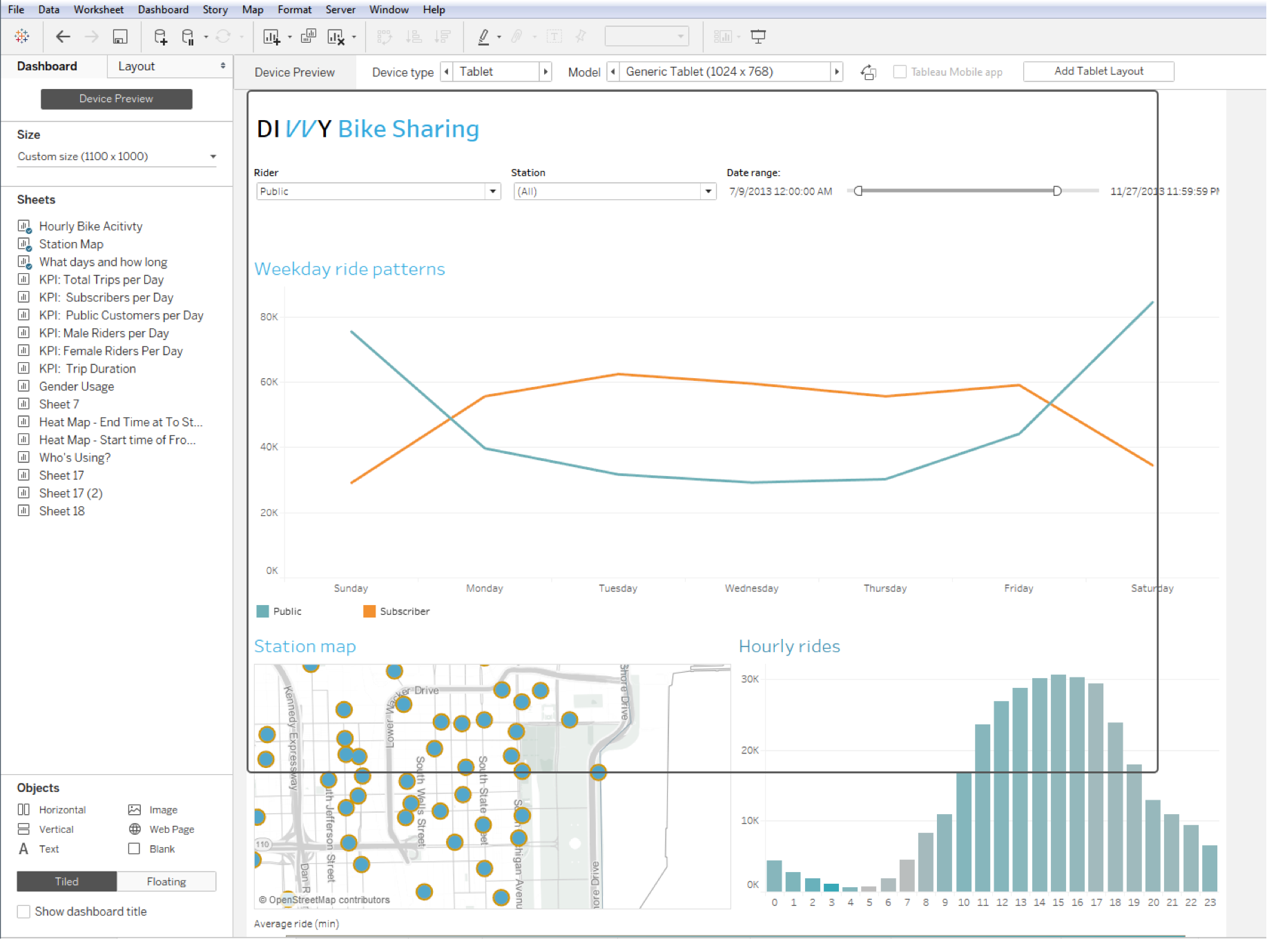
In the example below, notice that the dashboard extends beyond the borders of the preview screen (the black outline). This would be a bad experience, requiring horizontal and vertical scrolling to access the entire dashboard.
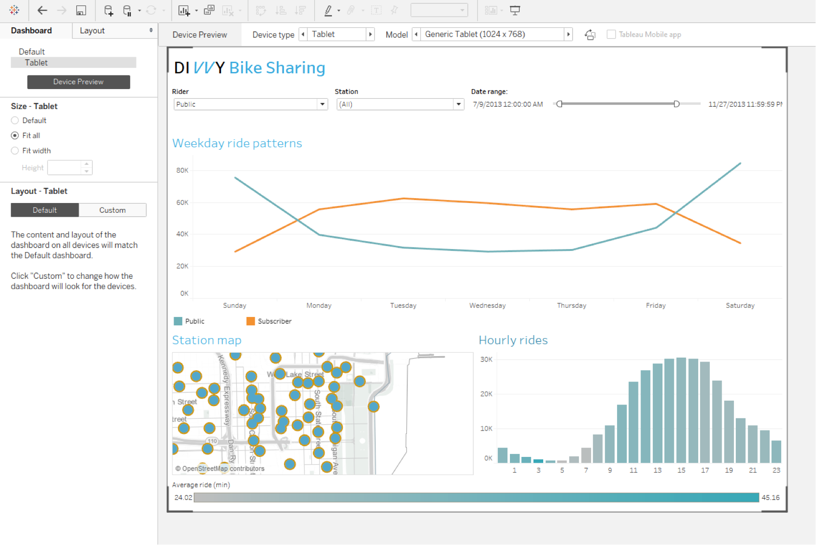
But there’s an easy fix! Click the “add tablet layout” button in the preview toolbar. That creates a special customization of the dashboard that we call device layout.
With device layout, you can customize the dashboard’s content on a device by its sizing behavior. For this dashboard, I’ll select the “fit all” option, and the dashboard will automatically scale to fit inside the preview frame.
This feature is deceptively simple yet powerful. You can use it to check your existing dashboards and see how they appear on various devices. You’ll be surprised by how many work well on numerous devices with very little modification.
With device designer, your original dashboard becomes the default master template. Worksheets, actions, and formatting are shared across device layouts and the default dashboard. This is intentional as we want to create a single dashboard that’s optimized for viewing across devices. And since each device layout can have its own sizing behaviors, you can control the worksheets that are displayed as well as their respective sizes.
When you’re ready, simply publish to Tableau Server and pull up your dashboard on any device. Tableau Server will automatically detect the width of the device’s browser window and serve up the appropriate layout. You only need to remember one URL since it’s a single dashboard. Better yet, forget URLs and just use the Tableau Mobile app for phone or tablet!
Join the beta
We’re thrilled to bring you these new features, and we’d love your input. We have a timeline for getting Tableau 10 out the door, but we’d first like to get solid usage in beta and fix any bugs. Please join the beta program and let us know what you think.
Learn more about Tableau 10
Tableau 10 includes a brand new look and feel, and a host of new features to help you prep, analyze, and share your insights even faster. Check out our Coming Soon page for details.
- Uncover patterns in your data with Tableau 10’s clustering feature
- Quickly find marks in context with Tableau 10's new highlighter
- Build your own custom territories in Tableau 10
- Do more with bar charts in Tableau 10
- Tableau 10 includes more maps data, multilingual auto detection
Answers through analytics
- Integrate your data with cross-database joins in Tableau 10
- As requested, you can filter across data sources in Tableau 10
- Do more with APIs in Tableau 10
- Tableau 10 includes even more data-source options
- Connect directly to Google Sheets in Tableau 10
- (Finally!) see and understand your IoT data with our Google Sheets connector
- Connect directly to your QuickBooks online data in Tableau 10
- Favorite your data sources in Tableau 10
- Tableau 10 includes even more data-source options
Data breakthroughs
- Check out the beautiful look and feel of Tableau 10
- Format your workbook with just a few clicks in Tableau 10
- How we designed the new color palettes
- Tableau 10 includes a new typeface designed for data
Beautiful by design
- Tips for designing device-specific dashboards that make everyone happy
- Manage your Tableau Mobile deployment with AirWatch or MobileIron
Delightfully mobile
- Author dashboards from scratch on the web in Tableau 10
- Do more while publishing workbooks in Tableau 10
- See a history of your revisions in Tableau 10
- What's new in Tableau Online
Do more on the web
相關文章
Introducing improved online/offline flows in Tableau Mobile
 2020/11/17
Metrics, headlines for your data
 2020/05/28
Learn about Metrics for Tableau—Optimized for mobile, track all your KPIs from various dashboards at a glance, all in one place—anytime, anywhere.
Subscribe to our blog
在收件匣中收到最新的 Tableau 消息。