Color Legend with Totals: Save Real Estate, Keep Value


Have you ever had the need to have color legends for your charts?
Color legends are very useful for being able to tell exactly what a color references inside of a chart but it takes up a lot of real estate on a dashboard that could be used for other purposes.
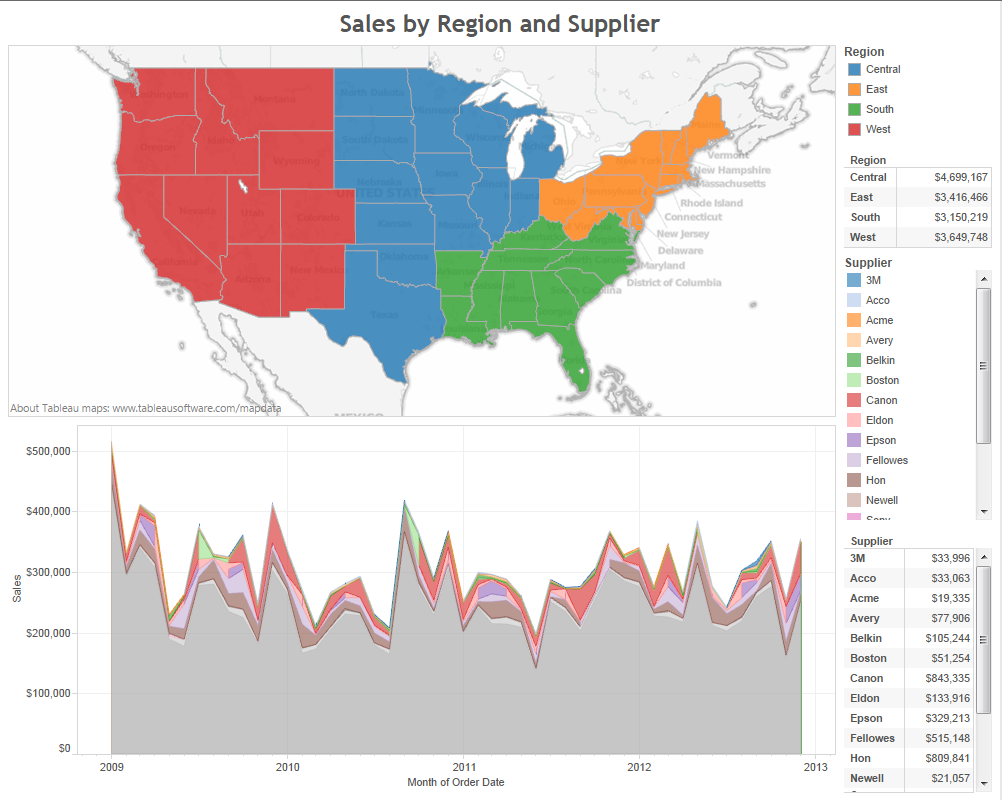
In my current example, I have a dashboard with two charts, two sets of color legends, and two crosstabs with sales totals of the same dimensions in the color legends.
In this post, I will show how Tableau can consolidate two sets of information (color legend and totals crosstab) into one space efficient chart.
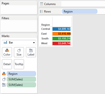
First, I will open up my region totals crosstab. Then I am going to change my chart type to a bar chart using the dropdown located within the marks card. This will convert my crosstab but leave my total sales on the text.

Next, I will place my Sales dimension onto the size shelf.
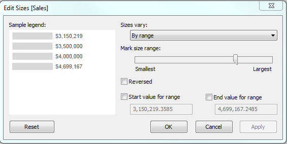
This will cause my bars to start looking like a bar chart. To get the bars to push from one end of my chart to another, I will double click the Size legend (located below the marks card), select “By range” from the drop down on the right side of the size window, and slide the mark size range slider to the largest size allowed.
Now take the Region dimension and drag it onto the Color button. By now your worksheet should look a little something like this:
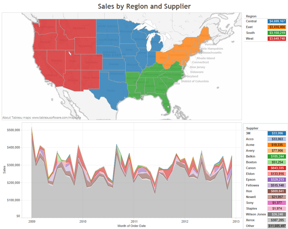
Last, in order to make the numbers not look like they are getting cut off on the right side, I am going to right click one of the totals, select format, click the alignment button on the left side, and change the default pane alignment to a center alignment.
After doing to same steps with my Supplier crosstab and taking out those now redundant color legends, my dashboard will look cleaner and have a lot more space for me to other useful charts.
Side note: if you ever experience the totals disappearing during the creation of these charts, simply drag off the label and place it back on again.
Thanks for reading and if you have any questions, comments, or just plain feedback, please use the comments section below.
Subscribe to our blog
在收件匣中收到最新的 Tableau 消息。