Back to US Election 2020 Data Home
Vote by mail
Asking respondents: "How likely are you to vote by mail ballot in the November 2020 elections?"

Survey methodology

These data come from a series of SurveyMonkey polls collected continuously since June 1, 2020, with about 35,000 responses collected every week. Respondents were selected from the more than 2 million people who take surveys on the SurveyMonkey platform each day.
Data have been weighted for age, race, sex, education, and geography using the Census Bureau’s American Community Survey to reflect the demographic composition of the United States age 18 and over. Depending on the exact visualization and any filters selected, other factors—like vote registration or state—are also taken into account.
Visualization best practices

A hex map is ideal for visualizing this data because by equalizing the size and shape of the states, you can more easily focus on the differences across the data.
"States have different ways to deal with absentee voting and voting by mail, so putting that data into a map was obvious. It's great that this format allows to compare the differences by state while also showing the differences by demographic groups." —Laura Wronski, Research Science Manager at SurveyMonkey
Learn how to build a Hex Map and Diverging Bar Chart in Tableau.
Explore more Election 2020 vizzes
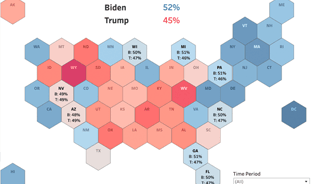
Candidate preference map
Asking respondents: "If the 2020 presidential election were being held today among the following candidates, for whom would you vote?"
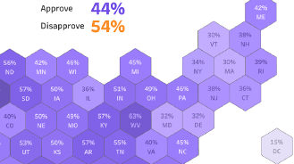
Job performance approval
Asking respondents about their perceptions of how different parts of the government have responded to the COVID-19 crisis.
Survey demographics
Take a look at who is responding to the survey and across a variety of categories.
Recommended content
