Three ways to make your COVID-19 dashboards more accessible to people with disabilities


Editors note: This blog post was authored by Kyle Gupton, Product Management Senior Director at Tableau.
Since the launch of Tableau’s COVID-19 Data Hub, many people in the Tableau Community have created outstanding dashboards to explore critical coronavirus data. In fact, there have been over 19,000 COVID-19 vizzes published to Tableau Public since January 1st, 2020. However, a consistent challenge I’ve seen is that a lot of these dashboards have major accessibility issues that prevent people with disabilities from getting the data and insights they need.
While there are many resources available to help Tableau Public authors create accessible dashboards, I’d like to share the top three most important actions you can take to make your dashboards more accessible. Read on to learn more.
Allow data download
Enabling the “Allow others to download or explore and copy this workbook and its data” option on Tableau Public is the most important thing you can do to make your dashboard more accessible. Click the Edit Details button next to the viz title. Under Toolbar Settings, check the box that says Allow others to download or explore and copy this workbook and its data and click Save.
The reason it’s so important to take this action is that the download option must be enabled in order for users to open the View Data page. The View Data page is critical for many users with visual disabilities as it provides a table of data that assistive technologies like screen readers can read. Without the View Data page, a user who needs such assistive technology will have no way to get to the underlying data in an accessible format.
Use titles and captions
The second thing you should do is ensure that all visualizations, filters, parameters, and legends on your dashboards have clear, self-explanatory, and visible titles. It’s also helpful to include a visible caption for every visualization in a dashboard that gives an overview of the viz itself. By adding titles and captions, assistive technologies are better able to read the dashboard, which is critical for those using such tools to navigate a data visualization.
Set a logical focus order
Finally, you should make sure that the focus order for your dashboard is logical. The focus order is the order in which items on a dashboard are navigated when using a keyboard. The default focus order is likely to be very confusing for anyone using only a keyboard to explore web sites and applications.
While the focus order isn’t something you can easily control in Tableau today, there is a good workaround that involves editing the Tableau workbook XML. You can find instructions for how to edit the XML correctly on the Tableau Community Forums. The typical pattern is for focus is to go left-to-right and top-to-bottom.
Wrapping up
While there are many other best practices for accessibility, implementing these three changes will massively improve your dashboard accessibility, particularly for users with visual disabilities who use assistive technologies like screen readers. It’s these users who face the biggest obstacles when interpreting data visualizations.
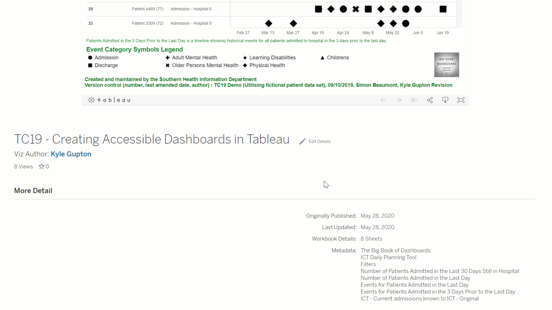
If you’re interested in going even further, you can watch my TC19 session on creating accessible dashboards.
Good luck with your accessibility journey, and I hope to see more accessible dashboards soon!
相关故事

Meet Iron Viz 2024 Finalist Jessica Moon
 2024/04/15

Meet Iron Viz 2024 Finalist Pata Gogová
2024/04/08

Student to BI Analyst, How Tableau Can Lead to a Successful Data Career
 2024/03/20
Subscribe to our blog
在您的收件箱中获取最新的 Tableau 更新。