GONE! Visualizing Every Brewers Home Run in the Miller Park Era


The following is a guest post by Tableau enthusiast and journalist Matt Montgomery.
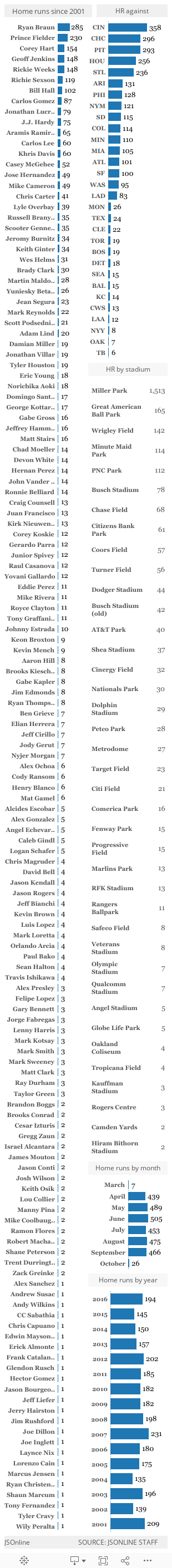
Miller Park has been one of the most hitter-friendly ballparks since it opened in Milwaukee in 2001.
Only five teams have hit more home runs at home than the Milwaukee Brewers: Chicago White Sox, Texas Rangers, Colorado Rockies, Toronto Blue Jays, and Baltimore Orioles.
At the Milwaukee Journal Sentinel where I work, a team of sports producers has been tracking every home run by the Brewers since the park opened. We track the homers in an Excel spreadsheet and upload that data to an interactive database.
For many years, that database was a giant text table with filters that could answer one simple question at a time. However, the search tools were limited and the table wasn’t pleasant to look at—unless you enjoy looking at numerous rows of data for the sake of it. So I came up with this visualization:
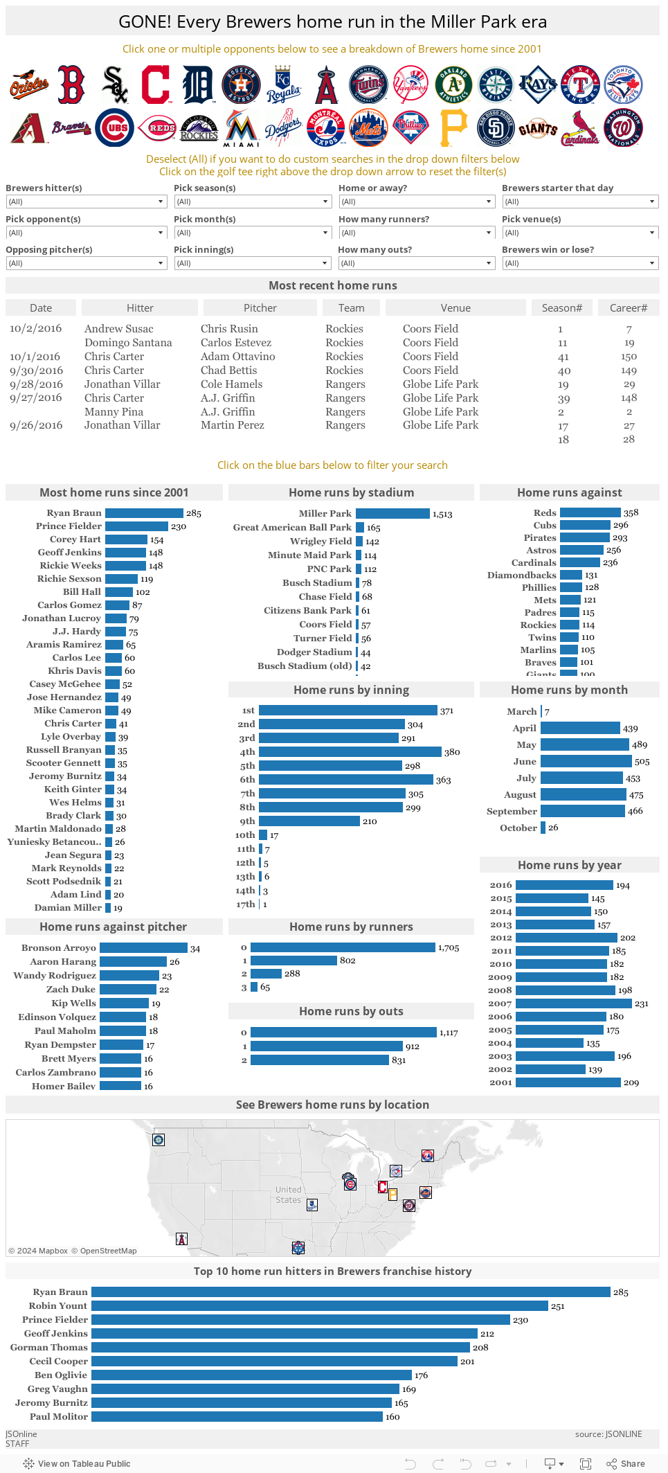
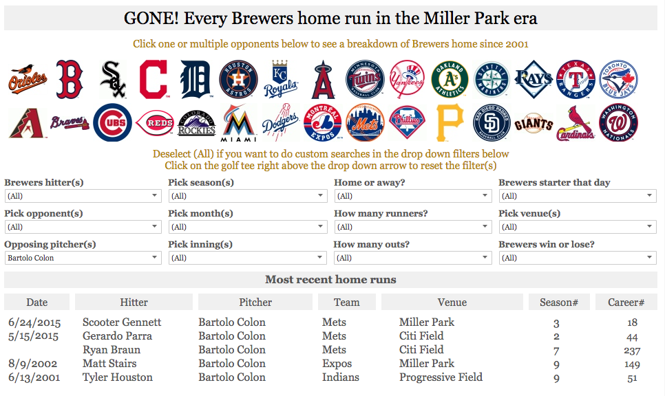
My goal was to redesign that database with Tableau Public to serve readers with a better visual experience while giving them the tools to answer more complicated questions. For instance, I’d like to know more about the Brewers’s home runs hit off of pitcher Bartolo Colon at Miller Park since 2001.
As it turns out, Scooter Gennett hit one against Colon’s New York Mets on June 24, 2015, which was his third of the season and 18th in his career. Also, Matt Stairs (!) hit one off Colon when he was on the Montreal Expos (!!) on Aug. 8, 2002.
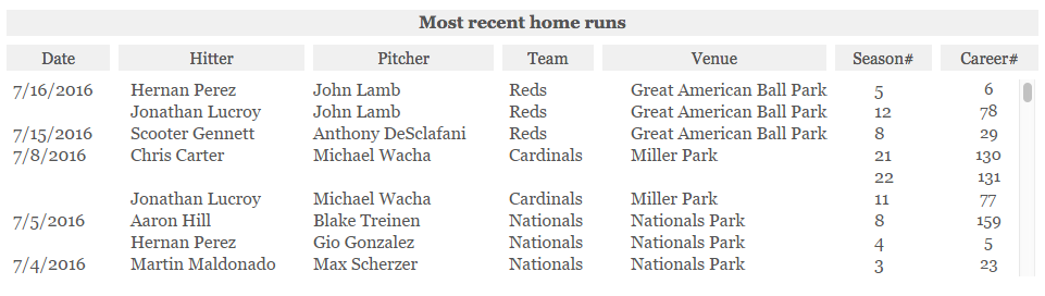
The Expos relocated to Washington, DC and became the Washington Nationals in 2004. After having a nostalgic thought about the Expos, I wanted to see all the home runs the Brewers hit against the Expos away from Miller Park. The search turned up nine results with seven hit at Olympic Stadium (their home ballpark from 1977 to 2004) and two hit at Hiram Bithorn Stadium in San Juan, Puerto Rico.
Questions like those motivated me to build an interactive dashboard that would be a one-stop-shop for all searches regarding Brewers’s home runs in the Miller Park era.
Using the same Excel spreadsheet that started in 2001 and getting Tableau Public installed on a handful of computers, the logistics were in place for the facelift.
When it came to building the new dashboard, I tried to follow InterWorks’s dashboard-performance checklist as best I could.
I wanted users to filter their searches in many ways, but I also wanted to minimize load time for each search. Therefore, I avoided the multi-select dropdown lists and created dashboard actions so the interactive experience would be flexible yet quick.
I decided on a width of 965 pixels because that was the exact width of the Journal Sentinel article-page template. That way, readers would have the most room to interact, left to right. I didn’t have a strong opinion on height, but wanted to make it as short as possible while making sure each sheet had space to stand alone.
I imported all the MLB team logos to create custom shapes (more details on how to do that here) that could be used as filters.

I created various search filters to mirror our style from the previous database.
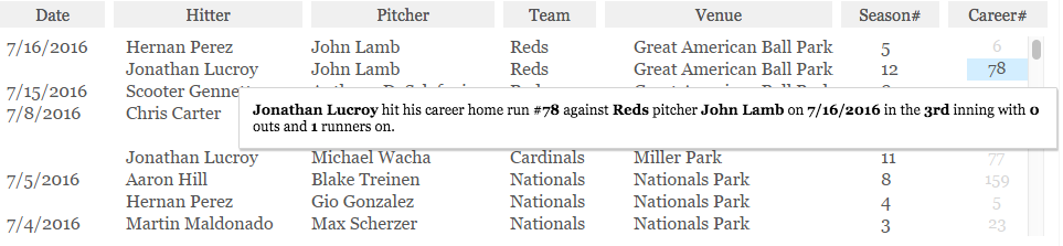
I wanted to have a text table that gave more context to the homers. I used the following dimensions in the table: date, player, opposing pitcher, opponent, venue, season number, and career number.
In the worksheet’s tooltip, I wrote a descriptive sentence that incorporated and bolded the table’s dimension. So when a user hovers over career number, the home-run details would update. The brackets signify dimensions.
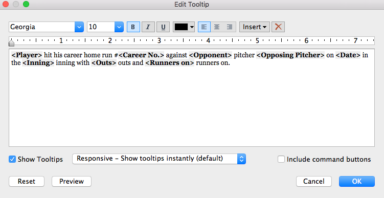
Then I dragged the "career number" field onto Text so the tooltip details would show up there.
I thought creating individual sheets with bar charts for each type of home-run detail would be the easiest to digest. Then I made the sheets act as filters to assist in searches.
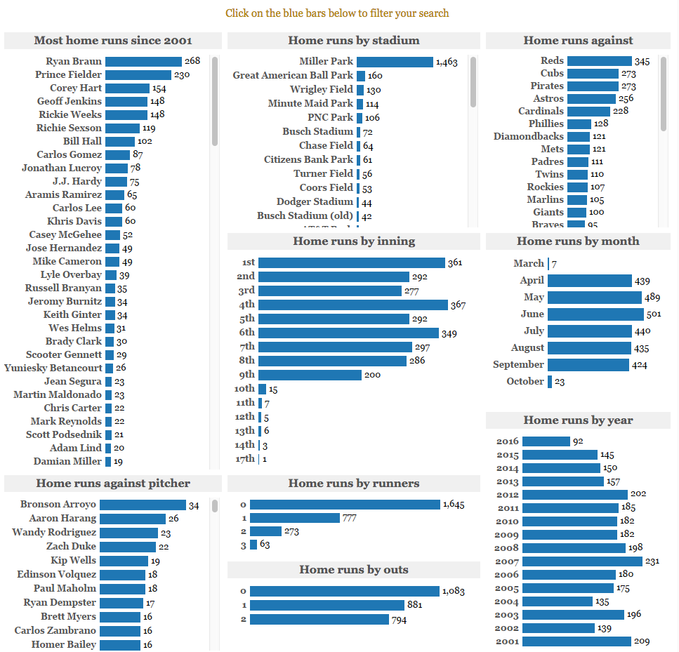
Toward the bottom, I used a symbol map with MLB team logos to show the physical location of the home runs. I used the sheet’s tooltip to give details about location, ballpark, and number of home runs hit.

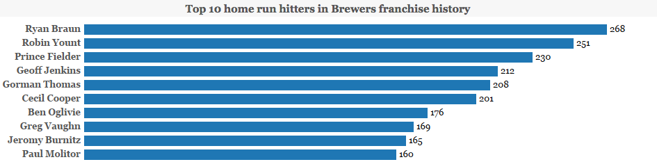
Also, I wanted to show the top 10 home-run hitters in franchise history for some historical context.
While this dashboard allows desktop readers to answer various questions, I wanted to create an interactive dashboard for our mobile readers as well.
Following some more best practices, I wanted to keep the interactive clear, simple, and fluid. I kept the same bar charts from the desktop dashboard and removed the team logos, search filters, text table, symbol map, and top 10 hitters. Since I was tight on space with a width of 310 pixels, I made sure to have each sheet fit the entire view so there wouldn’t be scrolling from top to bottom in the individual sheets.
While the mobile version isn’t as slick as the desktop version, it satisfies the best-practices criteria.
With the help of a developer, the landing page of the home-run database properly displays the desktop or mobile dashboard based on the device used.
I hope you enjoy the dashboard. Feel free to share your feedback in the comments below or via Twitter @JS_mmontgomery.
For more visualizations by Matt, visit his Tableau Public profile page. If you've got a sports viz you'd like to share, tweet it to us @tableaupublic. If you've got an Olympics viz, add #OlympicsViz as well.
相关故事

Meet Iron Viz 2024 Finalist Jessica Moon
 2024/04/15

Meet Iron Viz 2024 Finalist Pata Gogová
2024/04/08

Student to BI Analyst, How Tableau Can Lead to a Successful Data Career
 2024/03/20
Subscribe to our blog
在您的收件箱中获取最新的 Tableau 更新。