#ElectionViz: US TV networks have room for data storytelling improvement


Editor’s note: A version of this blog post originally appeared in Nightingale, a publication by the Data Visualization Society.
How was US general election night for you? For me, it was underwhelming.
That emotion had nothing to do with the political story, but everything to do with the data storytelling of US TV networks. My goal on election night was to enjoy and comment on the way they told data stories, which you can find on Twitter under #ElectionViz. I came away disappointed. The gulf between the charts we find on news websites and US TV networks is enormous. News websites offer sophisticated experiences, whereas the networks offer—well, not much more than screens dominated by geographical shapes of counties in the US. There is not a great deal of difference between this year’s screens and those from 1968.
Let’s take CNN as an example. John King, like all anchors on most networks, are amazing commentators. Their knowledge of the US political landscape and their ability to narrate events are hugely impressive. Unfortunately, their words were not supported by visuals that would have made it easier for an audience to follow along.
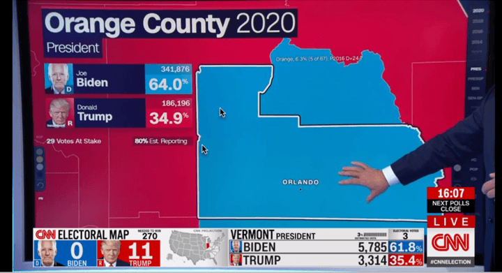
Orange County, Florida map as seen on CNN at 8pm EDT on November 3, 2020.
Almost without fail, when an anchor zooms into a county map, they make three data-driven observations:
- What is the current split between candidates?
- How many votes have been counted?
- How is this different from 2016?
Also, once the narrator has zoomed into a county, the shape or location of the county is no longer a primary piece of information to focus on. Given that, how easy is it to answer the three questions the narrator needs to answer? It’s not at all easy.
What if we changed the display to focus on the three questions? It could look something like this:
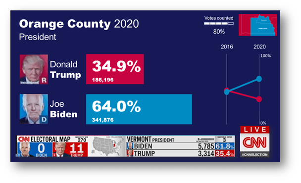
The geography is now just a small thumbnail, alongside a vote count progress bar. The candidate’s vote numbers, instead of a text box, are shown as bars. A slope chart on the right shows the swing from 2016.
These are not complex charts: bars and slopes use the most basic building blocks of data visualization, and yet, in an instant, we can see the information the narrator is describing.
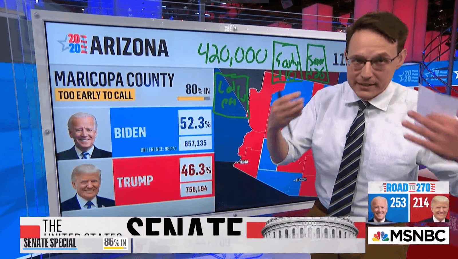
All the major networks I followed used the same template: map-driven graphics with little thought to the little things that could have greatly enhanced the stories being told. Steve Kornacki on MSNBC did take full advantage of the sports-style telestration board with extensive use of hand-drawn numbers and circles. These enhanced the visual power of his explanations.
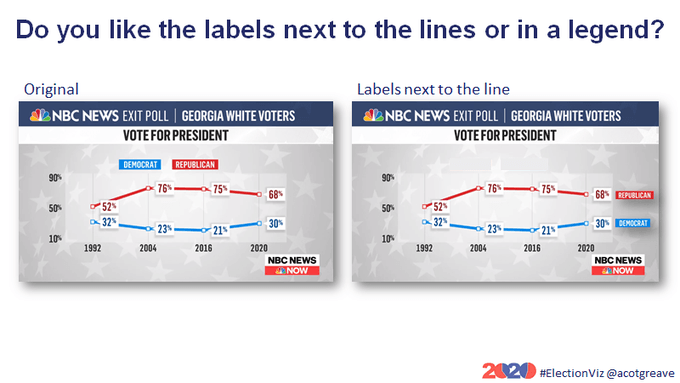
Beyond the maps, I was surprised at how few visualizations the networks created. There was the occasional line chart, including a nice one from NBC. It was well laid out, with clear labeling and an identifiable data source. My only quibble was the positioning of the party annotations. It’s always nice if you can put the category label at the end of the line itself.
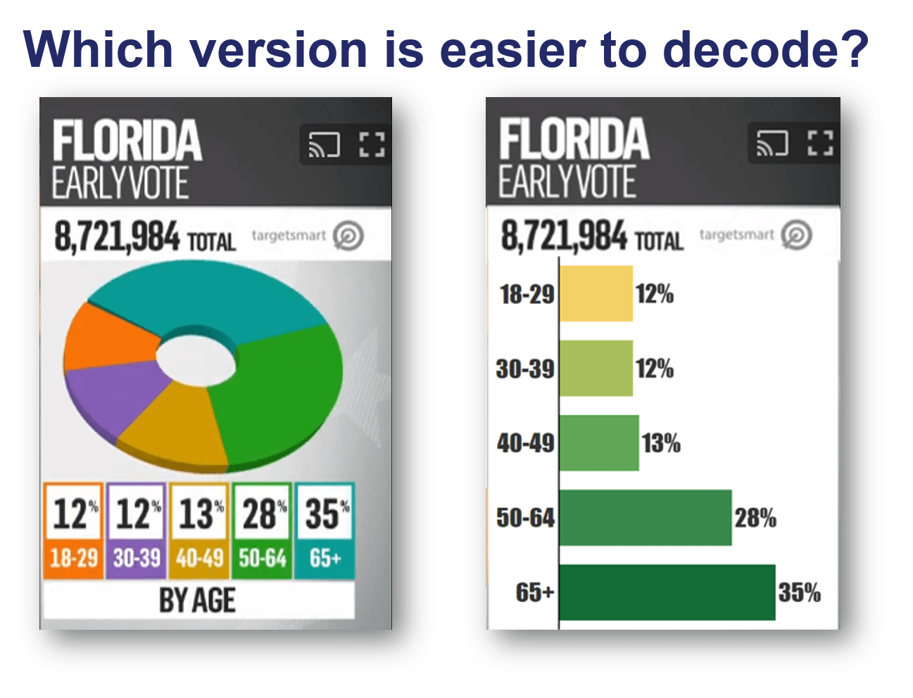
In any TV coverage, it’s only a matter of time before you see a pie chart of some sort. The first I saw was also on NBC. Take a look at this, and try and decode the pie chart. Pay attention to how many times your eye moves across the chart as you do so:
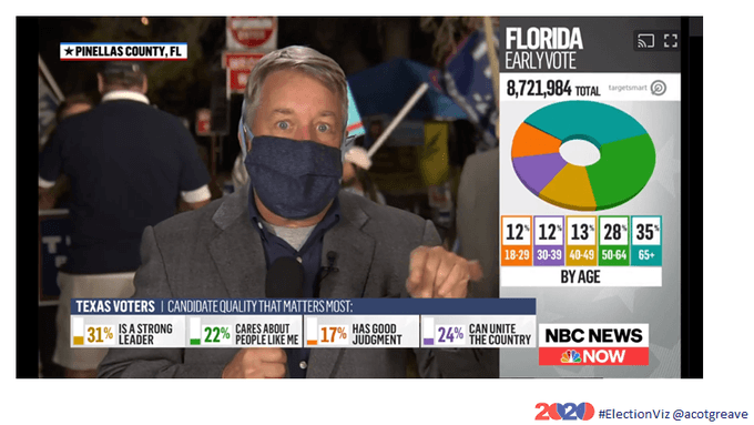
Let me guess, your eyes went on a chaotic path across the chart from legend to segment, to numbers, to legend, and so on. How about if we showed this as a bar chart instead? How long does it take to parse the information now?
As I watched the live feeds of the news websites though the night, it was clear that traditional print media are streets ahead in terms of data storytelling. It’s not because their browser-based graphical displays are complex, or that they appeal to data geeks like me. It’s because they consider the questions audiences have and focus the display on delivering answers as quickly as possible.
What seems to be missing is the fundamental goal any data storyteller needs to ask:
- What are the key questions I need to answer?
- How can I present the information so that those questions can be answered as easily as possible?
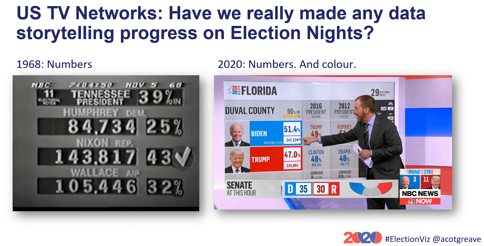
On reflection, I was surprised by the information design conservatism in the US TV Networks. Comparing today’s coverage to coverage in 1968, other than the addition of color, the displays are still tables of numbers and the odd map. I did #ElectionViz for the UK General Election in December 2019, and the visualization maturity of Sky News and BBC were far further ahead than that of the US networks.
As the dust settles and we move towards 2024, I would love to see a little more visual sophistication to support the amazing anchors.
Ok Twitter! It's 3.30am in the UK and I don't think there are any more new charts the media have up their sleeves. So I'm calling it a night for #ElectionViz. Thank you for following, it's been quite the exprience. For now: a whisky to toast you all: pic.twitter.com/4QjZnkHglu
— Andy Cotgreave (@acotgreave) November 4, 2020
相关故事

How Team USA uses data to build a digital HQ
 2022/02/08
Data trends that will impact you in 2022

Healthcare Analytics Hub Starter Kit: Get the data you need faster
 2019/10/18
The purpose of the Healthcare Analytics Hub Starter Kit is to provide a sample of what your healthcare app could look like. It’s not a complete solution; instead, it’s focused on what’s possible. Please contact your Tableau Account Manager to get started today!
Subscribe to our blog
在您的收件箱中获取最新的 Tableau 更新。