Tableau Research leader and resident color expert Maureen Stone talks R&D at Tableau


Maureen Stone was intrigued by Tableau from the start. A pioneer in visualization herself, she connected with the mission of helping people see and understand data. Maureen first learned of Tableau through its co-founder Pat Hanrahan and Jock Mackinlay, then her colleague at the iconic research and development center, Xerox PARC in Palo Alto, California, and now a technical fellow at Tableau. When Maureen relocated to Seattle after devoting 20 years to illustration and design systems at Xerox PARC, Jock reached back out. In 2004 he asked her to advise Tableau on color palettes and user experience (UX), which later evolved into a full-time role. Today, as Senior Director of Tableau Research, Maureen and her team innovate ways to make data more accessible for all people to see and understand.
Her extensive research in digital color applications—and experience authoring “A Field Guide to Digital Color”—made Maureen a natural fit to help Tableau explore color’s role in data analysis. As a resident color expert, Maureen’s research on how color impacts our ability to understand information has shaped the Tableau experience. She's also a strong accessibility advocate for people with color-vision deficiencies in data visualization work, and she was among the first women inducted into the IEEE Visualization Academy’s hall of fame for her research in the field.
At the helm of Tableau Research, Maureen has broadened her scope beyond color and UX. Her team drives data-visualization innovation, including integration with artificial intelligence (AI) and machine learning (ML), so people can more easily navigate the world of data.
Molly: You are Director of Research at Tableau. Tell us about your role and how you work with your team and CTO Andrew Beers.
Maureen: My role is to help Tableau Research fulfill its goal of doing good research while being useful to the company. Being part of the Office of the CTO (OCTO) allows us to have multiple teams working individually and together to foster innovation at Tableau. As a member of Andrew’s OCTO leadership team, I both represent the research team and help lead OCTO as a team.
Researchers are self-directed, but they’re still people with careers that need to be managed, and that’s one of my main responsibilities as director. Most who join us are already good at doing research and in getting published, if that’s their goal. The bigger challenge of defining and managing how they as researchers can be useful to Tableau is my primary mission.
Finally, I help form our strategy around where to focus our efforts. We continue to invest in visual analytics, specifically around new types of data (such as text and graphs) and new application environments, such as presentation and collaboration. We are investing in natural-language applications, including search and more expressive ways to help people ask questions about their data. And we are looking at the integration of AI and ML with Tableau, through the lens of Responsible Analytic Assistance, to use data and its analysis in a trustworthy, responsible manner.
Molly: How are you optimizing Tableau with AI and ML?
Maureen: We treat ML and AI as a way to assist people with their work. Ask Data and Einstein Discovery, for example, clearly use AI and ML technologies, but there are opportunities all throughout the analytic pipeline.
One with a lot of promise is how to help people assemble and shape data into a form that allows them to ask analytical questions. Traditional data prep optimizes data for computer access: How do you structure it to fire queries in a language like SQL and quickly get an answer? But our mental models of data are different: What are they, and what tools can we create to bridge that gap?
Our ML projects emphasize search and discovery. They blur the boundary between features like Ask Data, which generates answers from a curated datasource, and search, which finds answers other people have already discovered. We’re very interested in capturing and applying intent. For example, if I say, “give me the best,” what do I mean by “best?” And how do I express that?
Another ML prototype is an analytics system where you can ask questions to prompt suggested follow-on questions or recommendations to create a viz. We’re exploring how to fluidly move between language and direct manipulation for visualization and how they might work together.
In the AI space more broadly, our main projects are around Responsible Analytical Assistance. How can you interact with an algorithm to understand if it answered the right questions, that the answers coming back from the system are trustworthy, correct, and believable?
We don’t believe you’re done after getting an answer to a question—it’s not responsible or trustworthy. The user needs to be skeptical and understand the limitations of the system. This exploration transcends AI and applies to all the products we build.
Molly: Color isn't purely aesthetic—you advocate for intentionally choosing the best possible colors to create visualizations. How did you become interested in the impact and importance of color in data analytics?
Maureen: In my work on illustration/design systems at Xerox PARC, much like Adobe Illustrator when only Xerox had the technology for it, we built color pictures on displays. You'd print on desktop printers and the colors were horrible. Transforming color from display to print became an interesting and complicated problem.
That got me interested in how people think about color. Say I have a yellow box on a display I’m printing—what does that mean? What is the concept of yellowness? Is it defined by the computer display or the printer, which are very different? This work led me to the world of color, its technology, and its different applications.
When I came to Tableau, my job was to understand how color can function as part of data visualization and help people use color to represent data. For example, color works well to define or distinguish categories, like sports teams, fruits or veggies, or crayons. You can map it to quantity by varying color brightness where more is darker and less is lighter.
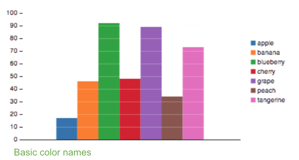
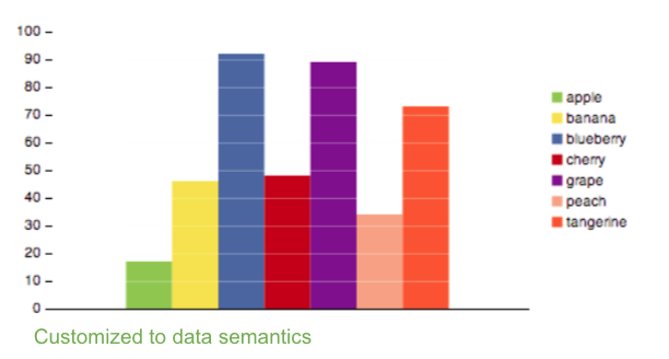
Maureen’s research helps to prove the importance of honoring the association between color and data semantics. Yellow represents “banana” far better than the color orange.
Molly: Your research also focuses on making data accessible. How can we make data easier for everyone to see and understand?
Maureen: First, ensure the default colors, sizes, and contrasts are comfortably legible for everyone, and that the important information is readable, even if the color is replaced with shades of gray. This provides sufficient contrast for comfortable reading and supports those with all ranges of color vision.
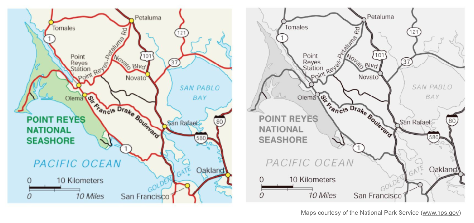
‘Get it right in black and white’ is a fundamental principle in designing with color, Maureen says. Here, the color version of the map has 'gotten it right' because the grayscale version is readable and legible.
For color specifically, we pay attention to a genetic condition, affecting 8–10% of men, that makes it difficult to distinguish red from green. This affects not only the visibility of red and green, but also the colors that are distinguished by the addition of red or green, such as blue versus purple, or gray versus brown. The default Tableau color palettes accommodate this problem by significantly varying lightness, especially in easily confused colors. For example, our default green is deliberately lighter than our default red.
The relationship between color and size is also important. If you’ve ever looked at a little paint chip in the store before painting a room at home, the color looks different when it covers a wall. That’s fundamental. An object’s size impacts how colorful it looks.
At Tableau, we’re painting the data. A mark has to work, whether it’s a little line or a big area, so we have to worry about how our colors work at different sizes. It’s a challenge we address in the design and the application. For example, in visualizations with large areas of color, like a choropleth map or an area chart, we automatically fade the colors a bit so they’re not too bright. At the other extreme, our background and shading colors are so light and subtle that we enhance them in the color picker so people can distinguish them.
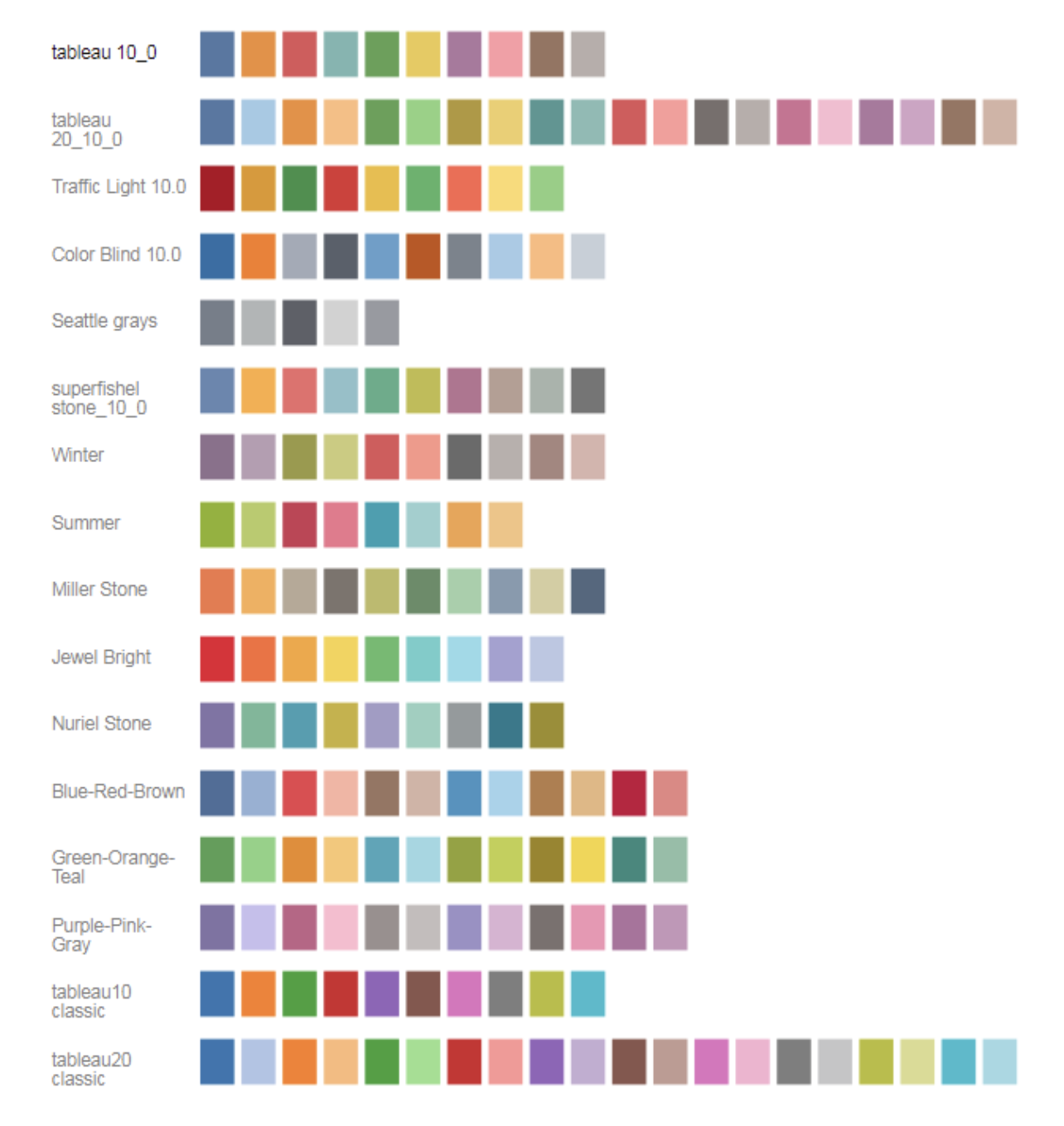
Tableau Color Palettes
Molly: What’s your favorite color?
Maureen: I like cool colors like blues and teals, but in the last few years as a manager I’m wearing a lot of red.
相关故事

How one university is instilling data skills in the next generation of business leaders
Subscribe to our blog
在您的收件箱中获取最新的 Tableau 更新。