The most interesting data vizzes on COVID-19 we've seen in the media so far


The spread of COVID-19 around the world has set off a spike of interest in data visualizations. Everyone wants to see and understand how case counts are rising, what kind of impact the virus might have on themselves and their community, and what role they can play in slowing the spread.
At Tableau, we’ve been hard at work collecting these data resources into a hub so people can quickly access reliable information, and even analyze the data for themselves. But we’ve also been impressed by many of the data visualizations we’ve seen in the media and elsewhere on the internet. We’ve collected a number of them here, and if you’ve been impressed by any that didn’t make it onto this list, we’d love to see them.
Visualizing case data
With something as urgent and rapidly as evolving as a pandemic, clear, up-to-date data is incredibly important. When visualizing data on the virus itself, like the number of confirmed cases or the number of deaths, striking a balance between clarity and impact is key.
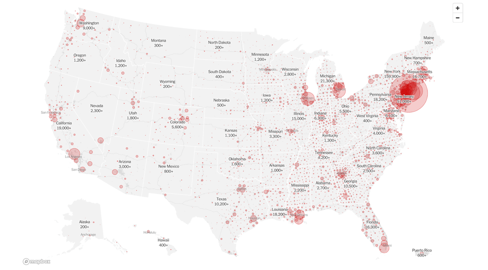
This visualization from the New York Times on confirmed COVID-19 cases illustrates that well. The overlapping circles can make the data difficult to find in certain areas, but you are able to see where confirmed cases are disproportionately clustered, and you can zoom in for more clarity.
The Guardian takes a more global lens in an incredible interactive visualization showing how confirmed cases spread around the world. Here, case counts are supplemented with key moments, like the World Health Organization declaring COVID-19 a pandemic. This approach works because it allows you to understand the rapid global spread of the virus, and grasp the evolving context as it progresses.
Comparing data by location
Many factors—from demographics to politics to geography and development—are playing a role in shaping the way COVID-19 affects different countries, and even different regions within them. The easiest way to get a sense of the differences by location as the pandemic evolves is a clear data visualization.
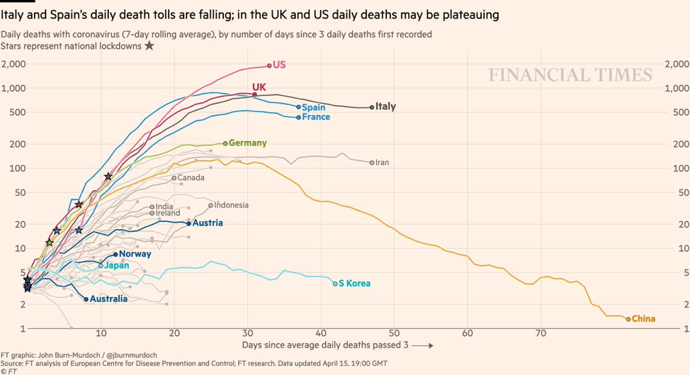
This chart from the Financial Times—arguably the defining trend chart of COVID-19—shows the different case trajectories for a number of different countries, clearly illustrating where countries have more successfully mitigated the virus (Japan) and where they haven’t (United States).
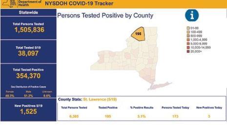
The New York Times decided to visualize testing data from the COVID-19 Tracking Project in a way that shows the U.S.’s testing rates in comparison to other countries, and also measures the different states against each other (the scrolling technique for displaying the data here is especially effective in how it parcels out information).
Understanding the economic impacts
COVID-19’s impact on the economy is unprecedented. Across the world, businesses are shutting down, economies are grinding to a halt, and people across sectors are facing record job losses. Good visualizations can dive into the data and show the impacts in historical context, and also illustrate how unevenly different populations and sectors are feeling them.
To illustrate the alarming rise in unemployment in the U.S., The New York Times created this striking visualization that immediately made the reality of the situation clear to anyone who looked at it (and yes, that last bar would be well off the page by now as unemployment numbers keep growing).

Diving more granularity into the pandemic’s impact on employment and the economy, Reuters created a series of charts that break down unemployment numbers by sector, age, race, and education level. They’re not the slickest vizzes, but make it very clear which groups are hardest-hit.
Another way to understand the economic impacts of COVID-19 is to look at the ways in which preexisting economic disparities are affecting people’s ability to comply with important measures like social distancing. The New York Times has created an incredible set of scrolling graphics that shows that people in the wealthiest 10% have been able to limit their movements more than those in the poorest 10%.

Taking a different angle to understanding economic impacts, Recode has some interesting charts that dive into other aspects of the coronavirus and work, including a graph that shows a stark rise in mentions of “working from home” in public company transcripts.

Analyzing health care system capacity
Understanding the local health care system capacity is critical for understanding COVID-19’s risk for overwhelming it. As case numbers rise, communities have to be able to see when critical cases might reach the point of exceeding the number of hospital beds so they can plan in advance.
ProPublica’s interactive tool for checking on hospital capacity is one of the first vizzes to try to make sense of what the ‘health care system capacity’ line on the flatten the curve chart meant locally. These visualizations are notable for using the unit of hospital referral area instead of county, since that’s the more relevant unit in this case. And you can put in your own location and see what the simulation would look like for you, along with helpful summary text to interpret the maps.

Visualizing environmental data
COVID-19 and the measures to contain it are affecting so many aspects of the world. One particularly noticeable change in many places—as lockdown orders have gone into effect—is a decline in pollution levels as traffic emissions have slowed dramatically.
The Financial Times has created a compelling set of maps comparing air quality measurements from March 1 to April 5, 2019 to the same span of time this year. The differences are apparent.

But the same story also cautions against expecting this change to last. FT analyzed data from China, which is slowly recovering from its initial outbreak. Pollution levels there are back on the rise, suggesting other cities might follow a similar pattern.

Seeing yourself in relation to COVID-19
As we continue to combat the virus, we have to create a sense of shared understanding around our own risk for contracting the disease, and our role in either spreading or stopping it. We’ve seen a handful of good visualizations that help see ourselves in the context of COVID-19.
First of all, it’s important to understand your relative risk to exposure. The New York Times created a scrolling visualization illustrating risk by profession, measured by exposure to disease during the workday and physical proximity to others.

The choices of individuals can have big ripple effects on the spread of COVID-19. Reuters created a compelling set of graphics to visualize how those individual choices ripple, illustrating the results of national contact tracing on the movements of a few people in South Korea who were index patients for clusters of COVID-19.

The Washington Post takes a similar idea—examining the role of individuals in spreading the disease—but also creatively visualizes how our decisions to stay home and avoid contact can stop the spread of the virus (this simulation is not specific to COVID-19, but instead applies more broadly to disease transmission overall). Check it out.
This list is just scratching the surface. This is an unprecedented time for many reasons, and good data visualizations can help us to understand both the disease and changes in the world around us.
To learn more about COVID-19 and see how Tableau can help you start analyzing the data on the virus yourself, visit our Data Resource Hub. And to see how members of the Tableau Community are visualizing the data, visit the COVID-19 Tableau Public gallery.
相关故事

After a year of COVID-19 charts, eight data communication lessons learned
 2021/04/19

4 reasons why embedded analytics is your path to a new revenue stream in the COVID-19 era
This blog post covers four reasons why organizations should consider embedded analytics.
What we can learn from the public sector’s response to COVID-19
 2020/05/21
A broad consensus is that COVID-19 will drive digital transformation in the public sector. During the 2020 Government Summit, speakers from Veteran Health Administration, Southwest Texas Regional Advisory Council, and FEMA discuss new processes, new technologies and innovations, and most importantly, a new mindset on decision making in the midst of crisis.
Subscribe to our blog
在您的收件箱中获取最新的 Tableau 更新。