How to slow the spread of misinformation


Editor’s note: Anna Foard is the Director of Training at datacrunchcorp.com and runs the data & statistics blog thestatsninja.com. Follow her on Medium. This post originally appeared in Nightingale, a journal by the Data Visualization Society.
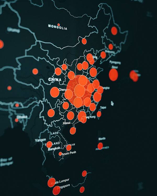
At this very moment news stories, studies, articles, and social media posts direct our attention to the stories unfolding around the COVID-19 pandemic.
While some articles inform with life-saving advice, others disguise dangerous opinions as research-backed truths. If the fact-checking people at Snopes.com struggle to keep up with the information spew, how does the armchair analyst filter fact from misinformation?
I teach people how to navigate the language of data. Since 2004, I’ve coached people through the interpretation and communication of charts, graphs, and statistics. Data is a fuzzy world, driven by context and details which are easy to misunderstand and misrepresent.
The door to misinformation opens the moment we try to infer about an entire population based only on a sample. And surprise! The data sets we rely on for insights and conclusions are only samples — subsets of the population. There will always be missing information and questions that go unanswered. Therefore, any study or article can potentially (and not necessarily intentionally) lead to miscommunication and misinformation.
Fortunately, you have the ability to control what information you digest and share with others. To begin, arm yourself with questions instead of assumptions. In the midst of this pandemic, we can stop the spread of misinformation by applying a sniff test to the information crossing our path. Use these questions to filter the noise when you come across a new piece of information — an article, a study, a social media post.
- What is the intent of this study/article? Do the metrics used actually support the message of the study? In other words, are we measuring what we think we are measuring?
- What is missing? What do we know that we don’t know? What do we wish we could find out? Is that information obtainable?
- What other variables could be attributed to this outcome? Also, consider any other variables that might impact the changes in the input variables as well as the output variables.
- Why is this information important? Why is this happening? Root-cause analysis doesn’t stop at the surface — keep digging by asking the next “why” question. This is the difference between addressing the symptoms vs. the real problems.
- How is this metric/number obtained? Surveys? Random samples? Self-reported? An agency? Has the method of obtaining these metrics changed?
- Are there road-blocks to reporting accurate figures? Could the challenges in collecting this data differ by country/region/state?
- Are the numbers given in absolutes? Or percentages? Or, are they weighted values based on the distribution within subgroups? For example, are per capita measures considered? What about overall population distribution of a variable such as blood type — since O is less common than A, absolute counts are less helpful.
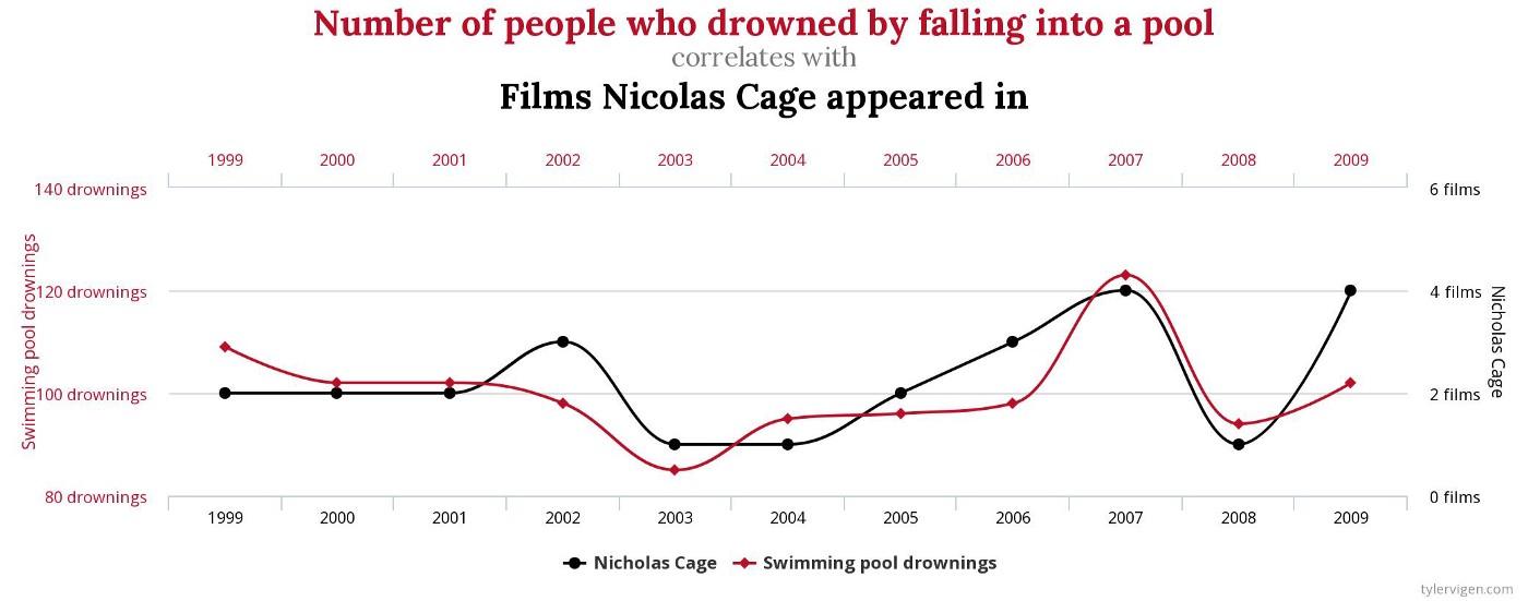
- Does this graph hide information? Check each axis — are they truncated? Or does it have misaligned dual axes for two variables over the same X axis? (See below.)
- Where did this study/article originate? Find the original study/experiment to look at the design, sample size, timing, source, etc.
- Who funded this study? You might have to dig deep to get this answer. Or you may never know.
- When was this data collected? Is it all equally relevant, or are we mixing old and new data?
- Does this article/study predict for the future based on past data? If so, what model(s) are they using? How many input variables? Keep in mind we use MULTIPLE forecasting models for hurricanes! Human behavior is extremely variable and and even harder to predict than weather.
- Does the source/author offer some margin of error/level of uncertainty for their metrics and predictions? Be cautious of any source that implies 100% probability of some outcome. A better source is willing to say, “I’m not sure” or “60% of the time,” etc.
- Does this information makes sense? We all have a little bit of common sense — use it.
- Before sharing or posting an article: If someone came along and said, “Wanna bet?” would you wager that the article/study is accurate? A great decision-making strategy by Annie Duke.
NOTE: Be cautious of EXTRAPOLATION — predicting beyond the range of known values
Lastly, we are resilient. Together, we will turn our world back on course. And though it’s easy to capsize in the tides of perpetual information, take some time to unplug. Sometimes we all need to close the computer, turn off the television, and enjoy a well-worn novel.
To see more information and visualizations on data and the coronavirus outbreak, visit Tableau’s COVID-19 Data Hub. This resource is constantly developing along with the situation, and we’ll be highlighting more stories the weeks to come.
相关故事

After a year of COVID-19 charts, eight data communication lessons learned
 2021/04/19
4 reasons why embedded analytics is your path to a new revenue stream in the COVID-19 era
This blog post covers four reasons why organizations should consider embedded analytics.
What we can learn from the public sector’s response to COVID-19
 2020/05/21
A broad consensus is that COVID-19 will drive digital transformation in the public sector. During the 2020 Government Summit, speakers from Veteran Health Administration, Southwest Texas Regional Advisory Council, and FEMA discuss new processes, new technologies and innovations, and most importantly, a new mindset on decision making in the midst of crisis.
Subscribe to our blog
在您的收件箱中获取最新的 Tableau 更新。