Best of the Tableau Web: Beautiful pi charts and dashboard design thinking
The end of October has come and gone— which means it’s time for another Best of the Tableau Web!


The end of October has come and gone— which means it’s time for another Best of the Tableau Web! There’s no doubt about it, this month’s BOTW highlight was Tableau Conference 2017 in Las Vegas. I love that there are almost as many takeaways from TC17 as there are authors, so thank you to everyone who posted and wrote recaps. I also appreciate the reflective posts many of you written addressing how the Tableau community can improve. We all want the best from the community, and seeing your ideas helps us find the right way forward.
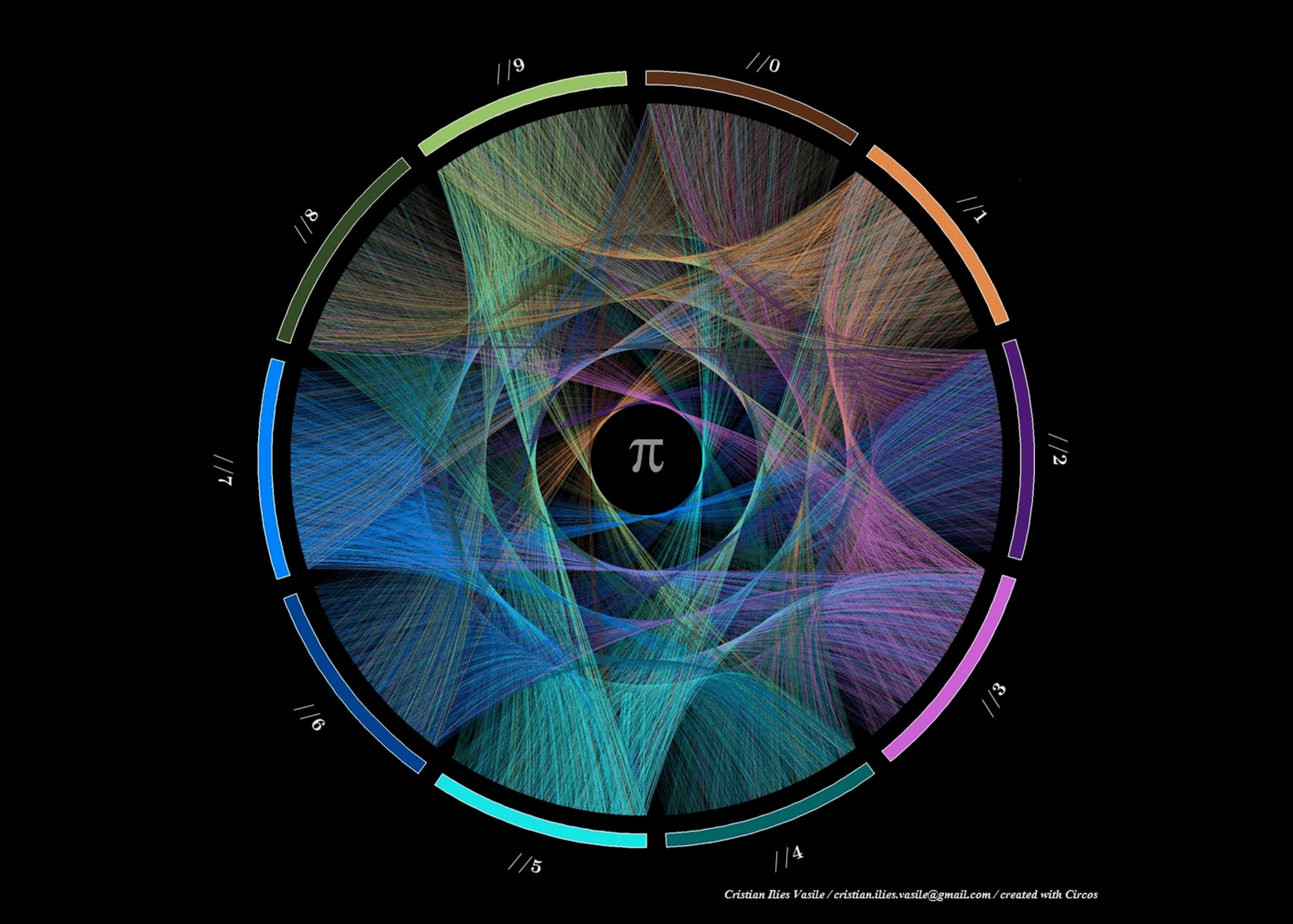
This month, you’ve also been coming up with some great ideas. I particularly liked Ken Flerlage’s post on the beauty of Pi. While this doesn’t have much business application, his post highlighted the power of being creative. The lesson I took from his post was that while you might have one goal in mind as you explore data, it’s the accidental paths you follow that are often more rewarding. Your own data explorations might not end up as gorgeous as Ken’s Pi vizzes, but they might provide you with unexpected insight. Well done, Ken!
I also enjoyed Elena Hristozova’s post about Dashboard Development and Design Thinking. This is a subject close to my heart, and it’s really good to see people applying existing models to our field. In this case, Elena took the Double Diamond model and reworked it for dashboards. If you want to find out more about dashboards, do check out our own series of Webinars running this November.
Tips and tricks
Viz Simply Don't overdo the donuts
Mark Edwards When Should We Use a Slope Graph?
Alan Eldridge Hexbin Scatterplot in Tableau
Alexander Mou Automating Monthly Report with Default to the Last Month
Joe Macari How to talk in “Tablish”: Lesson 1
George Walker Adding a dot to highlight the end of a line chart
Data + Science 10 Tips for Viz in Tooltips
Pixel Mixer Creating a “Transparent” Map in Tableau
Inspiration
Questions in Dataviz How important is interaction in visualisations? (aka Where’s Big Sam?)
Jeff Plattner Overcoming the Fear to Share
Typical Analytical Ten Takeaways from My First Tableau Conference
Ann Jackson #data17 Recap - a quick top 5
Pixel Mixer Introversion 2.0 - my Tableau 2017 Conference Experience
Visualibrarian Improving #IronViz, part 1: Why I, a woman, did not participate in Iron Viz 2017
Vizalicious #Data17 - nailed it
Ideas and Reflections Worth Sharing Dashboard Development and Design Thinking
Points of Viz The Tableau Desktop Qualified Associate Exam Experience
The Data Duo #Data17 Come Back, We Miss you!
Simon Beaumont When less isn’t more
Mark Edwards On The Subject Of #VizGoals
Bridget Cogley Measure Values, Toil, and Trouble: Avoiding the ‘Dead on Delivery’ Dashboard
Joshua Mulligan The Need for Speed: How to build Tableau visualizations quickly
Data Revelations Showing percentages? Lookout for these pitfalls
VizWiz Overcoming Burnout, Hexbin Maps and New York City's Urban Forest
The Marks Card 2017 Tableau Conference Recap
Jedi
Jonathan Drummey Waffle Charts and Unit Charts on Maps
Rody Zakovich Automatic Bins and Beeswarms in Tableau
Server
Paul Banoub What to name your Tableau Server?
相关故事

Meet Iron Viz 2024 Finalist Jessica Moon
 2024/04/15
DataFam Roundup: April 8–12, 2024
 2024/04/12

Meet Iron Viz 2024 Finalist Pata Gogová
2024/04/08
Subscribe to our blog
在您的收件箱中获取最新的 Tableau 更新。