Behind the Viz: Kasia Gasiewska-Holc on balancing design and data


Get to know your fellow Tableau Public authors with Behind the Viz, a blog series where we explore the people and processes behind our featured vizzes.
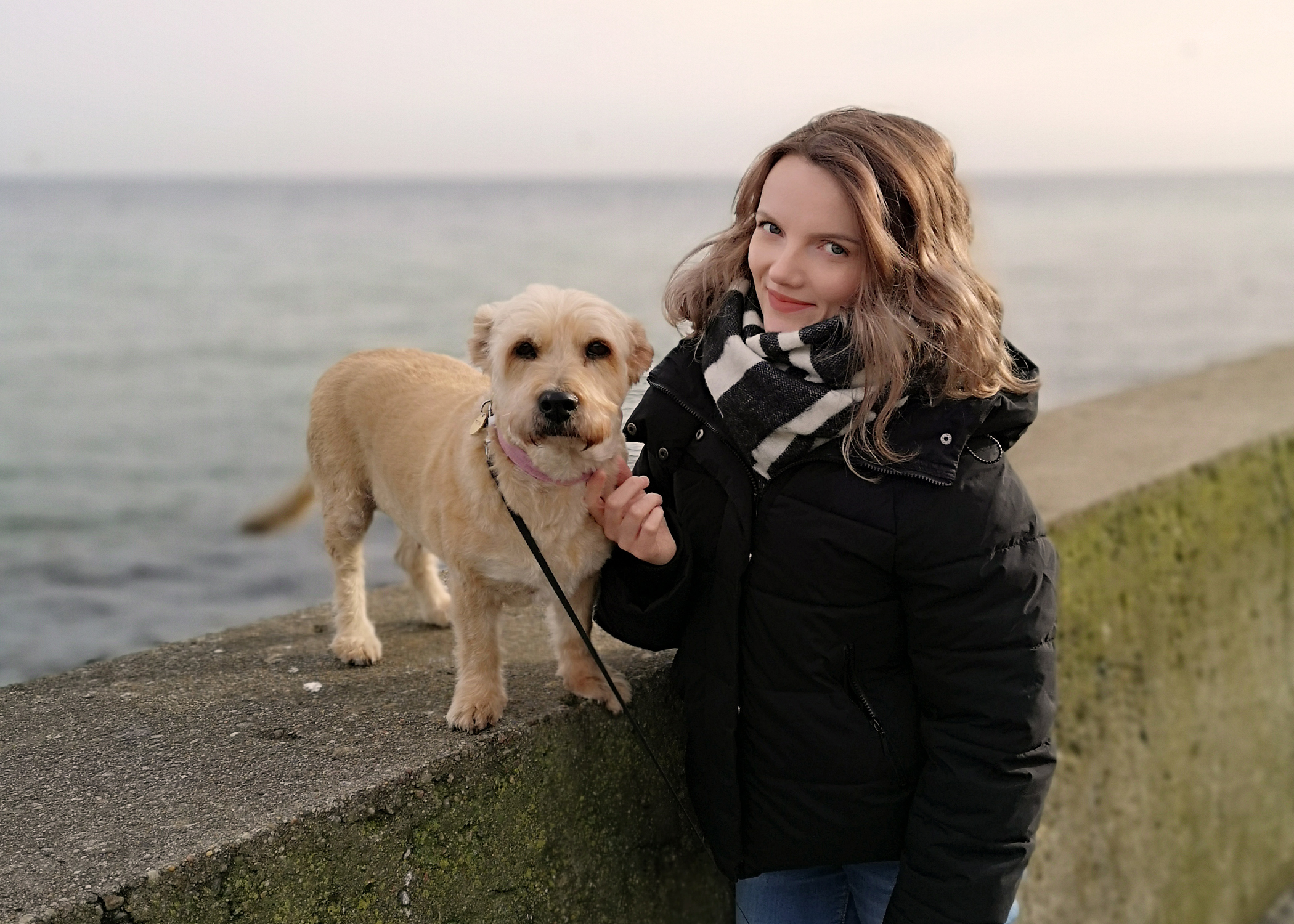
Meet Kasia Gasiewska-Holc! Kasia is a Marketing Data Analyst at Refinitiv. At work, she’s responsible for building actionable and insightful Tableau dashboards for a variety of teams across the business, with a strong focus on analysing marketing data. After work, she’s also a wedding stationery designer and an avid calligrapher. She tries to combine her passion for data analysis and love of graphic design by creating enticing visualizations that are not only pleasing to the eye but are also meaningful and touch on important topics, such as sustainability and environmental issues.
Kasia is a Tableau Public rockstar (you gotta go follow her) who recently published a viz that helps us dive into the amount of debris collected by the Ocean Conservancy in their annual International Coastal Cleanup. This viz, “Garbage in the Ocean,” was selected as Viz of the Day!

Her visualization has been a hit, sparking a ton of conversation across the Tableau twittersphere. The viz has been praised for its engaging design, interactivity, and heavily-researched annotations. The animation, zoom capability, and viz-in-tooltips were especially popular. Here’s one of many positive responses to "Garbage in the Ocean."
This is sensational, it is such an important topic to draw attention to but the way you’ve done it... wow! Goes without saying the animation looks great but personally the boat viz in tooltips are the highlight for me 👏 seriously well done
— Simon Beaumont (@SimonBeaumont04) February 7, 2019
We decided the community could stand to get to know Kasia a bit better. We talked to Kasia to learn more about her passion for environmentalism, her process while vizzing, and (perhaps most important) her pooch.
Without further ado, let’s take a look Behind The Viz!
How long have you been using Tableau Public?
How long have you been using Tableau Public?
I have been using Tableau for around a year now. My skills quickly accelerated when I decided to viz in Tableau Public by submitting my first viz to the Iron Viz Europe feeder contest in April 2018. Ever since then, I’ve been hooked!
Why did you choose this topic?
As much as I would like to, I can’t say I have always been very committed to fighting environmental issues. It was only about three years ago when I watched A Plastic Ocean, a documentary on plastic pollution that left me lost for words (available on Netflix!). After that, nothing was really the same. Even though I have not completely eliminated plastic from my life, I try to be more conscious about the impact that my actions and buying choices have on the environment.
As I live at the seaside, it’s hard not to notice all the trash that floats in the water (especially during the summer time), posing a threat to both marine wildlife and also human well-being. With my viz, I was hoping to raise awareness of this global issue, as I wholeheartedly believe that keeping our planet clean and healthy is a responsibility of each and every one of us. I have seen some analysis of different types of debris items that can be found in the ocean, but nothing that would put that data in the context of time needed for the trash to decompose in the natural environment. I was shocked by the data I have uncovered!
What was the hardest decision you made when creating this viz?
The hardest part of creating the viz was definitely the trade-off between design and content. Before I even started creating different elements in Tableau for this project, I already had a very specific idea about it design-wise. At the same time, it was very important for me to make the viz informative and meaningful. Unfortunately these two things rarely go hand in hand with one another, so making these two worlds meet can prove quite challenging. This project was no exception, but I think I managed to maintain a pretty good balance between the story behind the data and design. I think it’s largely thanks to the infographic style that I adopted. I noticed this design approach has the power to turn rows of numbers, text and plain data into something really beautiful, which is the result I was aiming for from the get-go.
What is your favorite new Tableau trick? How can others use it?
I have recently discovered a way to add custom vector graphic animations (images made of mathematical paths instead of pixel grids) to a Tableau dashboard. This was something I used in the “Garbage in the Ocean” viz for the first time, and I can already tell it’s not going to be the last time I use this trick. I think animations can really take your dashboard to the next level! Earlier this week, my guest blog post featuring a step-by-step guide on the subject was published— so for anyone interested in creating their own animations, I highly recommend having a read!
I also love the “transparent worksheets” feature— I think it’s quite powerful! In my “Garbage in the Ocean” viz, I used this trick to create tooltips for floating boats and for each circle representing a debris item on the main chart.
What is the best music to listen to while vizzing?
That’s an easy one! It’s got to be Led Zeppelin! It’s also suitable for any other activity or situation, I think it’s basically the soundtrack of my life.
Kasia’s Tableau Public profile is filled with stunning vizzes that strike a balance between design and data. Follow her on Tableau Public and you’ll be first in line for her next masterpiece!
Relaterade berättelser

Meet Iron Viz 2024 Finalist Jessica Moon
 15 April, 2024

Meet Iron Viz 2024 Finalist Pata Gogová
8 April, 2024

Student to BI Analyst, How Tableau Can Lead to a Successful Data Career
 20 Mars, 2024
Subscribe to our blog
Få de senaste Tableau-uppdateringarna i din inbox.