Discovering the power of a visual voice: a Zen Master’s journey


I recently had the honor of speaking at Tableau’s internal, all-hands meeting in Seattle and have spent a lot of time thinking about what it is that we do all day as “vizzers.” We take people, events, and things, deconstructed into bits of data, and attempt to reassemble them to find insights, meaning, patterns, and build useful tools.
I got my start in data analysis working for the airline Lufthansa. As part of their management training program, you worked in almost every department, from reservations to check-in and cargo. One day we were transporting a circus to Moscow. Imagine the mayhem of loading lions, performers, and stage equipment—all with German efficiency.
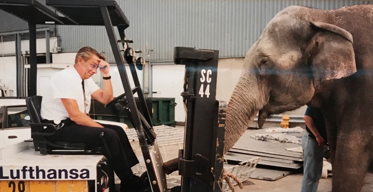
Yet for my job, the only data point of interest was the weight of an elephant that did not want to get on board. This beautiful, stubborn elephant was reduced to one number to load balance the plane and determine how much fuel was needed to fly her home safely.
Oversimplifying data points is necessary for analysis, but does this targeted abstraction help with everything? What about art? Swiss artist and entertainer, Ursus Wehrli, has a comedic series called Kunst Aufraümen, where he “tidies up” works of art. In his TED Talk he explains how adding order helps us better understand the painting’s meaning.
If we see the act of data visualization as this “tidying up,” you realize that every time we represent data with a mark (like bar chart or a dot on a map) we are deconstructing that information, adding our own translation, and using our visual voice to communicate on its behalf. This translation is the power of your visual voice and can be applied in so many ways or facets of your life.
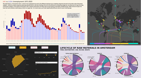
Why is this important? Let’s look at some dots on a map.
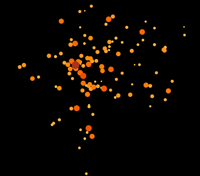
We’ve all seen hundreds of visualizations like this. It could depict flying elephants around the world, but this is actually from Splash. They are a non-profit partner of Tableau, dedicated to bringing water, sanitation, and hygiene solutions to children living in urban poverty in Asia and Africa.
Let’s focus on one dot—the red one—and what it actually represents.
If I told you it represents a trash can in a bathroom stall, you could imagine nearly endless versions of what this bathroom might look like, given a single data point used to represent it. It could be a delightful bathroom at an office—private, clean, and with proper disposal for feminine hygiene products.
But the red dot actually represents the absence of a trash can in a bathroom stall—a “pour-flush latrine with pan and water seal and direct drop pit or tank.” This toilet stall is located at a secondary school.
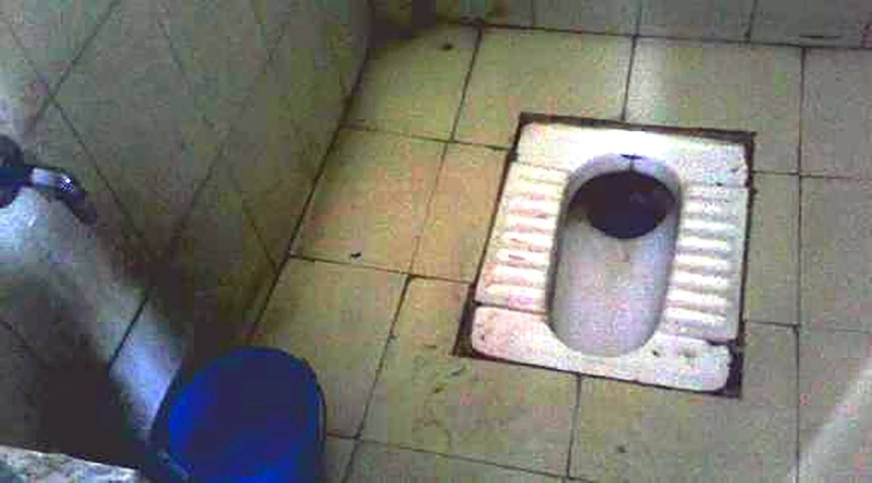
Let’s add in some other data points. The total number of toilets with trash cans for menstrual hygiene management is zero and the total number of female students is 435. Because there is no trash can, these 435 girls may feel shame and discomfort, have potential reproductive health issues tied to hygiene, or they may even choose to not attend school, thereby affecting their futures.
Now how do you feel about that dot on the map? And how do you feel about the power of your visual voice to translate and advocate on its behalf? You have the opportunity to make an impact and be a voice for those who may not have one.
The many ways I use #MyTableauVoice
Some people like to argue that everything in Tableau is just a scatterplot—marks arranged artfully on X and Y axes. But I argue that everything in Tableau is a translation of life and we must use the visual voice we’ve been given through Tableau to be true to the data and the life we represent when using it.
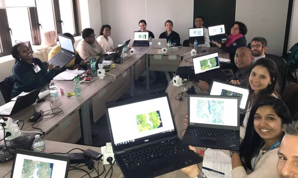
Through my volunteer work for the Tableau Foundation, I have the voice of a humanitarian who can support real heroes at organizations such as the World Food Programme, working to feed the hungry. I was fortunate enough to participate in their “Data Week,” during which analysts from around the globe—including Panama, Senegal, and Singapore, many of whom were new to Tableau—gathered to build dashboards.
With custom shapefiles and Mapbox satellite maps, we wanted to understand complex scenarios such as cell phone, electricity, and other infrastructure coverage to determine the best form for distributing aid in Zimbabwe. Analyzing predicted demand and food distribution, we looked at shortfalls in supplies in Côte d'Ivoire.
I’ve also used my voice for the #VisualizeNoMalaria project. Working under the guidance of PATH, we traveled to Zambia twice to gather use cases, understand goals, help deliver dashboards used in production, and provide Tableau training to support those on the ground working to help eliminate Malaria.
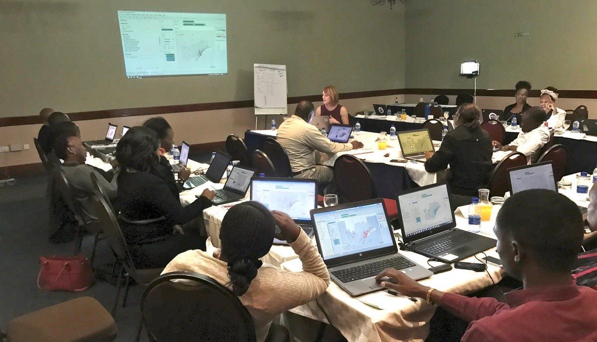
Tableau has empowered me to have a voice of protest as I’ve created visualizations like this one transposing bombs dropped during the Vietnam War onto American cities. The estimated bomb blast radii were used to clip areas of the cities down to the building level in an attempt to create empathy for the destruction of war. Below is a close up of my neighborhood in San Francisco. My house is a block away from a blast, but the nearby elementary school wasn’t so lucky.
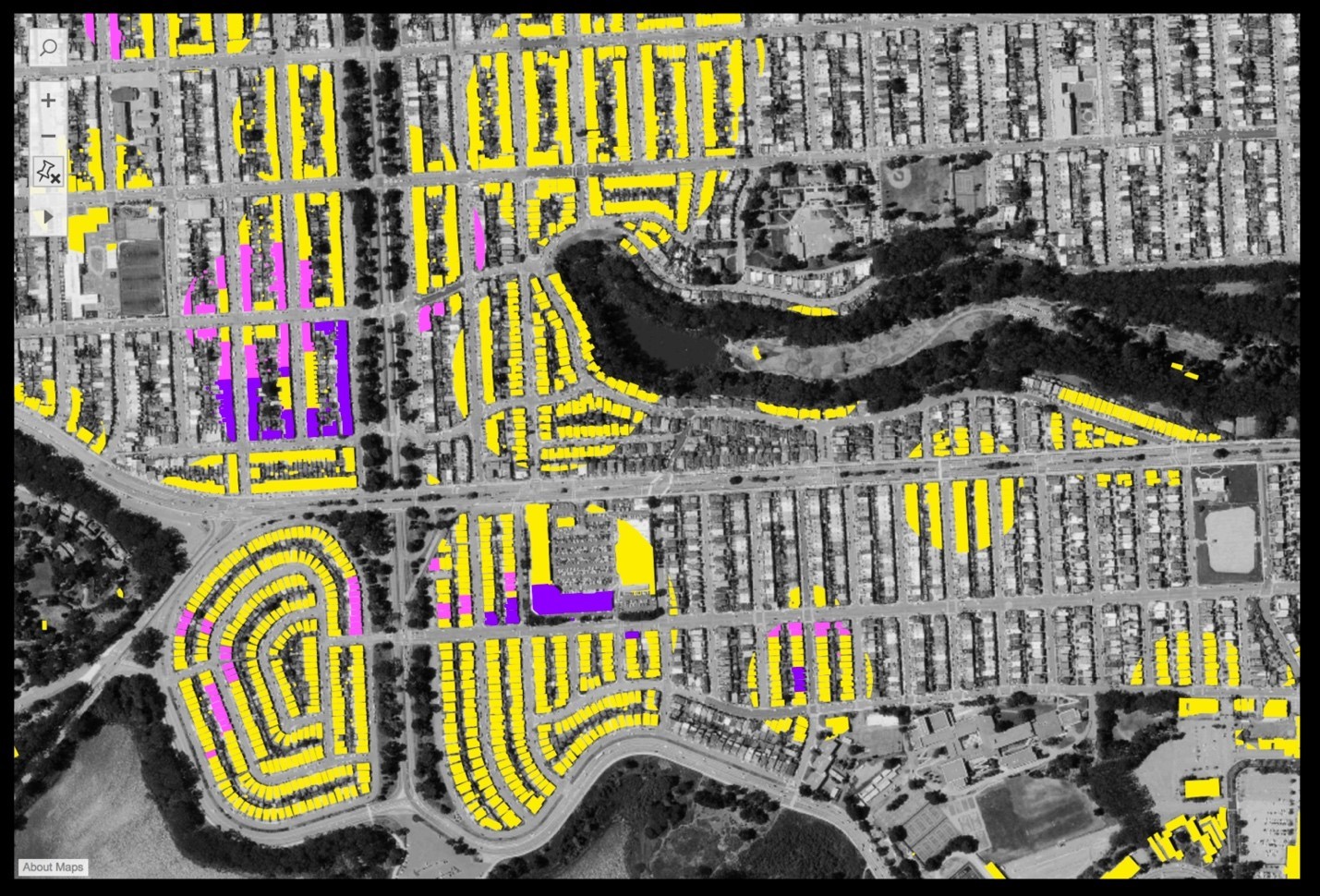
Tableau has allowed me to have the voice of an innovator—to wonder how more modern UX interactions could be used to enhance data visualization. Could we learn from Hollywood? Taking cues from immersive displays (such as those shown in the Hunger Games) and using Mapbox and Alteryx, I created a 3D bomb blast radius for use in Tableau.
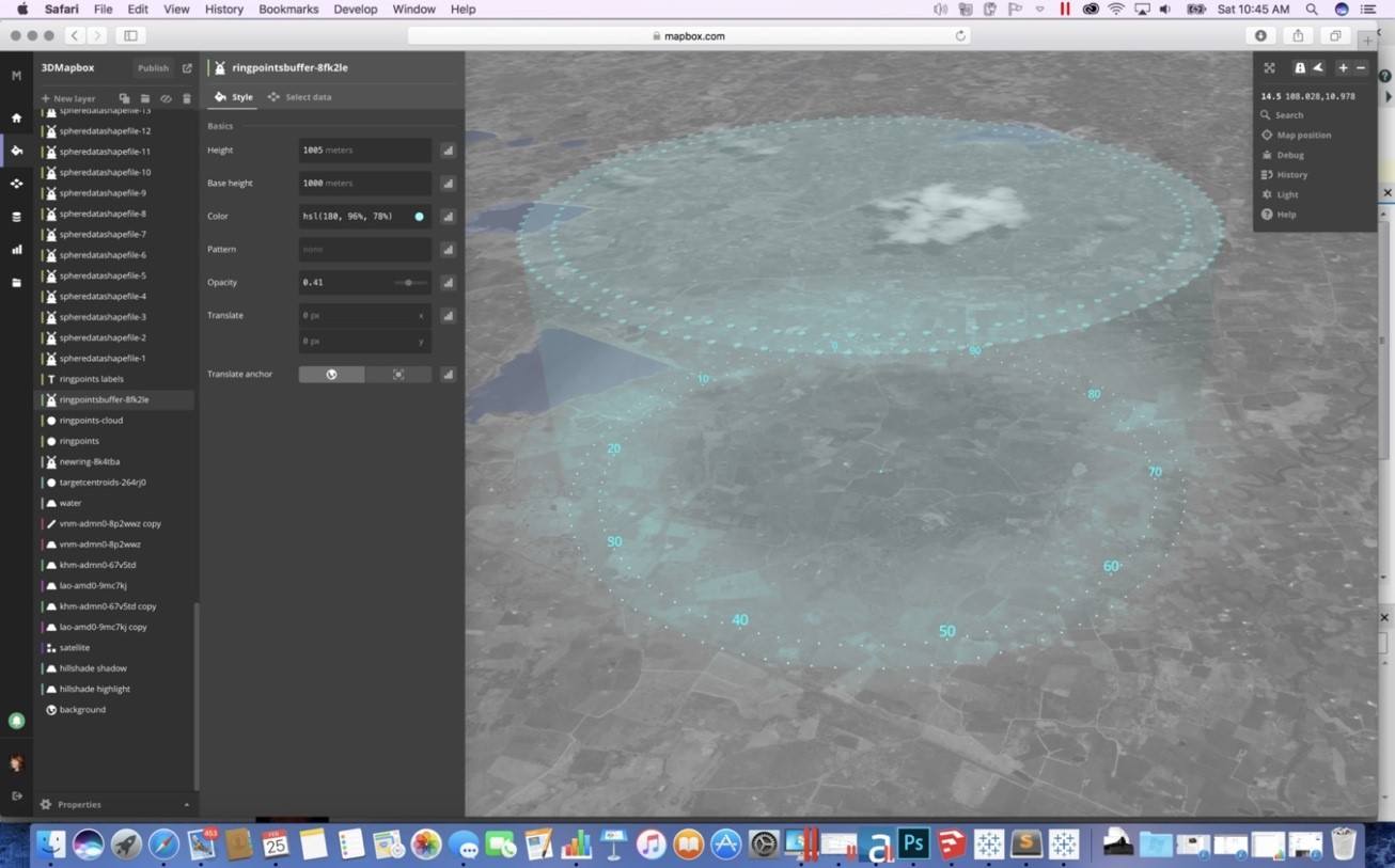
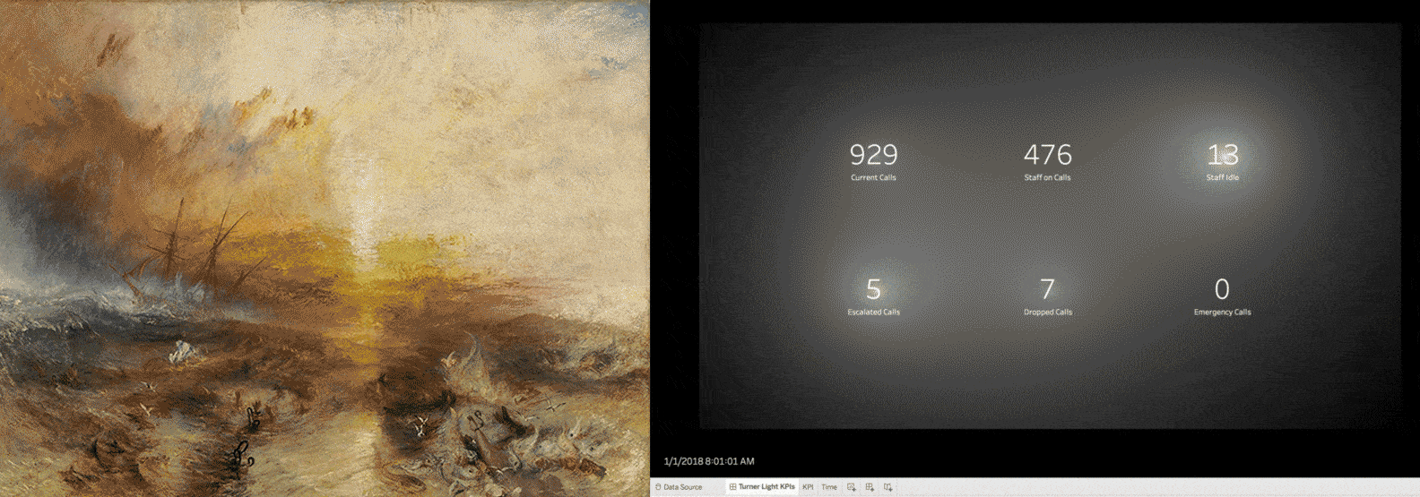
Tableau has allowed me to explore applying the work of an artist to data visualization. Inspired by JMW Turner’s magnificent brushes of light, I questioned if lighting could be a pre-attentive attribute. Could there be a “lighting” marks card?
A standard KPI dashboard usually has numbers in bold as the top row, with indicators of if this number is good or bad and perhaps a trend over time. While this provides a great overview of key metrics, I have no concept of the impact and relevance of the metric being up or down or off target a certain percentage. I wanted to use light intensity to show this impact and relevance.
As the dashboard updates live, I wanted to add the ambient lighting to focus the eye on the KPI whose value was the most relevant at the moment. Each of these values had to be considered relative to the relevance of the other metrics so that in the overall composition of the dashboard, the ambient lighting would be applied proportionally. This involved some brilliant Noah Salvaterra math.
On a more personal level, Tableau has allowed me to have the voice of introspection. I’ve taken a deeper look at my consumptive malaise, finding meaning and conflict while sifting through the mountain of banal objects that I interact with daily. I’ve pondered why I use so many things, why my wants outweighed my needs, and why I craved so many items that I would associate with being female-specific.
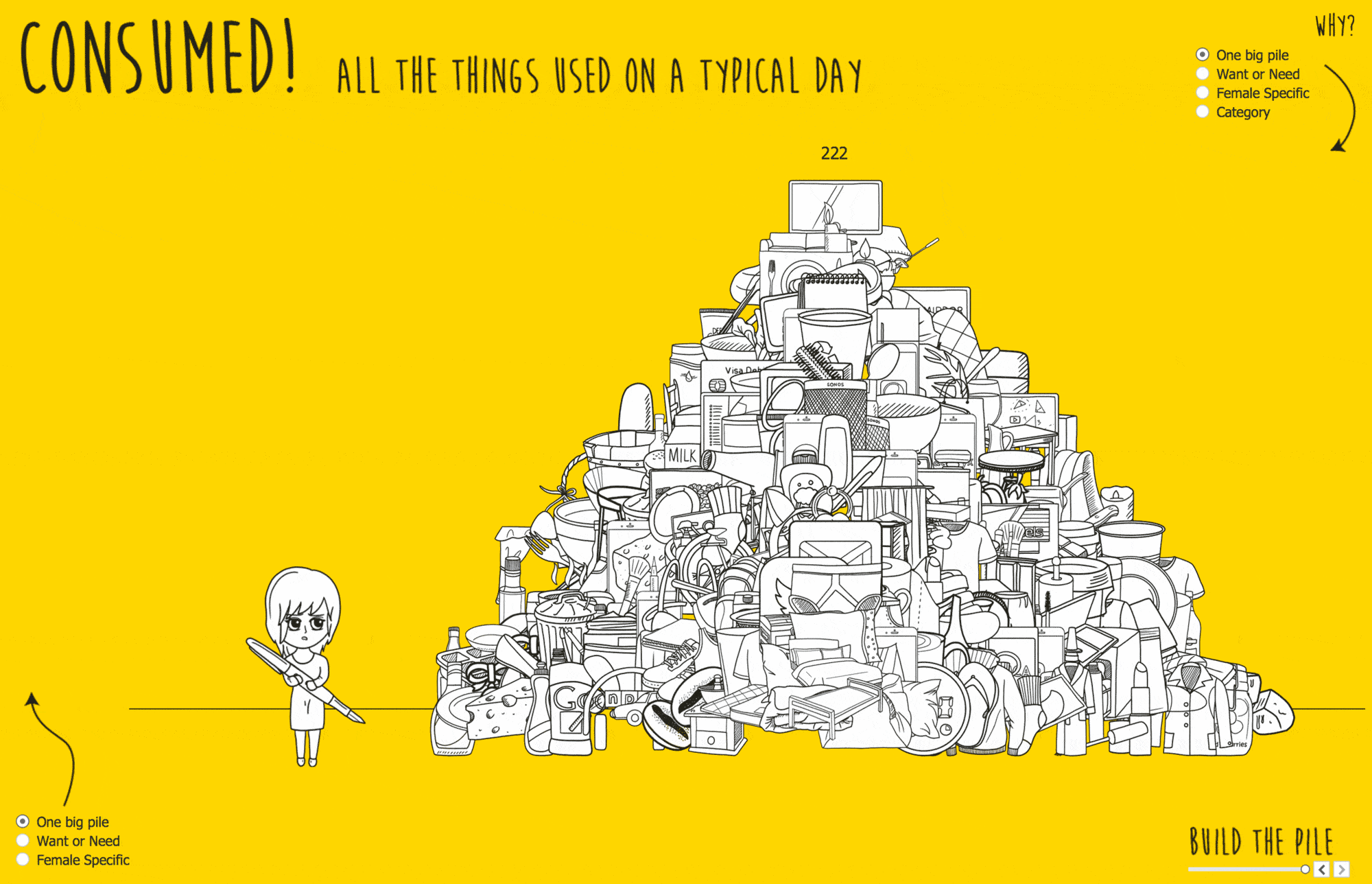
Tableau has given me the voice on an entrepreneur. More than eight years ago, I started DataBlick, a premier boutique data visualization consulting firm, specializing in Tableau. I have an amazing team that has included four Tableau Zen Masters, and a client list from Fortune 500 companies to small non-profits.
Tableau has allowed me to have the voice of a mentor, as I show young women that a career in data can be interesting and exciting. High school student Ruby Parish learned as an intern at DataBlick to build data visualizations with Tableau and her culminating project visualized crime data in San Francisco. Seeing and sharing crime data near her home and school was a powerful, albeit frightening, experience.
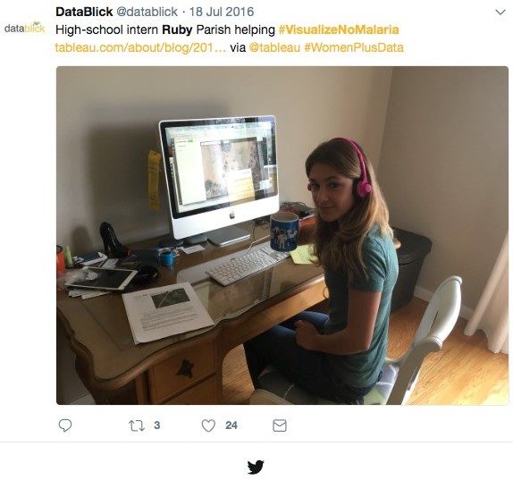
Tableau has also helped in my voice as a parent. My son Max, 12 years old at the time, had a science fair project where he wanted to test the efficacy of heat sensors to find (simulated) IEDs. Using a FILR camera, he recorded the heat image of a cell phone in increasing ambient temperature. He then used Python to convert the values of each pixel of the image to RGB values.
Max wanted a spectacular way to reveal his results, and using the work of Adam McCann and Merlijn Buit, he built a Tableau dashboard. We talked about the needs of scientists and engineers to communicate their results so others understand it and Tableau was Max’s voice in conveying his efforts.
Sharing #MyTableauVoice throughout the community
There is an amazing Tableau community who spent a few moments to reflect and share gratitude for the new voices that Tableau gave to them using the hashtag #MyTableauVoice. See a collection of their videos and tweets here.
Special shout out to: Mark Bradbourne,Chloe Tseng, Toby Erkson, Jonathan Drummey and Delilah Poupore, Cesar Picco, Brit Cava, Umar Hassan, Ann Jackson, Lee Durbin, Brittany Fong, Mike Cisneros, Philip Riggs, Eva Murray, Lilach Manheim, Emily Kund, Jeffrey Shaffer, Ken Black, Pooja Gandhi, and Eric Duell.
Thank you, Tableau!
Relaterade berättelser

Meet Iron Viz 2024 Finalist Jessica Moon
 15 April, 2024
DataFam Roundup: April 8–12, 2024
 12 April, 2024

Meet Iron Viz 2024 Finalist Pata Gogová
8 April, 2024
Subscribe to our blog
Få de senaste Tableau-uppdateringarna i din inbox.