How I overcame the vector map learning curve


When Tableau emailed asking me to build a viz for their website using the new vector tile mapping features in the 2019.2 beta, I was overcome with excitement—but also nerves. You see, the window to provide the viz was small, and although I’ve learned a ton in my short history of using Tableau, my maps have historically been simple, choropleth (AKA filled) maps. I’ve done next to nothing fancy with them. But the opportunity to have a viz published on Tableau’s website was not one I’d let go by the wayside, regardless of the challenge that was ahead of me.
At that time, I knew what a vector was, but I have to admit, vector tile maps were a complete mystery to me. To fill that knowledge void, I stepped into Jeff Shaffer’s office (he seems to know everything) and asked for his ten-minute tutorial on vector tile mapping. Of course, he did not disappoint.
The next step was to download the beta version and give it a try. I expected a steep learning curve, but much to my surprise, these new mapping features were so simple to use. Plus, they provided so many options—you could create hundreds of variations of your maps! What I found was that even a guy still learning maps could navigate these features easily, without much of a learning curve.
So here is a breakdown of vector tile mapping from the perspective of a mapping novice.
What are vectors?
Most image files contain pixels on a grid, whereby when you zoom in, the picture loses clarity. To see this for yourself, find a JPG of your favorite child (you might have more than one kid, but you know you have a favorite) and zoom in on that photo. The closer you get, the more pixelated the image.
Scalable vector graphics (SVGs), often referred to simply as vectors, don’t use this pixel-to-grid method. Vectors use equations to calculate the coordinates of each point in an image—more specifically, they use points, paths, lines, curves, polygons, etc. to render the image mathematically. In doing so, you are able to zoom as close as you like and never experience the pixelation you would with a JPG or PNG—the image remains as sharp as when it is zoomed out.
What are map tiles?
Okay, now that we know everything there is to know about SVGs (wink wink), let’s talk about map tiles. I won’t claim to be an expert on map tiles, so I’ll stay at a very high level.
Maps in previous versions of Tableau (and in many other applications) are basically positioned using different mapping tiles (essentially images, similar to a PNG) that fit together in a grid. Think about them as different pieces of a puzzle. Each zoom level comes with its own set of tiles. You’ve probably noticed this when you zoom in on a map, that the view becomes blurry as a new set of tiles loads. Continue to zoom in and you’ll once again see the view become blurry as those new tiles load. With each zoom, Tableau (or whichever application) is loading a separate set of mapping tiles.
While zooming, you may begin to see different features you did not see when zoomed out—like a street and street name. This is because of the separate tiles. When you zoom in numerous times, the features on the map (like a street) eventually become pixelated, like in a standard image file as we discussed above. When you reach the last set of mapping tiles, they start to degrade in clarity. You’ll also notice that labels, such as city names, get larger and larger on the screen, to the point where they are far too big to be of much use.
What are vector map tiles?
At this point, you can probably see where we are going. In version 2019.2, Tableau has introduced vector mapping tiles that use the same mathematical calculations to render their images as an SVG uses. So much like an SVG, when you zoom into the map, zooming is perfectly smooth. You don’t see any loading of tiles, there is absolutely no pixelation, and even the labels resize to perfectly fit your view. It is a thing of beauty!
Map styles and map layers
Alongside vector mapping tiles, Tableau has also introduced numerous new map styles and layers. In addition to Normal, Light, and Dark map styles, Tableau introduced Streets, Outdoors, and Satellite.
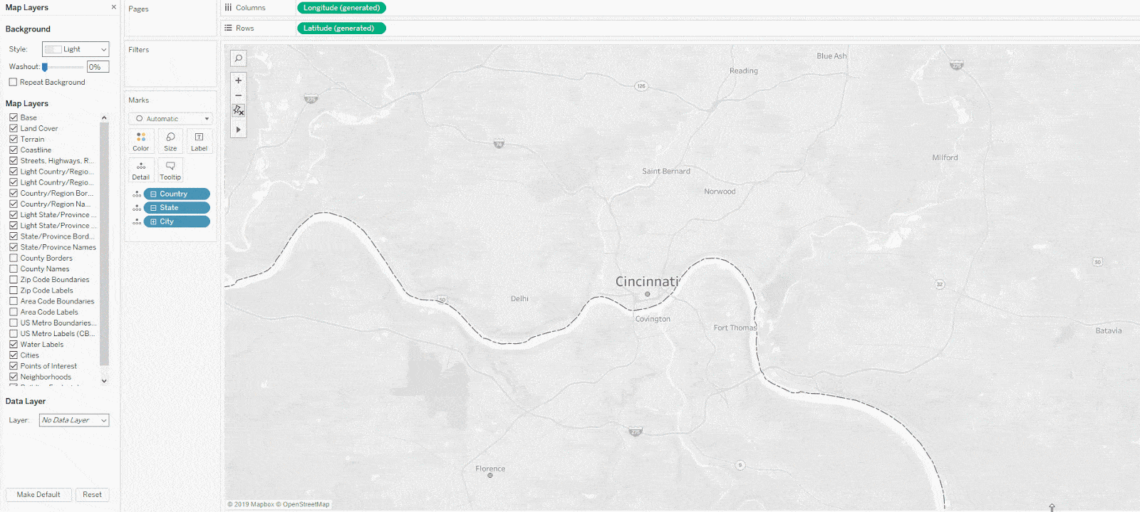
Tableau 2019.2 also includes a large number of new map layers including terrain, water labels, points of interest, neighborhoods, and my favorite—building footprints. In fact, here is my neighborhood, where you can actually see my house.
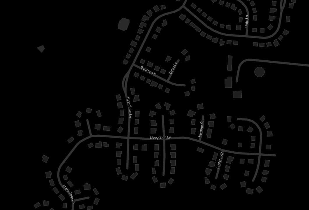
Now let’s take a look at my neighborhood in satellite view.
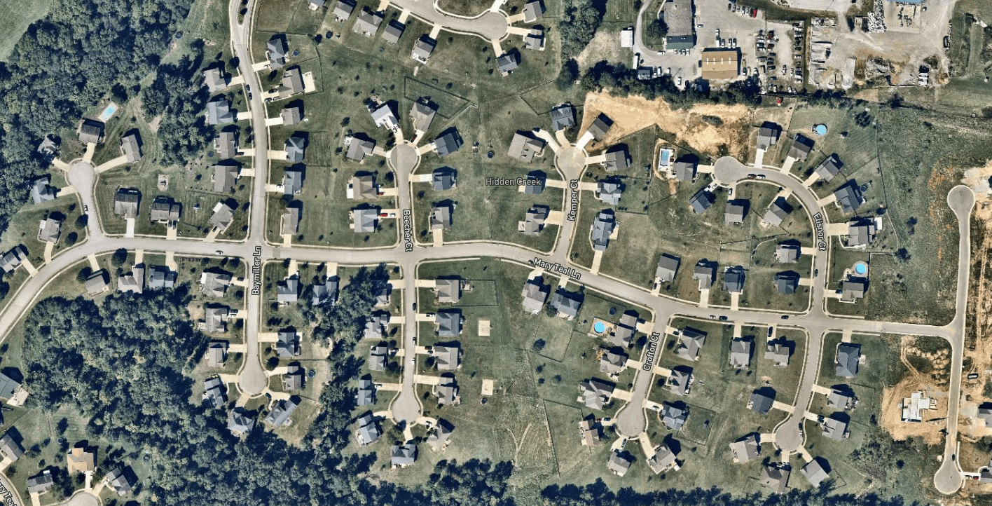
Wow! How amazing is that? No need to bring in a Google Maps web object—all you need to do is change the map style.
The combination of new map styles and map layers provides you with truly stunning maps in a seemingly endless amount of combinations and variations.
How I created the viz
When asked to do this visualization, I thought I would focus on my home town. But since nobody knows or cares about Burlington, Kentucky, I decided to venture north about 20 minutes and across the Ohio River to focus on Cincinnati, Ohio. I searched Cincinnati’s Open Data Portal for interesting data sets. I found several I liked, but then ran across one related to street segments. To be perfectly honest, it looked boring, but for some reason, I downloaded it and took a peek.
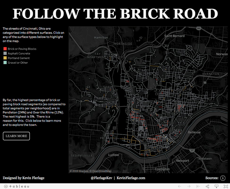
I used the data to connect points with lines to highlight all the street “segments” maintained by the city of Cincinnati. One data point referred to the street surface type (concrete, brick, etc.). Who cares, right? Well, what happened next is what makes Tableau and visual analysis so powerful. I categorized these surface types into broader categories, placed them on the color card, and noticed that most of the brick and paved stone streets were isolated to one area: the historic districts of Over the Rhine and Pendleton. In fact, when you look at the ratio of brick and paved stone street segments compared to the total within each neighborhood, by far, the highest percentage were in Pendleton (24%) and Over the Rhine (12%). The next highest was 5%. I decided to focus my visualization on this area, which was ranked as the most dangerous neighborhood in the United States just a few years ago, but has undergone a revival.
In doing so, I decided I would try to feature several of the new map styles and layers across multiple dashboards. The first was an overview which utilized the Dark map style, but incorporated many of the new map layers, including terrain, points of interest, and neighborhoods.
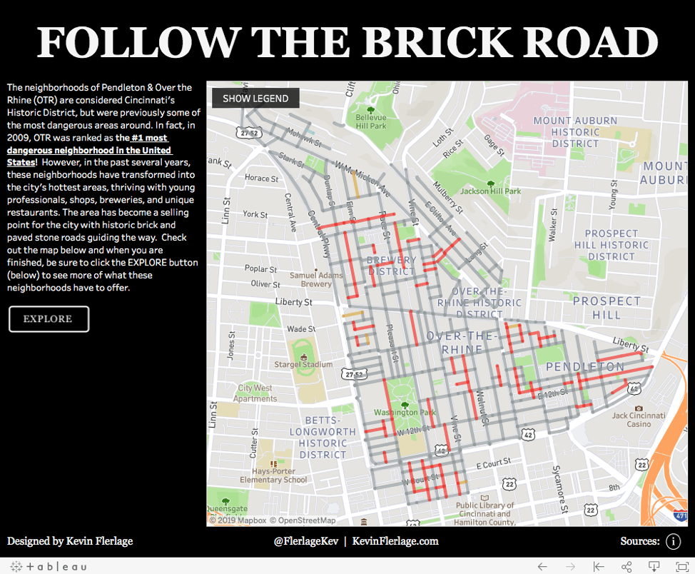
The second dashboard provides a closer look at Over the Rhine and Pendleton by providing information regarding its dangerous history and its revitalization. The map utilizes the Street map style along with numerous new map layers, such as building footprints. In this map, you can easily see the frequency of these historic brick and paved stone streets.
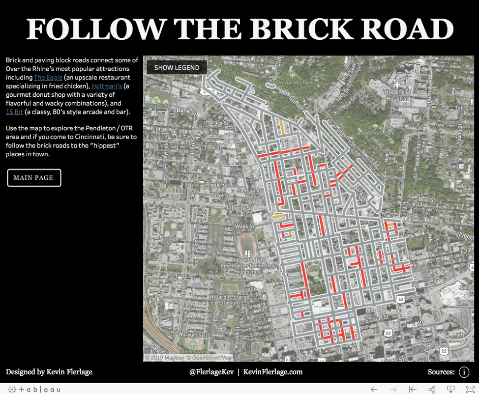
The third dashboard provides a more granular view, diving into the popular niche restaurants and establishments that have come about due to this rebirth. The map provides a satellite view (using the Satellite map style) so that you can zoom in to actually see the building and attractions. Movements are seamless as you zoom and pan around the map.
The full visualization can be found here. And I also developed an alternate version that provides a different variety of styles and layers as and also utilizes parameter actions (another amazing feature in 2019.2). You can check out this version here.
Wrap-up
Even though I still have a long way before I’ll claim any expertise with maps, the truth is, the new mapping experience in Tableau 2019.2 came with little learning curve. The combinations of map styles and map layers offer seemingly endless combinations and variations. These new map features allow you to provide gorgeous maps without exiting the platform. I sincerely recommend that you go out and give it a try immediately—you’ll love it!
Relaterade berättelser

Visualizing Women's Impact to History Through Data Visualization
 18 Mars, 2024

Behind the Viz: Adrian Zinovei Helps You Design Your Next Dashboard
1 Mars, 2024

Charting the Heart: Data Visualizations on Love
 14 Februari, 2024
Subscribe to our blog
Få de senaste Tableau-uppdateringarna i din inbox.