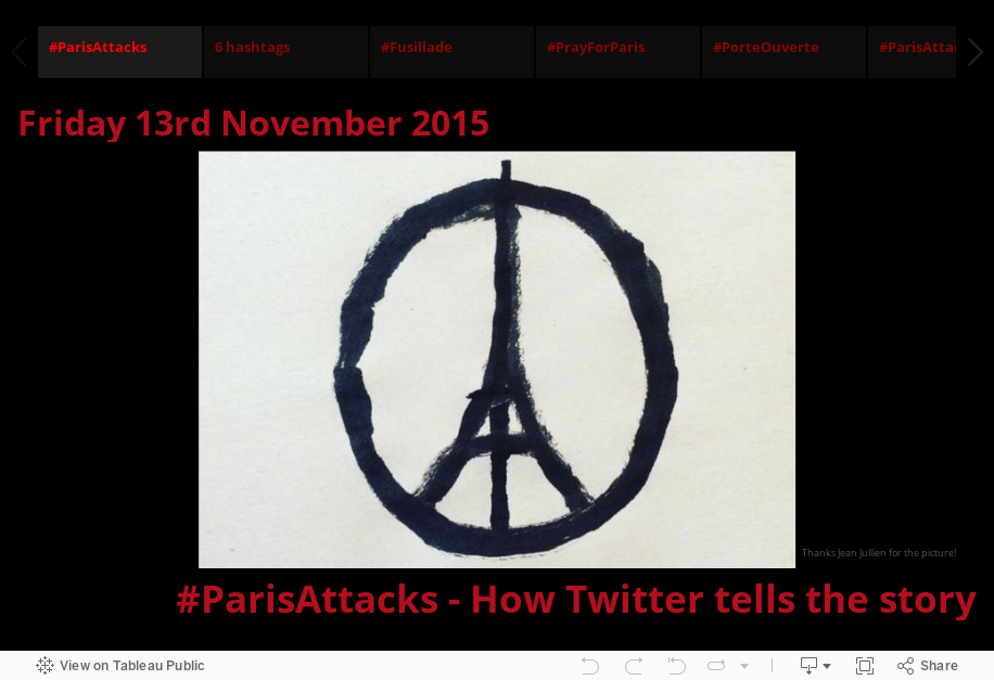
#ParisAttacks: How Twitter Tells the Story


Note: This is a guest post by Tableau Zen Master Jonathan Trajkovic in Paris.
This is an analysis of Twitter hashtags over the weekend following the terrorist attacks in Paris. I chose to try to tell the story with Twitter's data. I used the website talkwalker.com to get the data. The data set is aggregated by the hour starting on Friday, Nov. 13.
Why This Data Visualisation?
I made this data visualisation because I was really moved by all these attacks. The victims were in my age group. I live in Paris Xe, so it was in my neighbourhood. And I love going to concerts, and drinking a beer with friends. So this was a way for me to pay tribute to the victims.
Why This Data?
I chose to use aggregated data because I did not have so much time. But I was really interested in row data that showed geolocations and users. I was also interested in retweets and bookmarks. In fact, I would have loved to have the details of each tweet. But as I mentioned before, I did not have so much time.
Why a Red Color Palette?
It was difficult for me to choose a design. I tried different palettes but none was quite right. When I tried the red palette, I said to myself, “Wow, this is really aggressive,” and I thought about it for a long time. I chose to use this even if it is aggressive because, indeed, #ParisAttacks were really aggressive.
When my colleagues and friends looked at my visualization, they told me that there is too much red and it is aggressive. I told them that it is the aim of red palette. I want readers to have the same feeling than me about #ParisAttacks. Apparently, it is working.
Why Use Story Points?
First I tried to make a one-page visualization. But when I looked at the data and how hashtags move, I saw that telling a story could be a good solution. So I used Story Points to show the various hashtags that followed the events of Friday night.
Feel free to leave a message or a note about this work.
For more works by Jonathan, visit his blog, Tips&Viz.
Subscribe to our blog
Få de senaste Tableau-uppdateringarna i din inbox.