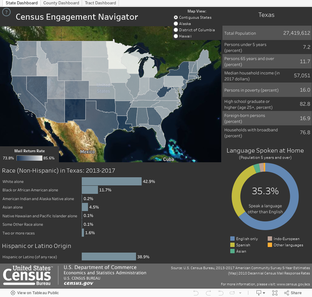
Explore nationwide US census engagement
This interactive, data visualization allows users to quickly understand what areas of the country had high or low return rates in the 2010 census, and the current demographic makeup of these neighborhoods. Begin by hovering over a state to see the 2010 Census Mail Return Rate appear within the tooltip, next click on a state to engage the surrounding charts and graphs, then follow the prompts within the tooltip to discover more.
Learn more about the Census Engagement Navigator here or explore other government-related data visualizations on Tableau Public.
Create and share on Tableau Public
Join the newsletter and find daily inspiration with the Viz of the Day. Yours could be featured next!
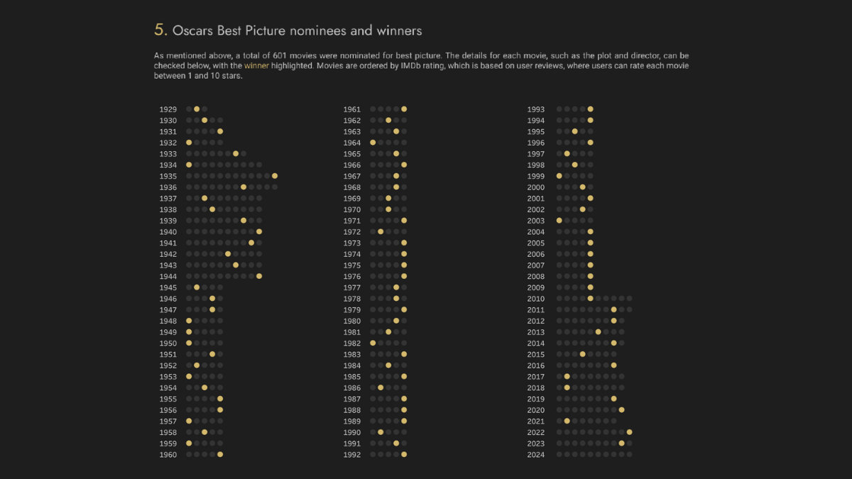
Best Picture 1929-2024
Film awards data never looked so good. Delve into cinematic excellence with Krzysztof Bieniek’s #VizOfTheDay—featuring 601 Best Picture nominees. Explore film awards since 1929 with this #DataPlusMovies entry.
Interact with the viz