Data Visualizations as Art


This winter Tableau hosted Vizzart, a competition for Tabloids to display their best non-analytical vizzes as art.
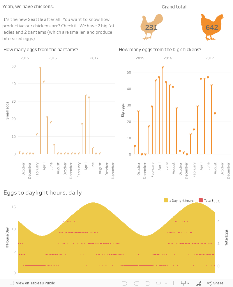
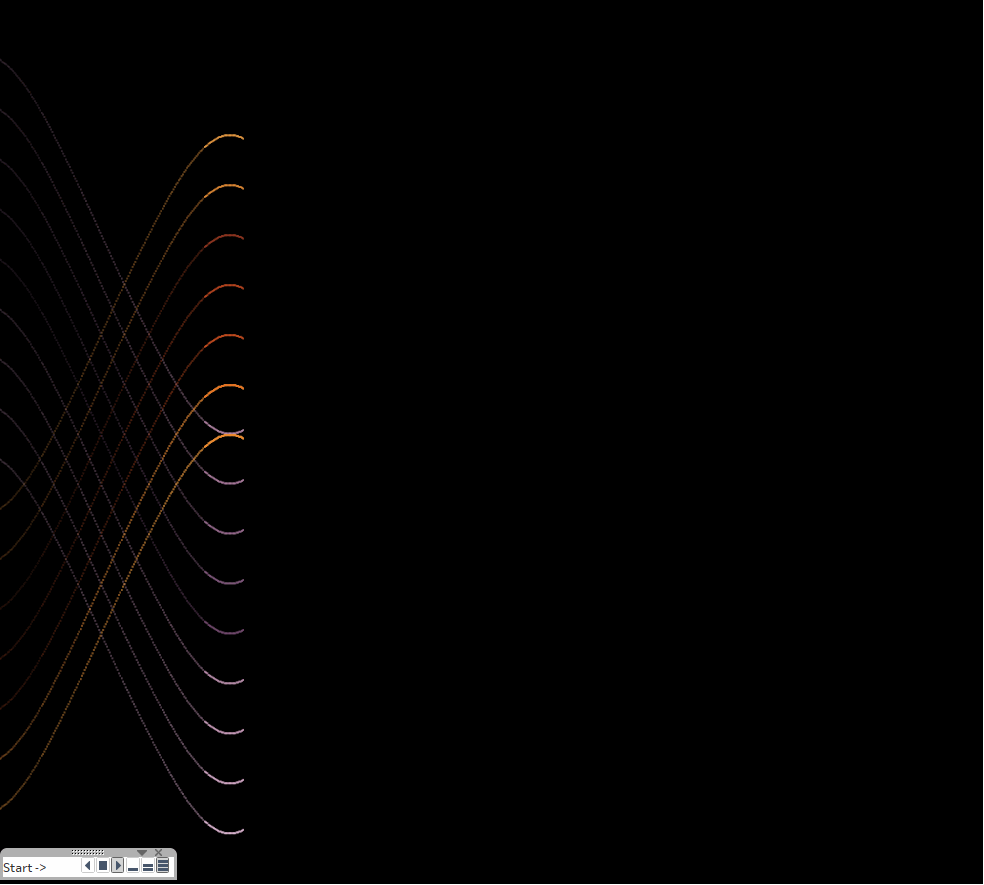
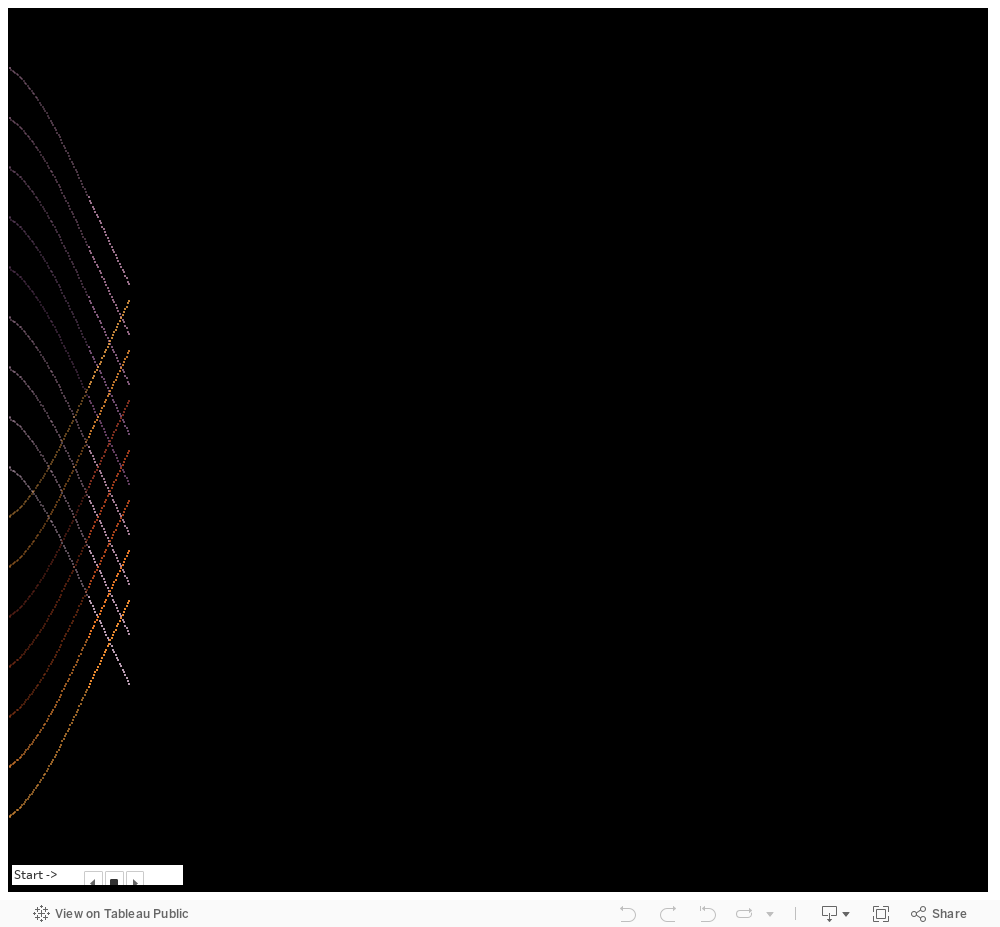
For me, it all started with a sine wave. I'd been tracking our chickens' egg production against hours of light, and I plotted this on a chart.
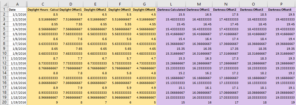
I loved that curve and I opened Excel to look a little closer at the difference in the values each day. Using that column's data as the foundation, I created new columns by adding and subtracting values. Taking it a step further, I subtracted the daylight hours from 24 and got the corresponding darkness hours. I created multiple columns of darkness using the same intervals I used to create the light columns.
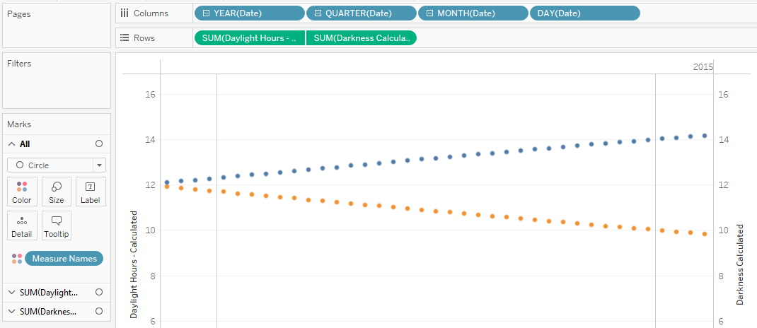
Then, I brought all of this into Tableau and created a chart with circles as the marks along a time axis.
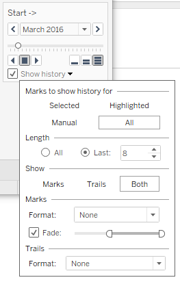
Because I had the light and darkness hours (and all their variations) with corresponding dates, I knew I could use the pages shelf to do something fun.

Now I was getting somewhere. I removed all of the grid lines, axis markers, titles, tooltips...everything except for the light and dark marks. I played a bit with the background colors and with the colors of the marks and I moved everything onto a dashboard. I made a few more adjustments to the pages to show history (and trails) and fade-out.
Here's a GIF of the result, and what would appear if you download the Tableau workbook and play the animation at full-speed.
I didn't have a plan when I started. I simply followed my gut, and to my delight I made something kind of neat and completely unexpected.
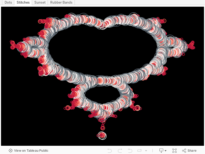
Turns out I wasn't the only one who started out wandering through a field of math. Here are some of the other submissions, along with a short explanation of how they were created. Each of these can be downloaded along with their data sets so you can explore them too!
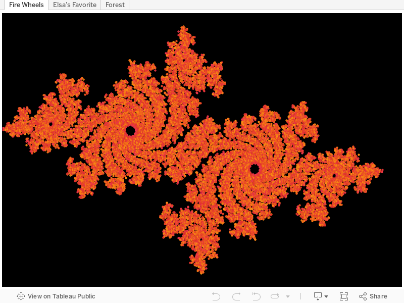
Leo Newman
I wanted to see what a fractal would look like in Tableau. I created a dataset that includes x and y coordinates and the values associated with them from the Mandelbrot set. Then I used shapes to plot all the values. I found that the majority of the variance was when the value was between 27 and 255 which provides a very distinct outline. I then played with the different shapes, sizes, and colors to produce some images that I found to be interesting.
Download Leo's Mandelbrot data set from Dropbox (35MB)
Leo also experimented with a Julia set, which he also made into a viz. The technique is the same as with the Mandelbrot set.
Download Leo's Julia data set from Dropbox (11MB)
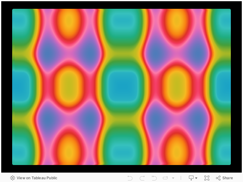
And just in case you think two was enough, Leo also made this fantastic rainbow plasma viz. I'm not sure how he did it, but it is mesmerizing!
Steven Pestana
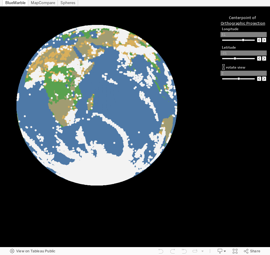
To create Blue Marble in Tableau, I used a python script to extract and bin color values from a composite satellite image of Earth with a resolution of one pixel per degree (latitude and longitude). These spherical coordinates were transformed to 3-dimensional Cartesian coordinates with an orthographic map projection. Parameters in the Tableau workbook define the center point of the projection and allow the viewer to rotate the globe. Additionally, I applied the spherical coordinates to a Wagner IV map projection for comparison with Tableau’s Web Mercator and my orthographic projections (areas visible in the orthographic projection are ‘illuminated’ in the other two).
Steven wrote an extensive how-to blog post about his art, and he's made all of his material available via github.
Didier Valat
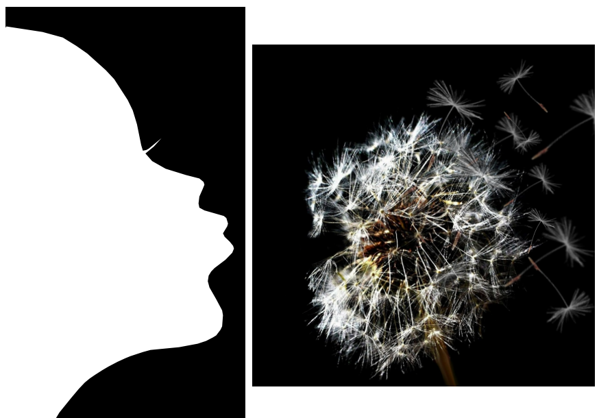
The aim of this viz was to create a poetical design and try to give hope to people. Indeed, the viz can be summarized as: "Always believe in your dreams."
I made a dashboard composed of 3 sheets.
- Sheet 1: the graph is composed of only one shape which has been done using polygons. The polygons are bound using the “Path” option in Tableau so the points are ordered in the Data source.
- Sheet2: a graph with a picture in background of the data source + shapes in (X,Y) coordinates and each shape represents a pappus (I have placed randomly on the right of the picture to have this "blow effect")
- Sheet3: a graph with shapes (X,Y), each shape represents a pappus and I have placed them (I played also with X & Y axis) in order to display the word "DATA"
Download the three text files Didier used to create his art.
Didier's viz was a little wide to show in this blog post, but I want to give you a preview here, and encourage you to open it up in full-screen. It's lovely.
Ken Schiele
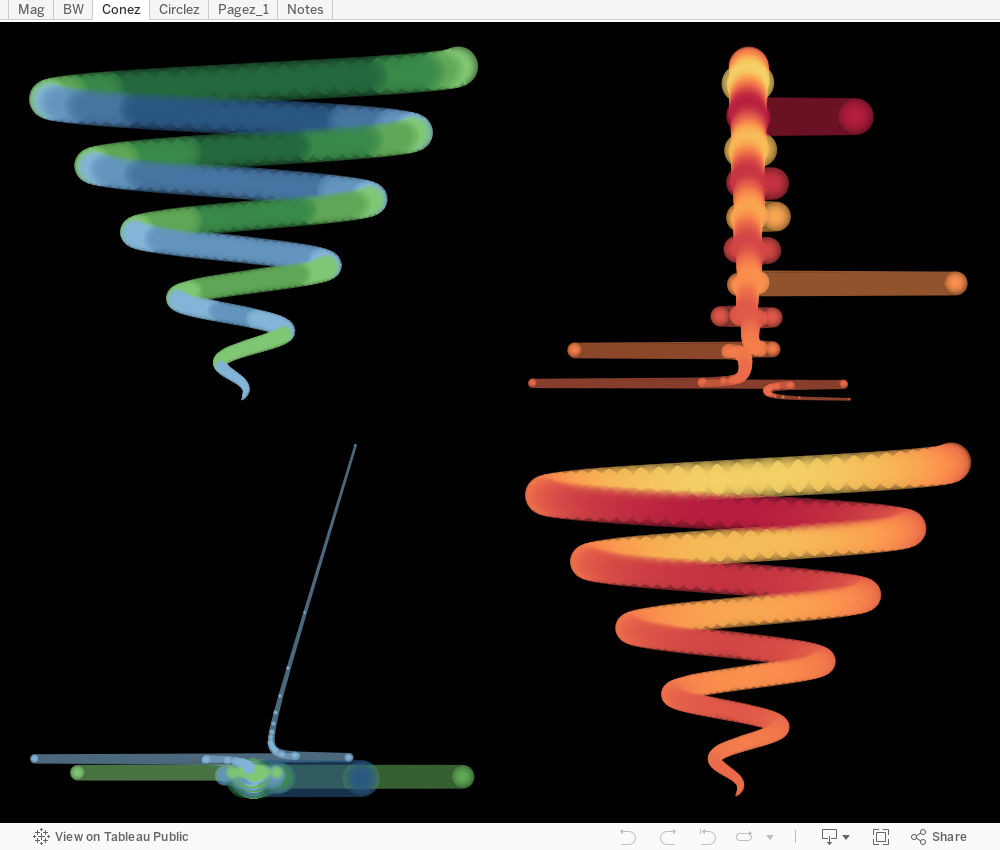
In this workbook, I used SIN() and COS() functions to make a spiral shape, then found some interesting gradient marks to use with customer shapes to make the ‘blurry’ views. I have used a similar dataset for building/testing analysis built in Tableau; the more I have worked with it, the more I have noticed there are some neat images to be made, not just useful ones. So – here it is. I did not spent as much time working on the color selections as I would have liked to, so I grabbed some that @VizCandy posted on her blog.
Download Ken's Excel file that he used to create his artwork.
Keep your eyes open for another blog post in two weeks with detailed how-to instructions on another Vizzart submission. You won't want to miss this one!
Histórias relacionadas

Meet Iron Viz 2024 Finalist Jessica Moon
 15 Abril, 2024

Meet Iron Viz 2024 Finalist Pata Gogová
8 Abril, 2024

Student to BI Analyst, How Tableau Can Lead to a Successful Data Career
 20 Março, 2024
Subscribe to our blog
Receba em sua caixa de entrada as atualizações mais recentes do Tableau.