Where Did All the Boris Bikes Go?


Editor's Note: Jonathan MacDonald is a Tableau and Alteryx consultant working for The Information Lab in London, England. In this #TravelMonth blog post, Jonathan shows how he quickly and easily turned raw data about Boris Bike usage into visual insights about London's tube strike transport meltdown.
On Monday 6th July news broke that London Underground (aka The Tube) drivers and station staff were going to strike for 48 hours that very week in a dispute over the introduction of the night tube, the new 24-hour tube service being introduced in September.
The strike started on Wednesday 8th July at 6pm, but the effects were evident hours before that, as office workers in Central London all left work early to try and get one of the last trains home. Stations were overcrowded and starting to shut shop from as soon as 3pm. The strike continued through all of Thursday and service only resumed on Friday morning 10th July.
As an aside, this just happened to coincide with an event called the Tableau on Tour London Conference, which saw many attendees ducking off right after the closing keynote to make their way back home, rather than sticking around in the pub next door for a few drinks, as is typical after the UK leg of the conference.
Not being one to forgo the opportunity of a few beers, I stuck around in the pub after the conference, and took my chances to try and make my way home later on the evening once – I hoped – things would have calmed down sufficiently to afford an Uber home without having to pay 3x inflated prices.
On my way home I was surprised to see loads of empty Boris bike stations around the City, which is what led me to throwing together some very quick vizzes which over the weekend turned into the story that you see below.

To those of you not familiar with London’s two-wheeled transport options, ‘Boris bikes’ are what we affectionately call Transport for London’s (TFL) Cycle Hire scheme, although they’re currently sponsored by Santander Bank, so I think technically we’re supposed to call them Santander Cycles. They’re called Boris bikes after Boris Johnson, who was (and still is) the rather flamboyant Mayor of London at the time the scheme was launched.
Since I’ve made use of the story points feature, I’ll let the viz speak for itself, suffice to say that London experienced a massive shortage of Boris bikes during the strike, as commuters checked them out of bike stations, took them home, and cycled them to work and back for a couple of days!
I thought I would highlight a couple of techniques I used, as I have had a few questions about them since:
Figuring out what is Central London
This was one of the hardest parts of the whole process! Initially I started by hand-drawing around a number of stations in what I believed to be the centre of London. I used the fantastic new free-form lasso tool which is new to mapping in Tableau v9 to circle all these points and then create a group from them:
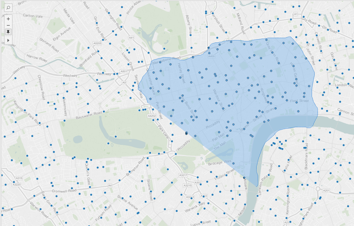
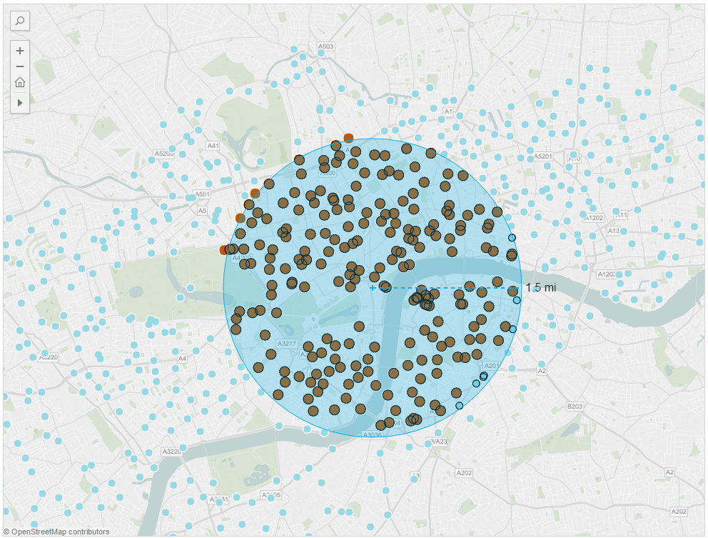
Googling then revealed that there is actually a common definition for the centre of London which is used in mapping when calculating distances in miles to London. It is the Charles 1st Statue in Charing Cross. With the help of the new radial lasso tool, I then redrew my selection to create a circle of points around the Charing Cross roundabout, to a finger-in-the-air radius of about 1.5 miles (Editor's note: notice the new distance read-out with the radial select map tool! This is a early release to Public of a Tableau 9.1 feature that applies to maps at zoom level 8 or higher.)
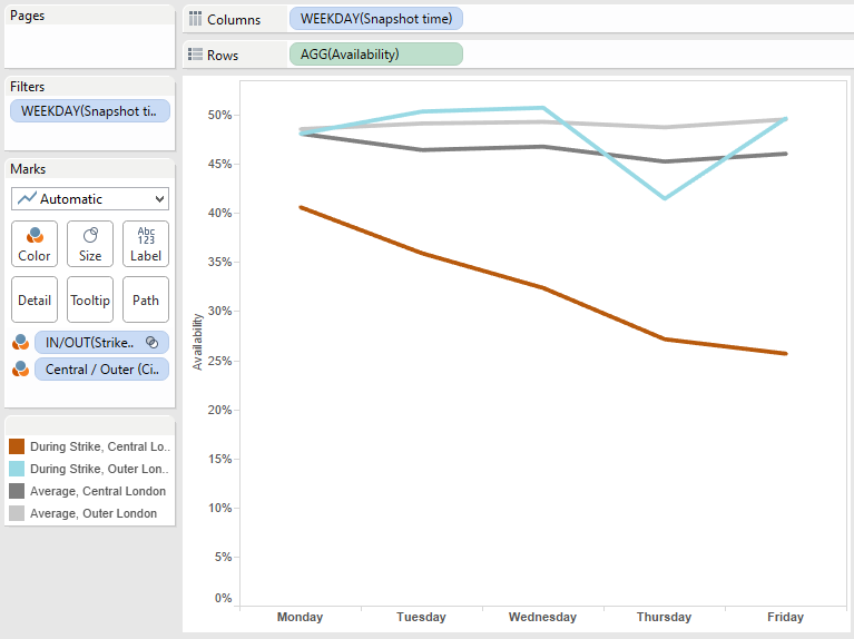
Weekday average availability using sets and multiple dimensions on the colour shelf
To enable a comparison of the availability of the bikes during the week of the strike versus the average availability at all other times, I created a set based on the date dimension that kept only members during the week. This allowed me to show members in and out of the set as separate lines on the chart. Another handy trick was to put both the In/Out set dimension on the colour shelf as well as the Central/Outer London dimension, which allowed me shade each line separately, to distinguish the overall average lines (in grey) from the strike week lines (coloured for central and outer London).
Snagit / YouTube trick to animate the viz on the last slide
It’s pretty simple really; I used Snagit which is a screen-capture tool to record a brief video of the dashboard playing through the Date dimension which I put on the pages shelf to cycle the map to show bike availability changes over time. I’m sure you can use any other kind of screen capture software to do this too. I then uploaded the resulting mp4 video to YouTube.
Finally I embedded the YouTube video into a dashboard as a webpage, which help from someone’s helpful blog post on the subject. The tricky part here is to get the sizing and the YouTube URL parameters right so that the video plays correctly. In short:
- Use the ‘&autoplay=1’ URL parameter to start the video immediately
- Use the ‘&vq=hd720’ parameter to play it in HD – the standard resolution was very poor
- The full URL looks like this – note all the additional parameters in bold:
- https://www.youtube.com/embed/arVG2tTNlSQ?rel=0&controls=0&showinfo=0&autoplay=1&vq=hd720
- When sizing the dashboard with the embedded video for your story points, use the ‘Fit to (dashboard name) to the (story points name) story points size’ option, which is right at the bottom of the Dashboard size drop-down menu
As a subject, travel and transport is so interesting to visualise, not least because there’s usually always an opportunity to use the mapping features of Tableau but there are also loads of publicly available datasets. This particular dataset is sourced directly from an open data feed provided by Transport for London’s API, which you can learn more about here: https://tfl.gov.uk/info-for/open-data-users/
Histórias relacionadas

Meet Iron Viz 2024 Finalist Jessica Moon
 15 Abril, 2024

Meet Iron Viz 2024 Finalist Pata Gogová
8 Abril, 2024

Student to BI Analyst, How Tableau Can Lead to a Successful Data Career
 20 Março, 2024
Subscribe to our blog
Receba em sua caixa de entrada as atualizações mais recentes do Tableau.