Analyzing the history of Tableau innovation


Innovation is necessary to use data effectively in the pursuit of a better world, particularly because data continues to increase in size and richness. Tableau has been helping people and organizations to see and understand data for almost two decades, bringing exciting innovations to the landscape of business intelligence with every product release.
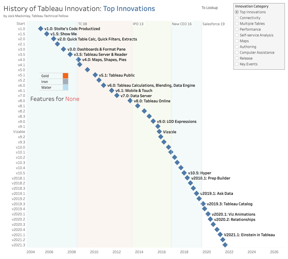
I am proud to announce that my History of Tableau Innovation viz is now published to Tableau Public. This allows you to explore features spanning more than 40 Tableau releases, including links to release documentation.
In this blog post, I'll describe my analysis of Tableau's history to drive analytics innovation—in particular, I've identified six key innovation vectors through reflecting on the top innovations across Tableau releases. And with this work, I invite discussions about this history, my analysis, and the implications for the future of analytics.
Navigating the History of Tableau Innovation viz
The history view shows Tableau releases with diamond marks placed on a temporal x-axis. Release v1.0 (April 2005) is in the top left corner. Four reference lines on the x-axis indicate key events in Tableau’s almost two-decade history:
- The first Tableau Conference in 2008
- IPO in 2013
- Adam Selipsky becoming CEO in 2016
- The Salesforce purchase in 2019
A diamond mark can be selected to list the features in that release, and selecting a colored square in the feature list will open release documentation in your browser. The colors describe my rating of each feature on an innovation scale that I invented when I built this dataset—Gold, Iron, Water. Please note that I was not rating importance—for example, the MacOS port was important but not particularly innovative. That said, I want to hear about errors in this data set and how you would rate features.
The innovation category radio widget in the top right of the history view describes my analysis. This radio widget controls the text labels of the release diamond marks. I identified these top innovations by reflecting on Tableau’s history and reviewing the Gold-rated features that I had identified as I built the feature data set.
Before we dive into the six key innovation vectors, we’ll revisit the origins of Tableau. Then, we’ll end with my observations of two lessons for future analytics innovation.
The people and technology behind Tableau’s origin story
Tableau co-founders: Three guys at Stanford with a passion for data
Tableau was born at Stanford by PhD candidate Chris Stolte under Professor Pat Hanrahan, along with the third co-founder, Christian Chabot, who was in the room at Chris’ dissertation defense in 2003. Chris had earned an undergraduate computer science degree from Simon Fraser University and had worked as a database-oriented software engineer. Pat, a full professor at Stanford in the area of computer graphics, had won Academy Awards (Oscars) for his famous invention of a domain-specific language called Renderman while he was one of the early employees at Pixar. Christian had earned a Stanford MBA and had done a prior start-up with Chris on automatically generating maps to help people navigate.

I believe I was the only other person in the PhD defense room who became a Tableau employee. I was a member of Chris’ dissertation committee, having done a Stanford PhD on automatic design of graphical presentations that Chris had used in his dissertation. I did not realize as Chris demoed his prototype PhD system that it would become Tableau Desktop, a product used today by millions of people around the world to see and understand data, including in Fortune 500 companies, classrooms, and nonprofit organizations.
Tableau’s initial office was in the back of a failing dotcom company in Mountain View, California, before Chris and Christian moved to Seattle where they both had family connections. In 2004, Tableau got both an initial series A of venture funding and Tableau’s first OEM contract with the database company Hyperion—that’s when I was hired. Incredible growth started in 2005 with the company roughly doubling in size every year until 2015. The first Tableau customer conference was in 2008. Tableau had its IPO at the NYSE with the ticker DATA in 2013. Chris and Christian stepped out of operational roles when Adam Selipsky became CEO in 2016. The Salesforce acquisition in August 2019 ended the Tableau board and the last formal Tableau roles for Chris, Pat, and Christian.
VizQL: A domain-specific language for visual, self-service analysis
The core innovation in Chris’ prototype was a domain-specific language called VizQL that combined query and visual encoding of data. VizQL was fundamental to Tableau’s success and much of Tableau’s subsequent innovation. Query allowed customers from a broad range of industries to connect to clean useful data found in SQL and Cube databases. The prototype could connect to multiple data sources at the same time—a precursor to Tableau’s investments in data federation. Visual encoding allowed people to quickly understand data through visual comparison rather than the mental math needed for grids of numbers. Even modern machine learning applications should use visual encoding to explain data to people.
VizQL’s visual encoding, in particular, supported a drag-and-drop user experience that allowed users who did not have query skills to focus on the data fields relevant to their tasks while exploring a fusion of the most useful 2D view types. Although 3D views are useful in some industries, Chris and Pat focused the prototype on 2D views because 3D only adds one additional visual-encoding dimension while introducing major usability issues including orientation, occlusion, and navigation.
The key breakthrough of VizQL and the prototype was supporting the flow of analysis with a user experience that had three key properties:
- Fields first: Answering questions from data needs to start with the relevant data, which can then be visually encoded to exploit the power of the human visual system.
- Incremental construction: VizQL’s fusion of the most useful 2D views, allows people to transition from simple to more complex visual encodings as they deepen their analysis.
- Immediate feedback: This helps people to manage their analysis even though working with data is cognitively challenging.
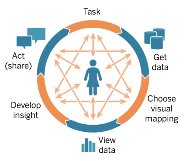
The combination of these three properties enables self-service analysis where people who know their business and the associated data can answer their own questions. The following Cycle of Visual Analysis describes the rich backtracking process of self-service analysis. This diagram is based on studies of people doing data work that was done by the Xerox PARC team that I was working with when I was on Chris’ dissertation committee.
Six Tableau innovation vectors driven by VizQL
VizQL’s powerful combination of query and visual encoding led me to the following six innovation vectors in my analysis of Tableau’s history:
- Falling under the category of query, we’ll discuss connectivity, multiple tables, and performance.
- Clustered under visual encoding, we have topics of self-service analysis, authoring, and computer assistance.
Let’s take a look at each.
Query innovation
1. Connectivity
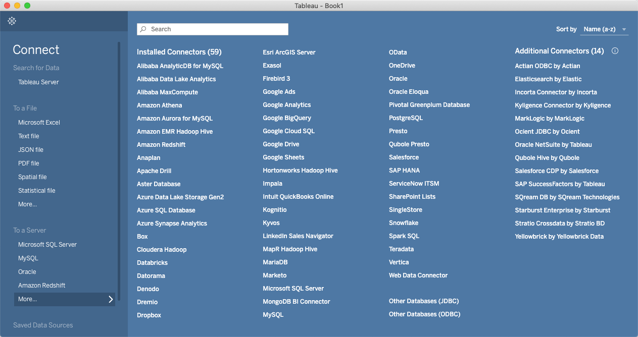
Connecting to data is fundamental to all data work, which is why “get data'' is at the start of the Cycle of Visual Analysis. With the proliferation of data, there are countless data sources and an increasing number of analytical use cases. Dashboards can help people find data sources relevant to their data work because the visual encoding taps the power of the human visual system. Tableau’s connectivity history, which is shown with the “connectivity” choice in the innovation category widget, indicates people work with both structured and ad hoc data sources.
For example, Tableau’s release v1 (April 2005) connected to structured data in SQL databases (MS Access, MS SQL Server, MySQL) and the two major cube databases (Hyperion Essbase and MS SSAS). Release v1 also connected to Excel and CSV files, which are often used in ad hoc ways. Connecting to both types of data sources was essential to Tableau’s success. The “connectivity” choice shows that we have added new data sources and/or updated existing connectors in almost every Tableau release. One important moment in this connectivity history is with JSON in v10.1 (Nov 2016), which typically falls between structured and ad hoc where users need to pull out the structure appropriate to their specific task.
2. Multiple tables
Although a single data table can be sufficient for many tasks, deeper analysis often involves multiple tables, including explorations that bring in additional data sources. However, joining tables requires data skills that many people who know their business do not have—which is why Tableau continues to prioritize single-table analysis. The multiple table innovation vector, which is shown with the “multiple table” choice in the innovation category widget, is a story of adding multiple table support while still helping a broad set of people see and understand data.
Release v1.0 (April 2005) could connect to multiple tables, including database views that joined data tables together. However, each sheet could only use a single table. The ability to join tables in Tableau was added in v2.0 (June 2005) with both a dialog and the RAWSQL function in the calculation language. Working with multiple tables got a significant boost with cross data source actions in v5.0 (May 2009). Since users who do not understand joins still need to work with multiple tables, Blending was added in v6.0 (Nov 2010), which allowed users to drag and drop multiple tables on one sheet. The visual encoding allowed domain experts to immediately see that blended data was inappropriate, which is why Blending was useful to people who did not understand joins.
The Data Tab was added in v8.2 (June 2014) to give people who understand joins a better experience than a dialog. The Data Tab was integrated with the connection experience and supported the scenario of adding additional data sources during exploration. The multiple table vector took a significant step forward with Tableau Prep, a new product added in Tableau 2018.1 (April 2018), which focused on users who do understand joins and curating federated data sources. Relationships in Tableau 2020.2 (May 2020) shifted sheets to a multiple-table data model, where the sheet’s fields allow the computer to write much more efficient queries to the data sources.
3. Performance
Performance is a perpetual issue because data continues to grow in size and richness. In particular, the user experiences discussed next in the visual encoding section are significantly impacted by lag and other performance issues. There are two key approaches for addressing these performance issues: faster data computation and UX innovation to help people cope with long running data computations. Both are illustrated in v1.0 (April 2005)—connecting live to databases allowed customers to access their fast data computation investments and Pause Automatic Updates allowed the user to do a bunch of drag-and-drop before running slow data computations. The “performance” choice in the innovation category widget contains both approaches.
A key early feature was Extracts in v2.0 (June 2006), which allowed users to maintain live connections to their database, extract the data to work offline, or seamlessly switch between the two. Another key data computation moment was Hyper in v10.5 (Jan 2018), which supercharged Tableau extracts with an in-memory data engine technology, designed for fast data ingest and analytical query processing on large or complex data sets.
Visual encoding innovation
4. Self-service Analysis
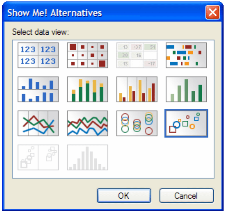
VizQL introduced a user experience where people who know their business and the associated data can answer their own questions, offering an important step forward in the democratization of data. Visual encoding, in particular, tapped the power of the human visual system. However, most people in 2005, including analysts, did not know how to visually encode data effectively—which is why my dissertation on automatic presentation was productized with Pat’s help in v1.5 (Oct 2005) with a feature called Show Me. Automatic presentation similar to Show Me was used in more recent features, including Ask Data in Tableau 2019.1 (Feb 2019) and Explain Data in Tableau 2019.3 (Sept 2019). (See the “self-service analysis” choice in the innovation category widget.)
Most data work involves many fields. Single views become complex as they encode more data fields. Academic visualization researchers have found that many fields are most effectively visually encoded with multiple views on a canvas with coordination between the views. The Dashboards feature was released in v3.0 (April 2007). Dashboards are useful for self-service analysis and for authoring analytical applications for others.
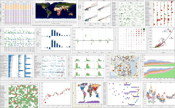
Maps are also very useful for self-service analysis, and were part of the early prototype’s fusion of the following five most useful view types:
- Maps for seeing data in a spatial context. People instantly understand that a geographic field is encoded in a map view.
- Bars for comparing quantitative measures across categorical dimensions, including seeing the dimension values ranked by the quantitative values via sorting. (Dot plots are very similar to bars and were also part of v1.0.)
- Lines for temporal analysis. People instantly understand that a time field is encoded.
- Text for rapid access to precise values. VizQL provided excellent support for categorical fields on both row and column, which is a Crosstab view. Table views only have categorical fields nested in one direction (typically on the vertical).
- Scatters for comparing two quantitative values at the level of detail (LOD) of categorical fields. Gestalt properties including clusters are salient on scatters.
The other four view types were part of v1.0 (April 2005) but Maps weren’t released until v4.0 (August 2008) because Tableau needed to gather sufficient map data to support customers around the world. The “maps” history in the innovation category widget shows Tableau’s long history of map innovation, making it an important part of the self-service analysis innovation vector.
5. Authoring
Self-service analysis leads directly to authoring, both the authoring of stories to explain findings and the curation of data sources and analytical applications to help others work with data. The knowledge gleaned during exploration motivates and informs curation. Tableau’s emphasis has pivoted from analysis to authoring as the technology expanded from individuals to organizations. Tableau Server, our second product, was released with v3.5 (Nov 2007), which is shown with the “authoring” choice on the innovation category widget. By v3.5, we had crossed a threshold where our customers wanted to share authored views.
Release v2.0 (June 2006) included Quick filter widgets, which allowed consumers to do one of the most useful analytical operations. Release v3.0 (April 2007) included both Dashboards and the Format Pane. Formatting, in particular, is essential when sharing visual encodings of data with colleagues. The next major authoring moment was our free product Tableau Public in v5.1 (Feb 2010), which allowed students, bloggers, and data journalists to share data visualizations more broadly on the web. Tableau Public drove the growth of the Tableau Community, which probably started with the first Tableau Conference in 2008. Tableau Public was also a key step to Tableau Online in v8.0 (March 2013), which is our cloud product.
6. Computer assistance
Computers and humans have asymmetric and synergistic data skills. Computers are willing and able to process vast amounts of data 24 hours a day, every day of the year— which is not true for humans. We, on the other hand, have rich, contextual knowledge of the world (especially when compared with computers) that can be used to check and amplify the computer’s processing of data.
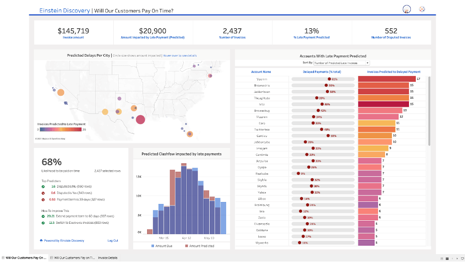
The “computer assistance” history shown with the innovation category widget starts with Show Me v1.5 (Oct 2005) where the computer recommended visual encodings of data to analysts who had only been working with grids of numbers. The next step in this history was Table & Join Recommendations in v10.3 (May 2017), which was Tableau’s first exploration of Machine Learning (ML) technology to provide computer assistance. Salesforce has accelerated Tableau’s exploration of ML, including with Einstein Discovery in Tableau in Tableau 2021.1 (March 2021).
Two lessons for future innovation
My analysis of Tableau’s history offers two lessons about the future of innovation in self-service analytics.
Human-computer (H-C) partnership for data work
Tableau has fostered a human-computer partnership for data work from its foundational innovation, VizQL, combining query (which points toward computers) and visual encoding (which points toward humans). A key benefit is that computers can reduce the dreary data work that humans need to do to get value from data. Machine learning (ML) technology will be an important driver for future innovation, including our Tableau Business Science initiative that brings ML capabilities to business domain experts.
Visual encoding is key to explaining ML models to humans. Computers are slowly getting deeper knowledge of the world. ML, in particular, has the potential to support all the innovation vectors described in this document. However, the world is a rich place—which is why business domain experts are currently needed to author useful ML models. ML is effective today primarily for routine data work—humans will need to oversee ML modeling for the foreseeable future.
Occasionally, computer recommendations will trigger humans to do data analysis. For example, computers can monitor changing data and notify appropriate people about anomalous changes. People can use their knowledge of the world to determine if a recommendation is a false positive or deserving of deeper analytical investigation that may lead to significant positive impact.
Collaboration: Human-human (H-H) partnership in analysis
Tableau’s history also points to collaboration as a key lesson for future innovation. Tableau started with a focus on individual question answering and grew to support all the data work of organizations. The image below describes the wide range of data skills in organizations:
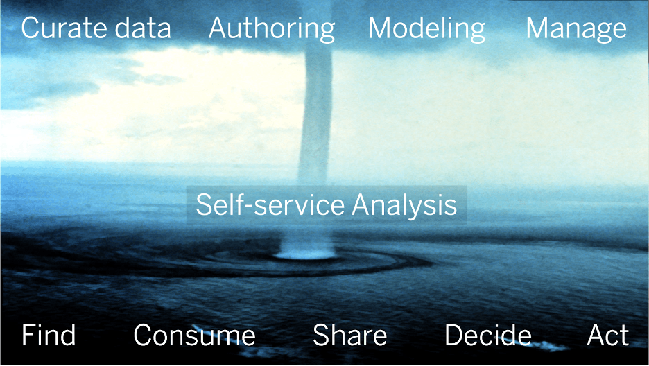
The ocean represents the bulk of an organization’s self-service data work, from finding data for some task to deciding to do some action. The clouds represent the work of data professionals who rain useful visual data into the organization, including authoring production dashboards and ML models that recommend best next actions. The waterspout represents self-service analysis, which starts when consumers see something in dashboards or recommendations that is potentially important to their job or their organization. Self-service analysis connects authors and consumers into an engine that makes organizations more data-driven.
Collaboration is a broad innovation vector with many scenarios. People typically have a hard time understanding how data is connected to the world. Consumers will reach out to authors to find appropriate dashboards or to understand ML recommendations. Following people and favoriting content can be valuable input to ML models that support collaboration. Self-service analysis typically starts with an H-C partnership; however, there are many reasons people shift from H-C to H-H collaboration.
Many data consumers have limited data skills or don’t have time to do self-service analysis. They might start working with data professionals or delegate the data work to colleagues. Consequential data-driven decisions typically involve many people. Data work will need to move from one device to another. People will collaborate synchronously and asynchronously. Asynchronous data collaboration is an innovation opportunity—including annotation, commenting, and independent exploration of hypotheses.
What innovations are important to you?
I look forward to hearing feedback from the community on my analysis, and I’m eager to see what this Tableau release data may inspire from others.
What would you like to see from Tableau next? We know that you understand your data challenges better than we ever will—and we’re always looking for your input and ideas to help drive our innovation.
Histórias relacionadas

Visualizing Women's Impact to History Through Data Visualization
 18 Março, 2024

Behind the Viz: Adrian Zinovei Helps You Design Your Next Dashboard
1 Março, 2024

Charting the Heart: Data Visualizations on Love
 14 Fevereiro, 2024
Subscribe to our blog
Receba em sua caixa de entrada as atualizações mais recentes do Tableau.