4 ways the Tableau Community visualizes World Cup data


The World Cup is the biggest sporting event in the world, with 3.4 billion people expected to watch the this year’s tournament. With an event of this size, there is no shortage of data about the history, teams, players, and matches. Here are a few visualizations that demonstrate just how rich the World Cup is with data.
The history
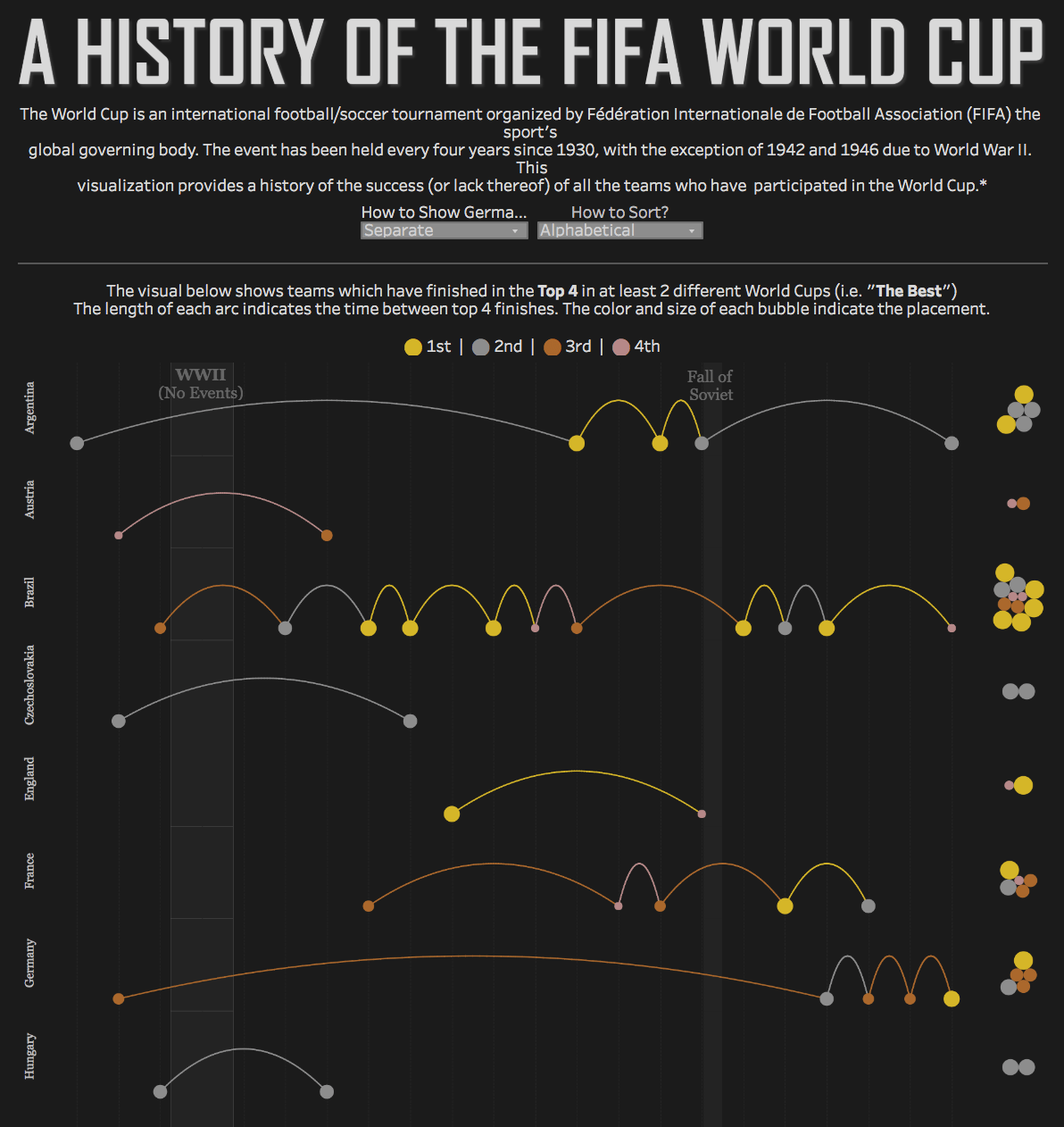
It all started in 1930 in Uruguay where only 13 nations participated. In 1998, FIFA expanded to a 32-team tournament, with more than 200 teams competing across the world for those spots. In the viz below, Ken Flerlage shows teams which have finished in the top four in at least two different World Cups, and the time between top four finishes. You can see Brazil, Italy, and Germany have consistently finished near the top of each tournament, while Spain and Portugal went years between top four finishes. (click on the image for interactive version)
The teams
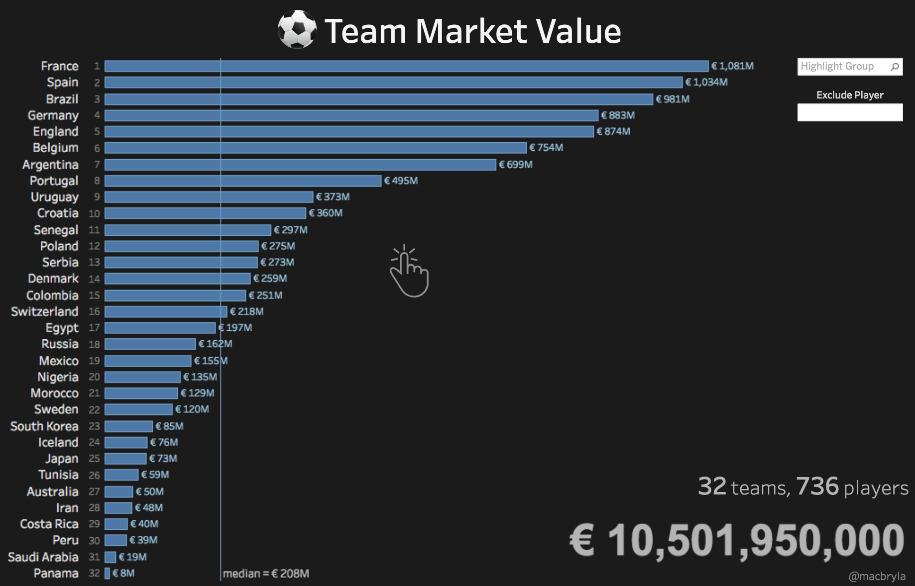
The World Cup is big business, with the total market value of the 32 teams in the 2018 World Cup worth a mind-blowing €10.5 billion (that’s $12.1 billion). Dive into Mac Bryla's viz to explore each group and exclude players to see what impact they have on their team. (click on the image for interactive version)
The players
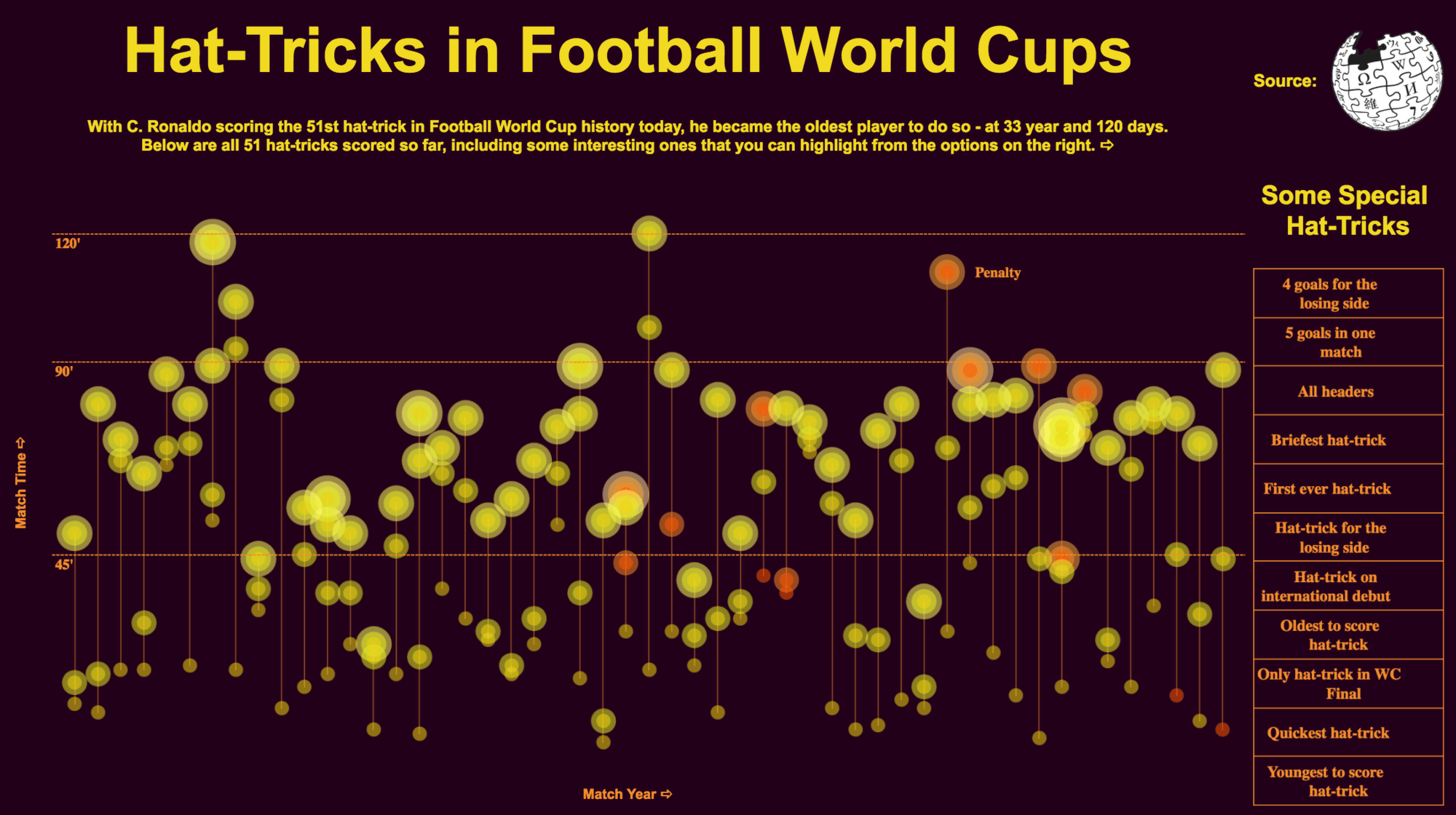
A hat-trick is when a player scores three goals in a match. In soccer, scoring goals is quite difficult – and hat-tricks are rare. Only 51 have been recorded in World Cup history, and Harpreet Ghuman has turned that data into a stunning visualization. For any player who has recorded a hat-trick in the World Cup, you can see the minute during the match when they scored each goal. Did you know Bert Patenaude recorded the first hat-trick in the 1930 World Cup? Erich Probst recorded a hat-trick 24 minutes into a match, the fastest hat-trick in World Cup history. (click on the image for interactive version)
The matches
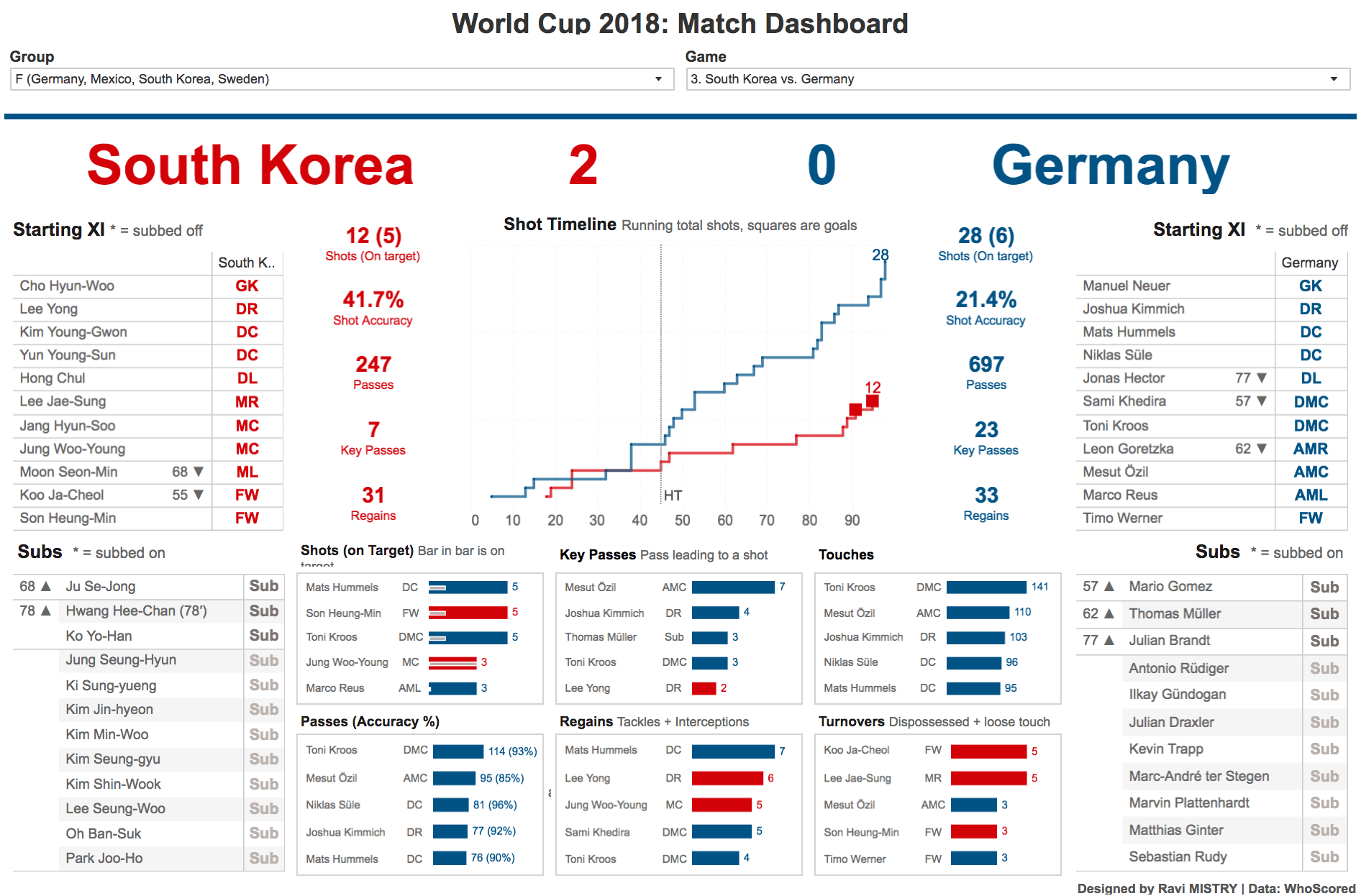
No two matches are the same, but often they are decided by a narrow margin of victory. So what makes them different? Passes, touches, and shots are all data that can be used for match analysis. In this dashboard, Ravi Mistry aggregates a variety of metrics to provide a full summary of every match in the 2018 World Cup. (click on the image for interactive version)
Other resources
- Join our Summer of Sport webinar series to learn how to make visualization using sports data.
- Want to see more sports data visualizations? Check out more examples of what the Tableau community is making.
- Why is sport such a good topic for visualisations? Dive into Neil Richard's post to find out.
Histórias relacionadas

Visualizing Women's Impact to History Through Data Visualization
 18 Março, 2024

Behind the Viz: Adrian Zinovei Helps You Design Your Next Dashboard
1 Março, 2024

Charting the Heart: Data Visualizations on Love
 14 Fevereiro, 2024
Subscribe to our blog
Receba em sua caixa de entrada as atualizações mais recentes do Tableau.