Hot out of the oven: Tableau at Gartner's BI Bake-Off


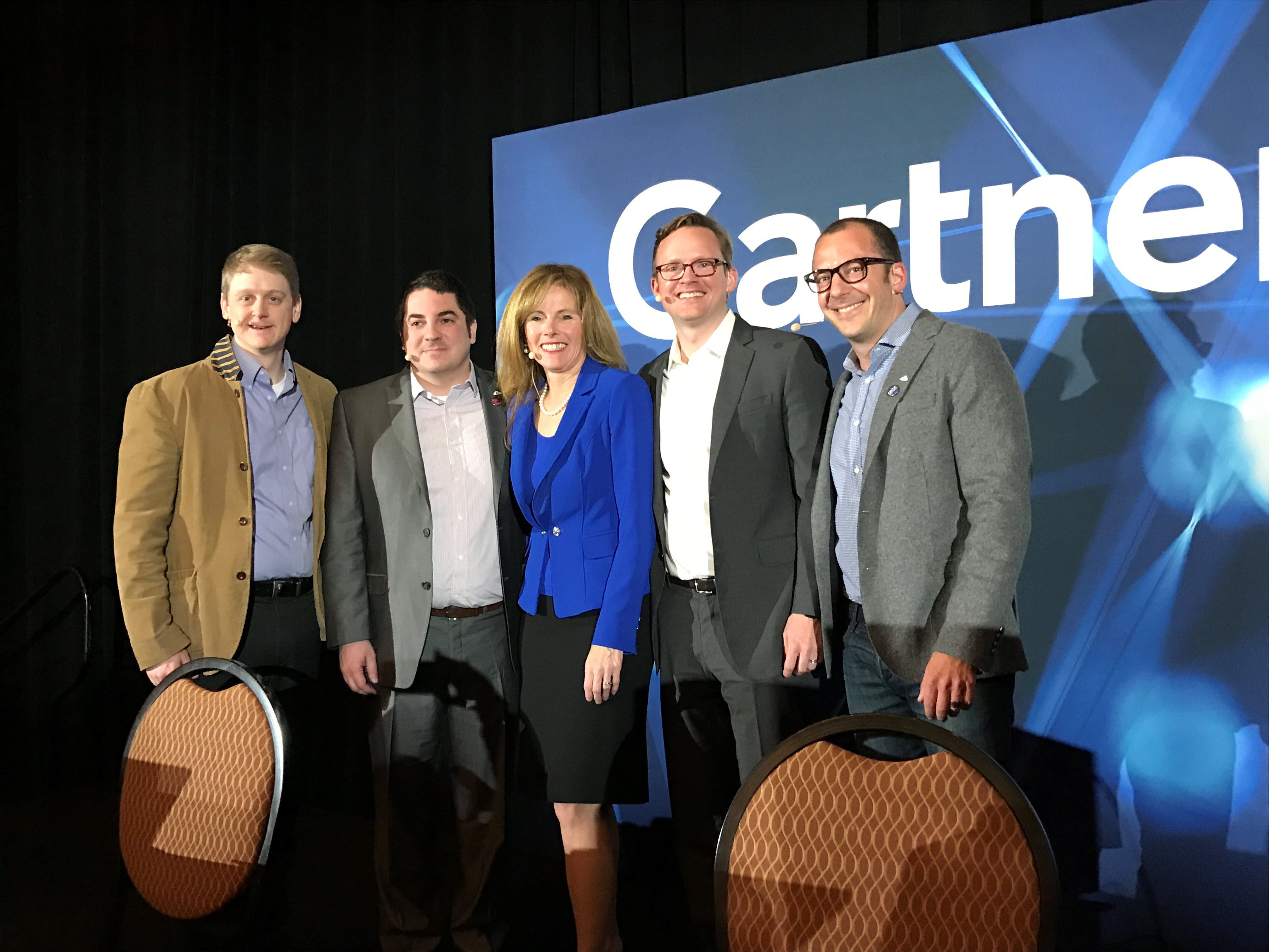
It’s not often that we get to show off head-to-head our capabilities. But once a year, we do exactly that. We go to Gartner Analytics Summit and get on stage with other top vendors. With a little friendly banter from our Chief Product Officer, Francois Ajenstat, we do what’s needed and go at it! It’s called the BI Bakeoff. It’s like an Iron Viz competition between the top analytics tools.
Every vendor gets the same data set to work from. This year’s data was traffic fatalities in the US and we had to demonstrate how our product could meet a specific criteria. Each participant had 3 minutes per criteria to demonstrate how the tool could meet the following criteria - look and feel, self-service data preparation, dashboard design and storytelling, information sharing, data governance and finally a unique differentiator or cool innovation.
The BI Bake-Off is the brain-child of Gartner analyst Cindi Howson. A top analyst at Gartner, and former owner of BI Scorecard, Cindi was recently recognized as a top influencer in Big Data Analytics. She’s hosted bake-offs for the last 10 years.
There are no winners or losers in the bake-off. Attendees ranked each vendor based on their own perspectives and requirements.
So, where did Tableau shine? How did we take on the challenges of dirty data? Ultimately, creating a visual analytics experience that was both immersive and powerful.
Interactive dashboards with guided analytics
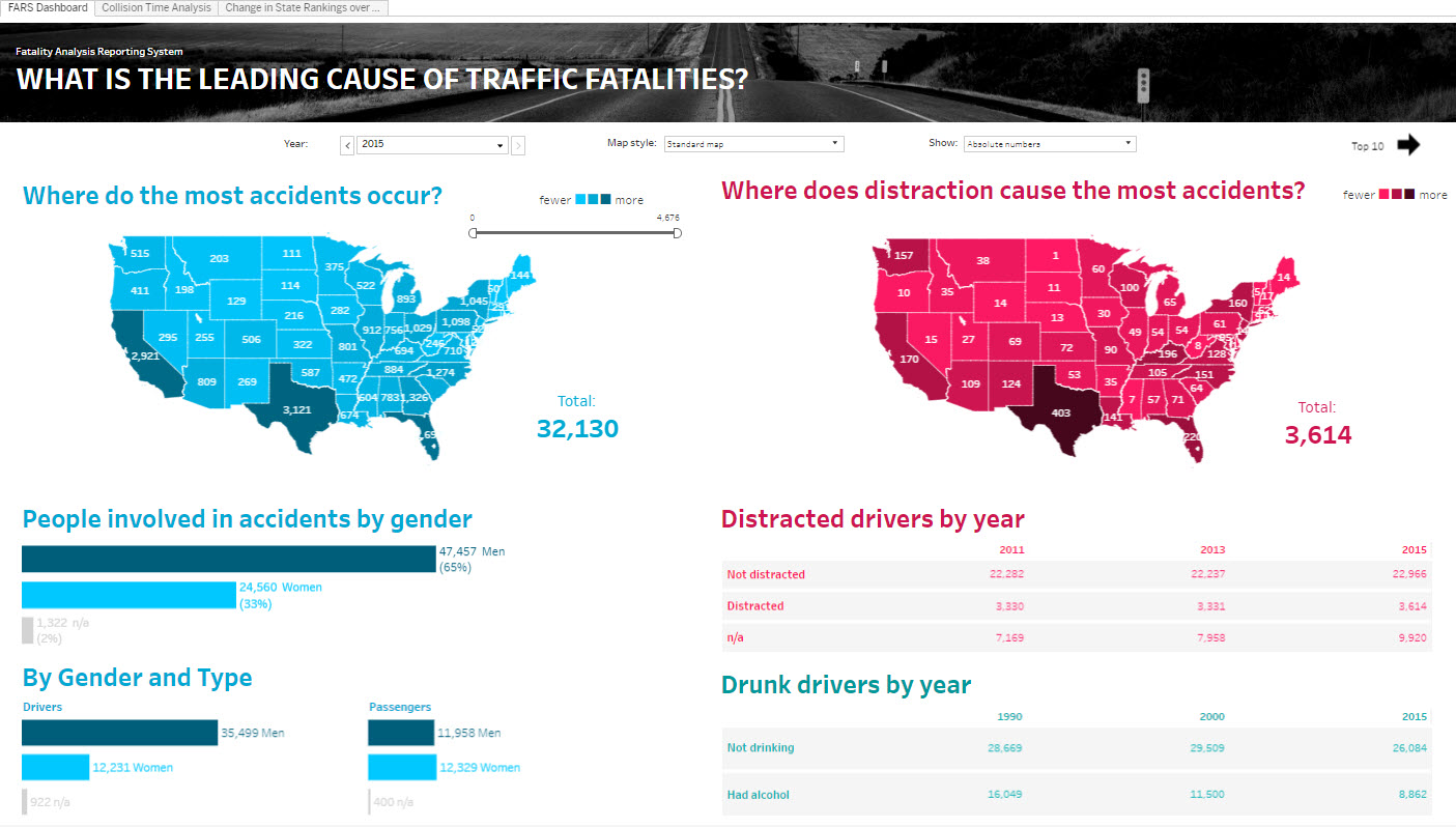
The first question posed seemed rather straightforward. “What is the leading cause of traffic fatalities, is it different by age or state?” But as with any analytical question, the answer led to more questions.
With Tableau, it was easy to answer this question, and more importantly dig deeper into the data. It turns out that the leading cause of fatalities is distracted driving, and that the most accidents occur in Texas. Of course, that’s just the beginning of the story.
We built a dashboard that provides interactivity and exploration. You can drill into details on demand using tooltips, filter the data for a particular state, sort the crosstab, keep only or exclude the information to focus your analysis. We also added guided analysis to enable us to explore additional perspectives in the data - analyzing accidents by time or ranking by state. You can also explore this secondary dashboard that didn't make it into the bakeoff, but gives you another view into the data.
What happened when we adjusted for population by state?
Many charting tools can answer the first analytical question. Tableau is built to support deeper thinking. Asking the next question, and the question after that.
With Tableau, we could easily experiment with different viz types out of the box to find new insights of the data. In this case, we used a hex map. We normalized the data for population and found that the state with the highest distracted driving was New Mexico and the most accidents occur in Wyoming.
Tableau also makes it easy to pull this into a guided analytical flow for consumers to explore the data for themselves.
One of the great things about Tableau's ease of use is that you can make your analysis more robust by having many people analyze the data. An example of this is the community led #MakeOverMonday, where hundreds of people create vizzes out of the same data set published every Sunday night. With this data set we had a few Tableau people create their own visual analysis. It not only helped prepare in a short time, but it also validated the analysis and it defined the approach to show off at the bakeoff. Here are some of the top findings we gathered:
- Not surprisingly, most accidents are for younger drivers between the ages of 20-24
- For men, it peaks at 18 years old and for women at 19
- And those drivers have more passengers riding with them than older drivers to the impact is magnified
- The most accidents occur on the weekends in the early mornings (2 a.m.) after people leave the bars. Please don’t drink and drive.
- However, the evening work commute (4-7pm) is the next worst period for accidents
- When compared to population, Wyoming is the state with most accidents and New Mexico the state with most distracted drivers.
- Traffic fatalities have been on the decline for the last 30 years with a peak in 79-80.
- However, we’ve seen a sharp increase in accidents caused by distraction – specifically Technology related
- Finally, July 4th is the worst day for accidents. Please stay off the roads on this day.
Powerful, intuitive data prep
Up next, we took on the challenge of connecting to data to do the ever-dreaded data prep. If you’ve ever attempted to download, clean, pivot, transform and altogether reshape data from a website, you know what I mean. We had to take data spread across multiple CSV's and even a PDF file and quickly shape it for analysis.
With Tableau, we were able to complete all of the functions with simple drag and drop operations. This type of use case with data spread in multiple sources that need to be blended together to do some analysis right away is Tableau’s sweet spot. Union was a snap – just drag and drop and the data is unioned together. We were able to join with other files visually – these could be stored on the file system or across databases.
One of the advantages of Tableau is that you can always see your data. So, seeing the number of accidents by age is 2 clicks away. And you can visually inspect the data to determine if there are problems or data quality issues.
In the Gartner requirements, we had to group victims by age group. Again, that’s simple. Just create a bin and Tableau intelligently determines the bin size for you. We used a parameter to control the size to give users more flexibility.
In addition, we had to reach out to data stored in PDF and other reference data on the web. We used an upcoming feature, our new PDF connector (currently in beta) to connect to the PDF file. No pre-processing was required. Tableau instantly found the table of data in the PDF file and I was able to use it.
Same thing for web data, just go to a web page, find the data you want and copy paste. All of those sources can be blended together easily by the user. And none of this required learning how to code, it did not require a separate tool or specialized skills. Tableau made it easy to perform sophisticated data preparation natively.
By the way, this is the #1 pain point we hear from customers--data prep is time-consuming and difficult without a specialist. In Tableau, we've introduced easy ways for people to prep their data for discovery. Now, organizations will want to do some data prep in a more scalable and governed way, that’s why we’re investing in a brand new product codenamed Project Maestro dedicated to creating an intuitive, powerful data prep experience for all people.
Cool Innovations: NLP, metrics and a guest appearance by Alexa
Gartner also asked us to show a cool innovation. The most difficult part of this challenge was just choosing which innovation to show. Our dev team is hard at work on a product roadmap with machine-learning powered recommendations, instant analytics, built-in governance, a new Hyper fast data engine and more!
Ultimately, we decided to focus on how to broaden the adoption of data by making data pervasive and accessible in natural ways. A key place that people want to consume data is on their phones. So we showed a new Metrics app that we’re working on. You’re able to keep track of all of your key metrics and get an at-a-glance view of any data on your phone. It's fast, easy and powerful.
Then we showed how Natural Language Processing (NLP) will be integrated with Tableau. Just by typing a question (or using your voice) into Tableau, we’re able to understand the meaning and intent of the request, convert it into the appropriate query and display the data in Tableau. For instance, you can ask “show me home sales over 1M in Madison Park”. And voila, the data is right there. Think of it as filtering on steroids.
Finally, we showed how Tableau can be integrated into Amazon Alexa. This was simple to do using our APIs. You can ask Alexa, “How many customers do we have”. The Alexa skill will send the question to Tableau which then reads the data from a viz. This same approach is used to integrate with Natural Language Generation vendors like Narrative Sciences, Automated Insights and Yseop.
We believe that these technologies have the potential to increase the reach of data and make it more accessible by more people.
We loved being a part of the Bake-Off this year. Thank you to Cindi and the rest of the Gartner team for organizing!
Histórias relacionadas

Embedded Analytics: Should you build or buy?
 7 Junho, 2022

IT’s role in building a Data Culture: Analytics agility, proficiency, and community
 6 Dezembro, 2021
Three ways to help everyone make fast, data-driven decisions with modern BI
22 Novembro, 2021
Subscribe to our blog
Receba em sua caixa de entrada as atualizações mais recentes do Tableau.