How to make dumbbell charts in Tableau


Note: The following is a guest post by Tableau Zen Master Ryan Sleeper.
Tableau dumbbell charts, also known as DNA charts, are an alternative visualization choice for illustrating the change between two data points. Dumbbell charts get their slang name from their appearance, which look similar to weights, and sometimes strands of DNA when they are in a horizontal orientation.
I personally love that there is an outside-the-box chart type that isn’t named after a delicious food such as donuts or waffles. You may even say that dumbbell charts are a healthy alternative!
Names aside, this is another chart type that I find to be engaging, effective, and relatively easy to create in Tableau. This tutorial will illustrate how to make a dumbbell chart in Tableau in just a few steps.
Tableau dumbbell charts are actually dual-axis combination charts, where one of the axes have a mark type of circle and the other has a mark type of line. If you are unfamiliar with using two axes in Tableau, it may be helpful to read my previous post on dual-axis combination charts before reading further.
How to make dumbbell charts in Tableau
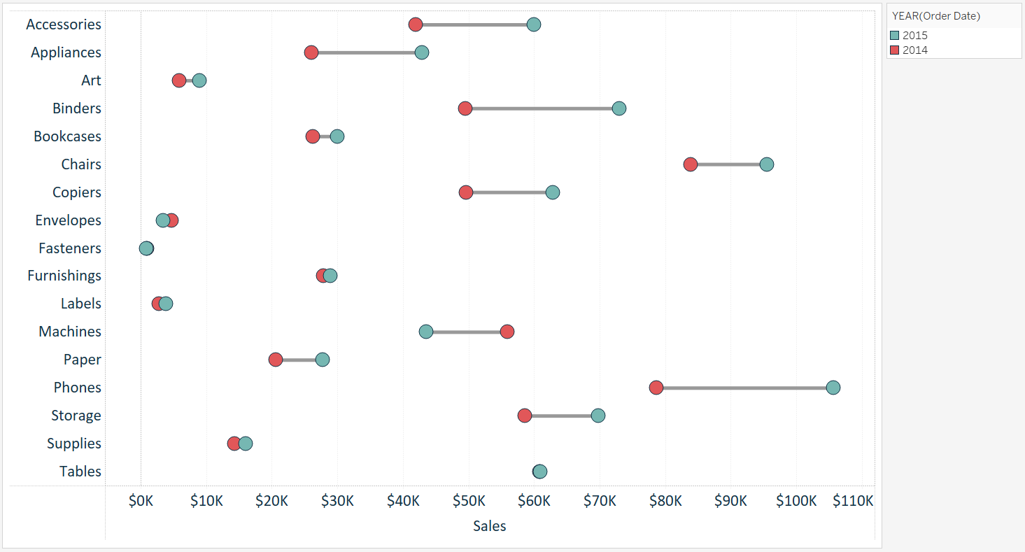
For this tutorial, we will recreate this visualization which compares the year-over-year sales per sub-category in the sample Superstore data set.
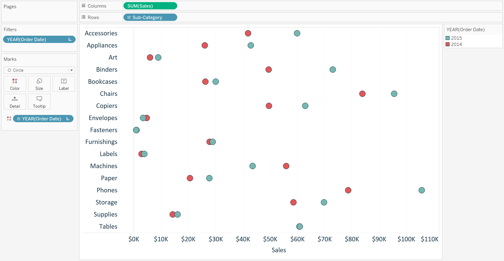
The first step to creating a dumbbell chart in Tableau is to create a dot plot with the measure and dimension you want to visualize. In this example, I will place the Sales measure from the sample Superstore data set onto the Columns shelf and the Sub-Category dimension onto the Rows shelf. This creates a bar chart showing sales by sub-category. You can easily convert the chart to a dot plot by changing the mark type from automatic to circle.
I will also filter the visualization to the last two years in the data set so that I have only two comparison points per sub-category, and also color the marks by year to distinguish which year is which. At this point, my view looks like this:
Note that this chart type can also be created with a vertical orientation by swapping the location of the fields on the Rows and Columns shelves, but we will stick with the horizontal orientation for this tutorial.
The second, and actually final, step is to create a second axis with the Sales measure and change its mark type to line. To turn this dot plot into a dual-axis combination chart, drag the Sales measure near the top of the chart directly across from the Sales axis on the bottom of the chart. When a dashed line appears, drop the measure on the view.
Alternatively, you can place a second occurrence of the Sales measure onto the Columns shelf, right-click on the second pill, and choose “dual axis." Ensure the axes always line up by right-clicking on the top axis and choosing “synchronize axis."
At this point, you have two sets of Marks cards (one for each occurrence of the Sales measure), and they can be edited independently. Navigate to the second set of Marks cards, change the mark type to line, then drag the YEAR(Order Date) dimension on the Marks shelf to the Path Marks card.
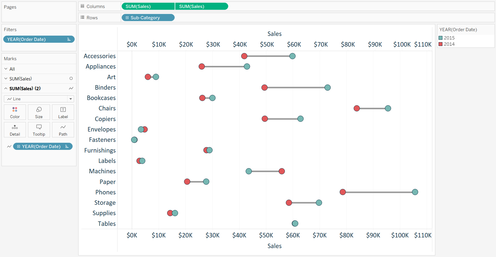
That’s all it takes to get to a nice-looking dumbbell chart in Tableau. From here, you can format the size and color of the marks and hide the top axis by right-clicking on it and deselecting “show header."
For more tips, tricks, and vizzes by Ryan, check out his Tableau Public profile page and his blog. You can also connect with him on Twitter @OSMGuy.
Histórias relacionadas

Visualizing Women's Impact to History Through Data Visualization
 18 Março, 2024

Behind the Viz: Adrian Zinovei Helps You Design Your Next Dashboard
1 Março, 2024

Charting the Heart: Data Visualizations on Love
 14 Fevereiro, 2024
Subscribe to our blog
Receba em sua caixa de entrada as atualizações mais recentes do Tableau.