When We Tell Stories with Data, We Can Have Profound Impact


Note: This is the first installment of our series on storytelling with data. This is a guest post by Nelson Davis.
Stories move us. Data helps us understand where we’ve come from, and gives us the hope we’ll make the right decision as we go forward.
When we choose to tell stories with data, we can harness both of these tools. When done thoughtfully, a story told with data can change the way we see the world, creating conviction that may even call us to action. The goal is to take data, present it in the form of an impactful story, and put it in the hands of decision makers who can influence outcomes. So how do we go about creating these impactful stories with data? Let’s dive in and find out.
Ask Yourself: Do I Want to Tell a Story?
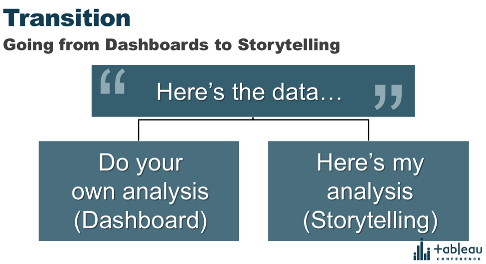
Once we have the data in hand, the first thing we need to ask ourselves is whether it’s our responsibility to analyze the data and take a stand with our interpretation of it. Most of the time when we create a dashboard, we minimize our own analysis, opting instead to call upon the end user to uncover his or her own insights. When we do this, we’re acting a bit like our cousins, the statisticians, whose goal in life is to present data without any bias.
In contrast, when we choose to analyze our data and present the most impactful parts through a story, then we’re acting like our (seemingly-distant) cousins, the op-ed journalists. Except when we attempt to interpret and present the data, we don’t just have our opinions on the line; rather, we stake our credibility as analysts. What if we missed something? What if the data is not complete? What if our presentation misses the insights we were hoping to show? Because of these and many other questions, you need to know that data storytelling takes guts.
There are many things at stake when you present analysis and draw conclusions, but it doesn’t stop there. You have to be invested in both the data and the story you’re telling. You’re invested in the data because presenting it requires that you have developed understanding and context around the data. I wouldn’t seek out data to tell a story about African flying swallows because I don’t know anything about them, and I’m frankly not all that interested in learning about swallows. My lack of context in the subject matter (birds from Monty Python movies), and my lack of interest in birds in general, tells me I’m not invested enough to tell this story. And I certainly wouldn’t risk my credibility to analyze something that I’m not passionate about.
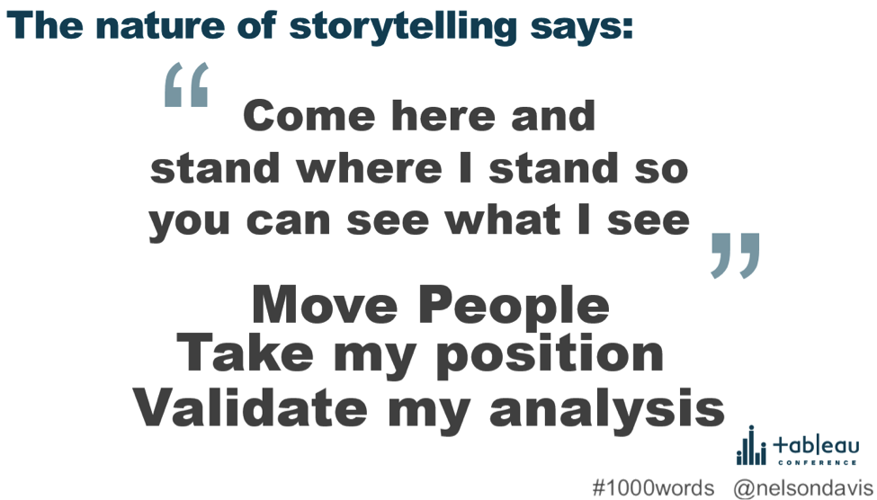
Conversely, when there’s an opportunity to present data on a subject I understand deeply or one on which I might have a unique perspective, I actually feel an obligated responsibility to tell the story. Why? Because if I don’t, the story might never be told. When these opportunities present themselves, you almost feel a burden to share the story of what is inside the data, so that your analysis can move others. Then they would come to share your same perspective, seeing things the way you see them. This is the nature of great storytelling.
Show the Big Picture—and the Small Picture
By now I hope I’ve convinced you that stories are worth telling, but how do we tell stories successfully? If we look at today’s world for a data storytelling rock star, I would argue Hans Rosling would be it. He’s passionate not only about the data (global demographic data, to be specific), but even more about presenting the data in ways that interests, engages, and educates people. He does this through his passion and engaging visualizations.
Personally, five years ago when I was a transportation civil engineer and saw his video 200 Countries, 200 Years in 4 minutes, I thought it was the coolest thing I’d ever seen. Like, ever. It was one of the first things that sparked my interest in data visualization, and that’s changed my life.
Hans begins by creating context and understanding for his audience, which becomes the foundation of the analysis and storytelling he’s about to share. Without setting up this fundamental framework, the rest of the presentation is meaningless as the information will go over the heads of an uninformed audience. Remember: If we want to move people, give them the context, a map of where they’re going.
While Hans is a master storyteller, there are two techniques he uses that I want to call out for emulation. The first is looking at the big picture, or the macro-narrative: In general, what’s going on? Is there a trend toward improvement over time? What’s the one thing the audience must walk away with after looking at this analysis? Don’t be afraid to plainly state this and what you think this means for the future. Leave no doubt here.
The second technique is to highlight and call out individual stories, or micro-stories that validate and explain the big picture. We can never forget that there’s a story behind every data point. Oftentimes it’s the micro-story that we find ourselves connecting with. This is when the data begins to actually feel personal, because the scale is whittled down to a seemingly tangible level. This connection is what telling stories is all about.
Storytelling with Data Can Change Minds
Lastly, I’m passionate about telling stories with data because I’ve seen the impact firsthand. Through a series of events in 2014, I found a powerful story within some demographic data that had been looked at thousands of times. By changing perspectives, I was able to see the dramatic impact of genocide and war on individual countries by looking at life expectancy—both the raw value and the yearly world rank. The stories that surfaced impacted me tremendously and have turned into the greatest story I’ve ever told with data.

I hope you’ll consider telling your own stories with data. Yes, it takes courage, but the impact is profound. If you move just one person, then you’ve changed the world.
Nelson shared these insights at the Tableau Conference as part of the Zen Master track. You can watch his presentation on the Virtual Tableau Conference site. For more works and thoughts from Nelson, visit his blog, the Vizioneer, and his Tableau Public page.
Subscribe to our blog
Receba em sua caixa de entrada as atualizações mais recentes do Tableau.