Best of the Tableau Web: March 2021


Welcome to our monthly highlight of tips, tricks and inspiration produced by the Tableau Community.
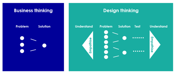
The Tableau Community and the DataFam never cease to amaze me. Always pushing the limits of what the tool is capable of, showing the world the power of data, and challenging thinking about the world of analytics and data visualization. The past month, you may have caught David Pires’ blog on Rethinking Data Visualization, and how he and the team at Expedia implemented design thinking to change their approach to data visualization. They shifted from a practice of simply reporting to looking at visualization as more of a data product enhanced by product development practices.
David Pires on Rethinking Data Visualization,
image credit: Antler How design thinking can shape your business idea.
As I read the article, I thought back to my early days as an analytics practitioner. In the late nineties, we were all about the waterfall method of project management. We built a data warehouse, then hoped and prayed that once we finished the build cycle and were ready to report, the requirements were still the same. Next, came the Agile methodology, where data reporting became more about the minimal marketable features. This worked well for software and other products, but it never really found a foothold for me with analytics.
Regardless, the idea of iterative design with the users’ needs in mind, in my opinion, is the only way to work on data visualization products. Dashboards should never be “done”—they are a living, breathing component of any business with a thriving data culture. If you happen to have a wearable health monitor, you probably checked your “dashboard” a lot when first wearing it. As time went on, you forgot about the dashboard; it was dead. The same happens to your company dashboards, but there are some tools to help you identify those dead dashboards and keep your environments clean. You can also use an extension like the Tableau Tracker to record user activity and improve dashboard engagement or reassess if and how you breathe new life into them with Design Thinking, as David describes.
With that, enjoy Best of the Tableau Web with tips, tricks, inspiration and more produced by the Tableau community. For updates throughout the month, follow me Twitter and LinkedIn, and check out the list of blogs that Andy Cotgreave and I follow for Best of the Tableau Web. If you don’t see yours on the list, we invite you to add it here.
Formatting, Design, Storytelling
Lindsay Betzendahl, Viz Zen Data: Blank Character for Navigation Buttons
Bridget Cogley, TableauFit: How the EXCEL do I format that?! 5 Tips for winning formats
Chelsea Morgan & Kendra Allenspach, Interworks: Bringing Custom Color to Your Tableau Dashboards
Zak Geis, Guest on The Flerlage Twins: Tableau Design Tips
Inspiration
Joshua Smith, Jackalope Data Designs: New job, who dis? (and a lesson for your next career move)
Adam Mico: Tableau Community Initiative Deep Dive: #DuboisChallenge
Neil Richards, Questions in Data Viz: What are Truchet tiles?
Mark Bradbourne, Sons of Hierarchies: Why Tableau?
Server
Eric Parker, OneNumber: How to Generate Tableau Extracts Faster
Tips and Tricks
Kevin Flerlage, The Flerlage Twins: Alternative Map Projections in Tableau
Issye Margaretha, Biztory: Embedding Tableau Dashboards in Salesforce
Katrina Johnson: An Introduction to Tableau Sets
Alan Murray: How To Tableau: Heat Grids
Kevin Prescilla, The Data School: Tableau Public Pre-Submission Checklist
Verwante verhalen

Meet Iron Viz 2024 Finalist Jessica Moon
 15 april, 2024
DataFam Roundup: April 8–12, 2024
 12 april, 2024

Meet Iron Viz 2024 Finalist Pata Gogová
8 april, 2024
Subscribe to our blog
Ontvang de nieuwste updates van Tableau in je inbox.