Housing Connector uses data to help families find homes


Editor's note: In August 2021, Tableau Foundation made a $550k grant to Housing Connector. This grant will go to supporting Housing Connector's ability to scale outside of the Puget Sound region in Washington state, and the technology that supports their staff's ability to help people find housing.
Housing Connector was founded on a belief that no unit should sit vacant while there are individuals in need of a home.
Housing Connector helps people like Chauncey Williamson, who spent more than two years applying to over 20 apartments, simply to be turned away each time because of a low credit score. When he applied through Housing Connector, he was approved, and finally received keys to a home of his own.
Launched in October 2019, Housing Connector recognizes that access to a stable home is often cut short at the point of the rental application. Factors like an individual’s credit score, past debt, or eviction history can quickly derail the process for an individual who would otherwise have no problem meeting their rent obligations.
To help applicants overcome these challenges, Housing Connector partners with property owners and managers to lower screening criteria and increase access to housing for individuals exiting homelessness. In exchange, property partners receive access to free referral service to attract new renters, and a mix of both financial and situational support for up to two years to ensure their risk is minimized and families maintain stability.
Housing Connector deliberately uses a simple approach to overcome the complexities in ending a crisis like homelessness. But behind that simplicity is a data powerhouse that is driving the success of the platform.
Through a partnership with Zillow, Housing Connector was able to create a real-time marketplace for renters to search and apply to Housing Connector listings. They used Salesforce to develop a flexible infrastructure that allows their team to manage the program and data. And by stitching it all together with Tableau, the Housing Connector team is able to go beyond daily program administration to gain a deeper understanding of the relationships between data, improving customer insight, and maximizing impact.
Insight into the housing journey
From the time a resident begins their housing search, Housing Connector uses Tableau dashboards to understand the interactions that take place at each stage of a resident’s housing journey.
Starting when a potential resident searches for an apartment on Zillow, data on availability and distribution of housing units, numbers of log-ins and messages sent by partner organizations or individuals flow into a Tableau dashboard embedded inside Salesforce. These dashboards let Housing Connector staff look at the big picture of how far along the process of housing each client is and explore questions such as, “how many individuals were responsible for sending a message, which property partners received one of those messages, and how are the properties contacted distributed geographically and by price and layout?”.
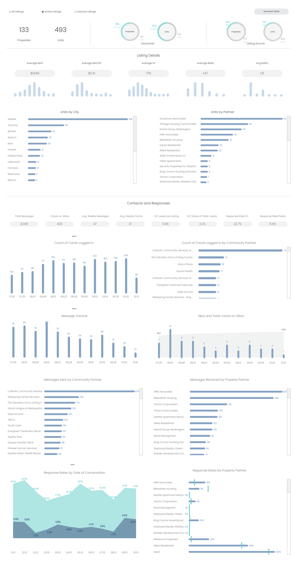
Housing Connector’s housing inventory and flow dashboard
Having the power to answer questions like this is not hypothetical convenience—it plays out daily by helping the Housing Connector team quickly assess unit demand trends, user engagement, and which partners may be due for follow-up or re-training opportunities. Being able to view this dashboard without leaving Salesforce and see how listing or messaging data is trending over time by account, is critical to Housing Connector’s staff to be able to understand what actions they need to take to ensure as many people get housed as quickly as possible.
From housing search to stability
After someone has secured housing through Housing Connector, people occasionally need additional financial or situational support to stay in their housing. To ensure that this incident response function is not just a mechanical process of responding to and resolving tickets, but one that also prioritizes services where they are needed most, Housing Connector uses Tableau dashboards—inspired by dashboards created by the broader Tableau community—to help team members in touch with broader trends while also staying focused on keeping individuals successfully housed.
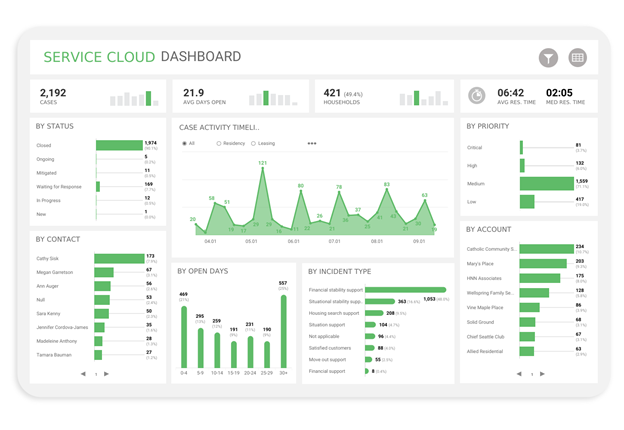
Housing Connector’s Service Cloud response dashboard
With creative credit owed to work by Tableau Ambassador Pradeep Kumar, the Service Cloud dashboard gives Housing Connector’s team the ability to understand how the total volume of reported incidents has changed over time and how these incidents are distributed amongst our partners and by incident categories. These dashboards give perspective on both the individual case and the broader thematic trends.
For example, if a Housing Connector staff member saw a partner was overrepresented in the number of incidents at their properties, this dashboard helps that staff member easily understand, in near real-time, both where and what types of services need to be activated to support residents, or where closer collaboration on housing stability services may be needed with property and community partners. Being able to take both a narrow focus to address someone’s current need, as well as the bigger perspective on trends is one way that Housing Connector can ensure that it stays focused on its goal of ensuring successful housing outcomes for families.
Reporting impact
Housing Connector, like many organizations, aims to track how well it fulfills its objectives. To do this, they developed a KPI dashboard for their staff and board. This dashboard highlights eight key metrics, each of which has a trio of directional indicators to help interactors understand the current month KPI number as well as historical context.
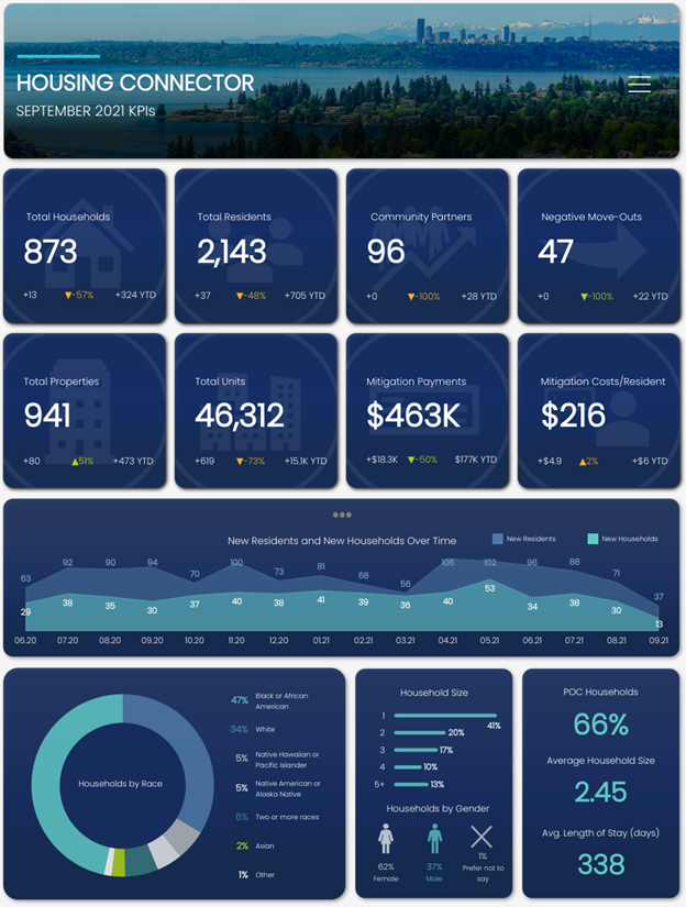
Housing Connector’s KPI and management dashboard
This dashboard also lets people dive into as much detail as they want to explore. Below the KPI tiles is a modular section which lets them select one or more KPIs of their choice to plot and understand how that key metric has changed over time. This dashboard also features parameters and filters at the top of the page to filter the entire dashboard by month and or geography.
In combination, these features give board members and Housing Connector leadership the ability to quickly assess the state of our organization at any given moment and in any given market. If any indicator shows signs of high variance, people can use this dashboard to lead further diagnostic analysis and eventually drill down using other, more specific dashboards to continue investigating.
What comes next
Ending homelessness is not straightforward, and it does not have a one-size-fits-all solution. Housing Connector’s approach is just one of many possible solutions to end homelessness in a city or county, but the idea of using and trusting data is a universal way of identifying where levers for change and improvement exist, and ultimately, maximize impact.
Of course, for Chauncey and others who have been helped by this program, the results are much more meaningful--a roof over their head, a bedroom for their kids, a kitchen to cook holiday meals in. A second chance at a place to call home.
Watch an interview between Shkelqim Kelmendi, Housing Connector’s Executive Director and Jason Schumacher, Housing and Homelessness Lead at Tableau Foundation to learn more.
Verwante verhalen

Using data to drive conversations about climate change
 28 april, 2022

Leveraging data to improve forestry practices worldwide

Doing Good Data Means Doing No Harm
 13 december, 2021
Subscribe to our blog
Ontvang de nieuwste updates van Tableau in je inbox.