How to viz responsibly as you work with data on systemic racism in the U.S.


The murders of George Floyd, Breonna Taylor and so many more Black Americans at the hands of the police have sparked a broad, hopeful movement to end police violence and address the systemic inequities facing Black communities across the country
Amid all of this, there is an enormous role for data to play. “If we are ever going to get to the kind of solutions that allow us to deconstruct oppressive policies or practices, and have a glimpse at constructing some more emancipatory systems for racial equity and justice, data are essential to getting there,” says Shena Ashley, VP of Nonprofits and Philanthropy at our partner organization Urban Institute. At Tableau, we know how critical accurate and thorough data is to help understanding complex and fraught issues like these, how shared facts can create a language for constructive conversation, and can ultimately inform lasting policy solutions.
We know that many members of the Tableau community will be interested in visualizing data on everything from violence to the impacts of racism to celebrations of Black success and more. Data visualization is an incredibly useful way to better understand a situation, but there are several important things to keep in mind when working with this data. We outline some below, and welcome your feedback for more considerations that should be added to this list.
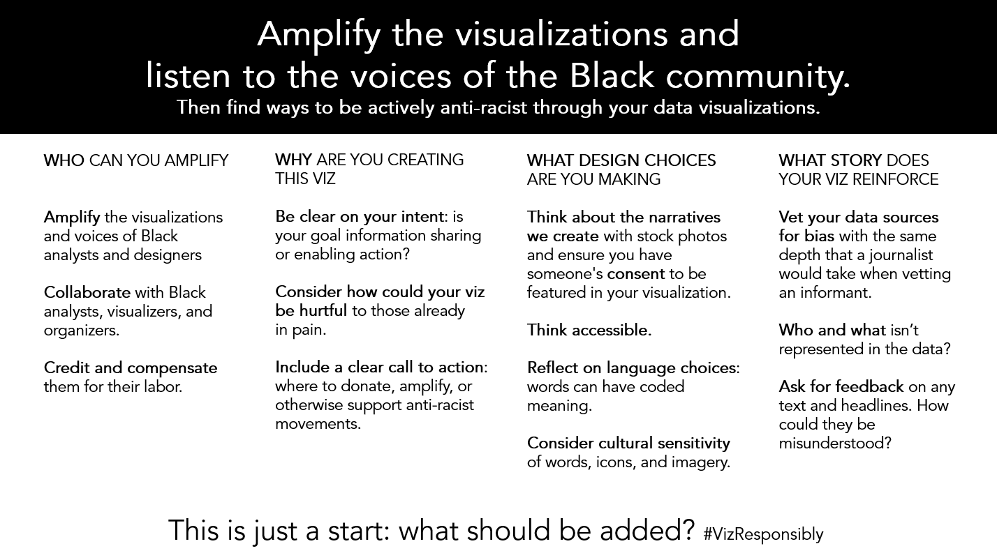
Credit: Amanda Makulec
Think about the full implications of your viz
While data may be neutral, the presentation of data is not. Especially when vizzing data on inequities and marginalized communities, be mindful that you are not reinforcing harmful stereotypes and narratives in your work. This resource from Datassist is a helpful reference point on visualization best practices and being sensitive as you visualize across cultures. Everything from how you aggregate data to how you design your viz could—whether you intend to or not—perpetuate harmful stereotypes or ideas, or put up cultural barriers to accessing information.
DIsaggregating data to the most granular level possible is extremely important, Ashley says. “Our ability to have race consciousness, in policies or programs or in data visualizations, really depends on us actually having data that is disaggregated. If our data just reflect the average condition, our work will only be able to address the average condition.”
Sarah Treuhaft, managing director at PolicyLInk, a Tableau Foundation partner that advocates for policy solutions for racial and economic equity backed by data, agrees. “If you don’t disaggregate, you miss a lot of what is happening for some segments of the population, especially people that have been marginalized and discriminated against—we need to understand the specific conditions that communities face so we can design strategies to ensure that everyone has what they need.”
While disaggregating data by race is vital for identifying where changes need to be made, Ashley cautions that there’s an enormous amount of responsibility that comes with doing so. “You have to be aware that disaggregated data can also be weaponized against vulnerable people,” she says. For example, she adds, if disaggregated data shows that children of color struggle with school performance, people who are not educated on structural barriers could interpret the data through the lens of personal responsibility, instead of seeing it as an example of the way systemic racism impacts educational outcomes. When you’re working with this data, it’s important to pause and ask how it could be interpreted, and what guardrails and information you could supplement the data with to tell a more complete and ethical story. If possible—especially if you are not from the community represented in the data—make sure you check your biases and interrogate your assumptions. If possible, consult with people with different points of view and experiences, and factor in their perspectives.
Learn and include the relevant context
Even if the viz you’re thinking of creating focuses on specific data—for example, this one by Tableau community member Eleonora Nazander on Black death rates due to COVID-19—the data visible in the end result is not the whole story.
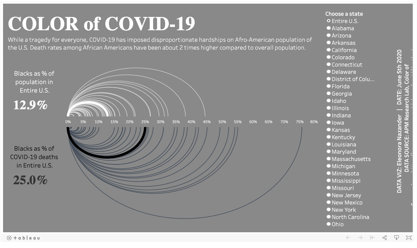
Looking at the above viz, think about all the other data that informs what we’re seeing here. The most important question you can ask when looking at data, Ashley says, is “why?” Why are Black people dying disproportionately? Is there data I can find on inequities in pre-existing conditions and access to care that might inform my understanding? (There is: Kaiser Family Foundation is a good place to start). And from there, is there more research I can do to understand why these inequities exist? “There are always deeper layers of questioning,” she adds. Even if this research and additional data does not make it into the viz, it’s invaluable for informing your understanding and influencing how you choose to present information.
But if you can, use your visualization as a knowledge-sharing platform for both the issue at the heart of your viz and the broader context. Think about where you can add interactivity to your viz and link out to resources that help explain and contextualize the data that’s visible. “It’s really important to provide context for what the drivers are of the inequities that you see when you present data showing inequities, like racist policies or structural barriers” Treuhaft says. Using data visualization as a jumping-off point for a larger discussion around systemic inequities is something PolicyLink has been very focused on. In their Bay Area Equity Atlas, for example, every indicator the team measures is also explained in depth, with both drivers of inequities and suggestions of strategies that could address it. “When working with this data, think about solutions—how can you show people what to do to take action, and what are people working toward on the ground?” Treuhaft says.
It all comes down to providing context. When visualizing data on inequities, it’s important to think beyond the numbers, Treuhaft says, and more about a narrative that contains explanations and courses of action. And as you do this, prioritize including sources directly from the people and communities whose stories are reflected in the data, like referencing and linking out to Black-led advocacy campaigns to address inequities.
Exercise sensitivity and thoughtfulness in your design
While understanding the deep context around data is vital, the surface-level presentation matters just as much. The design choices you make when you’re visualizing data can have far-reaching implications and consequences. Everything from the colors you use to the language you employ matters and can feed into the way people understand the data you present. Be mindful of inappropriately appropriating imagery or designs, and especially of visualizing data in a way that others or offends the people represented in it.
The Urban Institute, Ashley says, follows a set of best practices that are intended to ensure data is presented in a way that is informative and empathetic. “Some of them are basic, like not using gendered colors—blue and pink—for male and female, and we avoid semantic color for race, like red for American Indian or yellow for Asian,” she says. “And we always want to remind people that the data we are showing represents individual people. We try to use a series of stacked dots, instead of solid bars, when we can to get people to think more about the individual stories that go into the data.”
And it’s incredibly important to source feedback and do the research into how a particular community presents itself, so your viz can amplify their perspective. For instance, Black with a capital B is often preferred, but many outside the community default to what they assume is correct, like African-American or black. Getting elements like names, rhetoric, and design right in your viz is vital, and it takes time, consideration, and effort.
Broaden the scope of your storytelling
There are numerous stories you can tell with data on the Black experience in America. Think about the stories on race you most often see told through data. Many of them focus on inequities and ways in which the United States has failed Black people and people of color. But data can also be a powerful tool for broadening the range of stories told about being Black in America.
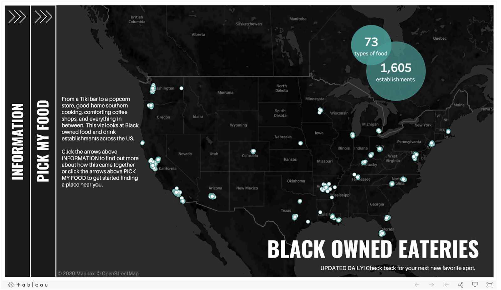
This excellent viz by Tableau community member Autumn Battani shows Black-owned restaurants across the U.S. and directly contributes to the widespread desire to support Black-owned businesses. Think about how data can broaden the conversation and expand people’s understanding and perspective.
Acknowledge your sources
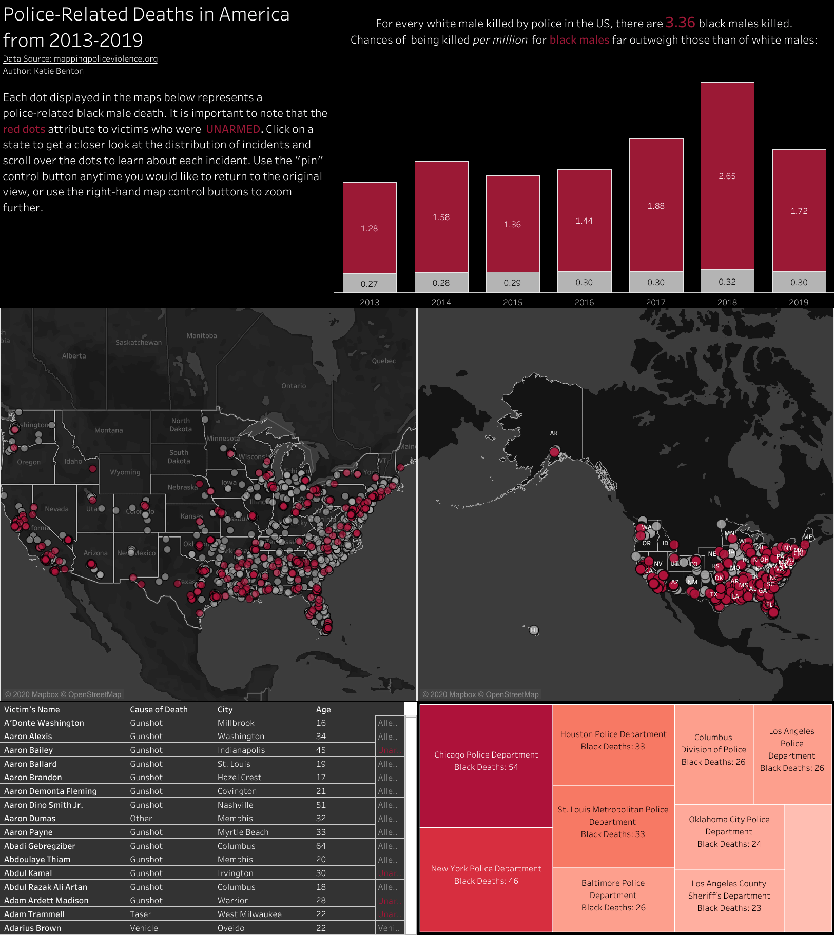
Oftentimes, good data on racial inequities is not a given. In the past several months, we’ve seen gaps and lags in data reporting around the impacts of COVID-19 by race, and federal datasets on police-connected violence are incomplete because the way police departments collect and report data on use of force is inconsistent. If you are accessing and downloading data on racial inequities, consider who put in the work to make that data available, and make sure you acknowledge the source in your visualization.
For instance: If you are interested in accessing data on police killings, a handful of organizations—Mapping Police Violence, Fatal Encounters, and The Washington Post: Fatal Force (paywall) to name a few—have independently crowdsourced databases to make up for the lack of solid federal data. These databases take a lot of work, from trawling records and newspapers to scanning local social media accounts for information, and are maintained out of recognition that having as complete of data as possible on this subject is critical. By featuring the data source in your viz, you can give credit to this work and direct more people to the organizations behind it.
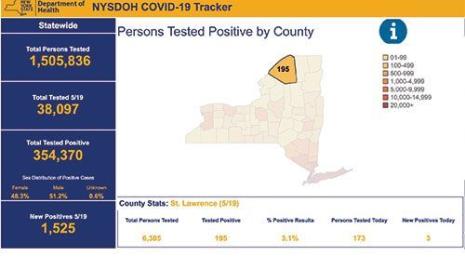
Here’s an example of how this can be done:
Amplify the work of Black data scientists, designers, and organizers
All of this leads to here: If you are considering visualizing data on race or systemic inequities, like those faced by the Black community in the U.S. for centuries, do not assume that you are the first person to do so, or even that your viz will add something new or helpful to the conversation. Be as thorough as you can be in researching and learning from Black data scientists and designers (here is a list) and in looking to organizations like PolicyLink, Color of Change, Data 4 Black Lives, and so many more that work at the intersection of data and systemic inequities. Familiarize yourself with the conversation and with the work that is already happening. If you have something to add by creating and sharing a viz, consider all of the above. And—this also applies if you don’t end up deciding to publish a viz—consider how you can use your platform to amplify the work of others.
Remember that Black people are the experts on the Black experience in America. All of your data and visualization work on systemic inequities needs to be grounded in that fact.
Verwante verhalen

After a year of COVID-19 charts, eight data communication lessons learned
 19 april, 2021
4 reasons why embedded analytics is your path to a new revenue stream in the COVID-19 era
This blog post covers four reasons why organizations should consider embedded analytics.
What we can learn from the public sector’s response to COVID-19
 21 mei, 2020
A broad consensus is that COVID-19 will drive digital transformation in the public sector. During the 2020 Government Summit, speakers from Veteran Health Administration, Southwest Texas Regional Advisory Council, and FEMA discuss new processes, new technologies and innovations, and most importantly, a new mindset on decision making in the midst of crisis.
Subscribe to our blog
Ontvang de nieuwste updates van Tableau in je inbox.