8 changes to the COVID-19 data set


Since we began hosting COVID-19 case data in February on the Coronavirus (COVID-19) Data Hub and elsewhere, our community has created thousands of powerful visualizations on the pandemic that are of incalculable value to organizations around the globe. While much of the focus has been on understanding where the virus is and how it’s spreading, there are more metrics and data relevant to the conversation than strictly cases and deaths geographically over time. For the last month, we have been working with technologies from Salesforce, MuleSoft, and Tableau on building an integrated Data Platform to make the COVID-19 related data we provide more actionable. The Platform gives the flexibility to bring in additional data sets like testing, demographic, and economic data to enhance your analysis. We advanced as far as we could on this initiative without making substantive changes to the initial data set, but eventually we hit a wall with what we were able to do. These changes will make the data accessible to more people and enable the enrichment of analysis for workbooks that have already been created. Here are the eight critical things to know about the data set:
1. The source of case data is changing
We believe having accurate and timely data is crucial for organizations to respond to time-sensitive, business-critical initiatives around COVID-19. When the crisis first began, Johns Hopkins became the predominantly referenced data source by aggregating data globally. Since then, many organizations have further developed efforts to reliably combine the data that is reported by local ministries or departments of health.
As the situation has evolved and changed, so too has the data. The launch of the Data Platform gave us a good opportunity to evaluate the options available. We have selected the European Centre for Disease Prevention and Control for international case data and The New York Times for domestic US case data going forward. This combination of data sets will enable us to best provide timely data to the global audience.
To ensure consistency across the data sets Tableau hosts, we will be deprecating the JHU data set. In order to avoid confusion, the data set “COVID-19 Cases,” which contains JHU sourced data will no longer be updated. We will name the new data set which contains the NY Times/European CDC data as “COVID-19 Activities.”
2. The data structure has been unpivoted
This is the biggest change to the data and the one that will have the largest effect on the ability for a pre-existing workbook to move to the new data source. Pivoting data involves rotating data from a state of columns to a state of rows, and unpivoting data moves the data in the reverse.
In the JHU data set, every locality and date has a row for ‘Confirmed’ and a row for ‘Death’ in the Case Type dimension. These correspond to the Cases and Difference fields, allowing you to see the total confirmed cases, total deaths, new confirmed cases, and new deaths respectively.
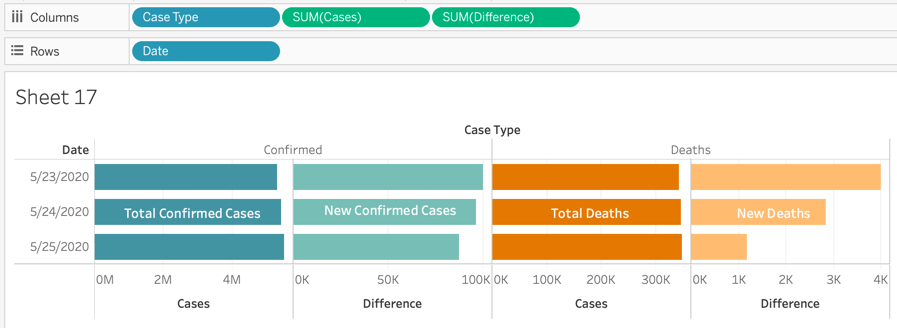
This was confusing for some people. We have seen many visualizations on Tableau Public that did not catch the nuance of this field. They were unknowingly and unintentionally visualizing inaccurate data. To clear up this confusion, the Case Type field has been dispensed with in the new COVID-19 Activities.hyper file. Instead, it has been replaced by four measures—one to represent each of the key measures.

It’s important to note how these fields should be used. People Positive Case Counts is the equivalent of the running total of People Positive New Cases Counts. Deaths works the same way. Subtracting the new counts from counts will give you the previous days counts.
If you are looking at multiple days aggregated together you should use People Positive New Cases Counts and People Death New Counts respectively.
If you want to analyze People Positive Case Counts and People Death Counts overtime at a level other than daily, we recommend first aggregating at the daily level, then taking their max(), min(), or average(). Level of Detail expressions are helpful in achieving this more complex analysis.
It is our hope that this change should make it easier in the long run for everyone to enrich their analysis by joining or blending to other data sources like testing, population, and demographic data as we make them available. Since the data is structured differently, you may need to rearrange the pills in the view to achieve the same visualization. Using Measure Names and Measure Values is a good way to approach this challenge.
3. Data will be updated more frequently
With the new COVID-19 Data Platform, we are now able update the data flows more frequently. Previously, we waited until all numbers were reported worldwide. Now, as different entities across the world report their latest figures, these will be added to the data source as soon as they are available. The great news is this enables us to include the current day in the data set. But it also means that if you are looking at the worldwide number for the current day, you will see only data for countries that have reported for that date. Meaning the daily number will grow throughout the day, likely reaching the global fully reported number sometime early the following day.
To validate if a location has reported for the day, use the following calculated field:
{ max ( [Report Date] ) }={ FIXED [Country Short Name] : max( [Report Date] ) }
To validate the percentage of location entities that have reported for the day, use the following calculated field:
countd( IF { max( [Report Date] ) }={ FIXED [Country Short Name] : max( [Report Date] ) } THEN [Country Short Name] END)
/
countd( { FIXED [Country Short Name]: min( [Country Short Name] ) } )
In the Starter Dashboard and the Work.com command center, we are not showing the latest information for each country. Rather, we are pulling in the most recent date for which all locations have data. We made this decision because we didn’t want to confuse people. That may change as we pull in more levels of details. If you want to replicate it for you your workbook, us this two-step calc:
- { MAX ( IF [Country Short Name] = "United States" THEN [Report Date] END ) }
- [Report Date] = [Max Date for US]
- Filter to TRUE and add to Context
4. Provincial data is still being finalized
We will come right out and say that there is one downside to changing the source of data. In this initial release of the new dataset, we were unable to include data at the provincial level for countries besides the United States and Canada.
We recognize that this will hit some people hard. Please know we are hard at work to address this. The foremost priority for our team is sourcing this data and integrating it into the new data source. We are specifically looking to support China, France, Australia, and the UK, and then will expand to other countries from there.
5. Standardizing the Data Model
The goal of the new platform is to curate raw fields into standardized data models that can more reliably be used to make data-driven decisions. We have updated the field names to better reflect the contents of data in the domain. Here is how the previous field names map to the new field names:
COVID-19 Cases.hyper (previous)
Admin2
Case Type
Combined Key
Country Region
Province State
Data Source
Date
Fips
Iso2
Iso3
N/A
COVID-19 Activities.hyper (new)
County Name
N/A
N/A
Country Short Name
Province State Name
Data Source Name
Report Date
County FIPS Number
Country Alpha 2 Code
Country Alpha 3 Code
Continent Name
In the CSV file, the field names will look slightly different as Tableau uses a collection of commonly used patterns to detect and transform your data to make it easier for you to interact with.
This is a great place to use the Replace References features in Desktop. Once you replace the data source, you may end up with red exclamation marks next to the dimension or measure pane. Right-click on the original field name that you want to update. Select ‘Replace references’ from the drop-down menu. A dialogue window should open giving you a list of fields, choose the name of the field from the right of the column. When you click OK, it not only changes the current field and updates every pill in the workbook, but it updates all dependent calculations that rely on it.
6. Clarified Longitude and Latitude
Throughout the world, not every location reporting case data is a nation-state. French Guiana in South America is an overseas territory of France. Greenland is an autonomous dependent territory of Denmark. Guam is physically part of the Marianas Islands in the Pacific, but politically separate as a territory of the United States.
In the previous COVID-19 Case data, regions like these had been grouped under their governing state. These territories would have been located as a domain value within the Province State field in COVID-19 Cases. However, when it came to using the field Country Region solely on a map, the Tableau generated longitude and latitude were aggregated to the location of the governing state rather than the physical location of the cases, sometimes a continent away. Guam’s data should have shown up in the South Pacific instead of on the continental United States. To correct this, we included Lat and Long fields in the data.
In the new COVID-19 Activities data set, generally speaking, territories and other administrative areas were brought up a level in the hierarchy to be included in the Country Short Name field. This makes Tableau-generated Latitude and Longitude values more accurate. As a result, the fields Lat and Long have been removed from the data set. If you’d like to recombine these areas, we encourage you to create a group or access the accompanying Location & Population Table on data.world. This data set includes all counties, not just those that have cases, so you can more effectively visualize what's missing.
7. Some values may change
Different reporting entities use different methodologies and criteria for including data in their figures. For example, the data in the COVID-19 Activity file will extend all the way back to December 31, 2019, nearly 30 days earlier than JHU reports.
The changes in reporting entity methodology, as well as changes in the granularity of territory reporting, will cause some values to change. At an aggregate Worldwide number, the change represents less than 2% of cases, and 0.2% of deaths. At a daily level, there is a higher variance. Because of the importance the historical series plays in informing decision making, it is important to call out the fact that daily totals may change. This can be because a case reported by a government entity is added to various aggregate data sets on different days.

Most aggregate sources do not retroactively correct previous days, but rather make corrections in the next available day's data. Some may have noted that at the lowest level of granular reporting, sometimes the total number of cases over all time compared to the previous day will go down by a number larger than the daily number most recently reported. These are corrections. If the amount of correction is larger than the new number of daily cases reported than you get a negative number.
8. More ways to access
The Data Platform enables us to share the data in more places to make it easy for you to connect in the easiest way for your organization. You can now access the data via API on the MuleSoft’s Anypoint Exchange or subscribe to COVID-19 activity data on the Coronavirus (COVID-19) Data Hub listing in the AWS Data Exchange.
While you can continue to access COVID-19 activity data from data.world by direct download as a .csv or .hyper file, even better you can connect directly through a new data.world Web Data Connector in Desktop. Using the data connector enables you to update a published data refresh on a schedule on Tableau Server or with Tableau Bridge on Tableau Online. While using the data.world WDC connector with Tableau Public, you will still have to refresh the extract manually, but it can decrease the number of steps required.
What's next?
It’s nearing time to make changes to your workbook. In the next few days, we will be sharing a second blog post walking you through step by step how to swap out the COVID-19 Case data file for the new COVID-19 Activities. Stay tuned.
If you’re not ready to make the changes yet, we’ve got you covered. We are providing a Tableau Prep flow you can download and run to restructure the Covid Activities data into the structure of the Covid Cases data. It will also update domain values to match the previous values and move territories back under their governing nationality.
Verwante verhalen

After a year of COVID-19 charts, eight data communication lessons learned
 19 april, 2021

4 reasons why embedded analytics is your path to a new revenue stream in the COVID-19 era
This blog post covers four reasons why organizations should consider embedded analytics.
What we can learn from the public sector’s response to COVID-19
 21 mei, 2020
A broad consensus is that COVID-19 will drive digital transformation in the public sector. During the 2020 Government Summit, speakers from Veteran Health Administration, Southwest Texas Regional Advisory Council, and FEMA discuss new processes, new technologies and innovations, and most importantly, a new mindset on decision making in the midst of crisis.
Subscribe to our blog
Ontvang de nieuwste updates van Tableau in je inbox.