How to Find the Best Sources for Free, Public Data Sets
Learn sources and tips on how to find the perfect dataset for your next data visualization project.


Jacob Olsufka has been a data analyst since 2015, and was a 2017 Iron Viz finalist.
Analyzing data outside of work can be a great way to build your skills and stretch your creative boundaries unbound from the repetition of business data. Have you ever wanted to start a data visualization project, but thought, "Where do I find data?" You are not alone. Luckily, there are many online, public resources out there. Tableau Public has some sample data on their resources page and this article lists several places where you can find free, public data. In addition to those, here are some of my favorite places to start looking for interesting and clean data sets.
Source 1: Find data from news sites and media outlets
Data from news sites are great if you are looking for a wide variety of topics. You can usually download them as a .CSV file that you can connect to software like Tableau.
- FiveThirtyEight - A goldmine of over 100 data sets on sports and politics. Examples: March Madness predictions, political polling, the Bachelorette show, etc.
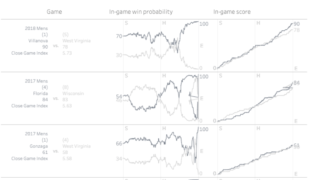
This is a great example of a dashboard built by Chris DeMartini using the March Madness data set from FiveThirtyEight.
- The Pudding - This data journalism website aims to explain hotly-debated cultural events with visual essays, sourced from original data sets and primary research. Their GitHub is a hub for pop culture data. Examples: Women’s vs. men’s pants pockets, weather conditions on Mars, etc.
- Buzzfeed - If you know Buzzfeed, you know that their news site covers a variety of topics in politics, sports, and current events. They also have a rich list of data sets on GitHub. Examples: Trump’s tweets, the text of every State of the Union address, etc.
- Washington Post - The Washington Post is a respected news source and their list of open data sets contains topics like NCAA financials and transportation data. Examples: School shootings, police shootings, NFL arrests, etc.
Source 2: Check out community-led projects
The Tableau Community is unmatched in passion and analytical prowess, so it is a natural place to start with for clean data sources that are ready for analysis.
- Viz for Social Good - A hackathon style project that connects the community with non-profit organizations. Examples: Advocating for fatherless boys in Africa, increasing awareness of child refugees, supporting black male entrepreneurs.
- Makeover Monday - A weekly, social-data project to create a discussion around improving data visualizations. Each Sunday, the team posts a link to a visualization and a data set. Your challenge is to create a better version of the visualization in your own creative way. Their weekly data sets are diverse and stay on the site for reuse, so it is a great place to start in your search for clean data. Examples: Wind energy by state, minimum wage, NHL attendance.
- Sports Viz Sunday - A community-led project to create, share, and promote visualizations from the world of sports. Sports Viz Sunday hosts a monthly challenge based on a topical sports theme, regularly sharing updates from the sports visualization world and providing rich data sets across a wide range of sports. Examples: World Cup, the Masters, Formula 1 racing.
- Iron Quest - A project aimed at preparing people for Iron Viz qualifier competitions, offering opportunities to practice finding your own data sets.
Source 3: Use your personal and quantified self data
If you’ve browsed around and still cannot find anything that interests you, there is always the option of collecting data about yourself. For example, someone collected their daughter’s sleeping patterns for the first four months of her life and visualized it.
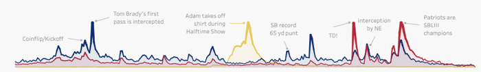
- Twitter data - Twitter has an API that allows you to get data about hashtags, keywords, or accounts. Here’s a guide on how to connect to Twitter data directly in Tableau. If you’re more comfortable working with APIs, you can query to get JSON data, which is a supported data type in Tableau. Here is the complete API documentation. Visualization example: Pulse of Super Bowl LIII.
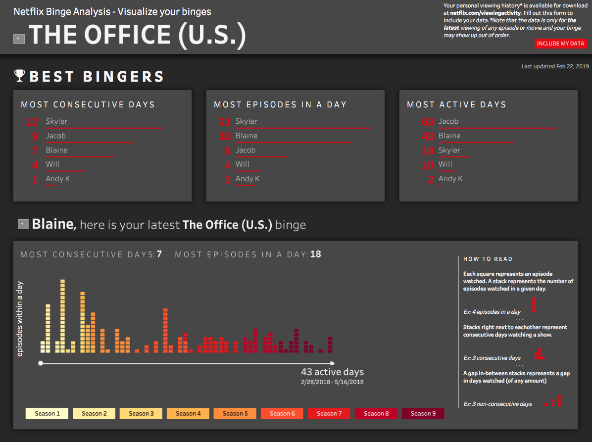
- Netflix data - Download your viewing data by going to netflix.com/viewingactivity. Visualization example: I have created a dashboard that compares people’s binges and visualizes Netflix viewing activity over time.
- Spotify streaming data - Did you know that you can request your personal listening data from Spotify? If you are familiar working with APIs, you can use the Spotify Web API to get data about music artists, albums, and tracks, directly from the Spotify Data Catalogue.
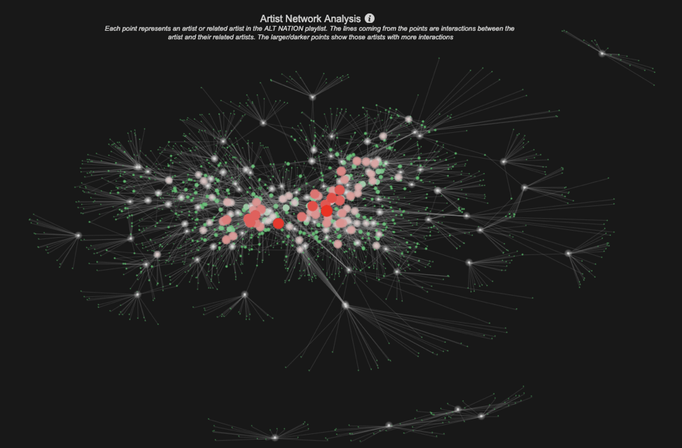
Robert Janezic used the Spotify API to create this Analysis of Alternative Tracks.
Source 4: Scrape data from the web yourself
Sometimes I find data on a website that I really want to bring into Tableau and explore deeper, but I do not want to have to manually copy and paste it. Enter web scraping. Google Sheets has a built-in function (IMPORTHTML) to import data from a table or list within an HTML page. Corey Jones wrote a blog post explaining how he uses this feature and even automates the process so that it runs each day. Skyler Johnson uses a similar method to track Instagram follower counts over time in this viz.
A few other websites for public data are:
General tips for curating your own favorite public data sources
These are some of the many places you can find data, but what makes one set “perfect” for you? In my opinion, the process of finding and preparing a data set is one of the best parts of any data project. Here are a few thoughts and recommendations:
- If you’re passionate about a topic, explore it through data viz. You will find yourself more likely to be invested in deeper analysis of these topics and you’ll understand the nuances that can unlock hidden stories. As an example, for my Pulse of Super Bowl LIII project, I learned how to write basic R code using the nflscrapR package to pull the win probabilities during each play from the play-by-play data. To acquire the screen time data for my Star Wars - Screen Time Analysis project, I used a Python script to parse data that began in JSON format to the state that I needed for analysis. This was particularly useful, because I now use Python in my current role for analysis. When in doubt, chase your passions.
- Embrace messy data as an opportunity to explore new tools. Messy data does not have to be seen as a roadblock, but rather an opportunity. Improving abilities in coding, data scraping, data prep, or task automation can be fun, with the added bonus of building out your skills section on your job resume.
- Create a unique data set. Although ready-made data is often convenient, an idea can lead to the pursuit or creation of an appropriate data set. Creating a data set can be a great learning experience and can really make for a visualization offering a unique story.
- Keep a list of potential ideas and projects. I keep huge lists in my phone of ideas that come into my head. Some of them may not amount to anything, but I have found that the more ideas you come up with, the easier it is to be motivated to find a data set.
There is plenty of data out there! Hopefully, this will provide a good starting point if you struggle to find inspiring data. Now that you have the data, why not create a Tableau Public profile to start visualizing and to share your work? What are you waiting for?
Verwante verhalen

Visualizing Women's Impact to History Through Data Visualization
 18 maart, 2024

Behind the Viz: Adrian Zinovei Helps You Design Your Next Dashboard
1 maart, 2024

Charting the Heart: Data Visualizations on Love
 14 februari, 2024
Subscribe to our blog
Ontvang de nieuwste updates van Tableau in je inbox.