How to Create a Collapsible Menu Container in Tableau
Available space for Tableau dashboards can be limited on mobile devices and blogs, so wouldn’t it be nice to have a collapsible area for all those quick filters, legends, explainers, and links? This post will walk through how to show and hide a dashboard menu area without writing any code.


Note: This is a guest post by Tableau Zen Master Robert Rouse. This post first appeared on the InterWorks blog.
Some of my favorite mobile apps like Slack, Feedly, and Google Maps have a slideout menu that appears when I tap on a small icon. That common design element makes plenty of room for user inputs and gets them out of the way when you’re done. It’s perfect for small screens.
Available space for Tableau dashboards can be limited on mobile devices and blogs, so wouldn’t it be nice to have a collapsible area for all those quick filters, legends, explainers, and links? This post will walk through how to show and hide a dashboard menu area without writing any code.
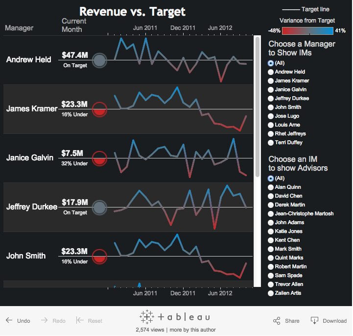
Below is the example dashboard we’ll use. Click the icon in the top left to see the menu area.

Compare this design to the same KPI dashboard from a previous post:

I want to say up front that Tableau is not meant to be a full-fledged application development tool. Although interactive dashboards fit the definition of an application, I strongly recommend using the JavaScript API in a web environment for customer-facing products that involve Tableau dashboards. Scripting offers the most flexible, controllable user experience. That said, this collapsible menu tutorial can be very useful in situations where writing code is not the best option.
Before moving on, it’s a good idea to review two previous posts to get a better understanding of some foundational points. The first is this post by Dustin Wyers which shows how to hide views using dashboard layout containers. The second is this post of mine which applies that concept (and others) to show or hide entire sections of a dashboard.
Dashboard Setup
The overall setup involves three main parts:
- A floating horizontal container that extends beyond the boundaries of the dashboard.
- A vertical sub-container for the menu area.
- A vertical sub-container for the visualization.
- A blank worksheet that can show or hide with action filters. This sheet controls the positioning of other elements inside the main horizontal container.
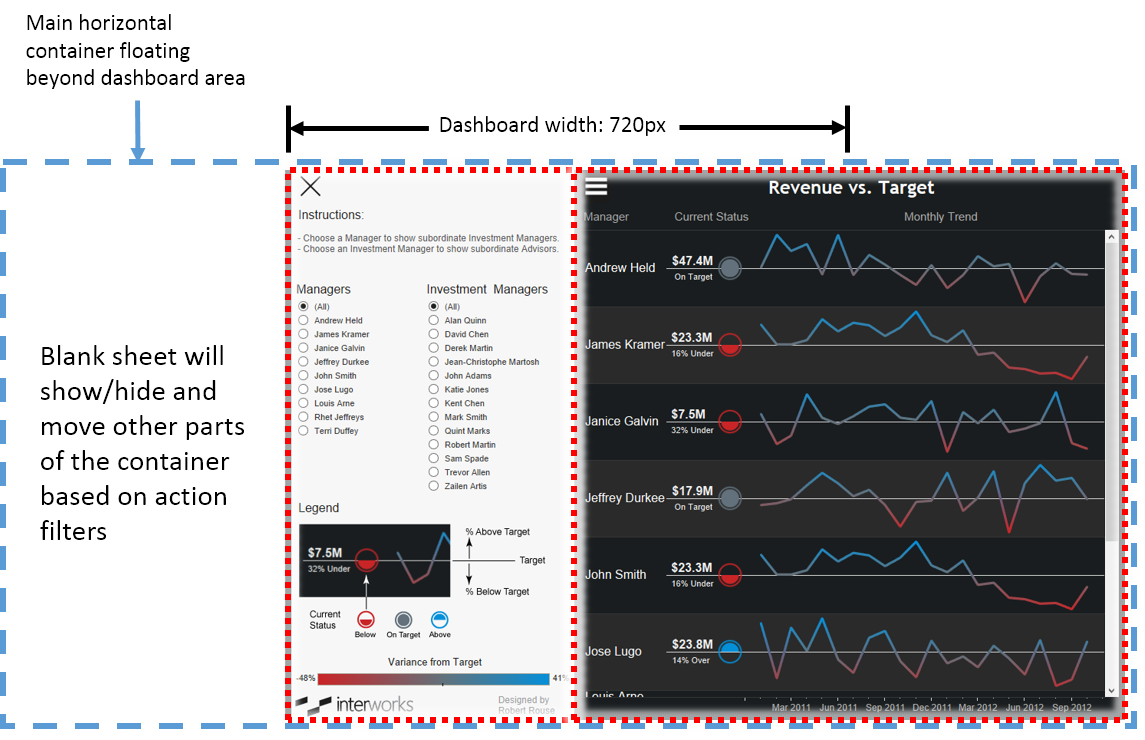
The dashboard size is set to 720 pixels wide to fit the InterWorks blog. I positioned the overall container with a negative “x” position to ensure the blank sheet is never visible. The container holding the visualization, titles, and menu icon is roughly that same width. The menu area fills half the screen in this example, but it doesn’t have to.
The key to sizing this layout is to adjust the position and width of the main container so that the blank sheet ends up filling the amount of space you wish to show or hide. It’s also important that the dashboard size is fixed; automatically resizing the dashboard would destroy this layout.
In my example, the main container is 1465 pixels wide and the “x” position is -382. The sub-containers are 377 and 710 pixels wide, leaving 378 pixels for the blank sheet to fill (plus or minus a few pixels due to padding). When it disappears, the sub-containers move to the left by that amount.
Laying Out Sub-Containers
It’s easy to build tiled layouts with drag-and-drop actions in Tableau, but we need more control over the containers for this. As you build a tiled dashboard, Tableau automatically adds containers for you behind the scenes. What we need to do is build the containers one by one.
The diagram below shows how the menu container is structured. It holds three horizontal containers (color-coded below) plus individual elements for text, images, filters, legends, and the worksheet we’ll use for the “close” icon.
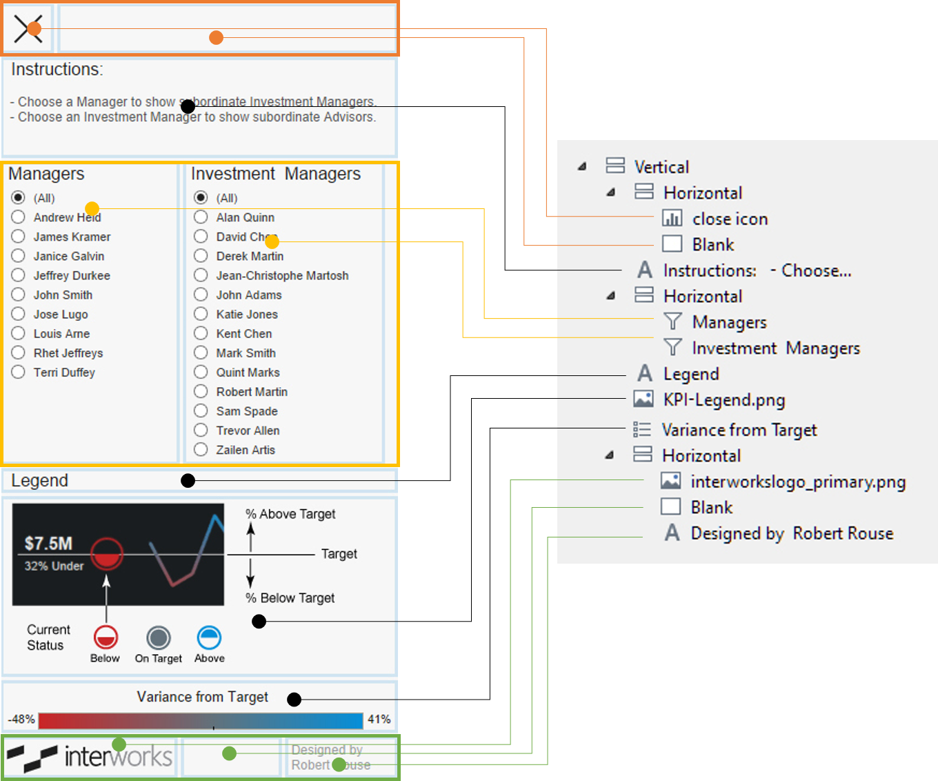
You can manually set the width of a vertical sub-container or the height of a horizontal sub-container. That’s how most of the pieces are sized in this dashboard. The KPI view has a similar setup to arrange the menu icon next to the title text and display a dynamic column-header worksheet.
For those who prefer floating dashboard elements for precise layout control, I have bad news: Those elements can’t dynamically change position if they float outside the container that contains the blank sheet. It is possible to have multiple containers with sliding content, but overlaying one on top of another prevents interactivity with the layers sitting underneath.
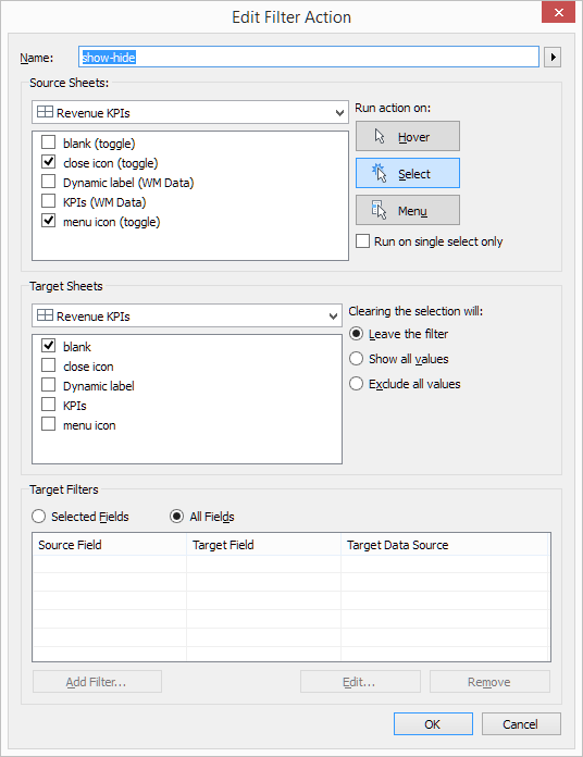
The Show/Hide Action
Controlling the blank sheet which moves the pieces to the left or right is simple. We have separate worksheets for the “menu” (aka “hamburger”) and “close” icons. These sheets use a data source with a [Toggle] field containing two values: “show” and “hide.” The sheets are set up this way:
- The menu icon sheet is filtered to include only “show.”
- The close icon sheet is filtered to include only “hide.”
- The blank sheet uses a copy of the [Toggle] field to include only “show” from that field. Using a duplicate field ensures the action filter does not affect this selection.
With this setup, the dashboard needs only one action that uses the icons as the source sheets and the blank sheet as the target. Set the action to run on Select and leave the filter when clearing the selection, as shown below:
My New Favorite Trick
I often see very impressive Tableau workarounds, but I don’t use them myself because they just don’t apply to common situations. I think this idea is different. I constantly feel like quick filters and explanatory items are crammed in to fit on a certain screen size. I want those things to be usable and accessible. Giving them a wide, collapsible space makes those things easier to read and click on when needed. It gives me twice as much room to work with and also helps remove distractions from what’s most important, the data.
Subscribe to our blog
Ontvang de nieuwste updates van Tableau in je inbox.