Tips and Tricks From TC14


Some of the more interesting and practical sessions at TC14 were the Rapid Fire Tips and Tricks sessions led by Daniel Hom. Don't worry if you missed them: we're bringing two of the best tricks shown in those sessions straight to you today.
Automatic Switching from a Fixed View to a Scrolling ViewDisplaying data can often be a challenge. One particularly annoying problem viz authors often run into is choosing whether to display a viz with the "Fixed Width/Height" or "Entire View".
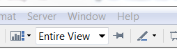
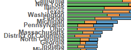
"Entire View" is a great way to neatly fill all of your available space, but once you get above a certain number of rows the view begins to scrunch together and the row headers become unreadable, as you see below.
But, what if it were possible to use BOTH methods in the same viz; to switch between "Entire View" and "Fixed Width". As you might have guessed by now, there is a way.
This method utilizes the ability of layout containers on dashboards to hide vizes. To start, you simply create a vertical layout container by dragging one out from the left hand side of your dashboard. Then, copy the worksheet you want to display, and then embed BOTH the original and the copy of the worksheet on top of one another in the vertical layout container. Switch one of the views to display "Entire View" and the other to display "Fit Width", it doesn't matter which one you use since they should be identical. For this to work seamlessly, you'll also want to delete the sheet titles on the dashboard.
Now all we have to do is display a single view at a time. To do this we can use the "size()" calculation. This calculation is very simple: it finds the number of rows in a view. So, if size()21 (if there are less than 21 rows in the view), then we want to filter out all of the data in the "Fit Width" worksheet (the one with the scrollbar). Conversely, if there are more than 20 rows in the view (the calculated field for that is size()>=21), we only want to show the "Fit Width" worksheet. You can easily achieve this by creating the two calculations above and then dragging them onto the filters shelf in their respective sheets.
The result? A dashboard that displays data in the most efficient method, regardless of how many rows you have filtered. Click the filter below to add a row and see this in action. The only change you should see is the addition of a row and a scrollbar. Subtle, yet useful.
Thanks to Ryan Janoff for this tip.

A frequent feature request that we receive is for the ability to embed charts within tooltips. Although this isn't possible, there is a workaround that can enable you to create bar charts within tooltips.
This trick is actually much simpler than you might imagine. It utilizes a special character that you can access by holding down Alt, then typing 219 on your number pad. █, there it is! If you have an interest, you can see that this is actually just one of an enormous number of alt codes that you can utilize to create other special characters. The ★, for instance might be good for a review or ratings viz. But I digress...
To create a bar chart, all you need to do is string together a series of these █ characters in a calculated field. Since there is no character spacing (or "kerning"), a series of them strung together looks like a solid bar ████████. Of course, you can easily control the length of that bar in a calculated field, like the one below.
LEFT("███████████████████████████████",ROUND([% Economic ]))
I shortened the field so it would fit there more compactly, but here's how it works. You have 100 █ characters strung together, and then a field that has a value 1-100 (a percentage, for instance). Then, you use the "Left" calculation to display only the value of that field. If the field's value is 34.6, the calculation above would round it to 35 and display 35 █ characters. With two or more of these calculated fields (one for each measure you want to display) on top of one another, you have a proportional bar chart. Hover over a dot below to see what I mean, and download this viz to learn more about how it is made. Keep in mind, I simplified the calculation from what is in the workbook, but the concept outlined above is all you need to know to get started.
Thanks to Andy Cotgreave and Andrew Cheung for this tip.

Keep in mind, these are just two tricks out of the 15 that were shown in the Rapid Fire Tips and Tricks sessions at the conference. Sign up for TC15 now to make sure you don't miss out next year!
Subscribe to our blog
Ontvang de nieuwste updates van Tableau in je inbox.