Viz Hall of Fame - 2013
Every day, thousands of visualizations are published to the Tableau Public servers. Each day we pull one amazing visualization from that vast pool of talent to show off as the Viz of the Day. In this post we've taken the best of the Viz of the Day this year, and profiled them here for easy viewing!


Every day, thousands of visualizations are published to the Tableau Public servers. Each day we pull one amazing visualization from that vast pool of talent to show off as the Viz of the Day. In this post we've taken the best of the Viz of the Day this year, and profiled them here for easy viewing!
Buyer or Seller's Market?
Since 2010, it has been generally assumed knowledge that the real estate market favored the buyer. At the very least, buyers had the comfort of knowing that prices were 25% lower than in 2006! As Stan Humphries from Zillow shows us with this visualization, the market has heated up significantly in the past several years. We like the "tell me my story" interactivity with this viz. Click the filter to see your state!

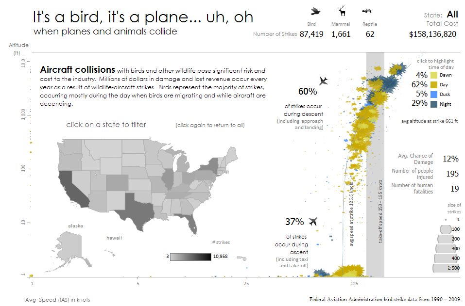
It's a bird, it's a plane...
Wow! What can we say about Kelly Martin's viz that it doesn't say for itself 1000 times over. This visualization of bird strikes takes advantage of the flexible dashboard formatting in Tableau 8 to create a stunning, analytically powerful message. Make sure to click for the full viz... we cannot do justice to it's full width here.
Global CO2 emissions
No Tableau viz list would be complete without an entry by La Nacion's prolific Tableau Public authors. This clean, stylized format is a staple of the La Nacion data department and we have to admit the two-tone colors on this particular view pop. Choose a CO2 measurement to see each country's ranking, you might be surprised by who emits the most person.

Taming PetCo Park
In late 2012 the San Diego Padres baseball team announced that changes would be coming to the center field of PetCo park. More specifically, in some places the wall would be moved in by a dozen feet and lowered by up to two feet in an effort to increase home runs. Ryan Robitaille created this front page news story to hypothesize what game scores, home run counts, and attendance might look like in the new park based on the 2011 season. To see the entire interactive viz make sure to open the image below - download it and see how it is built.

Snapshot of Europe in Recession
Le Monde, France's largest online publication tells the story of the European recession and the Euro crisis. The double dip in the economy is clearly illustrated as are each member state's negative growth rates. A clean color palette and interactive filters help the reader dial in on their country of interest and compare performance across the continent. Click to see the full viz on Le Monde.

NFL Home Field Advantage
Every sports fan knows that the home team starts off with a huge advantage in every game. Or do they? 'Jerome's Friend' of the Phillys Inferno blog created this visualization which shows the home field advantage for every NFL team... and for many teams it does not look like much of an advantage. Of course, that finding is tempered by the differing skill of each team but the view tells a fantastic story nonetheless. Make sure to click on the image for the full viz.

Which banks own Europe's debt?
Simon Rogers from the Guardian Datablog takes a look into the banks that are exposed to European sovereign debt. We like this viz because it is easy to understand, nicely formatted and above all, scary. Nice work, Simon!

The Kraken
Our own Andy Cotgreave pays homage to Tableau 8's internal pseudonym with this beautiful mosaic visualization of Kraky the Kraken consuming a submarine. Click on "About" for a fascinating look at how he created the viz. Apologies for not posting the full viz here, it's simply too large!

Need more viz? We feel your pain! Sign up for the Viz of the Day to ensure you always have your viz fix on hand.
Subscribe to our blog
Ontvang de nieuwste updates van Tableau in je inbox.