In our increasingly data-driven world, it’s more important than ever to have accessible ways to view and understand data. After all, the demand for data skills in employees is steadily increasing each year. Employees and business owners at every level need to have an understanding of data and of its impact.
That’s where data visualization comes in handy. With the goal of making data more accessible and understandable, data visualization in the form of dashboards is the go-to tool for many businesses to analyze and share information.
In this article, we'll cover:
What is data visualization?
Data visualization is the graphical representation of information and data. By using visual elements like charts, graphs, and maps, data visualization tools provide an accessible way to see and understand trends, outliers, and patterns in data. Additionally, it provides an excellent way for employees or business owners to present data to non-technical audiences without confusion.
In the world of Big Data, data visualization tools and technologies are essential to analyze massive amounts of information and make data-driven decisions.
What are the advantages and disadvantages of data visualization?
Something as simple as presenting data in graphic format may seem to have no downsides. But sometimes data can be misrepresented or misinterpreted when placed in the wrong style of data visualization. When choosing to create a data visualization, it’s best to keep both the advantages and disadvantages in mind.
Advantages
Our eyes are drawn to colors and patterns. We can quickly identify red from blue, and squares from circles. Our culture is visual, including everything from art and advertisements to TV and movies. Data visualization is another form of visual art that grabs our interest and keeps our eyes on the message. When we see a chart, we quickly see trends and outliers. If we can see something, we internalize it quickly. It’s storytelling with a purpose. If you’ve ever stared at a massive spreadsheet of data and couldn’t see a trend, you know how much more effective a visualization can be.
Some other advantages of data visualization include:
- Easily sharing information.
- Interactively explore opportunities.
- Visualize patterns and relationships.
Disadvantages
While there are many advantages, some of the disadvantages may seem less obvious. For example, when viewing a visualization with many different datapoints, it’s easy to make an inaccurate assumption. Or sometimes the visualization is just designed wrong so that it’s biased or confusing.
Some other disadvantages include:
- Biased or inaccurate information.
- Correlation doesn’t always mean causation.
- Core messages can get lost in translation.
Why data visualization is important
The importance of data visualization is simple: it helps people see, interact with, and better understand data. Whether simple or complex, the right visualization can bring everyone on the same page, regardless of their level of expertise.
It’s hard to think of a professional industry that doesn’t benefit from making data more understandable. Every STEM field benefits from understanding data—and so do fields in government, finance, marketing, history, consumer goods, service industries, education, sports, and so on.
While we’ll always wax poetically about data visualization (you’re on the Tableau website, after all) there are practical, real-life applications that are undeniable. And, since visualization is so prolific, it’s also one of the most useful professional skills to develop. The better you can convey your points visually, whether in a dashboard or a slide deck, the better you can leverage that information. The concept of the citizen data scientist is on the rise. Skill sets are changing to accommodate a data-driven world. It is increasingly valuable for professionals to be able to use data to make decisions and use visuals to tell stories of when data informs the who, what, when, where, and how.
While traditional education typically draws a distinct line between creative storytelling and technical analysis, the modern professional world also values those who can cross between the two: data visualization sits right in the middle of analysis and visual storytelling.
Data visualization and big data
As the “age of Big Data” kicks into high gear, visualization is an increasingly key tool to make sense of the trillions of rows of data generated every day. Data visualization helps to tell stories by curating data into a form easier to understand, highlighting the trends and outliers. A good visualization tells a story, removing the noise from data and highlighting useful information.
However, it’s not simply as easy as just dressing up a graph to make it look better or slapping on the “info” part of an infographic. Effective data visualization is a delicate balancing act between form and function. The plainest graph could be too boring to catch any notice or it make tell a powerful point; the most stunning visualization could utterly fail at conveying the right message or it could speak volumes. The data and the visuals need to work together, and there’s an art to combining great analysis with great storytelling.
Create beautiful visualizations with your data.
Examples of data visualization
 Of course, one of the best ways to understand data visualization is to see it. What a crazy concept! With public data visualization galleries and data everywhere online, it can be overwhelming to know where to start. Tableau’s own public gallery shows off loads of visualizations made with the free Tableau Public tool, we feature some common starter business dashboards as usable templates, and Viz of the Day collects some of the best community creations. We’ve also collected 10 of the best examples of data visualization of all time, with examples that map historical conquests, analyze film scripts, reveal hidden causes of mortality, and more.
Different types of visualizations
When you think of data visualization, your first thought probably immediately goes to simple bar graphs or pie charts. While these may be an integral part of visualizing data and a common baseline for many data graphics, the right visualization must be paired with the right set of information. Simple graphs are only the tip of the iceberg. There’s a whole selection of visualization methods to present data in effective and interesting ways.
General Types of Visualizations:
- Chart: Information presented in a tabular, graphical form with data displayed along two axes. Can be in the form of a graph, diagram, or map. Learn more.
- Table: A set of figures displayed in rows and columns. Learn more.
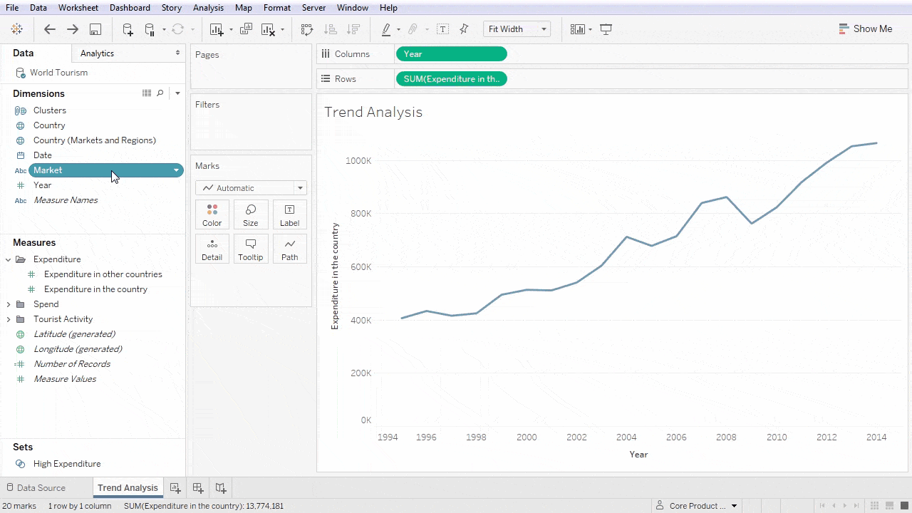
- Graph: A diagram of points, lines, segments, curves, or areas that represents certain variables in comparison to each other, usually along two axes at a right angle.
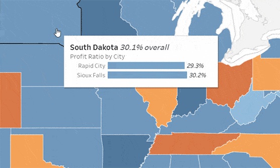
- Geospatial: A visualization that shows data in map form using different shapes and colors to show the relationship between pieces of data and specific locations. Learn more.
- Infographic: A combination of visuals and words that represent data. Usually uses charts or diagrams.
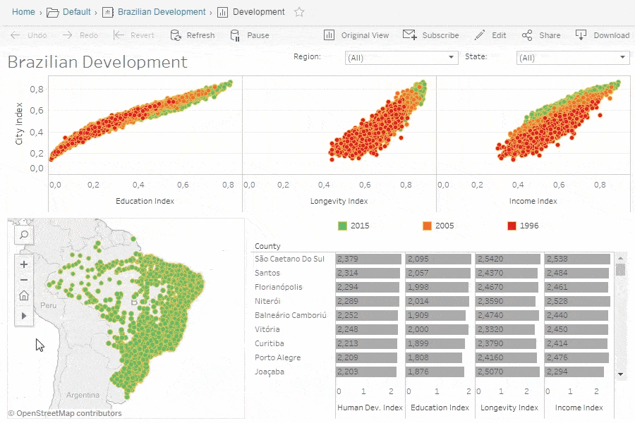
- Dashboards: A collection of visualizations and data displayed in one place to help with analyzing and presenting data. Learn more.
More specific examples
- Area Map: A form of geospatial visualization, area maps are used to show specific values set over a map of a country, state, county, or any other geographic location. Two common types of area maps are choropleths and isopleths. Learn more.
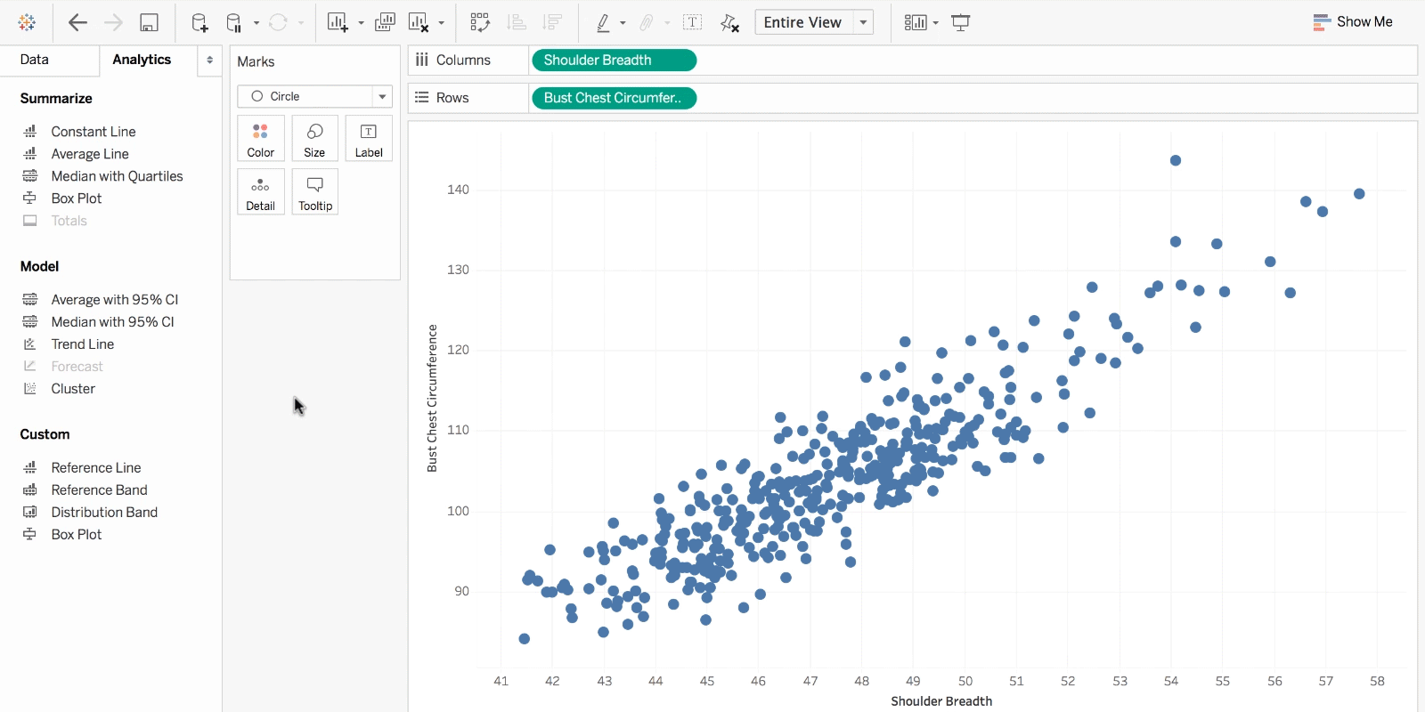
- Bar Chart: Bar charts represent numerical values compared to each other. The length of the bar represents the value of each variable. Learn more.
- Box-and-whisker Plots: These show a selection of ranges (the box) across a set measure (the bar). Learn more.
- Bullet Graph: A bar marked against a background to show progress or performance against a goal, denoted by a line on the graph. Learn more.
- Gantt Chart: Typically used in project management, Gantt charts are a bar chart depiction of timelines and tasks. Learn more.
- Heat Map: A type of geospatial visualization in map form which displays specific data values as different colors (this doesn’t need to be temperatures, but that is a common use). Learn more.
- Highlight Table: A form of table that uses color to categorize similar data, allowing the viewer to read it more easily and intuitively. Learn more.
- Histogram: A type of bar chart that split a continuous measure into different bins to help analyze the distribution. Learn more.
- Pie Chart: A circular chart with triangular segments that shows data as a percentage of a whole. Learn more.
- Treemap: A type of chart that shows different, related values in the form of rectangles nested together. Learn more.
Visualization tools and software
There are dozens of tools for data visualization and data analysis. These range from simple to complex, from intuitive to obtuse. Not every tool is right for every person looking to learn visualization techniques, and not every tool can scale to industry or enterprise purposes. If you’d like to learn more about the options, feel free to read up here or dive into detailed third-party analysis like the Gartner Magic Quadrant.
Also, remember that good data visualization theory and skills will transcend specific tools and products. When you’re learning this skill, focus on best practices and explore your own personal style when it comes to visualizations and dashboards. Data visualization isn’t going away any time soon, so it’s important to build a foundation of analysis and storytelling and exploration that you can carry with you regardless of the tools or software you end up using.
Learn more about data visualizations
If you’re feeling inspired or want to learn more, there are tons of resources to tap into. Data visualization and data journalism are full of enthusiastic practitioners eager to share their tips, tricks, theory, and more.
Blogs about data visualization
See our list of great data visualization blogs full of examples, inspiration, and educational resources. The experts who write books and teach classes about the theory behind data visualization also tend to keep blogs where they analyze the latest trends in the field and discuss new vizzes. Many will offer critiques on modern graphics or write tutorials to create effective visualizations. Others will collect many different data visualizations from around the web in order to highlight the most intriguing ones. Blogs are a great way to learn more about specific subsets of data visualization or to look for relatable inspiration from well-done projects.
See our list of the best data visualization blogs.
Books about data visualization
Read our list of great books about data visualization theory and practice. While blogs can keep up with the changing field of data visualization, books focus on where the theory stays constant. Humans have been trying to present data in a visual form throughout our entire existence. One of the earlier books about data visualization, originally published in 1983, set the stage for data visualization to come and still remains relevant to this day. More current books still deal with theory and techniques, offering up timeless examples and practical tips. Some even take completed projects and present the visual graphics in book form as an archival display.
See our list of the best data visualization books.
Courses and Training
There are plenty of great paid and free courses and resources on data visualization out there, including right here on the Tableau website. There are videos, articles, and whitepapers for everyone from beginners to data rockstars. When it comes to third-party courses, however, we won’t provide specific suggestions in this article at this time.