How we use our product: Making sprint reviews visual
A Tableau software engineer shares how we use our own products by sharing an example of making sprints.


From test results to performance metrics to branch health, developers are constantly flooded with data. Fortunately, I happen to know of a product that’s great for helping people see and understand their data. It’s sometimes difficult to stop myself from spending all day in Tableau, noodling with data and creating views and dashboards that leverage that data to better inform my team’s decisions.
At Tableau, one of our core cultural values is that “we use our product.” This is the first blog in a series where I’ll highlight vizzes that we use as engineers at Tableau to make our daily lives and the continuous improvement of the platform easier.
First viz up is my team’s sprint review dashboard. The origin story is that we needed a way to present quantifiable data on the items completed each sprint and document our progress toward completing features, so I got to designing.
The ideal view
We use Microsoft’s Team Foundation Server (TFS) as our primary work tracking software. TFS offers a lot in the way of Agile tooling, including some handy built-in visualization widgets that you can display for any of your team’s queries. While these are great for displaying important totals and simple, single-dimension charts, we wanted something more powerful for presenting at our sprint review meetings. We imagined a visualization that could accomplish the following things:
- Give us a historical view of our previous sprints and what was done in each one
- Show us how close, or far, we are from completing our current features
- Let us use those views to quickly drill down to individual work items that link back to TFS
What’s in a sprint?
We keep all kinds of useful, dev-wide data sources hosted on our internal Tableau server, so connecting to my team’s TFS data was as simple as connecting to our existing data source and adding a workbook filter on my team’s area path.
To design this dashboard, I started by creating a sprint-by-sprint view to track how many things were being completed each sprint. I created a bar chart with each bar representing one sprint with its size representing the number of defects and stories we completed in that timespan.
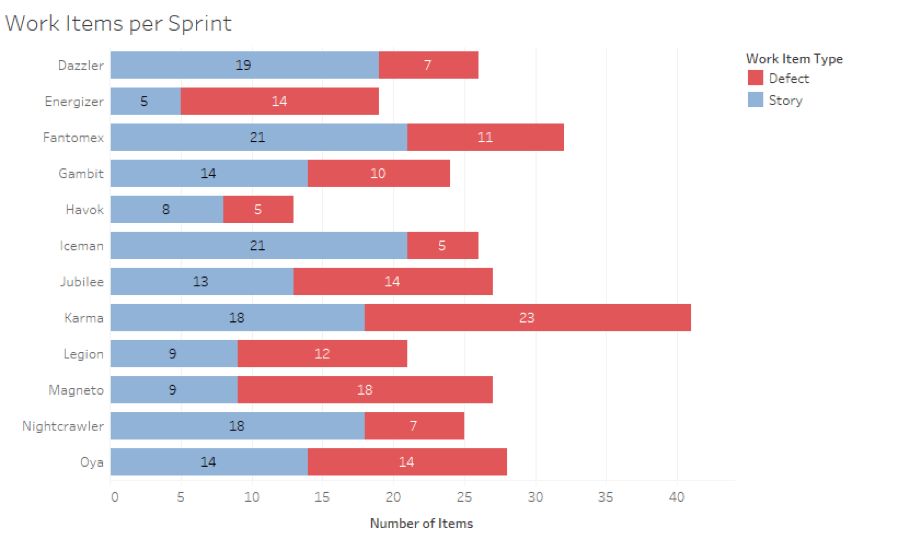
This view represents all of our sprints in the last half of 2018, roughly from June to December. The Exporting team names our sprints after X-Men characters because it makes things much easier to locate and assign in TFS—and because I’m a sucker for alliteration).
But I wanted to know more than just the number of items we completed. What were these stories accomplishing? I switched the quantitative axis from Number of Items to Effort, which is a number we assign each of our stories to designate its relative complexity. I also added the Parent Feature field onto Color so we could see where all of that effort was going each sprint.
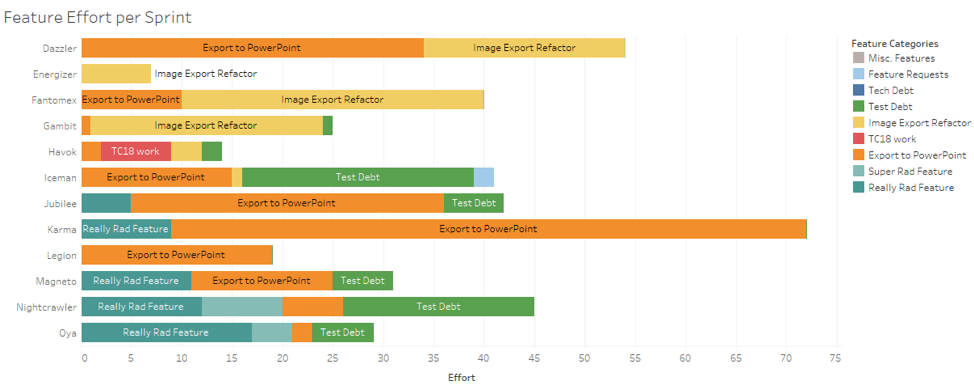
As you can see, this view gives me much more insight into exactly what we were devoting our time to in the last six months: mainly Export to PowerPoint, which we were preparing to demo at Tableau Conference in October and to include in the 2019.1 Beta. I can also see how we started devoting more and more time to a "Really Rad Feature." (That’s a working title if you couldn't tell. It’s a secret.) Since my team has only begun assigning effort in the last few months, we can use this data to start setting capacities for our sprint; our average effort completed is about 30 points, so we now avoid pulling in more than 30 points of effort when sprint planning.
Feature presentation
Once I created a historical view that let us know what we’d completed in past sprints, I moved on to a view that shows where we are right now on our current features. My first instinct was to create a similar set of stacked effort bars, but across features instead of sprints, with color used to represent the state of each item to show how much is left to do, what is in progress, or is complete.

This was good start, but I found myself doing all kinds of math in my head to figure out how close to done we actually were in each feature. So I updated the label to reflect the percentage of total effort across the feature using a table calculation.
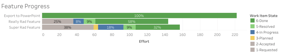
With the above view, we can see that:
- PowerPoint is 100 percent complete.
- Our Really Rad Feature is almost halfway done.
- We still have a lot to do on our Super Rad Feature.
We still see the relative complexity of each feature, and just like before, we know that there’s comparatively less work to be done on the Super Rad Feature than the Really Rad Feature.
Drilling down
Now that I had the overviews I wanted, I needed to load them all up into a dashboard and add some filter and URL actions. I placed the work item and effort views side-by-side up top, followed by the feature progress, and a list view of all the work items in our area path. In that list view, I added a URL action that creates a link in the tooltip for each work item, so the full details are easily viewed in TFS.
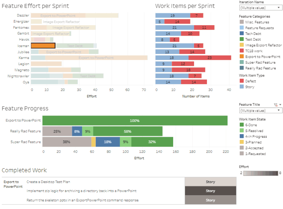
The next thing I did was to add a filter action on the dashboard that takes selections from the top three sheets and applies them as filters to the list view at the bottom.
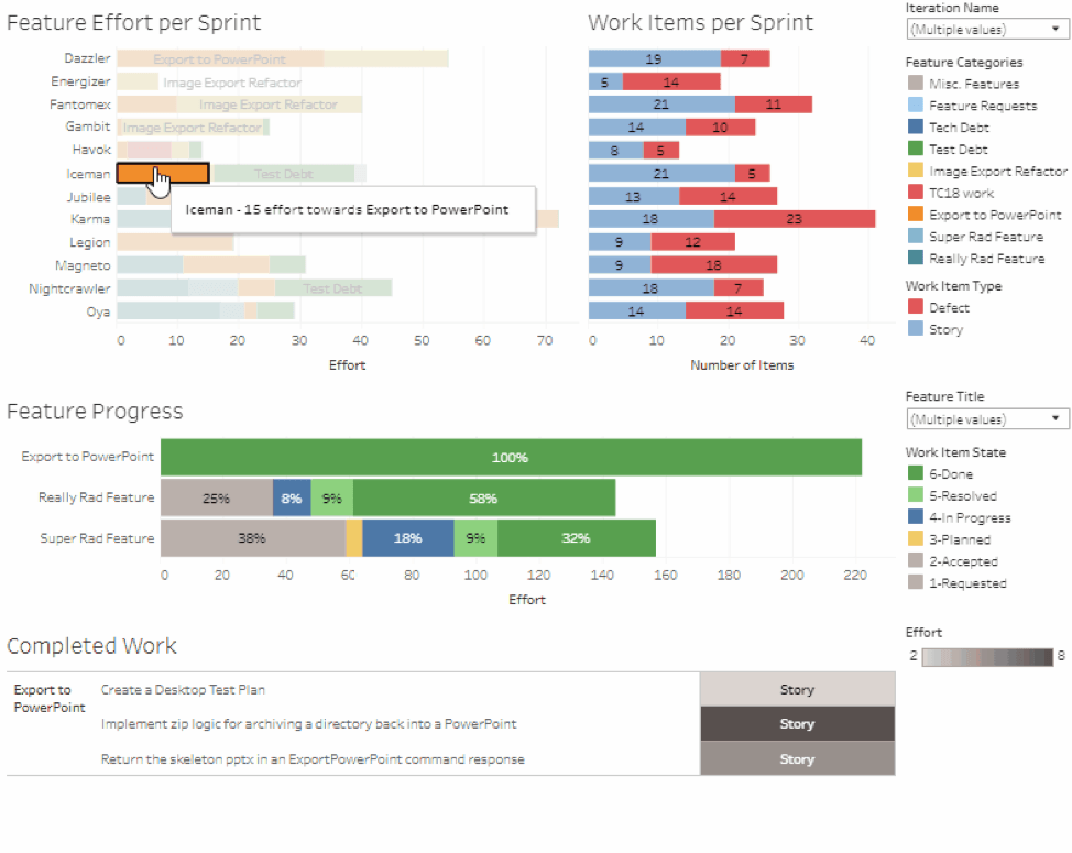
If we want to know what was completed towards PowerPoint export in our Fantomex sprint, we can click on that mark and see all of its component stories in more detail.
Integration into our iterations
With our dashboard complete, the final step was to figure out where this viz should ultimately live. This is something we look at as a group during our sprint review meetings with leadership, so publishing it to our internal server and including the link in the meeting invite is a great way to make sure it’s easy to pull up and present.
My team has found looking at this viz to be useful during our retrospectives when we want to review how much we’ve done in the past and identify patterns in how we complete work. Lately, we’ve been using it to make predictions about which releases our current features will be in based on the average amount of effort we complete per sprint.
One last thing we did with this viz was to create small versions of the sheets within it and embed those views on our TFS dashboard.
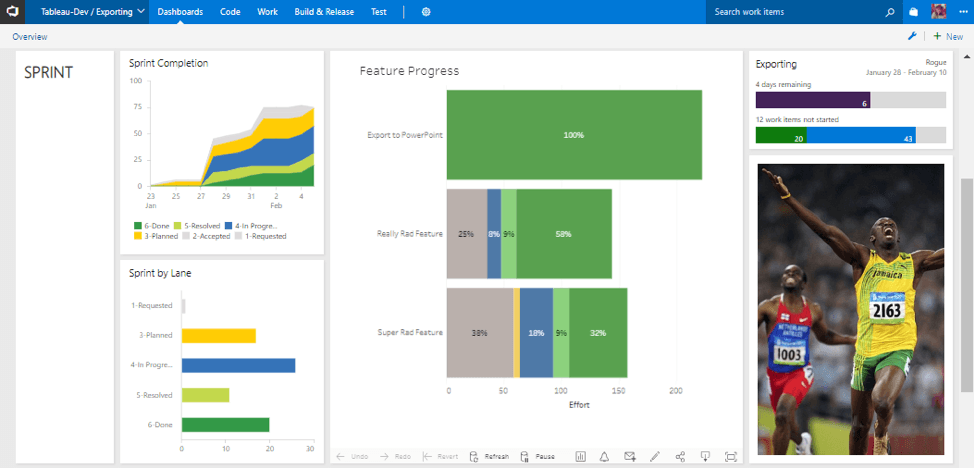
This dashboard fits in seamlessly with TFS’s native visualizations, and we gain information across more dimensions than those visualizations support.
If you were to scroll further down that page, you’d find a series of vizzes I’ve made to represent nightly test run failures and pass rates. The vizzes on our TFS dashboard are only relevant to my team specifically. (This is only one of several vizzes that help us do our jobs on a daily basis.)
At Tableau, we use our products. It's one of the biggest reasons I came to work at Tableau. Working on a product you use creates this incredible circle of positive feedback where your work is motivated by the idea of improving this tool you use every day. With insight into how the tool works, making those improvements is easier, and the work you put in just makes that tool you already love better and better.
Subscribe to our blog
받은 편지함에서 최신 Tableau 업데이트를 받으십시오.