How to Create a Compelling Iron Viz Qualifier Entry in 10 Steps


We invited Joshua Smith to offer his guidance on the best way to get started with an Iron Viz qualifier submission. He is uniquely qualified to advise you as a Iron Viz co-champion in 2019, judge in 2020, and has a deep working knowledge of UX design, storytelling, and data visualization.
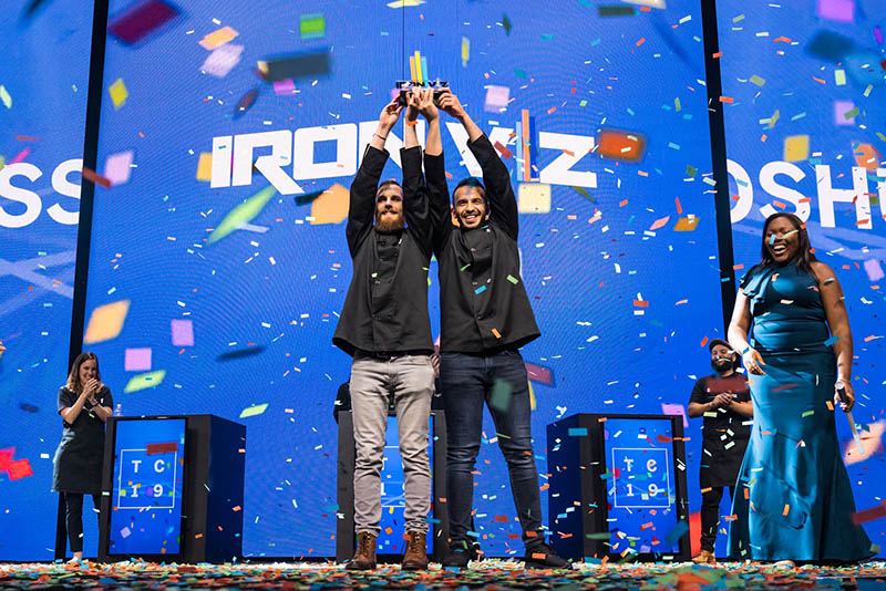
Joshua Smith is pictured on the left alongside 2019 Iron Viz co-champion Hesham Eissa.
In 2019 I wrote a step-by-step summary of my IronViz feeder process. In this post, I dive a little deeper into data storytelling specifically.
- Experience your subject matter
- Research, research, research...and validate your assumptions
- Take time to think about ethics and humanization
- Figure out your rhetoric
- Figure out your design strategy
- Storyboard
- Help your audience relate
- Use your voice-overs
- Workshop your viz!
- Close your story
1. Experience your subject matter
Once you've got your topic, go experience it.
Never underestimate the value of experience — even if you're already connected to your topic. No matter how passionate you are about the topic you've chosen, you probably haven't made an Iron Viz about it. You're doing something new, and you should experience it with a new lens.
For my Iron Viz Agriculture feeder, I went a drove through farmland. I walked the fence lines of farms, looking, listening, and (by choice or not), smelling.
COVID restrictions may make this more challenging, so you might need to be creative — but if your topic is art therapy, grab a pen and try drawing something. If your topic is nutrition, try tracking your macronutrients for a day. If your topic is environmental health, go for a walk and observe all the little things that contribute to our environment and, consequently, our health.
This isn't about insight, it's about perspective. It's this experiencing that will create the right mindset to find the insight. It's a critical step to understanding what you should look for in your data; without these experiences, the most brilliant insights may remain disguised in your data.
2. Research, research, research...and validate your assumptions
The best stories — whether fiction or nonfiction — come from a lot of research. This is different than experiencing in that you're collecting others' perspectives in addition to research, vocabulary, frameworks, statistical methodologies, and more.
I would argue this and the experience step are the most critical. This is the difference between making a chart and delivering an insight.
For my actual on-stage Iron Viz dashboard, I speed-read 3 books. I read about culture and folklore and food. I learned about international foods, and how we classify them. I gained perspective on cultural appropriation and recipes.
This step dramatically changed my approach. Initially I wanted to showcase America as a "melting pot" of foods and cultures. However, through my reading, I learned that "melting pot" is a term that's easily used by the majority, but minorities and immigrants often feel pressure to assimilate into the majority cultures. "Authentic" food is a difficult concept: we may say Taco Bell's tacos are cultural appropriation of Mexican food, but the Mexican tacos we think of now are a Spanish colonial appropriation of indigenous recipes. And that comes to another point: validate your assumptions — or even let go of them, at least when researching. I studied and published in folklore, and in my courses we spent a good amount of time talking about cultures and foods and folk recipes, but I still found that I had some incorrect assumptions. The same ended up being true about farming — there were a lot of things I "knew" that ended up being incorrect. Don't take anything for granted, because that might make you miss that critical insight that sets your work apart.
3. Take time to think about ethics and humanization
If you enter the qualifier, your viz is going to get more attention. It'll be on websites, and if you win it'll be shared again and again and again and again.
Take some time to list out the possible ethical considerations of your work, and revisit this over and over again. Are you displaying data about groups that are underrepresented? Are you discussing power imbalances in society? Are social justice or equity or inclusivity issues involved? Are there high stakes if people misunderstand or misuse your insights (intentionally or unintentionally)?
This isn't just about reducing harm, and it shouldn't cause fear or prevent you from vizzing even on the most difficult topics — but it absolutely should change how you viz, and the care with which you do it.
Imagine—your viz gets thousands and thousands of views: that's thousands and thousands of opportunities to make the world a better place through data storytelling.
You have the power to change minds and influence behaviors. Take the time to think about ethics, seek out expertise and representation, and weave ethical considerations through all of these steps (especially feedback—more on that later).
I'd highly recommend perusing some of the articles written by Tableau Visionary Bridget Cogley, our community's resident expert in data ethics and humanization.
4. Figure out your rhetoric
Years ago I read an amazing book: Everything's an Argument. In this book, Lunsford and Rusklewlcz argue that all writing and design can be viewed through the lens of "rhetoric", or the art of persuasion.
At its core, data storytelling is an art of persuasion — at minimum, persuading your audience to believe you and adopt your perspective.
Rhetoric is traditionally analyzed via the "rhetorical triangle":
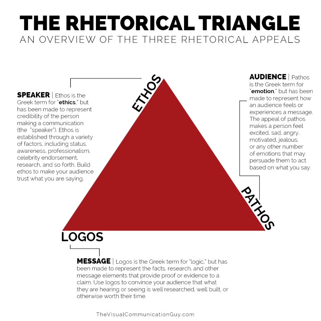
Lilach Manheim and Mike Cisneros (both prior Zen Masters) adapted this triangle to data visualization design in a series of posts you should absolutely read:
Taking the time to think through each corner (and the lines that connect them!) is a critical step to your story. This will help you create your tone and voice, and write and design to your audience.
Do you want to be informal, approachable, and welcoming as a friend that is learning with your audience? Or do you want to be seen as an expert who knows this topic? Should you be heavily analytical, or playful?
5.Figure out your design strategy
Design strategy is really about aligning your creative direction — all your small choices — to your rhetorical goals. Planning this out will help make your work feel cohesive, and will ensure that every element of your design contributes in the right way.
What fonts will you use? What color palette? Light background or dark background? Long form or short form? Highly interactive, or a static piece? All of these — and more — contribute to how your audience experiences your rhetoric.
Want an elegant viz to create the air of expertise and professionalism? Consider Serif fonts for paragraphs paired with double-spaced sans serif fonts, and perhaps more neutral colors. Want an exciting and bold viz that feels like your message is delivered with a bit of spunk? Consider using some more unique, punk-esque fonts in PowerPoint to create images for your titles and headers, paired with sans serif fonts and bold, high contrast colors.
Design is about more than "looking good" — every choice contributes to how your user will experience your work — and the data.
I use Don Norman's "levels of design" to plan out my design elements:
- Visceral: How do I want my users to feel when they look at my dashboard?
- Behavioral: How do I want my users to feel when they interact with my dashboard?
- Reflective: How do I want my users to feel when they think back on my dashboard? (This is especially important for storytelling)
A little bit of time working planning through these levels goes a long way toward making a cohesive design.
6. Storyboard
I start all my works by just making a ton of charts, first looking at univariate, then bivariate, and then multivariate patterns. Anything that looks interesting, I'll save. Anything that doesn't, I delete. Note: this is one of the reasons why experience and research are so important: a chart may "look" dull if I don't have enough background to see why it's important!
With all my charts as worksheets, I start rearranging them in my workbook as a sort of storyboard. The introductory charts (often univariate) go at the beginning to introduce the topic and data. I'll have a sort of talk track for each chart, and that will help me arrange them according to my rhetoric.
In American writing, we're often taught to introduce the topic and state our thesis, provide evidence, and then restate our thesis with a conclusion. This may be right for your storyboard — or, maybe you want to intrigue your audience with your ending, and build some evidence, revisit your ending, build more evidence, etc. Maybe you want to use the point/counter-point flow. There isn't a "correct" form here.
However, you do want to make sure your insights flow. Some of the most common feedback I get on my early drafts involve the transitions from one chart to the next, and often a simple rearranging helps readers follow my rhetoric and understand my conclusions.
7. Help your audience relate
Create characters, give them agency and stakes, and develop their character. Characters are how we relate to stories, how we learn from stories. They are how we experience things we wouldn't otherwise have experienced.
After the Iron Viz in 2019, I wrote a post connecting some of Robert McKee's storytelling principles to data storytelling. You might find that helpful to think about the story (or, even better, read his book!).
Your data may not inherently have characters, and that's ok. There may not be a "story", in the true sense of the craft, in your data. There wasn't a "story" for my on-stage Iron Viz, so I introduced the dashboard with a personally intimate story. There wasn't a "story" in last year's agriculture feeder data, but I introduced myself into the story for an ethos appeal, giving my readers a sense of the stakes I personally had with this data.
Data journalists will commonly pair insights with interviews: show the trends in the data, then make it "real" with quotes from an individual. Look at how The Guardian used interviews, audio, and images to humanize homelessness data. In perhaps my most recommended data viz video ever, Lisa Charlotte Rost describes how aggregations can often decrease empathy — and the power of individual data points.
If you want to tell a story, you can't ignore the most powerful part of stories: characters and their development.
8. Use your voice-overs
One of the quickest things that can get your audience to skim your work (or even close it) is being greeted with a massive wall of text. After all, this is data viz, not expository writing.
Of course, that doesn't mean we should skip text, or even shy away from large amounts of it — writing is a critical way we can bring our readers along, help them understand what they're seeing, and ultimately guide them to our conclusion.
But look at documentaries: they don't talk for ten minutes and then show a ton of images: they weave text with images, and create meaningful pauses.
Take your "wall of text" and break it into meaningful chunks. I try to keep my text no more than two lines at a time. If I have a paragraph that's 12 lines, I'll break it up into 6 smaller "paragraphs", and then use negative space and justification to force my reader to experience the same meaningful pauses they'd get out of a documentary.
Let your most powerful points hang for a bit. Have a brilliant insight? End the line, and toss in 50 or more pixels to let that insight sit with the reader while their eyes move toward the next element.
And don't hesitate to write on your vizzes! Documentaries typically pair talk track with imagery, and while that analogy isn't perfect for data viz, we can look at annotations on a viz as a similar technique that helps readers connect our message to what they are seeing.
Text is one of your most valuable tools — but, walls of text often function like physical walls, keeping readers from your message.
9. Workshop your viz!
Feedback is a benefit you get during the qualifiers that you won't get as much during the on-stage competition. (by the on-stage rules, you're limited to who you can show the viz to before the big day!).
Feedback shouldn't wait until your first complete draft — by that point, changes are more difficult. Instead, get feedback on your insights, get feedback on your rhetoric and design strategy, get feedback on your storyboard, and then you can make your first draft and start looking for feedback. The earlier feedback is often the most critical — this is the feedback that helps you see if your analysis and story are interesting. If you wait to get that information until you're done, you'll might find yourself having to start from scratch.
On an ethical note: this is a critical way to humanize your data, reduce harm, and help ensure positive impact. Disability, chronic and/or invisible illness, racism, sexism, homophobia, classism, and loads of other forms of oppression are very likely to be connected to your topic, your data, your rhetoric, and the way your work is perceived and used.
Remember, "Nothing about us without us". Reach out to people represented in, or connected to, your data. Get their feedback. Don't tokenize one individual and ask them to speak up for many; rather, seek multiple perspectives from that group.
Have you chosen mental health as your topic? Phone a local organization and see if someone is willing to provide feedback, or talk through your work. Maybe your story is about health and wellness among the LGBTQ+ community—find some advocates or organizations.
It's also a great idea to get feedback from experts. I talked to a ton of farmers about my Iron Viz agriculture feeder, and my work changed so much. Even if you're already an expert, don't tokenize yourself. Diversity of opinion and thought occurs within a group!
Not only will this help ensure your work creates positive impact, it'll make your story better — I guarantee it.
10. Close your story
Think about all the times you left a movie theater dissatisfied with the ending. The rest of the movie may have been phenomenal, but forever you'll emphasize how terrible the ending was.
Closure is one of the hardest things to get right (look at the ratings for the final episodes in some of our favorite TV series!). However, lit theory gives us a couple things to consider, called "codes of closure":
- Expectations: think about all the expectations you intentionally and unintentionally set up during the story. Have you resolved all of those? If you're going to talk about tracking nutrients, but you leave out protein, your audience might feel like you've missed something important. Don't leave your reader saying "I thought they would talk about that."
- Questions: think about all the questions you created intentionally and unintentionally during the story. Have you addressed the important ones? It's impossible to answer all of our audience's questions (especially with data storytelling). But, have you addressed the common counter-arguments? Have you made your sources clear? Is there a reasonable path between your evidence and your conclusion? Or are your readers left wondering "how did they get there?" or "why didn't they look at that?"
Take time to end your story. State your conclusion clearly, and if appropriate, offer a clear call-to-action in the form of a URL, next steps, or contact information.
Readers crave this. One of the easiest ways to hurt a storytelling score is to just stop. Your story flows chart to chart to chart, but after the final insight the story screeches to a halt with your signature, and the reader is left wondering "but where's it all going?"
Good luck!
Iron Viz is a yearly highlight of the Tableau community, and presents an amazing opportunity to challenge and grow your Tableau data visualization skills. With the breadth of the topic and the better prizes (even for the top 10 qualifier entries!), there's never been a better qualifier to enter.
I'm super excited to see what you put together.
Editor’s Note: This article is based on this original post on Joshua's blog, Jackalope.
관련 스토리

Meet Iron Viz 2024 Finalist Jessica Moon
 2024/04/15

Meet Iron Viz 2024 Finalist Pata Gogová
2024/04/08

Student to BI Analyst, How Tableau Can Lead to a Successful Data Career
 2024/03/20
Subscribe to our blog
받은 편지함에서 최신 Tableau 업데이트를 받으십시오.