Most information has nothing to do with data: 3 lessons from designers to sharpen your data storytelling


This blog post is adapted from INFO WE TRUST, a lavishly illustrated new book by RJ Andrews about how to make information people can believe in.
All of the world, in some way, is serving you information signals all the time. Most of them are not data-driven insights. The data storyteller has a lot to learn from beyond the world of data, insights that can help develop talents for sparking attention, engagement, and emotion. From magazine ads to Hollywood cinema, the full spectrum of information arts can transform how you see the world.
From the museum curator: create attention-holding encounters
Information consumes attention. And our attention is in limited supply. Museum curators know this—they design for what’s going on in your head. What room should I visit next? What does this art mean? What if I don’t see everything? I think I’d like a snack.
The ways museums are designed offer much to learn about data storytelling. Curators know that information overload is a visit-killer, so they try to design “museum fatigue” out of the museum. They want you to know where you are and where you’re going. It starts in the lobby, where big objects lure you like billboards to different choices. It continues with wayfinding elements that ease your navigation through the galleries. Long sight lines, right-angle turns, and human-scale distances all help visitors construct their own mental maps of the museum’s galleries and paths. Frequent “you-are-here” locator maps and well-labeled landmarks help visitors check in with, update, and expand their personal maps.
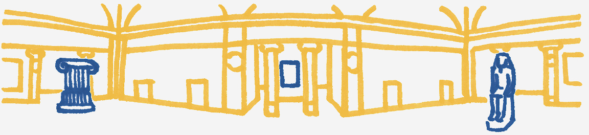
Inside a particular gallery, layer information to give viewers options. Text labels can augment understanding, but not at the expense of letting people discover and see things on their own. Help orient a viewer to many dimensions. Several paths to meaning can be contained in a single space. Give access to all of them. Create opportunities for return visits. Use subtle design to reduce navigation friction. Help audiences find their own context and meaning.
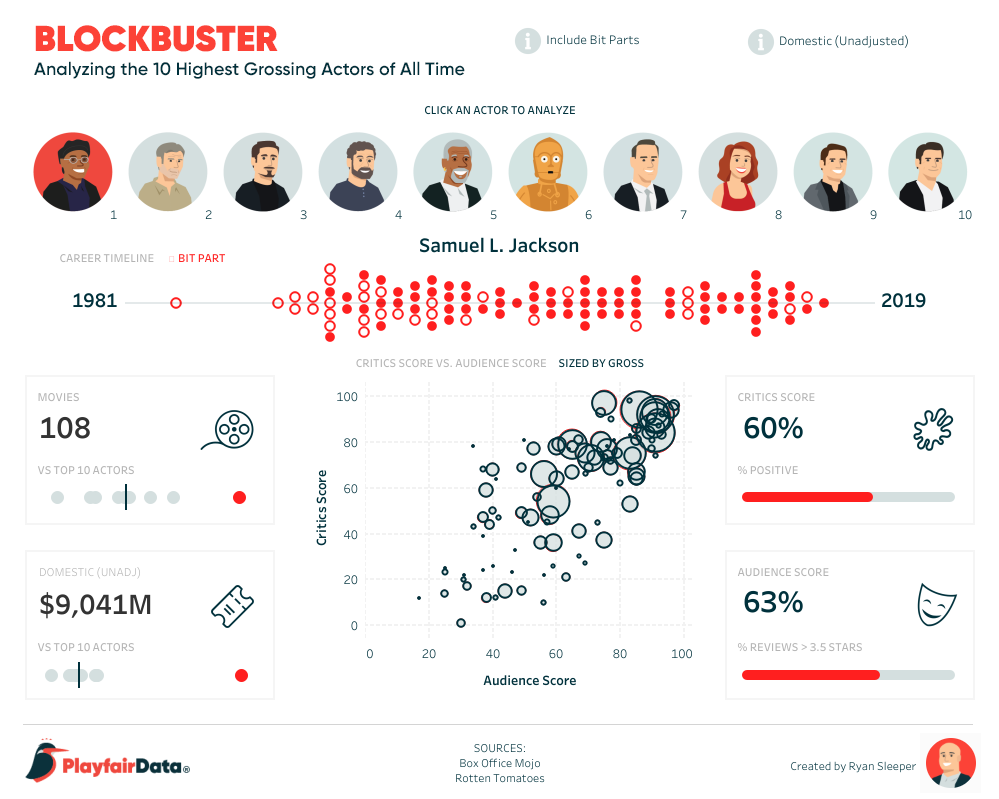
In his latest visualization, Ryan Sleeper takes up the museum curator’s mantle. There’s plenty to explore. Its layout and aesthetic keep the experience inviting. If you want to engage, hover to see, just like approaching the label of a painting.
From the poster designer: focus attention to meaningful chunks
Too many visual inputs cannot all reasonably compete for attention at once. If you overwhelm the viewer, then they may disengage.
Graphic design has a long tradition of attracting attention, conveying messages, and motivating action. What’s its trick to complex storytelling? Package sets of ideas into units of information that can be stored in your viewer’s short-term memory. These “chunks” of information can be divided into conceptual meanings defined by color, line weight, scale, and placement, all helping to match content to its hierarchy of importance. The viewer can then navigate the chunks and break them into their sub-elements as necessary.
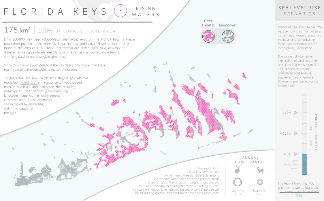
Ben Davis uses chunking to separate his story about the Florida Keys into a clear title and four distinct sections. The chunks are organized on a dynamic diagonal. Plus, their different coloring keys our attention to their different importance, before we read a single word.
From the filmmaker: sequence for flow
Our experiences of reality are never-ending stories, giving us a place in the world and a place in time. Information has not done its job until it impacts this story running in a person’s mind—only then has information truly informed.
Your mind experiences time in sequence, so it receives story in sequence too. Every story arrives across a linear flow, one beat after another. Filmmakers are masters of flow. They understand that good stories give you a reason to climb aboard for the ride. Stories are how you remember the past and expect the future.
Filmmakers command flow precisely to hold their viewer’s attention and to bias their experience. By placing content in the right order, they help make salient what matters for each moment. Take a look at the variety of plot structures below, each paired with a classic film:
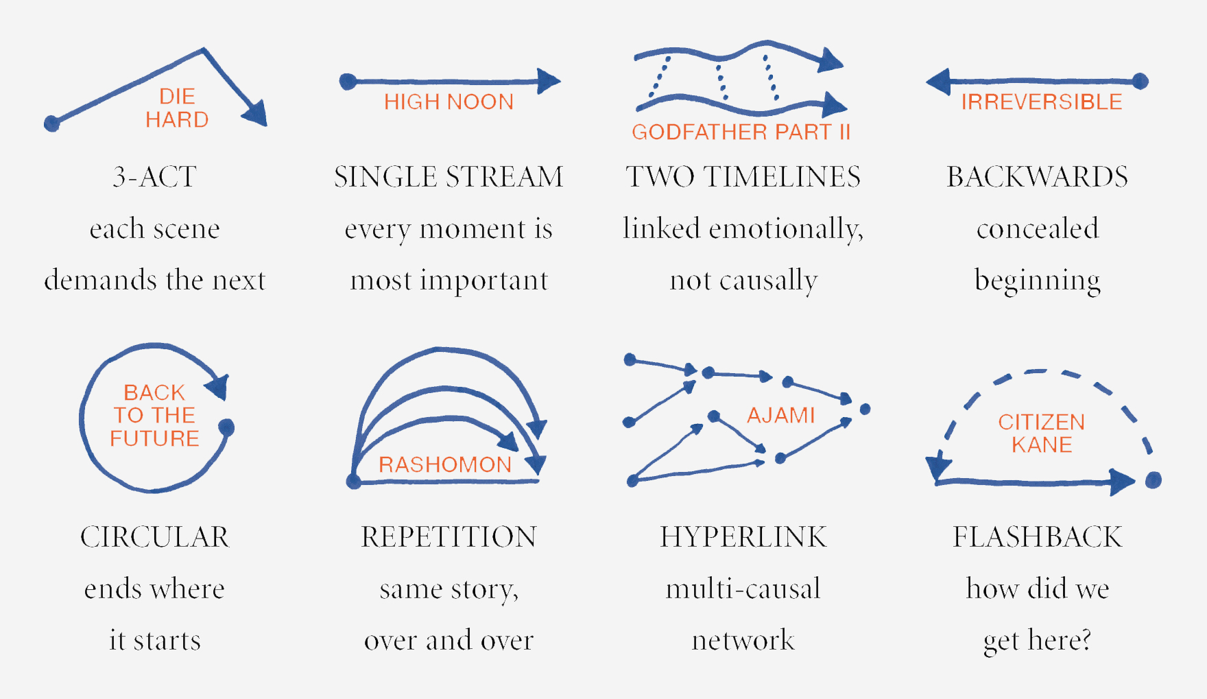
A film’s sequence can show effect, then cause. Sequence can also contrast unlike things. Sequence can elaborate, exemplify, and generalize. Sequence can surprise by violating our expectations. Each captures the viewer in a carefully constructed flow.
Anna Dzikowska uses the browser’s scrolling flow to tell a simple sequenced story, from then to now. After anchoring us in what it was like, each individual mark becomes part of a larger rush that builds toward a powerful climax.

Creativity is all about making new mappings between previously unconnected things. Keep filling your mental hopper with new concepts, then leave space for the mental fireworks to fire. Travel beyond the realm of data visualization into the larger world of human experience, and see how wonderful storytelling can be.
When you make your return to data storytelling, remember: Tableau Public is populated by data storytellers that also happen to have unique, specialized knowledge. Follow data-storytellers with unique backgrounds to continue expanding how you see the world. Turn your Activity Feed into a steady stream of new perspectives, new concepts, new stories. Get started by following Tableau Public’s Featured Authors.
Be sure to follow RJ Andrews on Twitter and learn more about his book INFO WE TRUST on his website.
관련 스토리

Meet Iron Viz 2024 Finalist Jessica Moon
 2024/04/15

Meet Iron Viz 2024 Finalist Pata Gogová
2024/04/08

Student to BI Analyst, How Tableau Can Lead to a Successful Data Career
 2024/03/20
Subscribe to our blog
받은 편지함에서 최신 Tableau 업데이트를 받으십시오.