#MyRecentViz: Is Trump signing more Executive Orders than other Presidents?


Editor’s note: This is a summary of the webinar from 7 February 2017. It is part of the #MyRecentViz series of blog posts and webinars, each deconstructing a beautiful and insightful viz. Andy has also written about his motivations behind this viz on his personal blog.
The Question(s)
President Trump signed ten executive orders and actions in his first ten days in office. From my reading of the news coverage on this topic, this felt like an unprecedented level of activity, but I wanted to find out whether this was really true. My main question was: How does Trump’s use of executive actions compare to other presidents’ first ten days in office?
As a secondary question, I was also interested in finding out how many executive orders presidents typically sign over their whole presidency.
The Viz
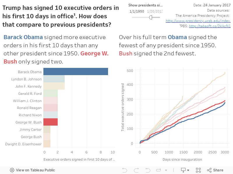
The viz contains of two charts aiming to answer those two questions. The bar chart on the left shows the number of executive orders signed by different presidents in their first ten days in office, while the line chart on the right shows the running total of the number of singed executive orders over their whole time in office. The filter is pre-set to show only presidents after the war, but allows one to expand the view to include more presidents.
The Answer(s)
From the bar chart we can see that no other president has signed as many executive orders in their first ten days, but President Obama came close with nine executive orders. Other presidents were far less active at the beginning of their terms, with Obama’s predecessor Bush for instance only signing two executive orders in his first ten days.
However, as we can see in the chart on the right, while Obama had a furious start to his presidency, in total he signed fewer executive orders than the other presidents since 1950.
The Data
The data on the executive orders is from the American Presidency Project, and actually includes executive orders, actions, and presidential memoranda. At the time of the creation of this viz (10 days after Trump’s inauguration), the site had not been updated with all of Trump’s exec orders. Over time, this viz needs to be updated to include Trump’s orders in the charts themselves.
The inauguration dates that were needed to calculated the relative dates for the running total are from History In Pieces.
The Chart(s)
A simple horizontal bar chart was employed to compare the number of executive orders across presidents. Bars may seem like a simple chart, but they are perfectly effective: encoding data using length allows for very accurate perception.
More interesting perhaps is the chart on the right where we are looking at the total number of executive orders signed. Rather than using another bar chart (to display the total numbers by president) I chose to show a bit more detail by plotting the running total over time. This makes for a more interesting chart, and also allows one to spot interesting patterns in the data, such as the curling up of the curves towards the end – many presidents push through executive orders at the end of their presidencies.
To create such a line chart in Tableau two steps are necessary:
- Calculate the relative dates (=days in office), for the horizontal axis. In this case I am using the datediff function to subtract the day the executive order was signed from the inauguration day of the president.
- Get the running total of the number of record for the vertical axis. I used the quick table calculation “Running Total” on the number of records, with each record (row) being one executive order in my dataset.
I also chose to include a slider filter to limit the view to the most recent presidents, while at the same time giving the reader the option to explore more data points. This also helps to make the chart look less cluttered.
The Design
The layout is a classic two chart-dashboard. The title and the sub-titles are given plenty of space as they help to tell the data story. The title also sets the context as it shows the number of executive orders signed by Donald Trump in the first ten days.
Given the contentious nature of many things related to US politics, I also decided to give the data sources and the date of the last refresh of the viz enough prominence by placing them in the right-hand corner of the viz’ header.
In terms of the colors, I decided to highlight the two most recent presidents before Trump, by using their party colors, blue and red. The other presidents were assigned low-saturation tints so as to set them back visually compared to Obama and Bush. The red and blue shades are also used in the accompanying text to make the connection clear.
Closing Thoughts
This was a quick viz to get a quick answer to a question that I had. Nonetheless a lot of design choices went into the construction of it. Not everybody was happy with all of the choices: especially the decision to not included Trump’s ten executive orders in the bar chart puzzled a few people. I can see their point, but personally I thought it was enough to include the relevant number in the title.
I will try to update the viz at irregular intervals as more data becomes available.
If you have any questions or feedback on this viz, you can reach me on Twitter @acotgreave.
Photo credit: The Whitehouse. Photo cropped to fit. Used under the Creative Commons Attribution 3.0 License.
관련 스토리

Meet Iron Viz 2024 Finalist Jessica Moon
 2024/04/15

Meet Iron Viz 2024 Finalist Pata Gogová
2024/04/08

Student to BI Analyst, How Tableau Can Lead to a Successful Data Career
 2024/03/20
Subscribe to our blog
받은 편지함에서 최신 Tableau 업데이트를 받으십시오.