How United Way Is Using Data to Show Impact and Build Bridges


Chris McFadin needed a bridge.
On one side, the data manager for the United Way of Greater Milwaukee & Waukesha County had suburban commuters who came into the downtown core each day for work.
On the other side, he had a fundraising team that raised over $60 million through workplace campaigns to support over 110 agencies providing essential services to people across the greater Milwaukee area.
These were agencies like the AIDS Resource Center of WI, with a program called Lifepoint that provides clean needles, screening, treatment resources, and Narcan to intravenous drug users throughout the community. Many employees from commuter communities assumed that these are “downtown” problems that are left behind at the end of each day.
Chris’s bridge needed to make clear that these issues were not left behind when someone left the office, that LifePoint services were just as necessary in the suburbs as in the city, and that signing up for a monthly donation through United Way helps people in need much closer to home than they realized.
The more Chris explored the services-delivered data, the more he saw an opportunity to build that bridge.
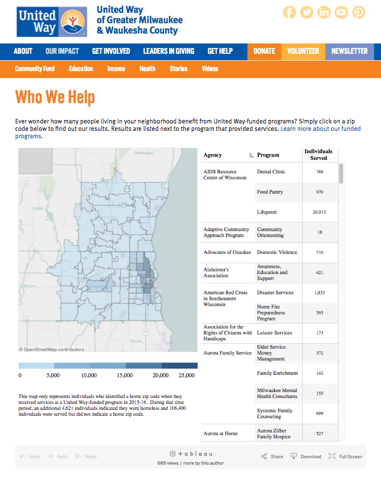
“The big question we get is: how many people in our neighborhood have we helped?” said Chris.
United Way staff explore survey data to measure the number of people benefitting from its funding, then they share insights about this impact with donors. But when people don’t live and work in the same area, the emotional connection to that impact isn’t as strong. The weaker the connection, the less likely someone is to continue to contribute each year.
Chris built the “Who We Help” map as a way of dispelling those myths and strengthening the bond between donors and service providers.
The viz shows the number of people benefiting from United Way-funded programs by zip code. The map also works as a filter, allowing anyone to see the specific agencies—what and for how many—are serving that area.
This filtering makes it easy for anyone to see exactly how United Way is making a difference both where they work and live.
Chris shared the viz during the annual workplace-giving signup campaign, and instantly saw results.
By slicing the aggregate data by zip code, he could make the issues and the interventions personal for everyone.
“People in the suburbs are surprised to see these problems so close to home,” said Chris, noting that the annual fundraising campaign is on track to meet its $60 million goal.
The survey data underlying the viz is a requirement for agencies receiving United Way funding, but individual beneficiaries are not required to answer as a precondition of receiving services. Chris says roughly half of all beneficiaries participate by sharing basic information on their gender, ethnicity, income, and home zip code.
That diversity of data is at the heart of what he’d like to tackle next: bring in other demographics into the report and let donors explore their community further. He’d also like to bring the organization’s broader Community Impact report to life in Tableau, making it easier for supporters everywhere to connect their contribution to an improved quality of life for thousands across the region.
And at the end of the day, all of this data work is about tearing down misconceptions, inviting neighbors to help neighbors, and show a community that is stepping up to help when it is most needed.
Know of an organization using data to change the world? Tell us in the comments below.
관련 스토리

Meet Iron Viz 2024 Finalist Jessica Moon
 2024/04/15

Meet Iron Viz 2024 Finalist Pata Gogová
2024/04/08

Student to BI Analyst, How Tableau Can Lead to a Successful Data Career
 2024/03/20
Subscribe to our blog
받은 편지함에서 최신 Tableau 업데이트를 받으십시오.