Introducing PolicyLink’s Racial Equity Data Lab: A new resource to support data for justice


Our partners at PolicyLink launched their National Equity Atlas in 2014. Developed with USC’s Equity Research Institute, the Atlas is one of the most powerful resources for data on racial inequities in the country. The platform contains data on a range of indicators, from demographics to economic vitality to connectedness, and provides analysis and examples of the data in action. Local leaders and advocates across the country rely on the access to inform their campaigns and policy efforts.
Tableau Foundation is proud to support the latest addition to the Atlas’s already robust set of resources: the Racial Equity Data Lab. The Lab, which PolicyLink CEO Michael McAfee announced at Tableau Conference 2020, is built with Tableau to allow Atlas users to produce their own visualizations using Atlas data. “It’s leveraging the power of Tableau so that Atlas users can create their own data visualizations, fact sheets, and dashboards,” says Sarah Treuhaft, vice president of research at PolicyLink.
The Lab is designed as a comprehensive data visualization resource for organizers working for racial equity and justice. On the Lab, visitors can find:
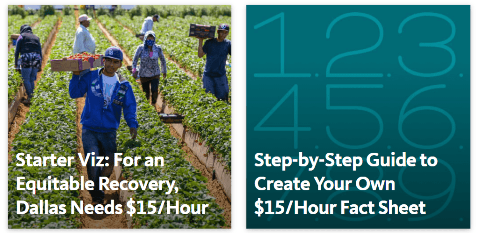
- A starter viz: This sample Tableau dashboard will be loaded with data on wage equity so users can create their own visualization of who earns $15/hour in their own state or city. An example dashboard shows this analysis done in Dallas, and users can access step-by-step instructions to create their own dashboard.
- Data viz basics: A guide to data viz best practices to reference as they build their analyses
- Tableau resources: A high-level overview of working with Tableau Public, as well as two starter workbooks and guides for two National Equity Atlas indicators.
- A gallery: Here, users can explore a growing set of examples vizzes created in Tableau with National Equity Atlas data.
“The purpose of the National Equity Atlas has always been to equip community based organizations, and organizers, particularly organizers of color, with data to support their equity campaigns,” Treuhaft says. Bringing Tableau into the platform and enabling organizers to create their own visualizations takes the utility of Atlas data to the next level. “It’s a visualization tool that allows us to meet the expressed needs of movement leaders,” Treuhaft says.
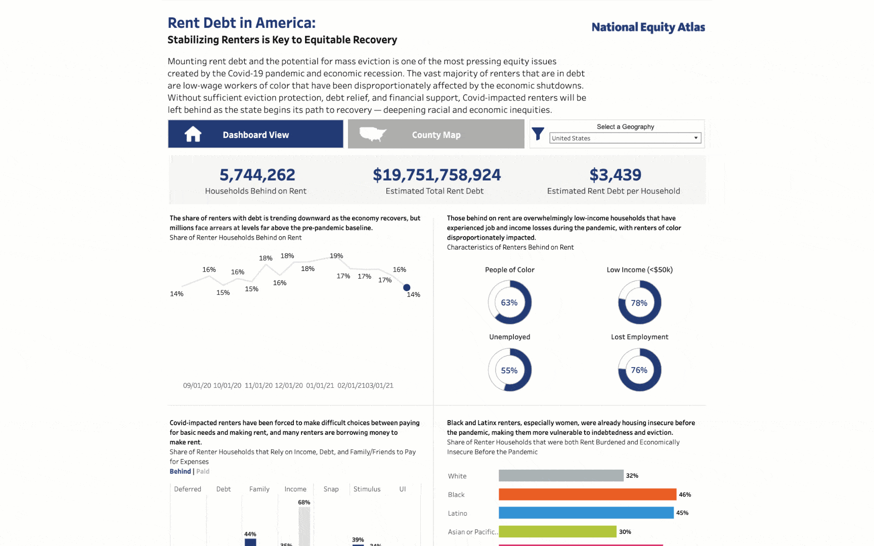
The first dashboard published as part of the Lab demonstrates the power of this resource. The National Equity Atlas partnered with the Right to the City Alliance, a national housing justice organization, to create a dashboard that combines Atlas data with U.S. Census Household Pulse Survey data to show who is behind on rent, and how much they owe. The dashboard was born out of a need for timely, accurate data on the extent of the rent debt crisis in the U.S. to inform the policy debate around potential solutions to avoid an eviction crisis in the wake of COVID-19’s economic fallout. The data is refreshed about every two weeks when new Pulse survey data is available, and filterable by geography to remain relevant to local organizers.
These types of immediate, actionable analyses are what Treuhaft says the Lab was developed to enable. “Data—especially data that’s disaggregated by race—is critical in equity campaigns,” Treuhaft says. “But community-based organizations often do not have access to the data they need, or the tools to visualize the data to create graphics they can use in fact sheets or campaigns. Those who have more money and more resources often do have access to data,” she adds. “Providing relevant, accurate data can help correct this power imbalance.”
Visit the Racial Equity Data Lab to learn more, and to learn more about Tableau Foundation’s work for racial justice, visit the Racial Equity Data Hub.
관련 스토리

Using data to drive conversations about climate change
 2022/04/28

Leveraging data to improve forestry practices worldwide

Doing Good Data Means Doing No Harm
 2021/12/13
Subscribe to our blog
받은 편지함에서 최신 Tableau 업데이트를 받으십시오.