#DearDuo: Our quantified-self journey


A little over a year and a half ago, we launched our new blog (thedataduo.com), focused on sharing our work and participating in the data viz community.
The blog was rolling along nicely, but we had a little problem, well, several actually.
- We didn’t know each other very well
- We needed some content to keep interest up
- We needed additional practice in visualizing unfamiliar data sets
- We wanted to maintain a consistent presence in the Tableau community
What it came down to was we needed something that would inspire us to keep vizzing and learning. We needed something, something consistent, something interesting, something insightful, and something fun…
Right around this time, Zen Masters Jeffrey Shaffer and Andy Kriebel had just wrapped up their Dear-Data-Two project. This was a Quantified-Self project where they tracked weekly data about themselves and then visualized it on hand-drawn postcards, which were then mailed to each other. This was an homage to the original Dear-Data creators, Giorgia Lupi and Stefanie Posavec.
Inspired by this project and energized by the community, #DearDuo was born.
What is #DearDuo?
We wanted to do something similar to our inspirations, but with some definite distinctions. First, we were not going to hand-draw anything. Kudos to those who came before us, but we knew our limitations. Our work would be produced solely in Tableau.
Secondly, we were not going to produce something on a weekly basis. Call us slackers, lazy, or whatever else you want. We knew that starting with an achievable goal that we could both commit to was the best path for us. We would track and visualize our themed data on a monthly basis.
Finally, we wanted our project to be different. We decided pretty quickly that instead of visualizing our own data, we should share our data with each other. This would help us practice visualizing unfamiliar data sets, help us get to know each other, and we thought it would be fun to make fun of each other as we wrote our monthly recap blogs. It turns out that this was pretty fun—especially making fun of each other— and we got better at it as we went along.
We named our project #DearDuo. You can view the entire project here.
The topics and data collection
We did some brainstorming in the beginning to figure out what topics we would visualize, but we wanted to rely on the community tooffer some suggestions. We did get a few topic ideas from folks and here is the final list: hobbies, annoyances, who was more fun at #data16, music, sleep patterns, work, drinks, outfits, Twitter, #MakeoverMonday submissions, steps, and our project recap.
We collected the data using various methods, including: Google Sheets, LastFM API, Nomie App, iPhone Health App data, Twitter Analytics, WordPress, etc.
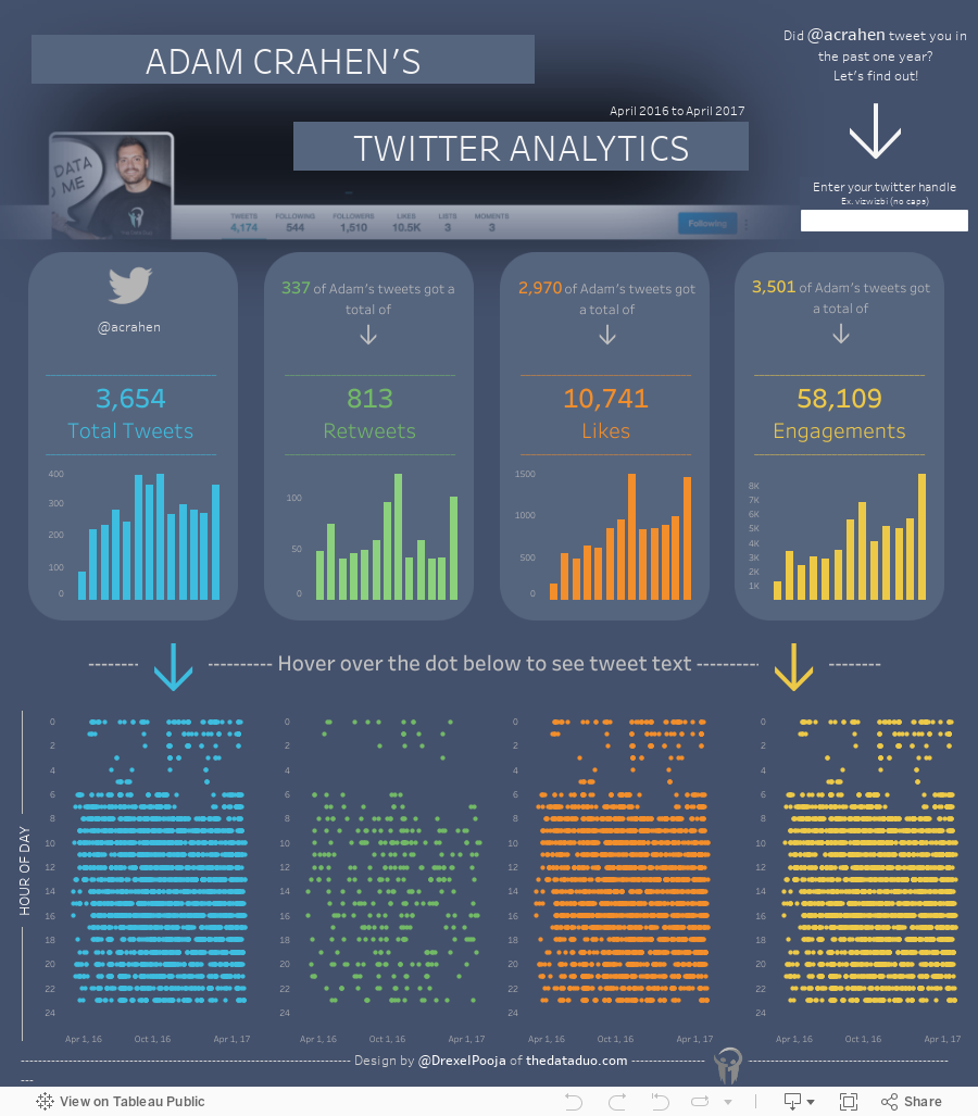
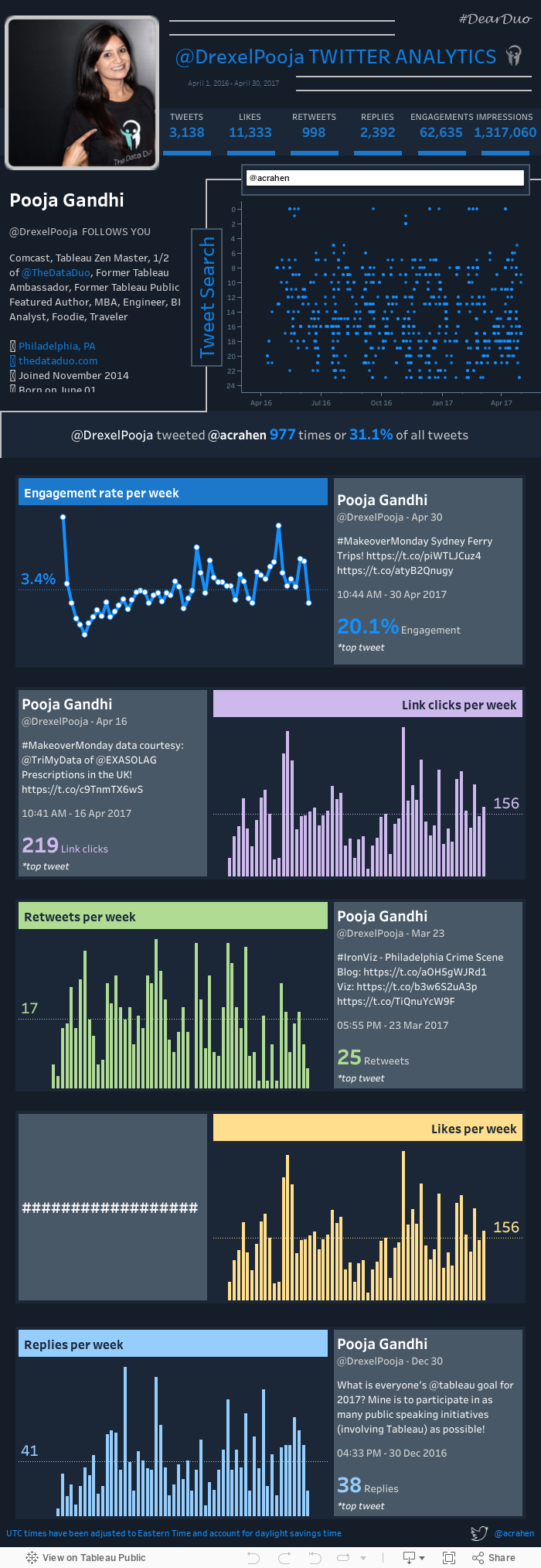
By far, our most viewed topic was our very own Twitter data. We both created a personal Twitter analytics dashboard (mostly so we could see if we were each other’s most tweeted handle) from data we extracted from the Twitter API.
The blog posts
We approached each month the same in that we described the data: our visual design process, and what we learned each week. It was that last part where the posts became fun for us. We became best friends while working on this project and naturally our sense of humor kicked in more as we got to know each other. We discovered that Pooja needs to see a doctor immediately because of her low step count, Adam was tracking an eager co-worker for a year (creepy), Pooja has a bit of a lead foot and provided excellent context as to what she was thinking as she tracked how many cars she passed on her way to work, and that Adam basically runs on coffee, beer, and no sleep.
At the start of the year, we noticed that whoever published their blog first, got all the views. As we grew into great friends, we also wanted the project to be more collaborative so we started publishing a combined blog post each week. Looking back, this was a great idea. The posts became more of a dialog for the reader to enjoy as we bantered back and forth telling our story through data.
What did we learn, aside from all the fun?
We learned that we are not very good at tracking data. Every week we would find mistakes or imperfections in each other’s data. We wish we could say we were just simulating real life situations where data is messy and imperfect, but the truth is we are just bad at it. It was hard to always remember to track things right away. It takes you out of the moment of life, so some months we used some tools to automatically track the data.
We learned that with enough practice, you can analyze just about anything. For example, we visualized what elevator Pooja rode in to get to her office, how many times Adam’s kids got out of bed, what kind and color shoes Pooja wore (SPOILER ALERT: she doesn’t even own sneakers), and how much coffee Adam drank. And, of course we found out who was more fun at Tableau Conference 2016. We put out a survey for the community to fill out (mostly because we didn’t want to track any data during the conference) and it was close (even with Adam soliciting votes during Data Night Out), but Pooja took home the crown.
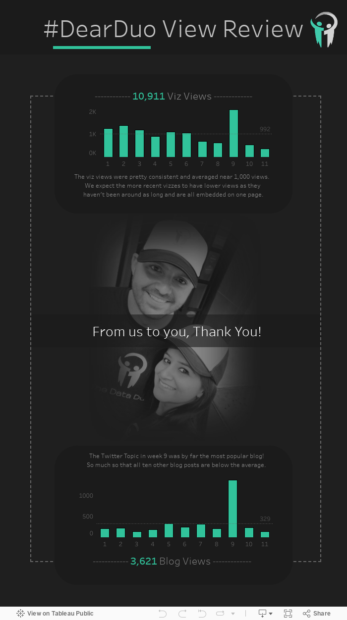
We learned (AGAIN) how awesome this community can be. We never thought anyone would care about our data project. At the time we published our final month, #DearDuo had almost 11,000 views of our visualizations and over 3,600 blog post views. We owe the community a big thank you. Here was our final collaborative visualization thanking the community for their support.
Benefits of the project
This year-long project taught us a lot. Tracking data, visualizing it, and exchanging the visual with each other all takes effort, determination, and commitment. While learning about each other, we also learned a lot about ourselves with the kind of data we tracked about our lives.
Some key learnings for us were:
- A collaboration taught us some things about responsibility and reliability
- We learned a lot of new techniques using Tableau from each other
- We involved the Tableau community and built some long-lasting relationships with industry experts
- Constant ongoing project meant we were always visible in the Tableau community
Our #DearDuo project is complete, but we aren’t riding off into the sunset just yet...
We hope that you’ll visit our blog to enjoy all of our #DearDuo visualizations and blog posts from our year-long Quantified-Self journey through data visualization. You can access all the content at here.
If you are already up-to-date and haven’t had enough of the Data Duo, we just launched the start of our next year-long data project called #DuoDare. You can read all about it here. We hope you’ll follow along!
Going to the Tableau Conference 2017? Don’t forget to see The Data Duo live during our session at #data17.
관련 스토리
DataFam Roundup: April 15–19, 2024
 2024/04/19

Meet Iron Viz 2024 Finalist Jessica Moon
 2024/04/15
DataFam Roundup: April 8–12, 2024
2024/04/12
Subscribe to our blog
받은 편지함에서 최신 Tableau 업데이트를 받으십시오.