Quadrant-chart tutorial, #ElectionViz among best of the Tableau web


Click to see the full-sized visualization.
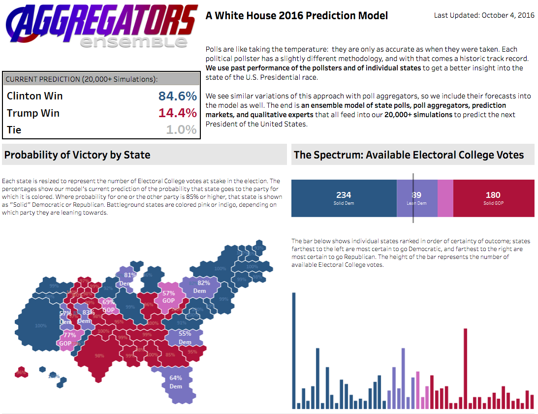
With Election Day fast-approaching in the US, many of us are looking to the data. Andrew Hoagland and Mike Cisneros created this impressive viz to explore how battleground states might swing come Nov. 8. They looked back at past performances of pollsters to create this prediction model based on more than 20,000 simulations.
Check out the cartogram on the left, which shows states sized to reflect the number of electoral votes at stake. According to this model, Colorado is leaning Democrat while Ohio is leaning Republican.
For more election-related data stories, check out our #ElectionViz gallery. And to learn how to create cartograms in Tableau, follow this tutorial by Tableau Zen Master Matt Chambers.
And here is the rest of the best of the Tableau Web:
Tips & tricks
DataBlick When the Pill You See Is Not the Pill You Use
The Data School Residual Plots in Tableau–Why Are They So Important?
Data Knight Rises Distance Calculations
Vizible Difference Cloning a Data Source in Another Workbook
VizWiz Using a Level of Detail Expression to Summarize Dimensions
InterWorks How to Make Centered Scatter Plots and Quadrant Charts in Tableau
Data + Science How To Create a Bar Chart on a Map in Tableau
Beyond the basics
Bora Beran Correspondence Analysis in Tableau with R
LBK.IO Forecasting in Tableau with R
Dabbling with Data Workaround for the Tableau 'Custom SQL' Restriction on SQL Server Variables
Dashboard design
Data + Tableau Visualizing a Metaphor
TableauFit Dashboard Design from Deep within the Brain: It’s Really Like Driving a Car
Tri My Data More than Pretty Pictures
Storytelling with Data Do You SEE It?
Do you blog about Tableau? Let us know in the comments below or via Twitter @tableau!
관련 스토리

Meet Iron Viz 2024 Finalist Jessica Moon
 2024/04/15
DataFam Roundup: April 8–12, 2024
 2024/04/12

Meet Iron Viz 2024 Finalist Pata Gogová
2024/04/08
Subscribe to our blog
받은 편지함에서 최신 Tableau 업데이트를 받으십시오.