Visualizing Election Polling Data: What to Know
Editor's Note: In the run-up to the 2019 UK General Election, Tableau’s Technical Evangelism Director. wrote extensively on the use of data visualization by the competing parties and in the media as the campaign unfolded. The below article contains excerpts from three articles he authored during that five-week period, shared here for readers to consider how data visualization--particularly public opinion survey data--can shape our shared understanding of elections and electoral politics. They are organized chronologically and have been lightly edited to add context.
November 11, 2019: Kickoff
The UK General Election campaign has officially kicked off. Once again, we face five weeks of data and statistics at the heart of the candidates’ efforts to land political blows fairly and unfairly. My one great hope is that all involved will think deeply about how they present data. In today’s political landscape, the proliferation of data has as much power to inform and educate as it does to obfuscate, confuse, and deceive.
This is not just about deliberate deception, but also about how a lack of fundamental data literacy skills does us all a disservice. Even well-intended data can be influenced by poor chart choices. The BBC published “11 charts on why the NHS matters in this election” on 5 November. The data in the article is sound, but some chart choices were not ideal for conveying the intended messages.
This is a complicated issue and it’s hard to solve. Journalists are under intense pressure to turn articles around quickly, and yet they are held to high standards. The charts they make should be as “readable” as a well-crafted paragraph in an opinion piece.
For journalists, it’s about thinking beyond the default charts their software provides, to how they can make it easier for their audience to understand the message. This is about choosing the right chart, and doing everything possible in designing it to reduce the cognitive load on the viewer.
Here are two examples from the BBC article.
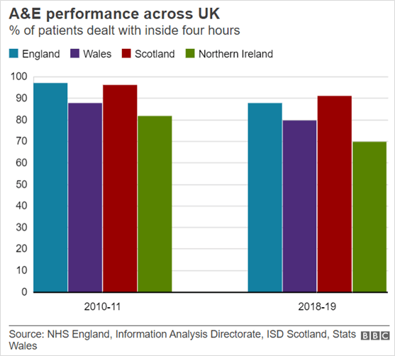
First, consider the chart comparing A&E performance.
The article discusses how the different regions have changed over time. Can you compare regions in this chart? I don’t think it’s easy.
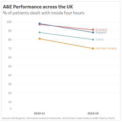
One alternative, a slope chart, makes it easier to compare regions over time.
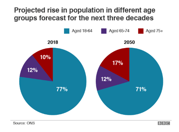
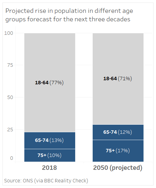
Second, this chart looks at age group distribution today and in 2050.
As you read this chart, pay attention to your eye-movements as you decipher it.
Your eyes are all over the place, right? To fully decipher the story of the data, you’re spending time moving eyes from the pie slice, to the colour legend, to another pie slice, back to the legend, and so on.
How about this version instead?
It’s easier to read, right? You don’t have to keep looking everywhere to see the message of the chart.
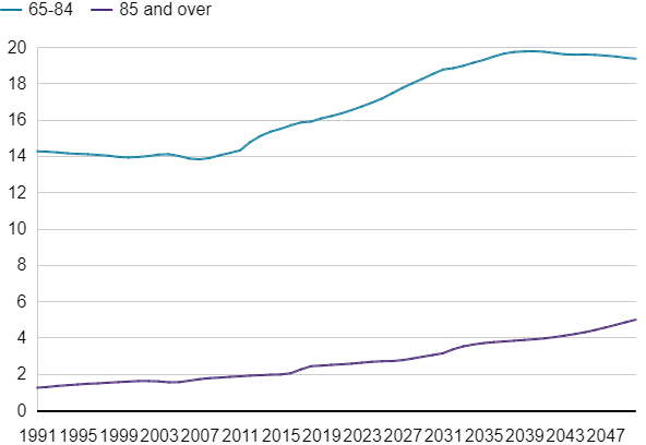
UPDATE:
9 Dec. The BBC republished the article this week (9 December) and reworked the Aging Population Chart.
December 5, 2019: A data viz review of the UK Election Poll trackers
We’re one week away and, as ever, all the media outlets have an election poll tracker. How do they stack up? Do they mislead? Do they adhere to good practice? Do they communicate well with their audience? What can we, as data analysts, learn from these?.
Today I’m taking a look at 5 trackers from across the media and political spectrum.
Overall, there’s lots to like. I didn’t find any egregious visualization crimes. Instead, I found simple charts, attempts to show uncertainty, and some new ways to tell stories. Take, for example, the Guardian, FT, and BBC trackers.
I’m struck at how similar these three are. Why is this? I believe it’s because many organisations realise that simple, effective charts are best. People want insight more than they want shiny toys.
The use of lines and colour saturation makes it easy to see the movements of each of the parties over time. Adding dots to indicate each individual poll is a very good way to communicate the variance and uncertainty.
Each tracker has a couple of nice features the others’ don’t, as well as a couple of things I might like to see improved upon. Taking a deeper dive:
The Guardian
The front page of the Guardian’s election site doesn’t show the tracker. Instead it shows BANs: the headline numbers.
Do I like this? Well, I wrote the book that introduced BANs to the world, but here, I’m not so sure. Headline numbers are amazing, but in an election, it’s the value relative to the others and how it’s changing that is most important.
I think that for the front page real estate taken with these numbers, it would be possible to show the info with some sparklines. Something like this, perhaps:
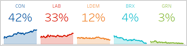
With that approach, we get the headline numbers, but also the sense of change—as well as a way to compare parties visually and quickly. Sparklines are great for mobile, too, as they will shrink down really small while maintaining readability.
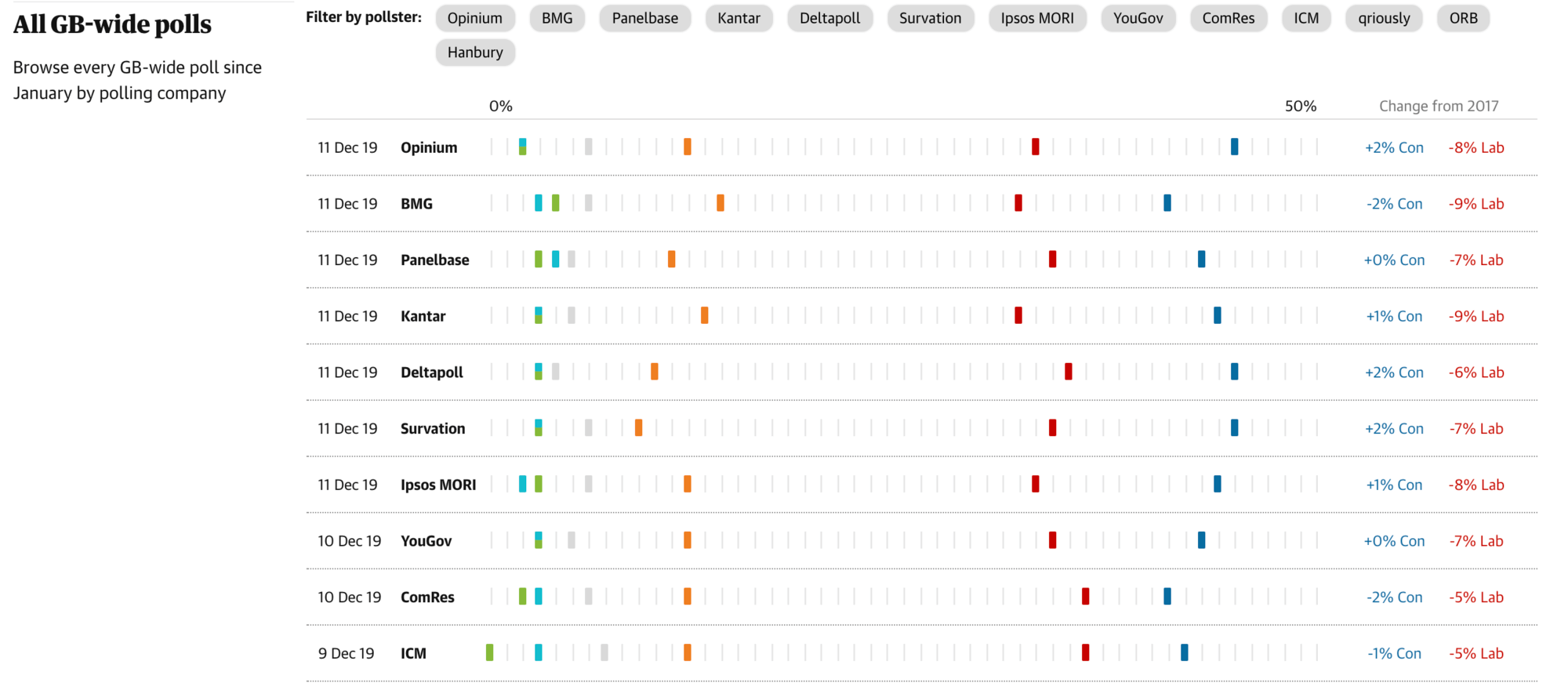
The Poll Tracker itself is the only one of the three with interactivity. Hover over a dot and it highlights all the polls by that pollster, for that political party:
I like this interactivity because it builds a deeper insight into each pollster.
Beneath the line chart is another interactive chart, showing all the polls, row by row. I like this too: it’s a visual representation of row-level detail (contrast that with the BBC and FT, which both have plain tabular data beneath their trackers).
The FT
The FT tracker lacks the interactivity of the Guardian, but is otherwise equally well done. There is one nice extra feature.
I like the labels at the right hand side on the FT tracker. They form an at-a-glance headline, embedded in the visualization itself.
I also like that the FT Tracker page contains changing political and methodological commentary, which they update throughout the campaign.
![]()
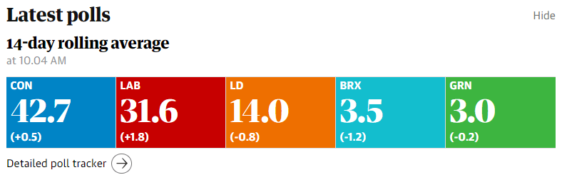
BBC
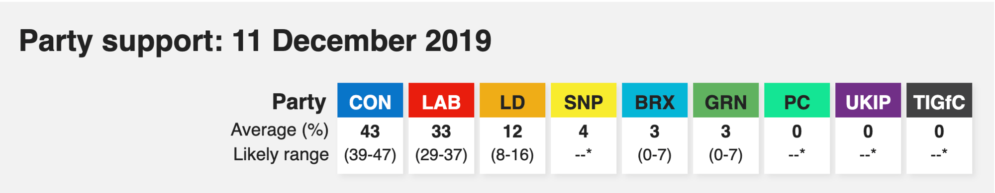
How does the BBC do it? As we’ve seen above, they have the same overall approach. The top of the BBC tracker has a headline section, too.
This is the only tracker to show the “Likely Range”. I think this is really important, because it’s the only one to show, in “headline” form, the uncertainty in the data. Including “Likely Range” lets us see how close the parties might be at the upper/lower ends of the ranges.
I have two small quibbles with the BBC’s tracking chart, which I call out on the chart below with red markers:
Number 1: Which line is this label referring too? I was confused. It’s a reference line label to the solid red line, not the dotted grey line. It took me a moment to work that out. I originally interpreted the solid red line as a border, not a reference line.
Number 2: The BBC chose to include more party lines than the FT and the Guardian, and the result is that the smaller parties’ lines become unreadable. Try following the black line from start to end: It gets lost.
Daily Mail
The Daily Mail doesn’t seem to have a tracker per se, but is publishing regular articles about polling data. I quite like that approach: it makes the polling numbers more of a news item than something to remember to go check in with.
There are a couple of things to like. They chose bar charts, which is great. There’s a nice clear headline. That tells me what I am looking at. But there are issues:
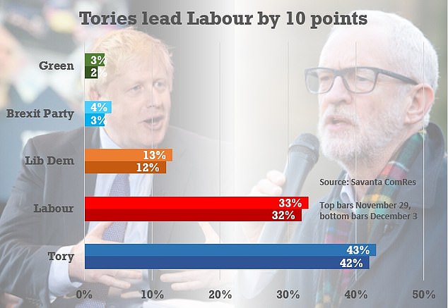
Number 1: Why 2 bars for each party? Have a look at the chart and come back to tell me what they mean…You’re back? It took about a minute, right? Now you’ve worked it out, does it help prove the point being made in the title? Not really. Are side-by-side bars the best way to show change over time? Not really.
Number 2: Since this is a chart about the Tories, in a Tory-supporting paper, why did they sort this so the smallest was on top?
Number 3: I don’t like the background images, personally. They might drive up engagement for a non-data audience on social media, but they do nothing for me.
Number 4: Why is the data source and explanation floating next to the Labour bars? It should be alongside the title, or at the bottom.
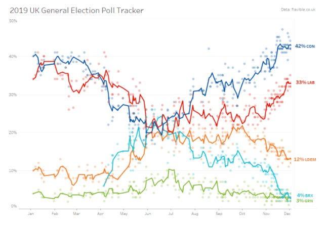
My own tracker: Tableau-built!
Finally, I thought I’d build my own tracker, using Tableau.
I took the data and combined the interactivity of the Guardian with the right-hand BANs of the FT. I didn’t push the needle out.
December 12, 2019: How do you visualize Exit Poll accuracy?
Well: Today is election day, and we’re all excited to see the results of the Exit Poll. I’ve seen two charts today explaining how accurate the Exit Polls are. One is from Statista and the other from The Economist.
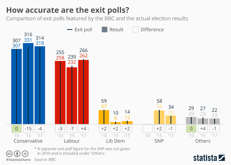
Here’s the one from Statista:
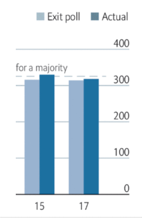
And here’s The Economist’s
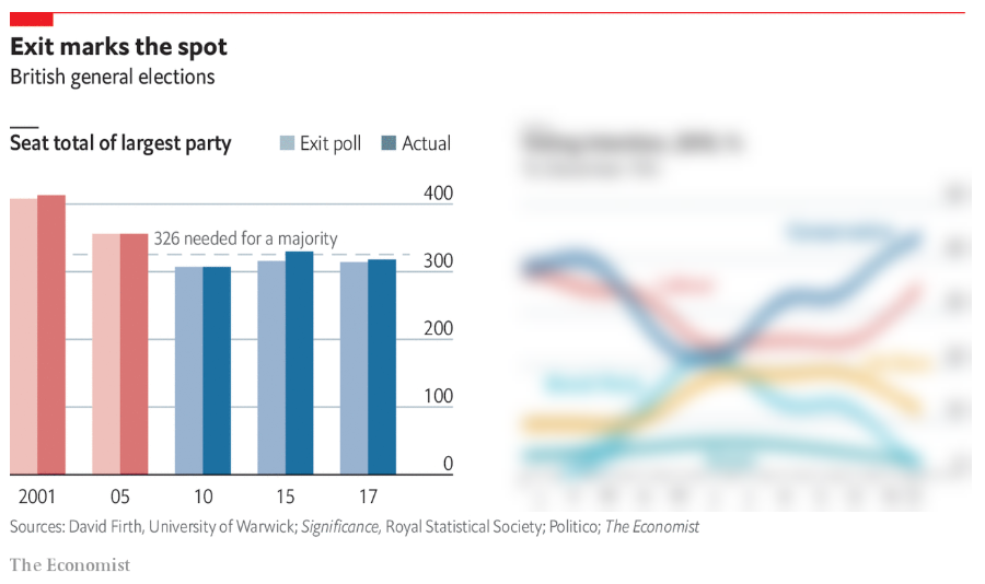
I’ve blurred out the chart on the right because I want to focus on the chart on the left.
Both of these charts are interesting for different reasons. The Statista chart packs in a lot of information. I can see predictions, outcomes, and variances for each party over 3 different elections.
The Economist sacrifices detail for the sake of rapid comprehension.
And that’s the dilemma we all face. Do you prioritise speed or detail in your visualization?
The Statista chart took me well over one minute to parse. It is a complex chart with some unusual constructs. See the Lib Dem section:
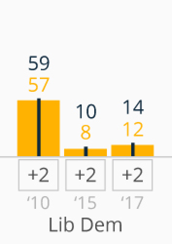
The thin black line and black number is the Exit Poll prediction, the yellow bar and number is the actual result, and the numbers below the bars show the difference.
Even knowing what it all means, I find it a cognitive challenge to parse the info. But I can come away with a lot of detail.
The Economist, on the other hand, eschews all the detail in favour of rapidly conveying the point: Exit Polls are accurate.
Do I have a preference? In a fast-moving news day, I prefer The Economist version: It makes its point quickly and simply, sacrificing detail for speed. This doesn’t mean the Statista chart is bad: It has more information, and my judgment is based purely on my objective (fast comprehension) which might not be the intent of the chart’s creator.
Recommended content
Andy's article
A posuere, primis debitis hymenaeos ante incididunt nascetur deleniti mollis.
Read the article
Lookback Gallery
A posuere, primis debitis hymenaeos ante incididunt nascetur deleniti mollis.
Read the blog
If Data Could Talk
A posuere, primis debitis hymenaeos ante incididunt nascetur deleniti mollis.
Learn more