Reflections from a data scientist: How my COVID-19 dashboard evolved over the course of the pandemic


As a data enthusiast, I like to make decisions and form opinions based on data, when possible. During these unusual times, this includes answering questions such as how safe it would be for me to go to the grocery store, to travel, to meet people in public, and so on.
Hence, from the start of the pandemic, I started building my own COVID-19 dashboard, in order to judge for myself how bad the situation really was.
It was easy enough to get my hands on the data—the Tableau COVID-19 Data Hub even has a starter dashboard for anybody to use—but, in my career of over 15 years working with data, I have never struggled more with interpreting a data set more than I have with COVID-19 data. Over the course of spring and summer, I rebuilt my dashboard again and again.
In this blog post, I look back at my dashboard evolution over time, examine the different versions, and share why your best dashboard is often your next one.
First version: Per capita numbers
In February this year, I got excited that Johns Hopkins University made available the latest coronavirus figures on their GitHub profile, the dataset that virtually all newsrooms use to report on the pandemic. From then on, until well into the summer, I looked at it almost every day.
I was transfixed by the numbers, because I was worried about what the situation meant for my own home country Germany and, by extension, the safety of myself and my loved ones. Was it still safe to make that business trip to the US? How about a ski holiday in Austria?
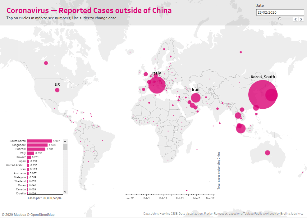
At the beginning of the pandemic, the media kept on telling the world that most cases were still concentrated in China. But China also happens to be a very large country. So, to answer my own questions, I placed the number of cases in relation to population size.
By the end of February, it was actually South Korea that had the highest number of cases per person. Germany was, at that time, far behind
Second version: Timelines
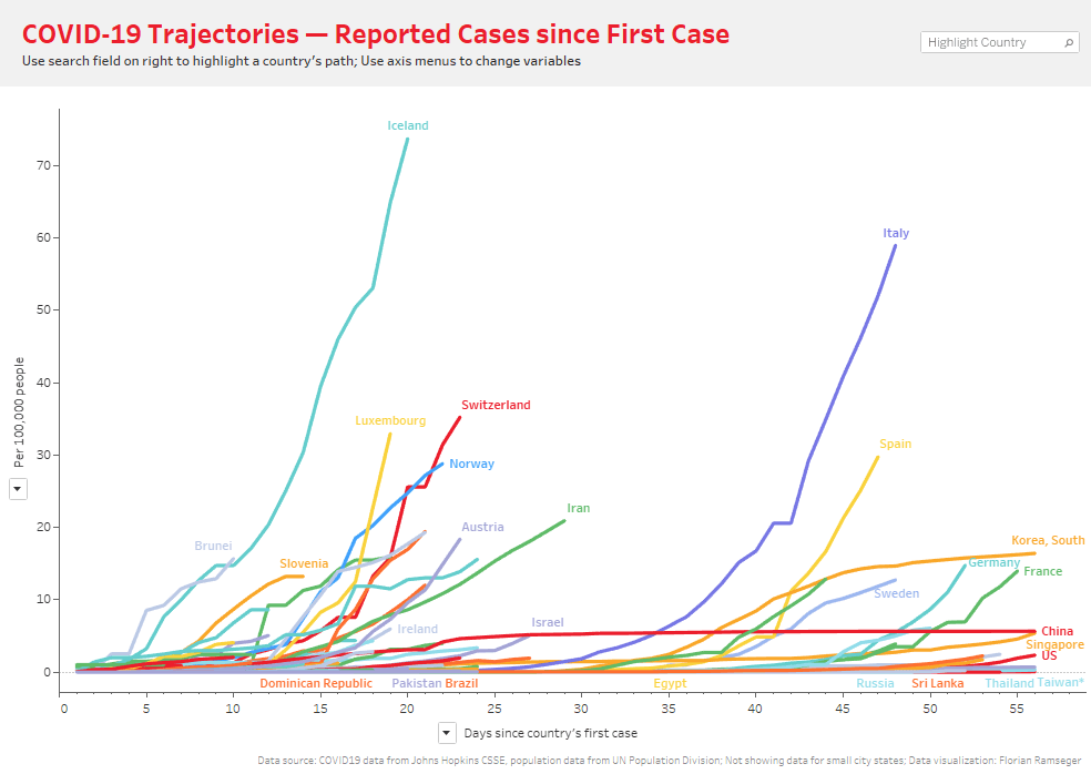
In March, the situation was getting serious in my home country, Germany. I wanted to see how we tracked compared to South Korea.
I changed my dashboard to show the evolution of the numbers over time. I added an option to align the curves so that they start from day zero, when the first case was detected in a country. That way, I could see how closely Germany followed the experience of South Korea and other countries.
My benchmark for my dashboard was a short-lived one. Per capita cases in Germany overtook those of South Korea on 19 March (and eventually outstripped them by a factor of eight). Germany as a country went into full lockdown around the same time.
Third version: Growth rates
With South Korea no longer being a relevant benchmark, my routine evolved to look daily at the figures of Germany’s neighbours.
But soon it became clear that different countries had very different criteria for testing people for COVID-19. In the UK even people with indicative symptoms were not tested and told to stay at home unless they felt worse while Iceland, for example, tested very widely so they could also get a handle on asymptomatic cases.
For this reason, it didn’t make much sense to simply compare official country numbers. Some commentators switched to reporting fatality numbers. Turns out that presented its own problems. For example, anecdotal evidence from France suggests that nursing homes were actively discouraged from bringing ill residents to the overcrowded hospitals. In France and elsewhere, there were likely to be many undocumented deaths in nursing homes.
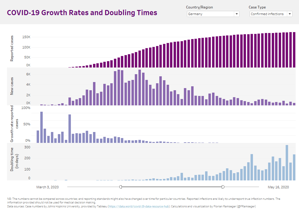
Because of these issues, I eventually decided that it made sense to only look at one country at a time. My assumption was that the way people are tested would be roughly constant over time within each country. I created a dashboard that showed the daily exponential growth rate and the doubling time by country.
And what the numbers were suggesting gave cause for hope. In Germany and elsewhere, the growth rate declined and the doubling time went up, as the lockdown measures started to show results by the end of April.
Fourth version: Daily new cases
Although I never added it to my dashboard, in my head I would revise the official numbers upwards, in order to get an idea of the true number of infected people, including those that were asymptomatic. Several studies based on antibody tests indicated what these adjustment factors might be for different countries.
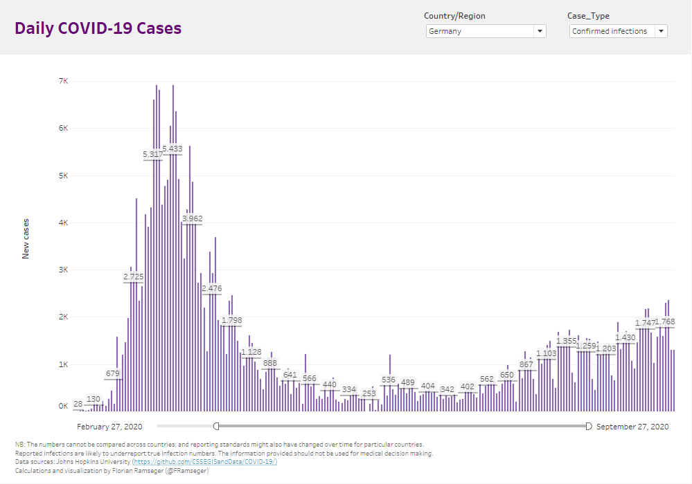
I also eventually dropped the growth rates and doubling times from my dashboard. With the public health measures in place, we were no longer experiencing exponential growth, and these numbers were no longer useful.
However, there were other issues. Some of my journalist contacts were telling me that in Germany, numbers reported over weekends tended to be lower, as might be the case elsewhere, because the local health authorities were slower at working new cases into the system. The pattern was visually apparent in the data, but one needed the extra information to interpret it correctly.
Once I knew the pattern was a data collection artefact and not reflective of reality, I added a seven-day average to my dashboard and from then on only looked at it once a week. Turns out that was good for my personal sanity too.
Fifth version: Case-to-test ratio
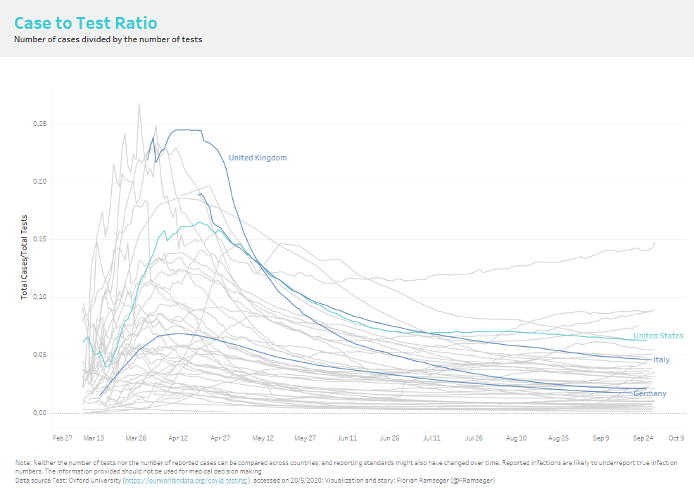
Looking at the raw numbers, cases started to tick up again in early August in Germany. But Germany also offered free COVID-19 tests for anybody returning from abroad. Hence, my initial assumption about the ratio of confirmed to undiagnosed cases being relatively stable over time didn't hold up anymore.
Once again, I had to pivot. Oxford University's Our World in Data project has up-to-date numbers on how extensively countries test. With that data, I added a chart to my dashboard that shows the case-to-test ratio, which gives us a rough approximation of the percentage of tests that come back positive.
An interesting visual pattern emerged: as countries went through the first wave, the case-to ratio followed a hump-shaped curve. The likely explanation is that unchecked transmissions lead to exponential growth in infections, but the logistics behind ramping up testing were more linear, resulting in an increase in the ratio. As public health measures began to take effect and the reproductive number dropped below one, the case-to-test ratio dropped again. In my mind, a country on the downward sloping part of the curve appears to have the situation under control. In August and September, that was still the case for Germany, meaning that additional tests still outstirpped additional cases, even if the latter number was increasing.
The best dashboard is the next one
To learn from data, we need to start with the right question; know what we want to compare; use what data is available, while accepting it's limitations; and interpret it with the help of subject matter experts. But rarely are all these puzzle pieces in place when we first start looking at new data — made apparent by my dashboard’s evolution over time.
I am now at the fifth iteration and it likely won't be the last. Soon, I might see the current version as irrelevant, insufficient, or plainly misleading, and I will have to pivot again. And that is okay. My colleague Andy Cotgreave warns about dead-end dashboards that don't allow you to further investigate the data or that don't evolve with the needs of the organization:
“Dashboards that don’t evolve don’t get used. Too often, a completed dashboard is seen as a finishing line, not a starting point. All this does is lead to dead-end dashboards. They litter company portals, unloved and unseen.”
Perhaps sales numbers, website visits, or click-through rates are not as contentious as data about a novel coronavirus, but whatever the topic, we should always be open to new information and interpretations, admit where we have been wrong or where a chart has become obsolete, and keep on iterating on our dashboard.
The Norwegian furniture designer Peter Opsvik who is often referred to as the father of ergonomic chairs said that, when sitting, "the best posture is the next posture” (which might explain his sculpture-cum-chair called the Globe Garden). The same might be true for dashboards. The best one is the next one.
Explore the latest COVID-19 data, articles, and advice on the Tableau COVID-19 Data Hub.
関連ストーリー

After a year of COVID-19 charts, eight data communication lessons learned
 2021/04/19

4 reasons why embedded analytics is your path to a new revenue stream in the COVID-19 era
This blog post covers four reasons why organizations should consider embedded analytics.
What we can learn from the public sector’s response to COVID-19
 2020/05/21
A broad consensus is that COVID-19 will drive digital transformation in the public sector. During the 2020 Government Summit, speakers from Veteran Health Administration, Southwest Texas Regional Advisory Council, and FEMA discuss new processes, new technologies and innovations, and most importantly, a new mindset on decision making in the midst of crisis.
Subscribe to our blog
Tableau の最新情報をメールでお知らせします